Let’s do one more text utility before we go into something more complex. In this case, we are going to make one that creates a text stroke.
Text Stroke
Don’t belittle this simple text-stroke. It can be used to create impressive text effects like the one you see below!
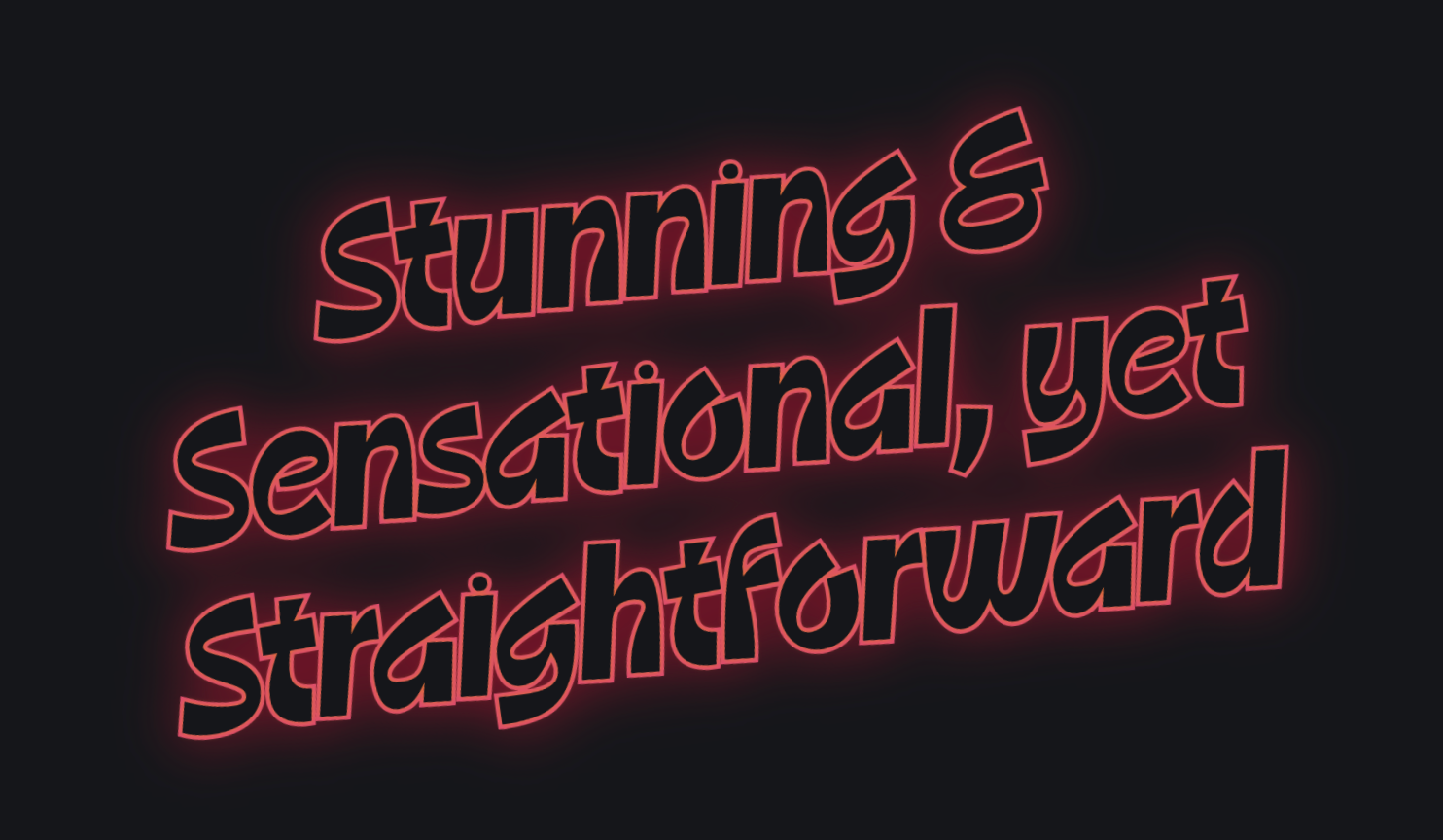
Creating a text stroke
Unlike what you might imagine, I am not a CSS expert that can conjure all these kinds of strange techniques up by myself. These techniques have already existed on the interwebs, created by others; I just happened to find and repurpose them.
For this text stroke effect, a quick search on Google suggests that Chris Coyier had already dug this up back in 2010!
You’ll want to read that article to get a sense of how to use it, but to keep things short, you need the following CSS to create a text stroke.
.text-stroke { color: black; /* The fallback color */ -webkit-text-fill-color: orange; /* The fill color (overrides color) */ -webkit-text-stroke-width: 1px; /* Stroke width */ -webkit-text-stroke-color: black; /* Stroke color */}Text stroke
This is a great start — but there’s something wonky about the overlapping strokes, so it didn’t quite work out. After a bit more research, I found that you also need paint-order to get the strokes to render right.
.text-stroke { /* ... */ paint-order: stroke fill;}Essentially, this is saying:
- Paint the
strokefirst - Then the
fill.
So fill should cover stroke.
Text stroke
But this created another problem — the stroke seems to disappear!
Upon closer inspection (and rereading Chris’ article), I realized the stroke seems to disappear because we only have 0.5px worth of stroke on the outside — and that’s because half of the stroke is rendered outside the text.
We need to bump it up a few notches if we want the stroke to be visible.
.text-stroke { /* This has 2px of stroke outside */ -webkit-text-stroke-width: 4px; /* ... */}Text stroke
Nice.
Creating the utility
At this point, we know we need the following CSS to create a text stroke.
.text-stroke { color: black; /* The fallback color */ -webkit-text-fill-color: orange; /* The fill color (overrides color) */ -webkit-text-stroke-width: 1px; /* Stroke width. Should be min 2px */ -webkit-text-stroke-color: black; /* Stroke color */ paint-order: stroke, fill;}We can create a few CSS variables to house each of these values to make text-stroke easy to use. We can also put in a few guardrails when we are doing that.
- We can ensure that the
stroke-widthis a minimum of2px, so at least1pxof stroke width is on the outside. - And we can have a fallback color (that is the same as
stroke-color) if this is not supported.
@utility text-stroke { color: var(--stroke-color, currentcolor); -webkit-text-fill-color: currentcolor; -webkit-text-stroke-width: max(var(--stroke-width, 0.1em), 2px); -webkit-text-stroke-color: var(--stroke-color); paint-order: stroke fill;}Now we can use text-stroke like this:
<div class="text-stroke text-orange-500" style="--stroke-color: black; --stroke-width: 4px"> ...</div>Text stroke
Nice.
Using text-stroke with other text
I got inspired to build text stroke when I created the first version of SplendidLab’s landing page.
Here, I want some of the header text to be an outline, while the others are standard coloured text. This helps to create good visual contrast and makes things interesting.

What I discovered at this point is that words that use text-stroke seem larger than the words that don’t use it.
This makes sense, because some stroke-width is created outside of the text. So words that use text-stroke would automatically seem bigger. You can see that in this demo below — I deliberately enlarged the stroke to make this visible.
With Stroke and Without Stroke
One way to fix this is to reduce the font-size by half of the stroke-width. Then the sizes can become even again.
@utility text-stroke { font-size: calc(1em - var(--stroke-width, 0.1em) / 2); /* ... */}With Stroke and Without Stroke
Functional Utilities for text-stroke
Building this utility should look very familiar to you at this point because we have been doing the same things over the last two lessons.
Except, we have a problem: Tailwind already uses stroke-* to output values for SVG stroke and stroke-width properties so we can’t use the same namespace.
I thought about it for a while, but the best I came up with is spl-stroke since I’m putting all these effects under Splendid Labz anyway. So I went ahead with it.
@utility spl-stroke-* {  /* For stroke-width */  --stroke-width: --spacing(--value(number));  --stroke-width: --value([length]);
  /* For stroke-color */  --stroke-color: --value(--color-*, [color]);  --stroke-color: oklch(    from --value(--color-*, [color]) l c h / --modifier(number)%  );}
Creating the text effect
Now we can take a stab at creating the text effect I showed you above! This can be achieved by using text-stroke and drop-shadow.
<div class="text-purple-900 text-stroke spl-stroke-orange-500 spl-stroke-0.5" style="filter: drop-shadow(0 0 0.25em var(--color-orange-500));"></div>Hey there
Now a further question might have arisen in your mind: How do you manipulate drop-shadow easily without writing the entire filter function? Well, we’ll get to that in a bit, because that will take us on a foray into shadows.
But first, let’s look at a final text highlight effect.
Welcome! Unfortunately, you don’t have access to this lesson. To get access, please purchase the course or enroll in Magical Dev School.
Unlock this lesson