I promised, so this will start getting a bit more complex. Not because it needs to be complex, but because the complexity gives you different variations you can use.
Now, there are many ways to highlight text. Here are some examples out in the wild:
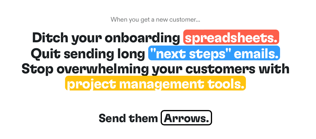

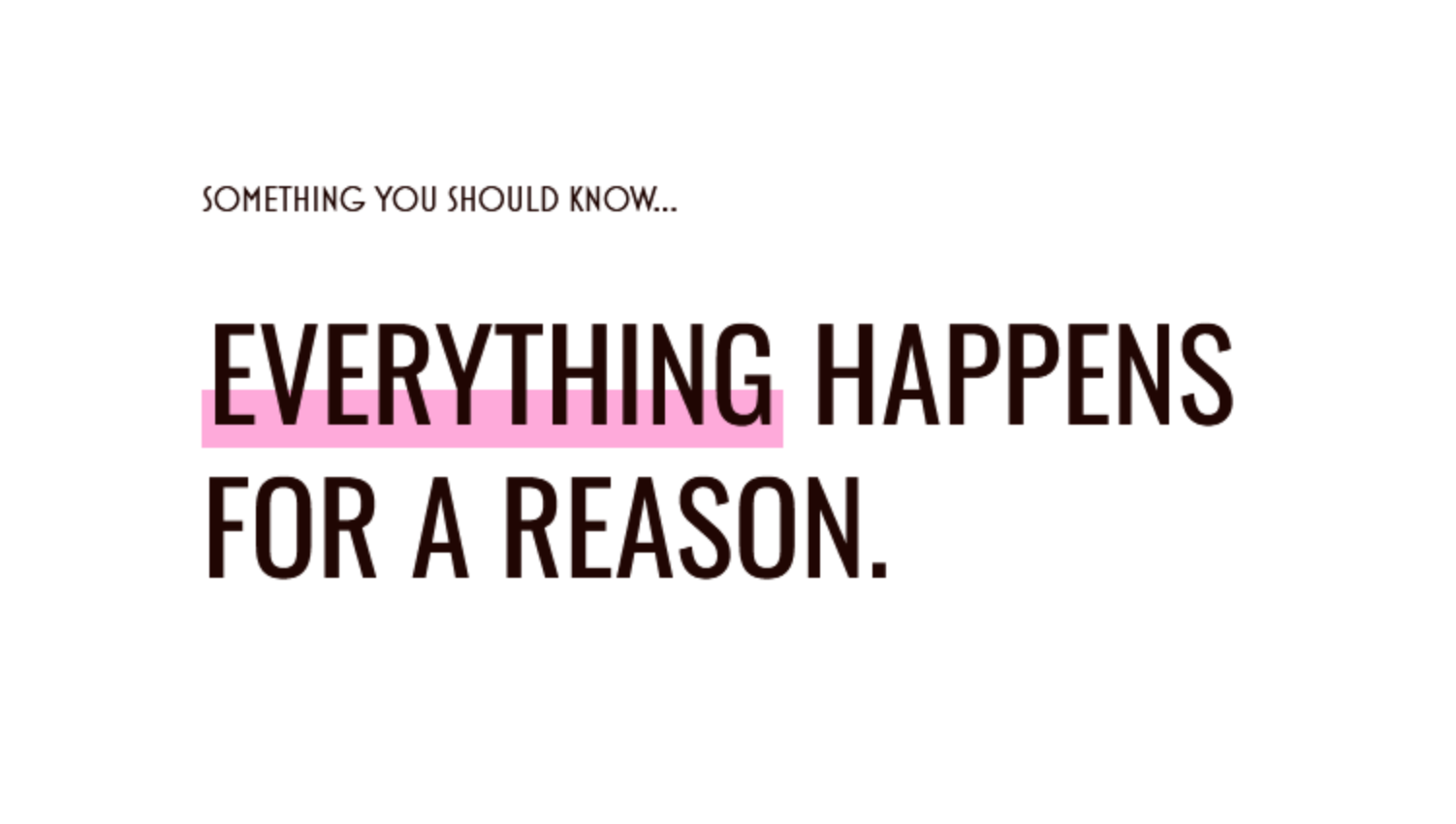

The first two are pretty obvious. They don’t add much visual interest so we won’t be talking about them. But the 3rd and 4th one — ooh. They’re nice.
Building the 3rd effect
Unlike text-stroke, I didn’t find good resources to build this. So I came up with an easy technique myself.
The idea is to add a linear-gradient as the background-image. Then we can control the position of the highlight by adjusting where we want the highlight to start and end.
@utility highlight { display: inline; background-image: linear-gradient( transparent 0 var(--highlight-start, 0), var(--highlight-color) var(--highlight-start, 0) var(--highlight-end, 1lh), transparent var(--highlight-end, 1lh) ); box-decoration-break: clone;}Hey There, Sexy.
If we want this utility to work across multiline text, we need to make sure it’s inline and has box-decoration-break: clone.
@utility highlight { display: inline; box-decoration-break: clone; /* ... */}Hey There, Sexy. Now the multiline version works perfectly.
I’ll be honest. I kinda stopped here… But when I was writing this lesson, I chanced upon the skewed box and I thought it looked pretty dang cool.
So I improved my highlight utility to support this.
Building the 4th effect
Vadim Makeev came up with this technique and blogged about it in A CSS Challenge: Skewed Highlight. I encourage you to read it to get a sense of what happened.
In the article, Vadim explains that you can’t skew a background, so he had to construct a 3-part background with gradients:
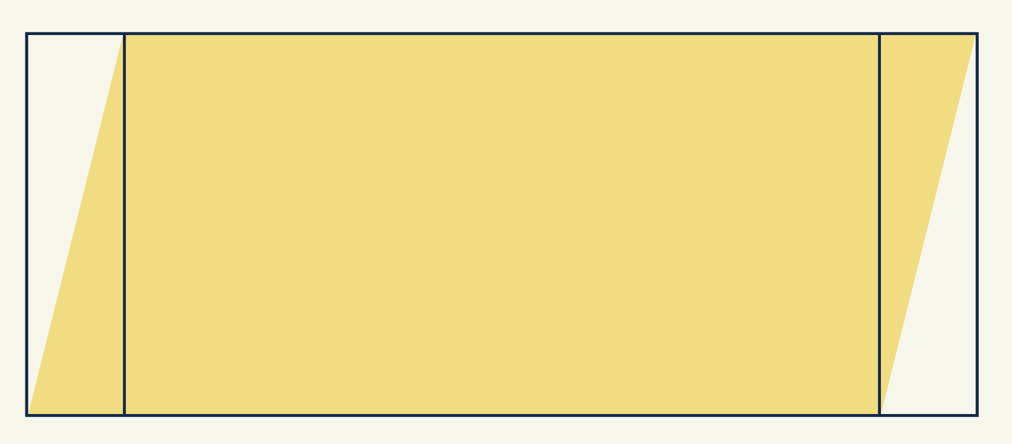
You can skew() a pseudo element to achieve the same effect here, but pseudo
elements don’t work with box-decoration-break, so we have to use Vadim’s
method.
He also had to adjust the background-size and background-position to make this work. So the code ends up being a little bit complex. But the idea is simple: 3 gradients, 3 positions, 3 sizes — one set for each.
/* example from Vadim's article */mark { background-color: transparent; background-image: linear-gradient(to bottom right, transparent 50%, #f8db75 50% 100%), linear-gradient(to right, #f8db75, #f8db75), linear-gradient(to top left, transparent 50%, #f8db75 50%); background-size: 0.25em 1em, calc(100% - 0.25em * 2 + 1px) 1em, 0.25em 1em; background-position: left center, center, right center; background-repeat: no-repeat;}This allows us to skew the background. In this case, Vadim set the left and right boxes to be 0.25em. But we can use a CSS variable for it.
@utility highlight { /* ... */ margin-inline: calc(var(--highlight-skew) * -1); padding-inline: var(--highlight-skew); background-size: var(--highlight-skew) 1em, calc(100% - var(--highlight-skew) * 2 + 1px) 1em, var(--highlight-skew) 1em; /* ... */}Hey There, Sexy. The multiline version still works perfectly.
But how can we include the height adjustment from what we had before? Turns out, it’s not too hard.
Height adjustments
I still want to use --highlight-start and --highlight-end to control the size of the highlighted background. To support this, we have to adjust the background-size and background-position correspondingly.
@utility highlight { /* ... */ --_highlight-height: calc(var(--highlight-end) - var(--highlight-start)); background-position: left var(--highlight-start), center var(--highlight-start), right var(--highlight-start); background-size: var(--highlight-skew) var(--_highlight-height), calc(100% - var(--highlight-skew) * 2 + 1px) var(--_highlight-height), var(--highlight-skew) var(--_highlight-height);}Now we can adjust the start and end position:
Hey There, Sexy. The multiline version still works perfectly.
This is beautiful.
Then, I had another wild idea — what if we could support gradients here? That’ll be so cool!
Supporting gradients
Turns out, it’s possible.
Here we just have to set the starting gradient color and ending gradient color in the background-image rule. And we’ll fallback to highlight-color if these gradients are not found.
We can also use --gradient-angle to determine the gradient’s angle. But we have to split --gradient into gradient-start and gradient-end because we need to put them separately in the two skewed boxes.
Since we’re composing this from 3 different boxes… this gradient can be rather finicky. But it works between 45deg and 135deg.
@utility highlight { background-image: linear-gradient( to bottom right, transparent 50%, var(--gradient-start, var(--highlight-color)) 50% ), linear-gradient( var(--gradient-angle, to right), var(--gradient-start, var(--highlight-color)), var(--gradient-end, var(--highlight-color)) ), linear-gradient( to top left, transparent 50%, var(--gradient-end, var(--highlight-color)) 50% );}Hey There, Sexy. The multiline version still works perfectly.
There we go! I hope you enjoyed this weird little trick to make your headings stand out even more!
Now let’s dive into shadows.
Welcome! Unfortunately, you don’t have access to this lesson. To get access, please purchase the course or enroll in Magical Dev School.
Unlock this lesson