Shadows are one of the most used elements in web design. They’re commonly used to define the soft edges of an element, or to lift an element up above other things.
Tailwind’s shadows
Tailwind has a few basic shadow-* utilities that let you do this. Here are their declarations:
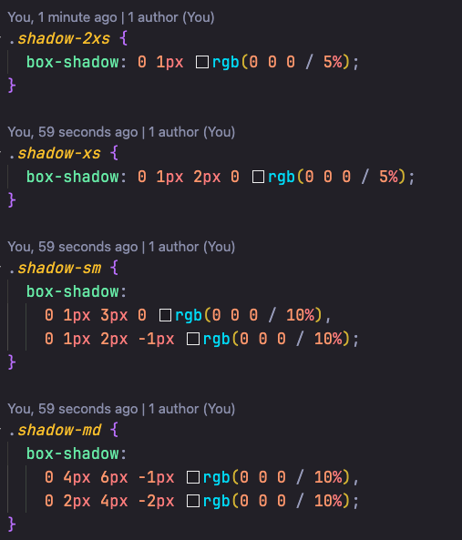
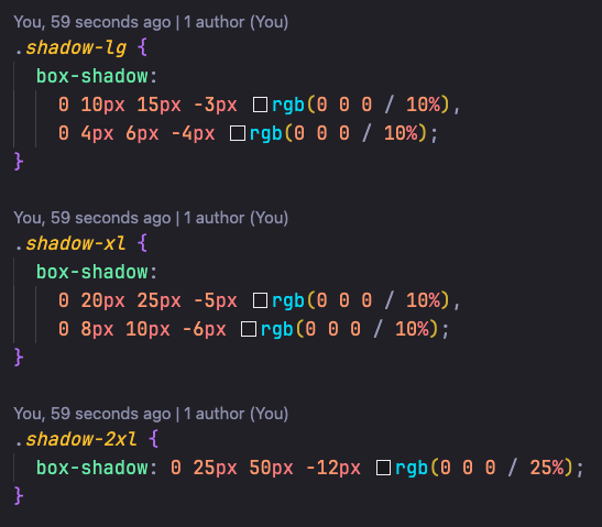
You use them with the shadow-* utilities:
<!-- md-sized shadow, --><div class="shadow-md">...</div>The default output from Tailwind’s shadow utilities is as follows:
2xs
xs
sm
md
lg
xl
2xl
I’ll be honest with you, they look rough and not nice at all.
What nicer shadows look like
Josh Comeau has an excellent tutorial on making beautiful shadows that look richer. I highly recommend reading this. He talks about:
- Shadow elevation
- The right shadow length and blur
- And choosing the right shadow colours.
He also built a shadow generator tool that gives you the right CSS for the shadows you want.
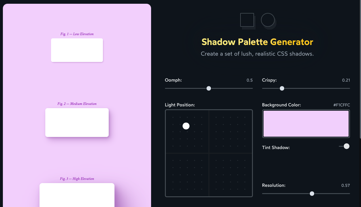
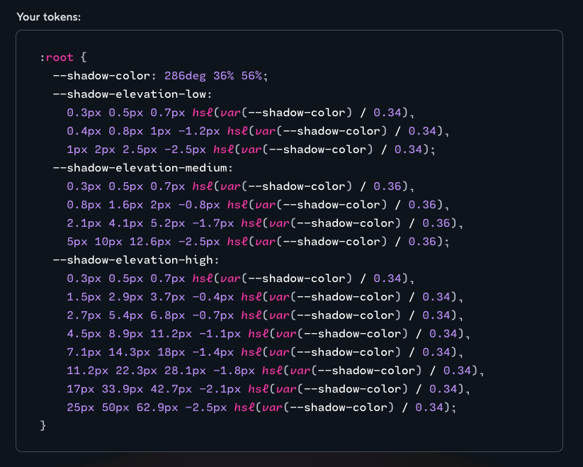
The tool is amazing, but I don’t use it. Because I don’t want to go to an external tool and copy-paste the CSS from there — I find it to be a cumbersome and slow process.
So I chose to build my own tools to create a similar effect.
Making a shadow utility
The basic idea behind creating a nice shadow is pretty simple if you begin to break down the code. This is an example that I lifted from Tobias Ahlin’s article on smooth box shadows that Josh referenced.
.selector { box-shadow: 0 1px 1px rgba(0, 0, 0, 0.12), 0 2px 2px rgba(0, 0, 0, 0.12), 0 4px 4px rgba(0, 0, 0, 0.12), 0 8px 8px rgba(0, 0, 0, 0.12), 0 16px 16px rgba(0, 0, 0, 0.12);}You can see that there is a very specific pattern — each layer of the box shadow has values that are twice the values of the previous one.
So the idea is simple. To create a five-layered box shadow, you need to have:
- a starting
xvalue - a starting
yvalue - a starting
blurvalue - a multiple for each of them
- the shadow color
We can extract these and put them into CSS variables like this.
.selector { --shadow-x: 0; --shadow-y: 1px; --shadow-blur: 1px; --shadow-x-multiple: 2; --shadow-y-multiple: 2; --shadow-blur-multiple: 2; --shadow-color: rgba(0, 0, 0, 0.12);}Now let’s say we only use this to create a three-layer shadow. You can create the first layer by using the variables like this.
.shadow-3 { box-shadow: var(--shadow-x) var(--shadow-y) var(--shadow-blur) 0 var(--shadow-color);}For the second and third layers, we can use calc and pow to magnify the shadow to the appropriate amount.
.shadow-3 { box-shadow: /* Layer 1 */ var(--shadow-x) var(--shadow-y) var(--shadow-blur) 0 var(--shadow-color), /* Layer 2 */ calc(var(--shadow-x) * pow(var(--shadow-x-multiple), 1)) calc(var(--shadow-y) * pow(var(--shadow-y-multiple), 1)) calc(var(--shadow-blur) * pow(var(--shadow-blur-multiple), 1)) 0 var(--shadow-color), /* Layer 3 */ calc(var(--shadow-x) * pow(var(--shadow-x-multiple), 2)) calc(var(--shadow-y) * pow(var(--shadow-y-multiple), 2)) calc(var(--shadow-blur) * pow(var(--shadow-blur-multiple), 2)) 0 var(--shadow-color);}The result of this 3-layer shadow looks like this:
Developing this further
3 layers are not enough, so I developed the idea and ended up with 7 shadow layers. I call each layer an elevation — because they’re there to lift things up.
elevation-1has one layer of shadowelevation-2has two layers- and so on
<div class="elevation-1">...</div><div class="elevation-2">...</div><div class="elevation-3">...</div><div class="elevation-4">...</div><div class="elevation-5">...</div><div class="elevation-6">...</div><div class="elevation-7">...</div>The output of these elevations (with their defaults) is as follows. I think they’re much richer than Tailwind’s built-in shadows — although it might be a tad overpowering.
Tailwind’s shadows
2xs
2xl
My elevation utility
1
2
3
4
5
6
7
So I added other variables like --shadow-alpha and --shadow-spread that allow us to adjust the generated shadows even more.
Here’s a demo you can play with to see how they all work together:
Now, creating the perfect shadow can be as easy as using the right elevation-* and adjusting a few variables!
<div class="elevation-5" style="--shadow-y: 2px; --shadow-color: black;"> ...</div>5
Functional shadow utilities
Variables like --shadow-y and --shadow-color are very verbose. They’re fine in CSS, but they’re a code smell if we were to write them into the HTML, so we need functional utilities if we want to make this easier to use.
But Tailwind has taken up the shadow-* namespace, so we need another name.
I thought about it for a while, and I chose to use s-* as my shadow namespace eventually. This allows me to write functional utilities for text-shadow with ts-* and drop-shadow with ds-*.
Then I built one utility for each of these variables:
| Utility | The property it adjusts |
|---|---|
sx-* |
--shadow-x |
sy-* |
--shadow-y |
sb-* |
--shadow-blur |
ss-* |
--shadow-spread |
sxm-* |
--shadow-x-multiple |
sym-* |
--shadow-y-multiple |
sbm-* |
--shadow-blur-multiple |
ssm-* |
--shadow-spread-multiple |
sc-* |
--shadow-color |
sa-* |
Shadow alpha (transparency) |
The code for this is similar to what we’ve discussed in the previous lessons so I’m not going to repeat it. You can find the actual utilities over at Splendid Labz.
Now I can use these utilities to adjust shadows easily. But the downside here is that these are quite cryptic to people who’re looking at them for the first time.
<!-- From this --><div  class="elevation-5"  style="--shadow-y: 2px; --shadow-color: black; --shadow-alpha: 25;">  ...</div>
<!-- To this --><div class="elevation-5 sy-[2px] sc-black sa-25">...</div>Welcome! Unfortunately, you don’t have access to this lesson. To get access, please purchase the course or enroll in Magical Dev School.
Unlock this lesson