In CSS, you can do strikethrough text with text-decoration-line. To create this in Tailwind, you can use the line-through utility.
<span class="line-through"> strikethrough </span>This text decoration is quite versatile. You can control a strikethrough’s color, thickness, and style — just like a normal text decoration.
<span class="line-through decoration-wavy decoration-red-500 decoration-2"> strikethrough</span>strikethrough
But it cannot create a strikethrough that is commonly used in pricing cards like the one shown below.
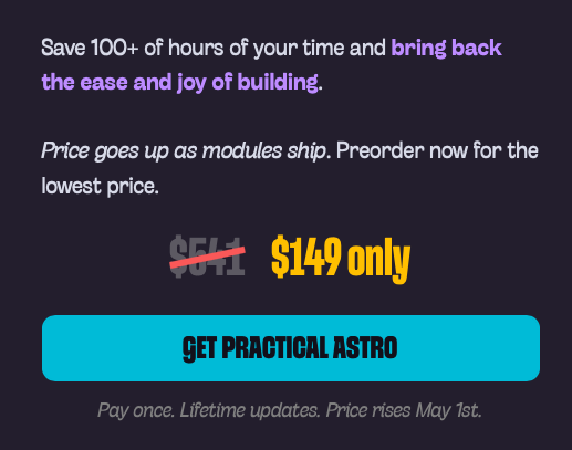
Creating a custom strikethrough
For this kind of strikethrough, we want a few things:
- We want to control its thickness
- It needs to be of a different colour from the body text
- It should be centered with the text.
- And we need to be able to rotate it.
CSS text-decoration-line can control the first three items, but it cannot do the last one. So we have to build a custom strikethrough.
I think the best place to put this strikethrough is on a pseudo-element. When we do this, we can add strikethrough to the parent element, and the strikethrough will occur.
<!-- ideal usage --><div class="strikethrough">$541</div>Here’s the CSS to create this strikethrough:
@utility strikethrough {  position: relative;  display: inline-block;
  &::after {    content: '';    pointer-events: none;    position: absolute;    top: 50%;    left: 0;    right: 0;    height: var(--strike-width, 0.125em);    background: var(--strike-color, currentColor);    transform: translateY(-50%) rotate(var(--strike-angle, 0deg));    transform-origin: center;  }}
Most of the CSS is straightforward, so I shall not explain much, but here are a few things to note:
position: absolutewithtopandtranslateYallows the strikethrough to be centered vertically.rotatelets it be rotated.heightandbackgroundgive the strikethrough the thickness and colour we desire- We can use
--strike-color,--strike-widthand--strike-angleto adjust the strikethrough to what we want.
Once you have that utility, you can use it like this:
<span class="strikethrough" style="--strike-color: var(--color-red-500); --strike-width: 0.15em; --strike-angle: 10deg"> $541</span>$541
You might think it’s ugly to write CSS variables as inline styles…
I agree — especially when there are so many variables here! But I’m okay with this, since I probably only use it once for the entire site. If I want to use it on multiple pages, I can always put them into a reusable class.
Don’t forget that CSS is your friend here!
.strikethrough { --strike-color: var(--color-red-500); --strike-width: 0.15em; --strike-angle: -10deg;}That said, we can also write functional utilities to make this easier to use if you prefer the Tailwind version.
Building functional utilities
We’re going to create 2 utilities.
strike-*: Forwidthandcolorstrike-angle-*: Forangle
For width, let’s say we want to use the --spacing value. We also want to take in an arbitrary length value.
As for color, we’d want to match it with --color-* and allow for [color] values. Since we’re dealing with colours, it’s best to add the alpha --modifier as well.
@utility strike-* {  /* For strike-width  */  --strike-width: --spacing(--value(number));  --strike-width: --value([length]);
  /* For strike-color */  --strike-color: --value(--color-*, [color]);  --strike-color: oklch(    from --value(--color-*, [color]) l c h / --modifier(number)  );}
If the utility above looks absolutely foreign to you, I highly recommend you read the functional utility lesson again. I promise it will make sense as you go through it again.
Next, for --strike-angle, I want to write something like strike-angle-10.
We cannot use strike-* as the utility because 10 is a number, so strike-10 will create a width. This is why we don’t have much of a choice but to use a different utility name — and strike-angle describes this best.
@utility strike-angle-* { --strike-angle: --value(number)deg; --strike-angle: --value([angle]);}Lastly, we need to create an inverse strike-angle utility to support negative values for the angle.
@utility -strike-angle-* { --strike-angle: calc(--value(number) * -1deg); --strike-angle: calc(--value([angle]) * -1);}Now we can use our functional utilities like this:
<div class="strikethrough strike-0.5 strike-red-500 -strike-angle-10"></div>$541
A little bit nicer, but I’ll say that’s not much of a difference in this context. At the very least, you got real good hands-on practice with creating functional utilities!
Welcome! Unfortunately, you don’t have access to this lesson. To get access, please purchase the course or enroll in Magical Dev School.
Unlock this lesson