In the previous lesson, you learned how to choose the font-size for other typography elements for your website. However, just setting the right sizes aren’t good enough. You still need something else for the page to flow harmoniously.
That’s where the second typography practice, Vertical Rhythm, come in.
In this lesson, you’ll learn:
- What is Vertical Rhythm
- How to apply Vertical Rhythm
- Mistakes to avoid when using Vertical Rhythm
Let’s begin.
What is Vertical Rhythm?
After going through the previous two lessons, you should be able to create font-sizes that look similar to this:
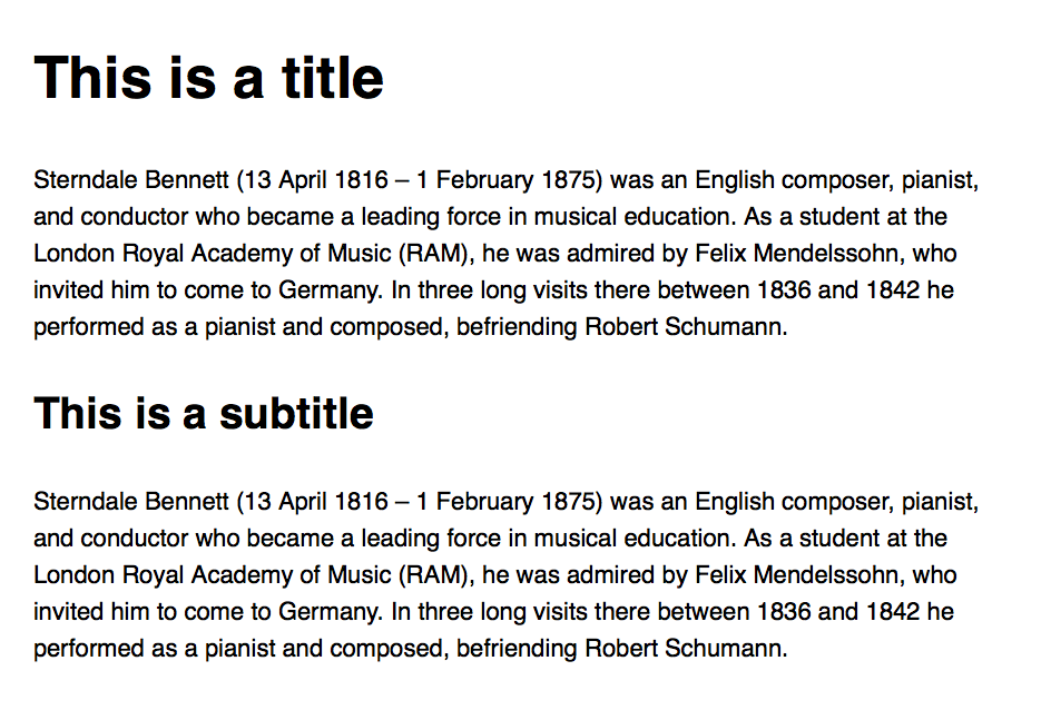
It’s pretty good already!
But it’s still unpolished…
Compare this image with the one above.
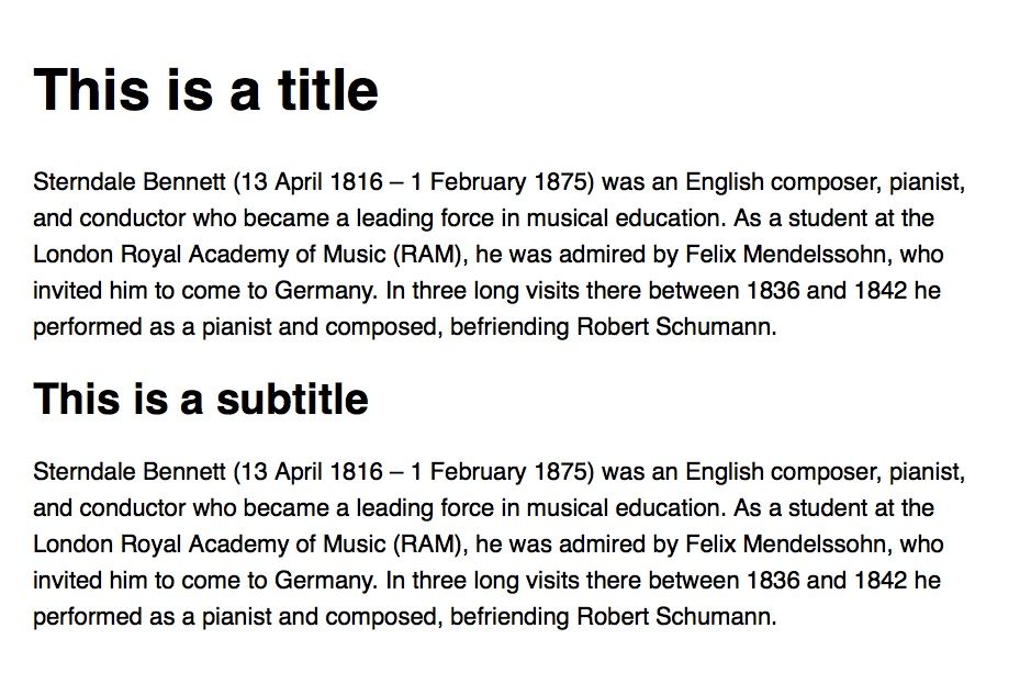
The difference is subtle. It’ll be hard to notice if you aren’t trained in typography yet, so let me put them side by side to help you see the difference.
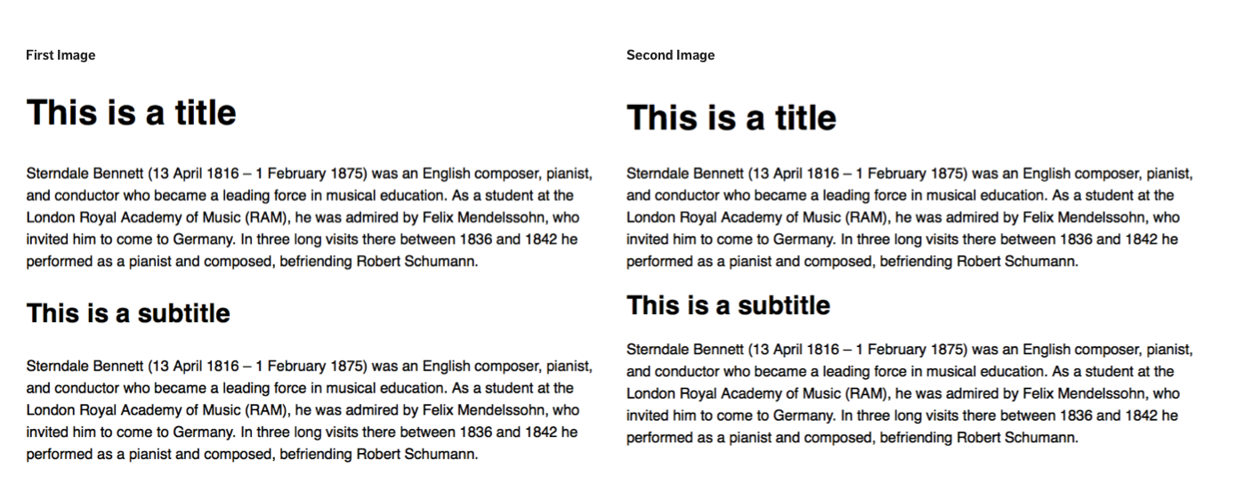
Which do you think is better?
The right one, I believe you’ll say. Here’s why:
- Notice that the whitespace between the headers and paragraphs in the two pictures. They’re different.
- If you draw lines through the second image, you’ll see that the chosen whitespace creates a consistent, rhythmic pattern that makes it easy to read:
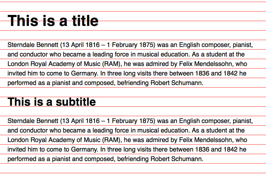
This process is given the term “Vertical Rhythm”.
Constructing the Vertical Rhythm
There are two rules to creating Vertical Rhythm:
- Set the spaces between each element to a multiple of the baseline
- Set the leading of each text element to a multiple of the baseline
The baseline mentioned refers to the lines that are drawn on the image you’ve seen earlier. Each line is a called a baseline. Baselines, when used collectively like above, is called a baseline grid.
The trick to Vertical Rhythm is getting the right baseline. We already have it. Can you guess what that number is?
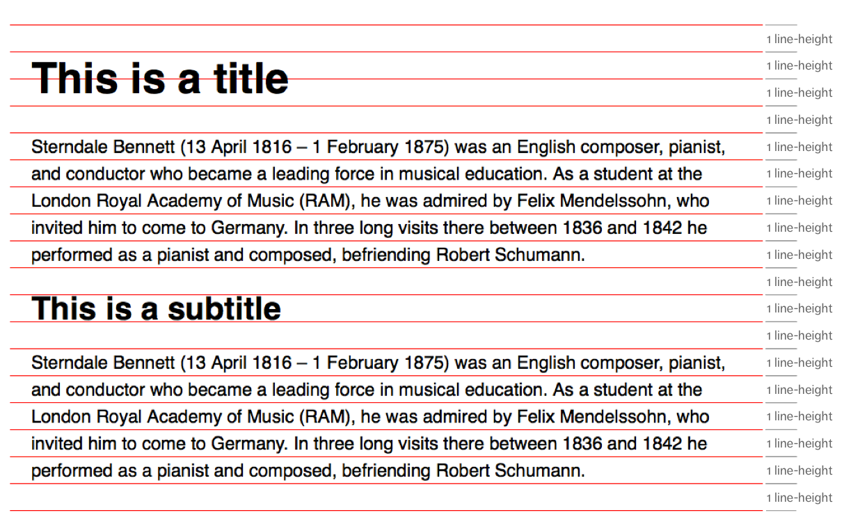
The right baseline is the line-height of your body text.
Many people don’t understand where the baseline comes from. They think it’s a magic number. They doubt themselves regarding their design because they don’t even know whether their magic number is right. See why we had to cover typesetting before we talk about the Vertical Rhythm practice? :)
Creating the Vertical Rhythm is straightforward once you get the right baseline. You just need to follow the two rules:
- Set the spaces between each element to a multiple of the baseline
- Set the leading of each text element to a multiple of the baseline
The first rule meant that vertical margin and padding need to be a multiple of the baseline.
The second rule meant that the line-height property needs to be a multiple of the baseline.
Assuming you use a font-size of 20px and leading of 1.4, your code will be:
html {  font-size: 20px;  line-height: 1.4;}
h1 {  font-size: 2.369em; /* 47.37px */  line-height: 56px; /* 20px * 1.4 * 2 = 56px */  margin: 28px 0; /* 20px * 1.4 = 28px */}
p {  margin: 28px 0;}
/* h2, h3, h4... */
That’s the gist of implementing Vertical Rhythm!
Next up, we take a closer look at the baseline grid — the tool to help you familiarize yourself with Vertical Rhythm.
Creating the Baseline Grid
If you’re new to Vertical Rhythm, it helps immensely to overlay your design with a baseline grid to make sure you have a consistent rhythm.
To create a baseline grid, you can use the linear-gradient function. In this code below, we have set the gradient to repeat every 24px.
html { background-image: linear-gradient( to bottom, red 1px, transparent 0, transparent 24px ); background-size: 100% 24px;}
Sometimes, you may need to adjust the baseline grid (upwards or downwards) to correct it’s position. You can do this with the background-position property:
html { /* Shifts baseline grid upwards by 6px*/ background-position: 0 -6px;}Note: this method only works for modern browsers. You’ll have to create a background image or use Basehold.it for older browsers
Although using a Baseline grid is beneficial at the start, it becomes a hindrance after a while.
Allow me to explain.
Downsides of the Baseline Grid
There are two scenarios where a baseline grid just doesn’t work on the web.
First, the baseline grid behaves differently on every browser if your baseline contains subpixels (anything less than 1px).
On Safari, you’ll find that text doesn’t fall nicely on the baseline grid, even though it’s supposed to be correct.
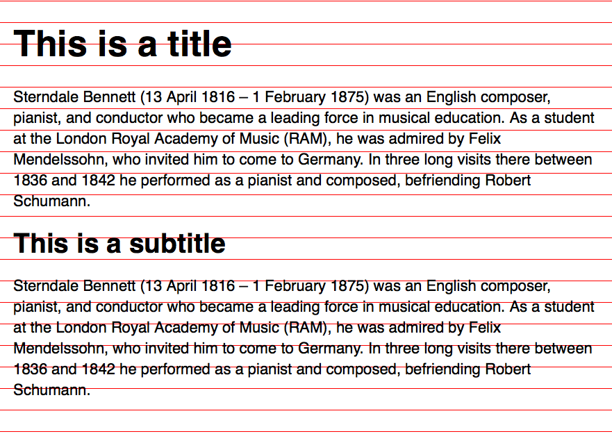
On Chrome, you can’t see the baseline grid unless you increase the background-size property by 1px. Even after doing so, you’ll see the baseline grid is off like Safari:
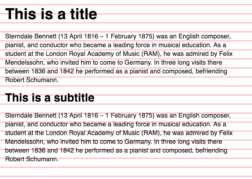
This phenomenon happens because most browsers don’t render subpixels. They round it upwards or downwards, which causes 30.8px to become either 30px or 31px, depending on the browser.
The only browser that renders subpixels properly is Firefox. The baseline grid remains correct, but there’s a minor problem where the 1px line looks larger than 1px because of how subpixels are rendered.
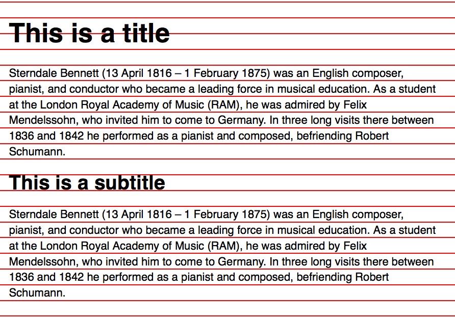
So, your baseline grid is sure to fall apart quickly if your design contains multiple subpixel occurrences (unless everyone in the world uses Firefox or all browsers support subpixels).
The second case where baseline grids fail is when you have a 1px border on your elements. These 1px borders pushes down other elements, causing them to leave the baseline grid:
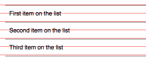
To prevent subsequent elements from “falling out of the grid”, Some developers choose to add extra CSS to remove the 1px border. Ultimately, it results in code that’s much harder to maintain.
These two failure scenarios I mentioned have led many designers and developers to give up on Vertical Rhythm, saying it’s impossible to achieve on the web.
Yes, it’s (almost) impossible to achieve Vertical Rhythm exactly as what the baseline grid suggests. The trick to Vertical Rhythm is to use the baseline grid as a guide. You should not follow the grid down to every pixel. Vertical Rhythm is not about following the baseline grid precisely. It’s about repeating whitespace to create a harmonious flow.
You’ll find out the why behind Vertical Rhythm and how to employ it in every situation when we cover the lesson on repetition in the next module.
There’s one more thing I’ll like to point out about baseline grids before moving on: the implementation of baseline grids on the web and baseline grids in print are different.
Print vs. Web Baseline Grids
If you researched on typography before this course, you’d notice that people place text directly on the baseline when they use baseline grids. This placement is a traditional approach that was used in print design.
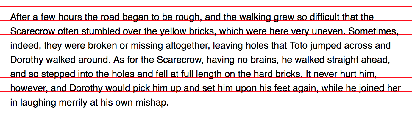
It’s possible to overlay the baseline grid in the same manner on the web, but it comes with a ton of code complications that far outweighs the benefits it brings.
We have go through a geeky discussion of how font-size and line-height works on the web to understand why this is the case.
Warning: Geeky discussion ahead. Skip if you’re faint-hearted.
On the web, text is always positioned in the middle of the line-height property. So, the relationship between font-size, line-height, and baseline is:
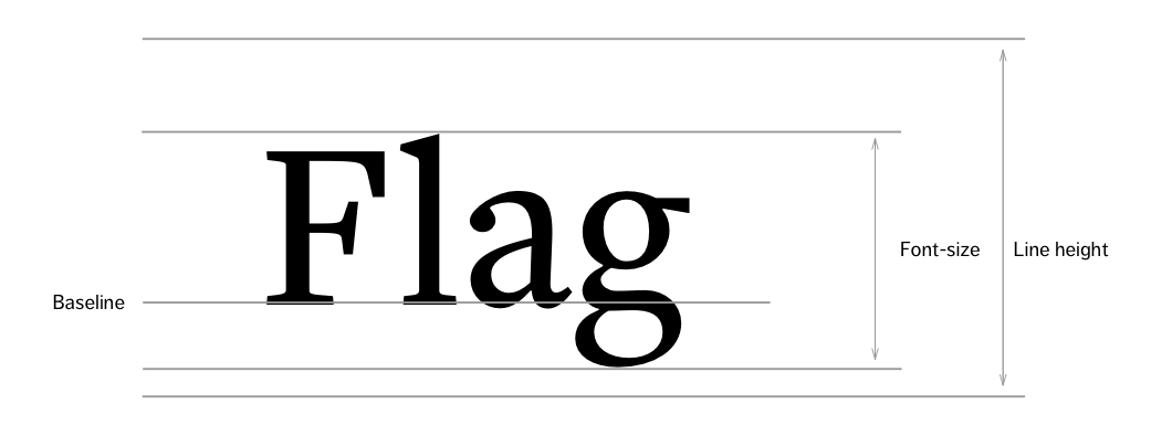
There’s no way to tell how to make text sit on the baseline just from these three properties. We can’t mathematically push down text by any amount because the top and bottom spaces between font-size and line-height aren’t equal.
We need another property to help us calculate the amount of space to push the text to sit on the baseline. This property is the cap height. It’s the height of capital letters (like F) in the typeface.
The relationship between font-size, line-height, cap height, and baseline is:
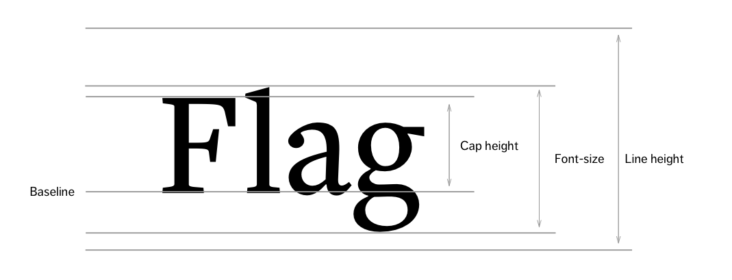
Now, we know we can move text down by a half the difference between the line-heightand the cap-height.
In CSS, we can reposition text either with position: relative; or a combination of margin-top, margin-bottom, and padding-top properties:
p {  position: relative;  top: $x; // where $x is the half difference between line-height and cap height}
// or
p {  margin-top: 30.8px; // Line height (for Vertical Rhythm)  padding-top: $x; // Pushing text down  margin-bottom: -$x; // Undoing the "push"}
Unfortunately, there is no Cap height CSS property. We need to find it through trial and error if we want to use this method.
To do so, we can create a baseline grid that’s equal to the cap height.

For example, with Helvetica, the cap height is 17px when the font-size is 20px. Since the cap height is always proportional to the font-size, we can also say that the cap-height is 0.85 times of the font-size.
So, assuming you have a line-height of 30px, you have to push text down by 6.5px ((30 - 17) / 2 = 6.5px) to make text sit on the baseline.
p {  position: relative;  top: 6.5px;}
// or
p {  margin-top: 30px; // Line height (for Vertical Rhythm)  padding-top: 6.5px;  margin-bottom: -6.5px; // Undoing the "push"}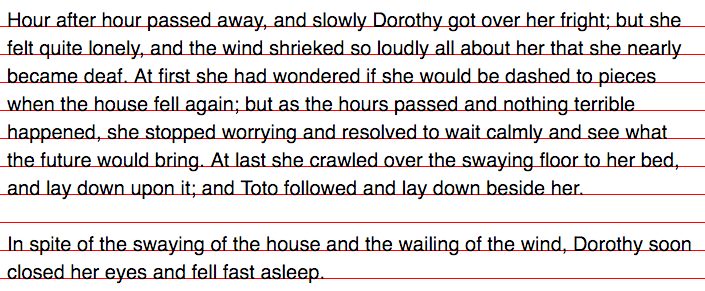
The above code only sets our body text on the baseline. To get typography of other sizes to sit on the baseline, we have to multiply 6.5px (half the difference between line-height and cap height) by a ratio of the difference in font sizes between your our body text and the font-size of the element.
So, if your <h1> is sized at 48px and your body text is 24px, you have to displace the <h1> by 13px (2 * 6.5px = 13px)
/End of Geeky Math
Notice we’re already using subpixels in the code here.There’s no way we can get text to sit on the baseline reliably on all browsers. You’ll always have a 1px difference here or there, and elements are sure to fall off the baseline grid again.
Furthermore, you bring additional code complications that affect your design in ways that may not be worth the effort. Explaining this requires another long post, and I’ve already done so in a separate article. Give it a read if you need some convincing :)
Wrapping Up
In this lesson, you learned the importance of Vertical Rhythm on your design. It harmonizes the flow of content between different elements on the same page.
You also learned:
- How to apply Vertical Rhythm to your web design
- How to create a baseline grid
- Mistakes to avoid when using baseline grids
- The differences between print and web baseline grids
The key to Vertical Rhythm is repetition; not forcing text to sit on the baseline. There’s no need to go through the code complications to push pixels.
We’ll talk about why repetition is so important when we examine four design principles and how they’re applied in Typography in the next module.
Exercise
Create a Vertical Rhythm for the font-sizes you chose in the previous exercise. Apply different amounts of margin, padding, and line-height to each text element in your design. Try to find a rhythm that looks right.
Next Up
Many people get stuck when trying to combine the two practices you’ve just learned. Don’t worry if you get stuck. I’ll show you how to use both Modular Scale and Vertical Rhythm on the same design in the next lesson.
Welcome! Unfortunately, you don’t have access to this lesson. To get access, please purchase the course or enroll in Magical Dev School.
Unlock this lesson