You already have an immense advantage over many designers and developers when it comes to typography at this point. Most frontend developers don’t understand what good typography is, and they rigidly apply print typography rules on the web, which complicates their code unnecessarily.
In the next three lessons, you’ll learn two important typography practices that are used for the web today. They’re built on top of the foundations to typesetting that you’ve learned in the previous lesson.
These two practices are:
- Modular Scale
- Vertical Rhythm
Let’s kick off by talking about modular scale. You’ll learn:
- What is Modular Scale
- How to choose font-sizes with Modular Scale
- How to choose your base number
- How to choose your ratio
What Is a Modular Scale?
I’m pretty sure your website contains more than just paragraphs of text. At the very least, you’ll have subheads, headers, lists and other typography elements.
The question is, how do you choose the font-size of these elements?.
If you ask a designer, the most common response you get is “I’ll tweak it until it looks right”.
It’s really frustrating whenever we get that response. Here we are, trying to learn to design and the designer has just given us the most useless advice ever! We simply don’t have the experience to know what looks right whenever at begin designing.
Luckily, there’s a way out.
When it comes to picking font-sizes, typographers swear by one rule — use a typography scale. It is a set of predefined numbers you can use for your designs. Here’s what a typography scale looks like:
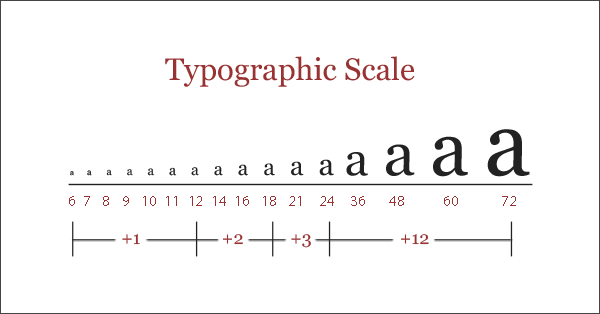
Using a scale is easy. You just select a number from the scale and use it for your headings. Although there’s still some trial and error to determine what sizes to use, it’s becomes much easier than plucking a number from thin air and hoping it’s right.
There are many kinds of typography scales. The one you see above is called a diatonic scale (which is rooted in music). Another example of a scale is the double-stranded Fibonacci scale. As you might imagine, this scale is derived from the Fibonacci sequence:
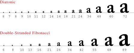
The problem with traditional typography scales is that they’re built for print design. We can’t blindly copy and use a them for the web. It doesn’t work.
Print typography uses points. It’s a different metric system from the ones we use on the web (think miles vs kilometers). A common reading size for print design is 12pts while a default size for the web is 16px.
Furthermore, print design has a fixed canvas. We know the dimensions of the canvas and the distance between the viewers’ eyes and the piece of work. So, it’s much easier to recommend a typography scale for print work.
On the web, screen sizes vary. Distances between the readers’ eyes and their devices vary. Plus, because of the different metric systems, you won’t be able to find the font-size you’ve chosen on a traditional scale.
We need to make some adjustments.
In 2010, Tim Brown came up with a solution. He coined it the Modular Scale. The idea of a Modular Scale is the same as a traditional typography scale. The difference is that you create the scale by using a ratio and a base number you select.
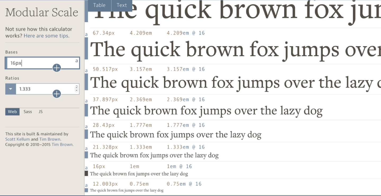
To create the scale, you take the base number, multiply or divide it by a ratio multiple times. Here’s an example of a modular scale with a ratio of 1.333 and a base of 16px.
Choosing The Base Number
Getting the base number right is important because it’ll determine how the scale turns out. Thankfully, we already have a base number we can use. Do you know what it is?
It’s the font-size of your body text.
Using the font-size of your body text as the base number of your scale ensures that the rest of your elements has something in common with your text, which helps the harmonious flow.
Choosing The Ratio
Getting the “right” ratio is tricky, because you can use any number you want. Some common ratios that Tim Brown recommends are:
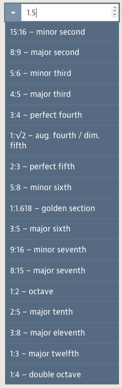
If you noticed, most numbers the list above originated from music. I highly recommend use a number from this list instead of devising your ratio because music produces harmonious relationships.
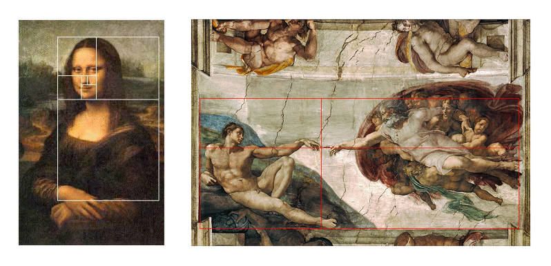
The ratio that’ll stand out to you right now is probably the Golden ratio (1.618). It’s commonly believed to the best most beautiful ratio in the world, and has appeared in many renowned paintings like “Mona Lisa” and “Creation of Adam.”
It also appears in nature, like in this nautilus shell:

Beginners fervently use the golden ratio in their designs, hoping that this almighty ratio will make their designs beautiful. But they get stuck later because their rules were too rigid.
I did the same too. I got stuck, and I wondered why it was so hard to design.
It turns out that the golden ratio is bullshit. Experienced designers don’t use it.
Plus, people don’t prefer the golden ratio anyway.
David Kadavy (author of design for hackers) once did a survey. He asked people to choose the best-looking rectangle out of four rectangles of different aspect ratios. One of these rectangles has the golden ratio.
Now, which one looks best to you? Try it!

The results are surprising for me.
Of the four rectangles, the 2:3 (or 1.5) ratio got the most votes (37%). The golden ratio was the second least favorite rectangle of them all.
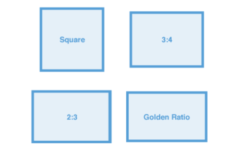
- 2:3 Rectangle 37%
- 3:4 Rectangle 29%
- Golden Ratio 25%
- Square (1:1) 8%
These results don’t mean the 2:3 ratio looks the best, and that you should use it at all times. It just proves that you don’t have to hang on to the golden ratio because everyone else says it’s the most beautiful number in the world.
At this point, you might think that these results aren’t dependable. You may think 2:3 or 3:4 or even potentially the 16:9 ratios are more beautiful than the golden ratio for rectangles because we face so many rectangles in our daily lives.
We see 16:9 ratios on television screens, monitors, and the iPhone’s screen; 4:3 camera displays, old TV screens and the iPad screen; 3:2 ratios on old iPhones.
That’s precisely the point! We prefer different ratios because we get exposed to different stimulus in our daily lives. The more we’re exposed to something, the more we’re familiar with them, the more we like them.
So, we don’t always like the Golden ratio. We just like things we’re familiar with.
But that’s enough about the Golden ratio. You choose to use it; you can opt not to. It’s entirely your decision :)
Why Modular Scale Works
Modular Scale works because we’re creating the scale by repeating a ratio. This repetition creates familiarity, which eventually leads to a harmonious relationship. We’ll find out more about why the repetition creates such harmony in the next module.
For now, just remember that modular scale works because of the repetition. Pick a ratio an experiment with it.
I often use the minor-third (1.2), major-third (1.25) or perfect-fourth (1.333) ratios for my designs because I found them much easier to work with. Sometimes, I choose to use the leading of my body text as the ratio to make the repetitions stronger.
Let’s say you decided to use perfect-fourth as your modular scale ratio, and your body text is set to 20px. You’ll get the following scale:
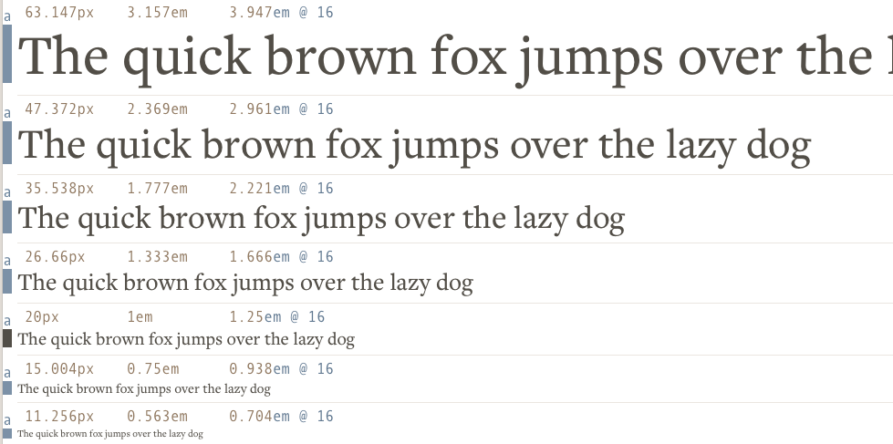
The simplest way to get the scale (like I did above) is to enter you base and ratio into modularscale.com
Go ahead, choose any number as the font-size of your headers, subheaders, and other text elements. Here’s an example:
html {  font-size: 20px;}
h1 {  font-size: 2.369em; /* 47.37px */}h2 {  font-size: 1.777em; /* 35.54px */}
It doesn’t have to the be sizes I picked here. Try different combinations and see what sizes you prefer.
Note: I highly recommend using relative units, which is why I used em in this example. If you’re unsure what em is, feel free to stick with pixels for now. I’ll explain what relative units are in a later lesson.
Wrapping Up
In this lesson, you learned:
- What is Modular Scale
- How to choose font-sizes with Modular Scale
- How to choose your base number
- How to choose your ratio
Get comfortable with using Modular Scale. You’ll use it very often in your career.
Exercise
Create an article with three levels of headers (h1, h2, and h3).
- Set the
font-sizeof these headers with Modular Scale. - Experiment with different ratios and see what comes out the best for you.
- Check if the sizes of your headers are too big or too small with the technique you learned in the previous lesson.
Next Up
Just setting the font-sizes of your headers aren’t good enough. Although the sizes are harmonious to your body text, it still doesn’t flow as perfectly as it should properly.
In the next lesson, I’ll show you how to create a harmonious relationship between body text and the headers you’ve just made.
Welcome! Unfortunately, you don’t have access to this lesson. To get access, please purchase the course or enroll in Magical Dev School.
Unlock this lesson