In the previous lesson, we covered four essential properties to good typography. They are:
- font-family
- font-size
- line-height
- width of text
In this lesson, you’ll master the foundation to good typography by learning how to set the font-size, line-height, and width of your text.
Before we begin, let’s address the pink elephant in the room — why aren’t we talking about typefaces?
You don’t have to choose typefaces (yet)
Everyone talks about typefaces whenever they talk about typography. Getting your typefaces right is extremely satisfying.
However, it’s the worse place to begin your typography journey because of one simple reason — it’s insanely difficult to choose one (or two) typeface(s) out of millions of typefaces. You need to spend months, even years, to learn about typefaces so you can explain why you prefer certain typefaces over others. I can guarantee that you’ll get stuck and give up learning about typography before you even begin designing.
Besides, you won’t even be able to know which is the “best” typeface if you can’t recognize what good typography is. You’ll face the same problems — text just doesn’t seem to look right no matter how you try.
The best way to begin learning about typography is to get the fundamentals right. We begin with typesetting (which means choosing the right font-size, line-height and measure).
Let other people fall into the trap of choosing sexy typefaces. We’ll going to speed ahead and learn the fundamentals first. Once you’re done, you can spend your free time swooning over typefaces to pick the perfect one. (I’ll cover how in the bonus section).
For now, choose any typeface you know. If you’re unsure, go with Helvetica or Georgia.
The right font-size, leading and measure
If you’re setting text for the first time. It’s tempting to believe that there’s a perfect font-size, a perfect leading, and a perfect measure.
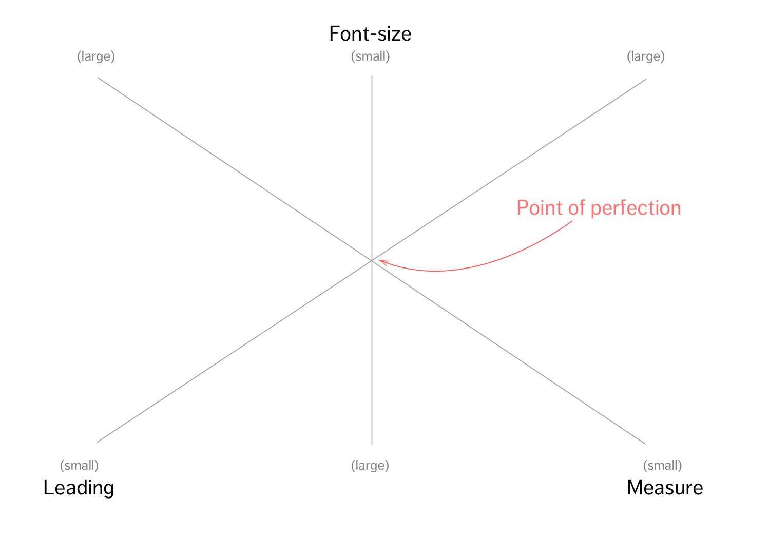
Don’t get sucked into this fallacy. You’ll never find the perfect sizes. Let’s walk through a quick exercise and you’ll understand why.
- Think of 10 websites that you feel are well designed. If you can’t hit 10, then think of as many as you can.
- Compare the sites. Do they all have the same font-size, leading and measure?
There you go. Every design is different. Each design uses a different typeface, a different font-size, a different leading and a different measure.
At first glance, it might seem that there’s nothing in common between the sites you’ve identified. But if you look deeper, you’ll see that the text on each site you’ve identified is clearly readable.
Why?
Because the prerequisite to good design is readable text. Without readable text, communication doesn’t happen, and your design fails.
With this newfound perspective, it becomes easier to choose the right font-size, the right leading, and the right measure. The key is to find a combination of sizes, leadings and measures that are good enough.
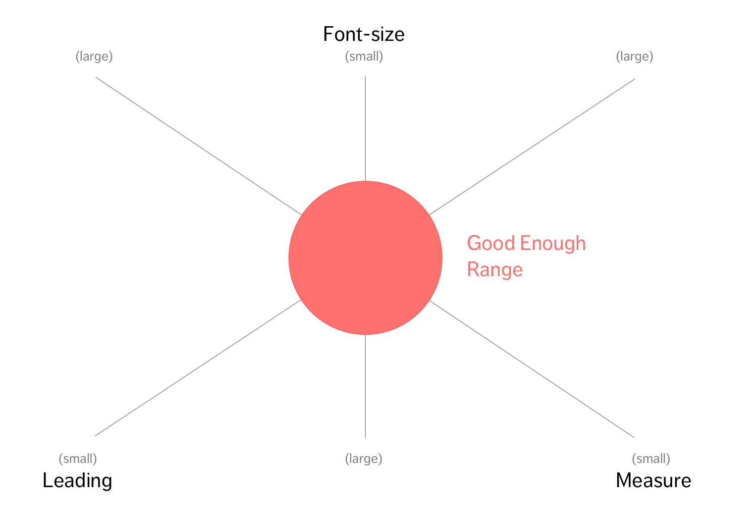
Now, with perfection out of the way, let’s start choosing a good font-size.
Choosing the font-size
There are two factors to consider when choosing font-sizes.
The first factor is the typeface you’re using. Some typefaces look much bigger than the others even when you set text to the same font-size. Don’t worry about typefaces like I mentioned earlier. Just focus on getting text right with Helvetica or Georgia for now.
The second factor is the viewing distance between your eyes and your screen. The same font-size will look smaller when viewed from further away. So the size you choose needs to be larger if the screen is farther.
Note: You don’t need to know the actual distance between your eyes and the screen. You just need to put yourself in the same position to test it out.
You’ll only be able to find a good font-size once you consider both factors. I’ll show you exactly how in this video (it’s five mins long).
I’m going to be totally candid here. I made a mistake while recording this video. I recommended a font-size of 22px, which was way too big, because I stood slightly further away from the screen than normal while recording the video. A better size is 20px. (See how a small change in distance affected my judgement?)
Anyway, you know the font-size is too small if:
- You have to squint your eyes
- You have to zoom in to read
You know the font-size is too big if:
- You notice letters instead of reading the content
- You can only read 1-3 words at a time
- You get frustrated while trying to read fast
Learn the technique we used when identifying when the font-size is too small or too big. The same technique can be used to choose a good leading and a good measure.
After choosing the font-size, the next thing is to choose the measure.
Choosing the measure
Getting the measure right is the second step. It’s much easier than getting the font-size right. I’ll show you exactly how in this 4-min video:
So, you know the measure is too short if:
- You feel irritated that the text broke when you built up a comfortable reading speed.
- Your eyes get tired from bouncing to the left and right rapidly.
The measure if too long if:
- You had to turn your head while reading the text
- You lose concentration midway while reading the line
According to Robert Bringhurst, the ideal measure is between 45 to 75 characters. Richard Rutter went further and mentioned that a measure of 66 characters is ideal for a single-column layout while 50 characters are ideal for multiple columns of text.
The measure is easy to write in CSS. One character is approximately 0.5em (em is a relative unit that we’ll talk about later), so, your measure should be between 22.5em (45 characters) and 37.5em (75 characters).
p { max-width: 30em; // Between 22.5 and 37.5em}The final step is to determine leading.
Choosing Leading
Getting the leading is the final step of the process because it depends on the font-size and the measure. You’ll want to use a smaller leading if:
- The typeface has a smaller x-height
- The font-size is large
- The measure is short
Let’s first find out how to set a good leading with the font-size and measure we’ve set in previous videos. Don’t worry about getting the leading right at different font-sizes or measures yet.
Browsers provide a default leading (of 1.2) that’s usually too small. The ideal leading is anywhere between 1.2 to 1.6 depending on the font-size and measure used.
You know the leading is too small if:
- The text feels dense and overwhelming
- You read the wrong line of text accidentally.
You know the leading is too large if:
- You get distracted by the whitespace
Getting the leading right isn’t hard. You just have to follow the same procedure as how you get the font-size and measure right.
Increasing Your Precision
So far, you’ve only used your eyes to decide whether the font-size, leading and measure are good enough.
Knowing your personal preferences isn’t enough. Different people have different eyesights, stress tolerance level, reading habits, etc. and hence, different combinations of good-enough font-size, leading, and measure. You need to test your decisions out.
Get people to read the text you’ve set and see if they find it easy to read. Do this a few times and you’ll quickly grasp the optimal combination that majority of the population agrees upon.
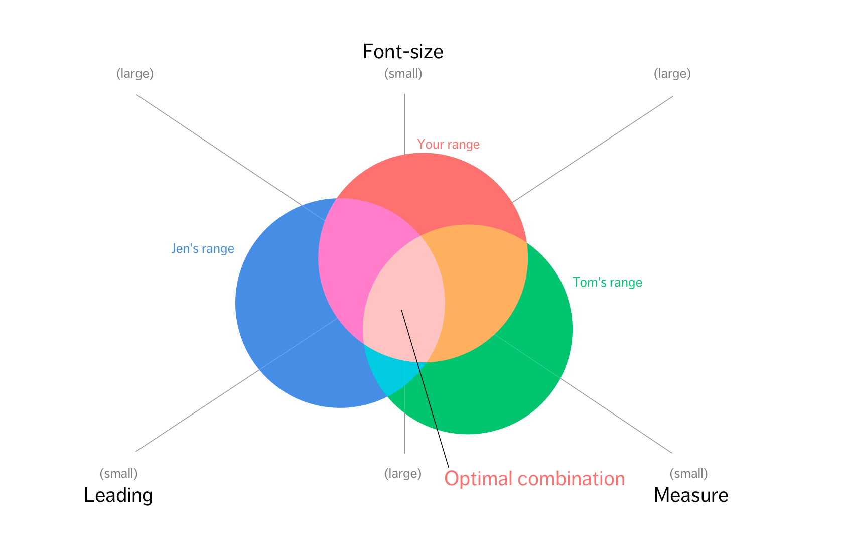
That’s when you know it’s good enough.
Wrapping Up
In this lesson, you discovered why typefaces weren’t the priority when learning about typography. What’s more important for you at this stage is to get the foundations to typesetting right.
Learn to choose the right font-size, the right leading and, the right measure and you’ll be able to do it for any typeface you choose in future.
Exercise
Select one typeface and create three paragraphs of text with it. Make sure you use real content (like stuff from Wikipedia instead of Lorem Ipsum).
- Try to find a good font-size, a good leading and a good measure for this typeface.
- Test it out with five other people. Get them to read and comment on your words. Ask if it’s easy to read. Notice their eyes and their facial expression when they read the text.
Next Up
Once you’ve gotten the basics of typesetting down, we can jump into more advanced stuff.
Next, we’ll look at how you choose the font-size of other elements on your website such that they grab enough attention while remaining harmonious with the rest of your body text.
Welcome! Unfortunately, you don’t have access to this lesson. To get access, please purchase the course or enroll in Magical Dev School.
Unlock this lesson