Why is typography important?
Think about the last time you went on a date. You took a shower, put on some nice clothes, applied perfume (or cologne). You did everything you in your power to appear your best, didn’t you?
Getting typography right is the same as dressing yourself up for the date. Typography is one of the key elements of design, and hence, one key to the dating equation. The only difference is that you’ll show your website to potential visitors instead of appearing in front of them in person (It’ll be freaky if you can pop your head out from their computers).
Your website represents who you are as a person. Design it well, and you may just gain enough trust for the other party continue and see what you have to say.
Do your typography wrong, and you’ll run the risk of them leaving for Facebook or Twitter before you even know it. That’s the cruel reality since people have limited attention spans, yet an abundance of distraction.
So, treat every visitor like your potential date. Design your sites well, do your typography well.
90 percent of design is typography. And the other 90 percent is whitespace.
— Jeffrey Zeldman, “The Year in Design”
What is typography
Typography is the style and appearance of text. It’s how we dress up words on a screen such that it becomes appealing to a reader. Every detail you use affects how the reader consumes text.
There are many ways we can dress up text. We can:
- Change the color
- Change the size
- Change the weight
- Change the typeface
- Change the style
- Change the whitespace between letters
- Change the whitespace between blocks of text
- etc.
As you can see, there’s an infinite number of ways you can change the appearance of text.
Okay, so far, we know typography is important. But we have yet to answer the big question — what’s good typography?
What is good typography?
We know that typography is the appearance of text. To find out what makes good typography, we first have to understand the purpose of text and typography.
The purpose of text is to communicate. Since typography is the appearance of text, its purpose is to help text achieve its purpose of communication. In other words, good typography helps people immerse themselves into what is written on the screen.
Two things must happen for readers to immerse themselves in the text.
- Text must convey appropriate emotions (if any)
- Text must be easy to read
Good typography supports text in these two aspects. Let’s go through them in detail.
1. Text must convey appropriate emotions
Will you ever release bad news to anyone while joking about it?
No! That’s horrible! I’ll come at you with my life if you plan on doing so. To be honest, I’ll punch the doctor (or nurse) straight in the face if they told me a family member doesn’t have much longer to live in a light-hearted, joking manner. I’ll do so even on April Fools.
When we interact face to face, we have the opportunity to observe subtle cues like body posture and the tonality of the voice to determine emotions within a message. That’s how we know whether people are happy, sad or frustrated within a split second.
But how can we tell if someone is happy, sad or frustrated via text? We don’t have the luxury of observing the cues I mentioned above. Instead, we come to rely on three channels:
- The written words.
- The accents used.
- The typeface used.
Let’s take a look at how words and accents work before moving onto typefaces.
Imagine you received this reply from a friend:
“What is happening?”
The message sounds neutral. They may be just curious or even concerned about what’s happening around you right now.
We just have to add a single word in and the message alters itself:
“What the fuck is happening?”
Notice what happened here. There’s a slight tinge of anger as “fuck” appeared. Then again, it might also be just the way you speak to this particular friend. Once again, the emotions aren’t exactly clear.
Watch what happens if we change the accents slightly:
“WHAT THE FUCK IS HAPPENING?”
Clearly, this person is angry.
The use of words and accents accentuates the intensity of emotions communicated through text. They fall under the realm of writing, so we’re not going to cover them in this course.
The third channel — typefaces — is something we as designers and developers are concerned about.
Typefaces determines the underlying mood of the conversation. They can bring out emotions that are impossible to communicate through just words and accents. They can make text appear whimsical, authoritative, friendly, or even make you feel as if you’re talking to a person from 75 years in the future.
A classic example of a typeface disaster is to use Comic Sans in a formal document. After all, you wouldn’t apply for an investment banking job dressed up as a clown, would you?
(Watch what if luxury brands like Louis Vuitton ever used Comic Sans)
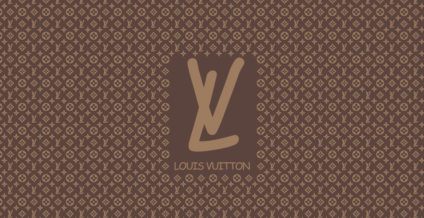
(Please don’t let anyone from LV find out. Keep quiet about this, would you?)
From these examples, you can already see that a typeface sets the underlying mood of the conversation. When used on the web, we declare typefaces with the font-family CSS property.
Typefaces are important. In fact, it’s one of the four essential properties to good typography.
That’s everything you need to know about communicating via words, accents and typefaces for now. Let’s move on to the second aspect.
2. Text Must Be Easy To Read
The second criteria for good Typography is that text must be easy to read.
- It means that people can read text easily, without getting distracted by anything.
- It means they don’t have to squint their eyes to make out what the tiny crawling ants on their devices are saying.
- It means they don’t have to hold the device further away from them because the text is too big.
- It means they don’t have to turn their heads when reading because the text is too long.
- It means they don’t accidentally drop to the second line of text while reading the first line because the text is so tight together.
Readability is all about finding the right balance and removing the disturbances so a person can enjoy the act of reading. It is affected by many factors. Some of which are:
- Size of text
- Leading of text (spaces between lines of text)
- Measure of text (width of text)
- Spaces between letters
- Spaces between words
- Style of font (normal or italic)
- Weight of font (normal, bold or other weights)
- etc.
You need to be aware of any property that may affect the readability of your text when designing. Luckily, we don’t have to bother with most properties because browsers have already set good defaults for them.
The only ones we need to care about are:
- Size of text (styled with
font-sizeproperty). - Leading of text (styled with
line-heightproperty). - Measure of text (styled with
widthproperty).
These are the three properties that make up the remaining of the four properties I spoke about at the start of this lesson.
That’s it for readability.
Wrapping Up
So in this lesson, we discovered what typography is, and why it is important. We also understood that good typography helps text communicate with its readers.
You need to be aware of the following two aspects to getting typography right. They are:
- Text must convey appropriate emotions
- Text must be readable
From these two aspects, we discovered the four properties that are important in web Typography. They are:
- The typeface:
font-family. - The size of text:
font-size. - The leading of text:
line-height. - The measure of text:
width.
Next Up
In the next lesson, we’ll dive into the foundation of setting good typography — choosing the right font-size, line-height, and width.
Welcome! Unfortunately, you don’t have access to this lesson. To get access, please purchase the course or enroll in Magical Dev School.
Unlock this lesson