You’ve already learned about the two most important typography practices, Modular Scale and Vertical Rhythm. The next natural step is to learn how to use them together.
Although it’s easy to use Modular Scale and Vertical rhythm together most of the time, you may run into situations where it’s impossible to get Vertical Rhythm right for elements at specific font sizes.
These situations are common. Many people get stuck and they have no idea how to move on.
In this lesson, I’ll show you how to resolve every problem you’ll encounter when using Modular Scale and Vertical Rhythm on the same design. Let’s begin by looking at possible scenarios where it’s hard to get Modular Scale and Vertical Rhythm to work together.
Possible conflicting scenarios
There are three possible scenarios where you’ll find difficult to use Modular Scale and Vertical Rhythm together:
- On multi-line text elements that are larger than the body text
- On multi-line text elements that are smaller than the body text
- On multi-line text elements with a background
Let’s discover and resolve the conflicts in each scenario.
Scenario 1: Multi-line text elements larger than body text
Once in a while, you’ll come across a font-size that doesn’t work with any multiple of the baseline. For example, the leading of the header element is either too large or too narrow in this image below:
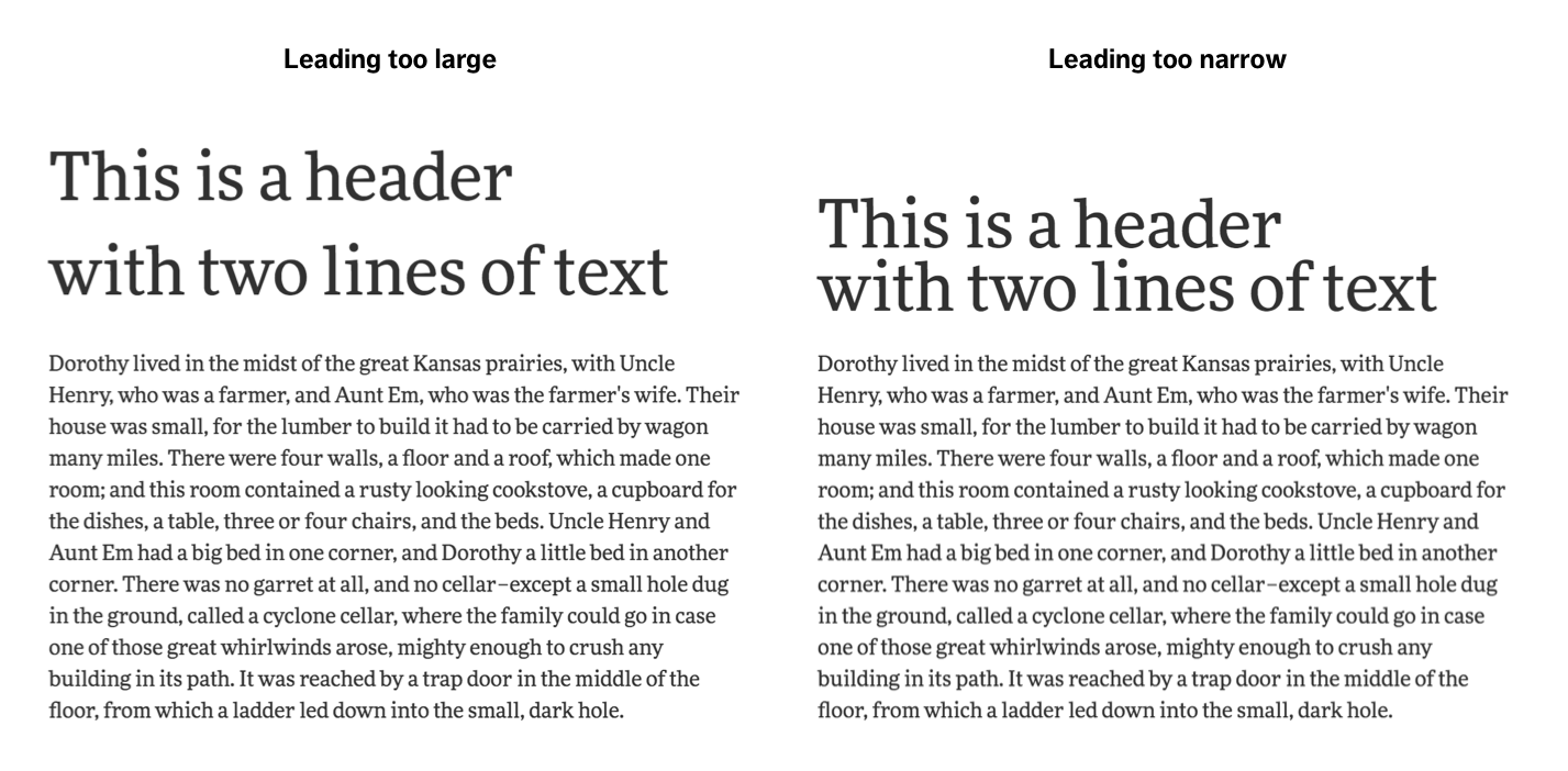
Here, the font-size of the header element is set to 50px. The baseline is 24px. The leading that’s too narrow is 48px while the leading that’s too large is 72px.
Most people believe they can only use integer multiples when using Vertical Rhythm. As such, they use multiples like 1, 2 and 3. However, as we can see, the leading of two baselines (48px) is too narrow for the header element above while the leading of three baselines (72px) is too large.
To solve this problem, all you have to do is to relax the definition of “multiple” and allow the use of multiples of 0.5. Watch what happens if we use a leading of 2.5 baselines:
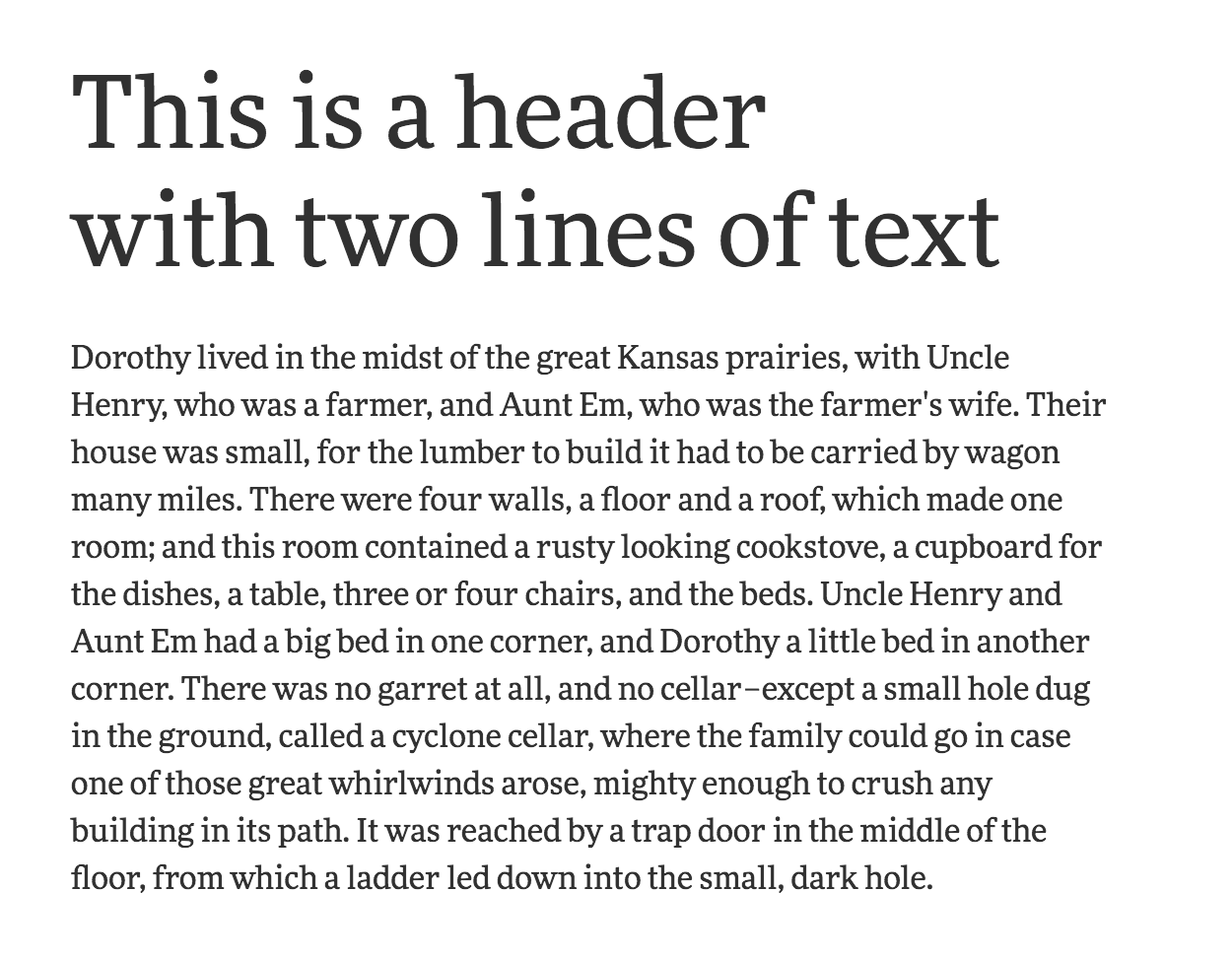
It’s so much better now.
In case you were wondering, we aren’t violating Vertical Rhythm by using half a multiple of the baseline. We’re just being flexible with the multiples because Vertical Rhythm is really about repetition. We’re still repeating consistent amount of spaces across the design even though we used half a multiple.
Let’s move on to the second scenario.
Scenario 2: Multi-line Text Elements smaller than Body Text
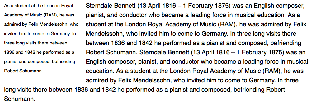
If your text element is smaller than your body text, you often need to reduce your leading such that it’s smaller than one baseline. It’ll be too large otherwise, like this:
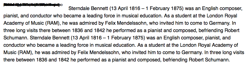
If you held on to the rigid rule where multiples can only be integers, you’ll have to use a leading of zero, which makes text stack on top of each other. This is a no go as well:
Hence, we need to use a leading between 0 and 1 baseline. One way is to set the leading to 0.5 baselines using our relaxed multiple rule.
Unfortunately, 0.5 baselines isn’t ideal for every situation. In our example, you can already see the leading is too narrow even though half a baseline is used:
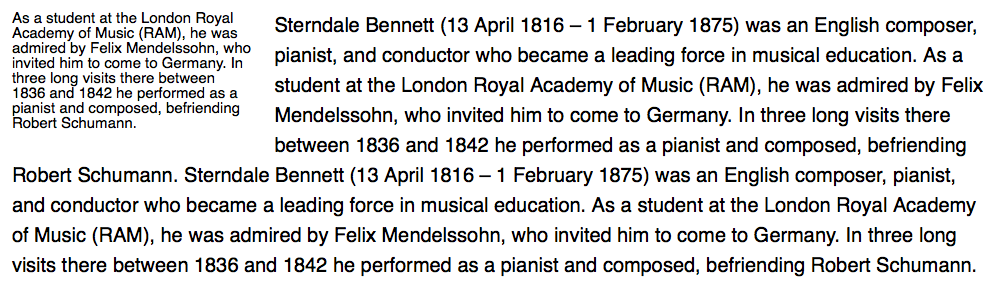
For these situations, typographers came to a consensus. You can use leading for the small text such that text sits on the baseline once every few lines. With this idea, the text (with proper leading set) reads just right:
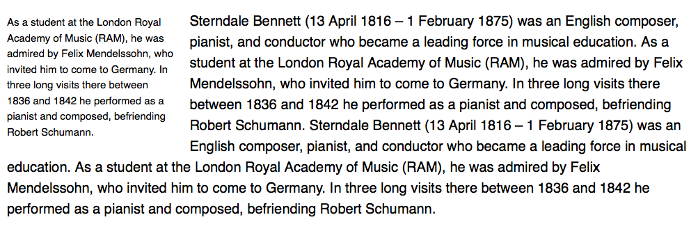
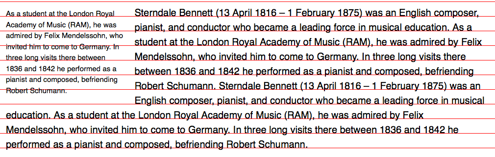
Let’s create a print baseline grid and you’ll see that every fifth line of text sits on the baseline for this piece:
Getting text to behave this way on the web is difficult. The math you need to do is more complicated than the one you’ve seen in the last lesson. It involves complicated equations that nobody wants to do while coding.
As a result, you don’t usually see designs that utilize multiple columns of smaller text on the web, because they’re hard to get right.
Let’s move on to the third scenario.
Scenario 3: Multi-line Text Elements with a Background
It’s common to for a design to contain elements that have a background. A good example of such an element is the button element.
These elements are easy to align to the baseline grid if you know there’s only one line of text. You just set the line-height as the actual height of the element and text will be centered automatically:
.button { line-height: 56px; /* 2 baselines*/}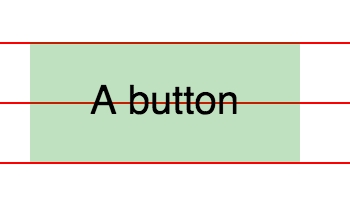
Things get complicated when there are multiple lines of text. We can’t set the baseline equal to the line-height, or we’ll have text with huge leading:
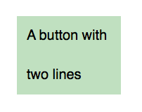
What we can do instead is to set the padding-top and padding-bottom to half a baseline, and the line-height to be a baseline.
/* Vertical Rhythm adds up to 2 baselines */.button { line-height: 28px; /* 1 baseline */ padding-top: 14px; /* 0.5 baseline*/ padding-bottom: 14px; /* 0.5 baseline */}You’ll get the same results as the above if there’s only one line of text. You’ll also get satisfactory results with two or more lines of text:
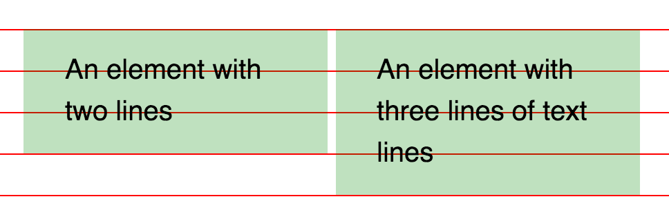
Multi-line elements with a background become a royal pain in the ass if you use a font-size where the leading can’t be one baseline.
Let’s say you use a size of 15px (20 ÷ 1.333) for your element. You can’t use one baseline (28px) as the line-height because it’s too large:
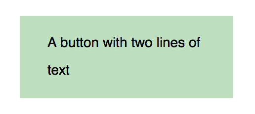
You can’t use half a baseline because the leading becomes too small:
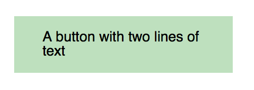
So, instead of trying to use half or a full baseline, how about using three-quarters of the baseline instead?
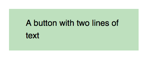
Again, this method works because we’re using the principle of repetition. (We’ll get to it, promise!).
However, if you look at the element carefully, you’ll notice that it doesn’t sit perfectly on a baseline grid:
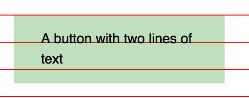
Chill. This doesn’t mean we’re violating Vertical Rhythm.
As mentioned in the previous chapter, the baseline grid is just a guide. Sometimes, you have to break the guide to produce a better result.
The important thing here is to remember that Vertical Rhythm is about the principle of repetition instead of following the baseline grid. (We’ll talk about repetition in the next lesson).
Let’s wrap up for now.
Wrapping Up
In this chapter, you learned how to combine Modular Scale and Vertical Rhythm in three scenarios where conflicts may arise.
As you can see, people encounter these conflicts because they adhere strictly to Vertical Rhythm rules without understanding what created Vertical Rhythm in the first place. As you know by now, it’s the Principle of Repetition.
Exercises
Go through the three scenarios with your chosen scale. Try combining it with Vertical Rhythm and see if you get the rhythm to look right.
The scenarios are:
- Multi-line text elements larger than the body text
- Multi-line text elements smaller than the body text
- Multi-line text elements with a background
Play with both line-height and padding properties for the third scenario and see if you can get the rhythm to look right as well.
Next Up
So far, I kept talking about the Principle of Repetition without actually explaining what it is. I’ll do so in the next module. We’ll dive into the design principles and learn how to apply them.
You’ll find out more about the Principle of Repetition, along with three others that’ll help you up your type (and design) game.
Welcome! Unfortunately, you don’t have access to this lesson. To get access, please purchase the course or enroll in Magical Dev School.
Unlock this lesson