You learned how to craft a responsive Modular Scale in the previous lesson, and you had to use the calculator on modulescale.com to work through the exercises.
Have you gotten tired at using manually calculating and changing em sizes in your CSS yet? If you did, this lesson is perfect for you. (If you don’t, maybe you should try it a few more times and feel the pain… 😈)
This lesson, we’re going to learn how to use a Sass library called Modular Scale to calculate font-sizes for you automatically. We’ll go through all four scenarios mentioned in the last lesson so you’ll learn to use the library for any situation.
Before we begin
From this point onwards, the course will require some Sass skills. Hopefully, you have already converted Sass into CSS in the previous lessons. If not, this is the time to dig into it and learn to do so.
Side note: I highly recommend you pick up Sass for Web Designers by Dan Cederholm if you’re clueless about Sass. It’s a worthy tool to learn if you want to be a great front-end developer (hint: most experienced frontend devs use it).
Alright, let’s start.
The Modular Scale library
The Modular Scale sass library helps you reduce the amount of work you do when using Modular Scale. You can calculate font-size values with a sass function, ms(), instead copy-pasting from modularscale.com:
h1 { font-size: ms(3); // Equivalent to 2.369em;}This function outputs the em values in CSS:
h1 { font-size: 2.369em;}Notice how this ms() function is similar to the em() function we made? That’s the beauty of Sass. We can simplify calculations with the help of some programming logic.
We’re not going to write the ms() function ourselves in this lesson because it’s way more complicated. The Modular Scale guys have already done it, so let’s piggyback on their work.
To do so, we first have to install Modular Scale.
Installing Modular Scale
There are three ways you can install Modular Scale:
- Use Bower:
bower install modular-scale --save - Use npm:
npm install modular-scale --save - Download Modular Scale from its github repo and add it to your project manually.
I highly recommend using the third option if you’re completely new to Sass and workflow related stuff. Otherwise, I recommend using either option one or two. (Option one and two makes it easier for you to manage dependencies used in your project. See Automate your workflow for more info if your interested. Otherwise, move on).
Once you’ve downloaded the library, @import it to your Sass file with the following code. It should be the first line in your Sass file. Make sure to replace path-to-modular-scale with the correct path:
@import 'path-to-modular-scale/stylesheets/modular-scale';With this, the installation is done. Let’s begin configuring the Modular Scale library.
Note: The lesson uses Version 2 of the Modular Scale library. I’m aware that Scott is working on a Version 3, and I’ll update when the new version comes out.
Configuring the Modular Scale library
Remember the left panel on modularscale.com?
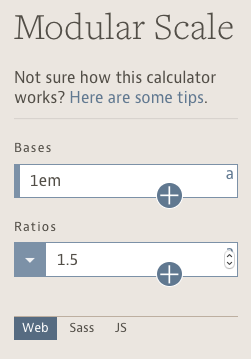
You had to configure your base and ratio in order for modularscale.com to generate your scale for you. Likewise, you need to configure these two numbers for the modular scale library.
By default, the base is set to 1em. Since we’re using relative units, 1em is the perfect place to begin. You don’t change this number unless you’re adding a second base.
The ratio, by default, is set to the golden ratio (1.618), which isn’t ideal. You’ll want to change this to the ratio of your choice. Here’s what you do if you wanted to set the ratio to 1.333 (make sure this comes after the @import statement:
// @import ...$ms-ratio: 1.333;We’re done configuring the Modular Scale library. Next, let’s learn about this mysterious ms() function I showed you earlier.
The ms function
Modular Scale gives you a ms() function (short for modular scale) to calculate font-sizes. It takes in one argument, a number — the nth-step of your font-size on the scale.
The font-sizes and steps for a Modular Scale with a ratio of 1.333 are:
- Step 3:
ms(3)=2.369em - Step 2:
ms(2)=1.777em - Step 1:
ms(1)=1.333em - Step 0:
ms(0)=1em - Step -1:
ms(-1)=0.667em
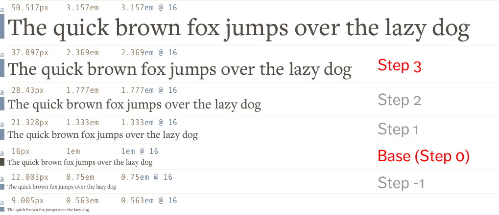
If you wanted your h1 to be 1.7777em, what you do is to locate the nth-step on the image above, and use the corresponding nth number in the ms() function.
h1 { font-size: ms(2);}If you wanted to increase it by one step to 2.369em, you simply change the nth-step from 2 to 3.
h1 { font-size: ms(2); @media (min-width: 600px) { font-size: ms(3); }}The resultant CSS is:
h1 {  font-size: 1.77689em;}
@media (min-width: 600px) {  h1 {    font-size: 2.36859em;  }}
If you somehow decide you want to set the ratio to 1.2, all you have to do is change $ms-ratio and your font-sizes are updated automatically:
$ms-ratio: 1.2;
h1 {  font-size: ms(2);  @media (min-width: 600px) {    font-size: ms(3);  }}
The CSS produced is:
h1 {  font-size: 1.44em;}
@media (min-width: 600px) {  h1 {    font-size: 1.728em;  }}
Isn’t that much easier to manage font-sizes? You never have to go back to modularscale.com ever again! 🤓🤓
Next up, let’s learn to configure the library for other scenarios we’ve covered in the previous lesson.
Adding a second base with the library
You can add a second base to the Modular Scale library by setting two numbers in the $ms-base setting:
$ms-base: 1em 1.5em;Once you made the change, the ms function will automatically adjust the steps such that it’s in ascending order according to modularscale.com.
Assuming you’ve adjusted the $ms-ratio to 1.333, the values from the ms function are:
- Step 3:
ms(3)=1.5em - Step 2:
ms(2)=1.333em - Step 1:
ms(1)=1.125em - Step 0:
ms(0)=1em
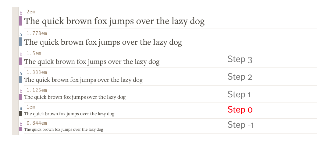
The library updates itself once you configure your new $ms-base. The ms() functions will output the new figures accordingly. It’s that simple. Nothing else to configure.
Let’s move on to adding a second ratio now.
Adding a second ratio with the library
Like with adding a base, all you do is to set two numbers in the $ms-ratio setting and the library will do the rest.
$ms-ratio: 1.333 1.618;Assuming your $ms-base is set to 1em, the values calculated by the ms function will be:
- Step 3:
ms(3)=1.777em - Step 2:
ms(2)=1.618em - Step 1:
ms(1)=1.333em - Step 0:
ms(0)=1em - Step -1:
ms(-1)=0.75em
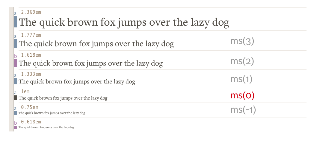
As before, the modular scale library automatically arranges the steps in ascending order so you don’t need to perform any complex math to use it.
Now, let’s move on to the final part of this lesson, where you’ll learn how to change Modular Scale ratios at different breakpoints (the fourth method).
Changing ratios at different breakpoints
Let’s first go through how to change ratios manually so you gain a proper understanding before we go into how you can do this automatically with the modular scale.
Here, let’s assume you’ve decided to use a 1.2-ratio Modular Scale for smaller screens and a 1.333-ratio for larger screens. The first step is to get some font-sizes from Modularscale.com.
Here’s a table that contains the font-size values of both scales with each step:
| Step | Ratio 1.2 | Ratio 1.333 |
|---|---|---|
| 3 | 1.728em | 2.369em |
| 2 | 1.44em | 1.777em |
| 1 | 1.2em | 1.333em |
| 0 | 1em | 1em |
| -1 | 0.833em | 0.667em |
If you decided to use the third step for your h1 values, your code should be:
// The Sass wayh1 {  font-size: 1.728em;
  @media (min-width: 600px) {    font-size: 2.369em;  }}
Notice the values are drawn from the 3rd step of both scales above.
Essentially, what we’re attempting to do (figuratively), is trying to change the $ms-ratio at different breakpoints, like this:
// Note: Doesn't work$ms-ratio: 1.2;@media (min-width: 600px) { $ms-ratio: 1.333;}We can’t do it this way because Sass cannot apply the new $ms-ratio value outside of it’s selector. to apply variables within media queries.
We need a better method.
Scott and the other awesome dudes behind the modular scale library has added a ms-respond mixin that lets you change the ratio with a single line of code. It looks like this:
h1 { @include ms-respond(font-size, 3);}Just one line? What is this trickery?!
That’s the power of Sass Mixins. Let’s find out what ms-respond does, and how to use it properly.
The ms-respond mixin
Before you can use the ms-respond mixin, you need to create a variable called $ms-range. This variable is a Sass list that contains two values in each argument:
$ms-range: 1.2 20em, 1.333 30em, 1.618 40em;In each argument (separated by rows in this above example), the first number is the ratio you want to use to create your Modular Scale. The second number is the min-width query where the ratio kicks in.
So, the $ms-range you see here will produce font-sizes that:
- uses a 1.2-ratio Modular Scale below
20em - uses a 1.2-ratio Modular Scale between
20emand30em - uses a 1.333-ratio Modular Scale between
30emand40em - uses a 1.618-ratio Modular Scale beyond
40em
Once you have the $ms-range variable, the next step is to use the ms-respond() mixin. It takes in two values:
.selector { @include ms-respond($property, $step);}$property is the property we’re creating with the mixin. It’s going to be font-size in most cases (unless you come up with fancy applications for this mixin).
$step is, well, the nth-step of the scale.
Here’s how to use the ms-respond mixin again:
h1 { @include ms-respond(font-size, 3);}It’ll produce the following CSS that uses calc and vw units. It’s super complicated:
h1 {  font-size: 1.728em;}
@media (min-width: 20em) and (max-width: 30em) {  h1 {    font-size: calc(1.728em + 0.64059 * ((100vw - 20em) / 10));  }}
@media (min-width: 30em) and (max-width: 40em) {  h1 {    font-size: calc(2.36859em + 1.86721 * ((100vw - 30em) / 10));  }}
@media (min-width: 40em) {  h1 {    font-size: 4.2358em;  }}
Didn’t I say it’s going to be complicated? :)
This method uses fluid typography. We talked briefly about it when we looked at how to use viewport units for typography. I won’t go into the details of the calculations now because it’s complex.
Here’s a GIF of the results from a technique like this. Notice how the body text size remains the same while the heading size changes when the browser is resized:

If you don’t like to use vw units you can opt to set $ms-fluid to false before using the ms-respond mixin. This will tell the library to output font-sizes in em instead:
$ms-fluid: false;
h1 {  @include ms-respond(font-size, 3);}
The CSS produced is:
h1 {  font-size: 1.728em; /* 1em * 1.2 * 1.2 * 1.2 */}
@media (min-width: 20em) and (max-width: 30em) {  h1 {    font-size: 1.728em; /* 1em * 1.2 * 1.2 * 1.2 */  }}
@media (min-width: 30em) and (max-width: 40em) {  h1 {    font-size: 2.36859em; /* 1em * 1.333 * 1.333 * 1.333 */  }}
@media (min-width: 40em) {  h1 {    font-size: 4.2358em; /* 1em * 1.618 * 1.618 * 1.618 */  }}
That’s how you use the Modular Scale library to change the ratio of your scale at different breakpoints.
Using Sass makes all of these so much simpler, isn’t it? I wonder if I would continue being a frontend developer if I had to write vanilla CSS… 🤔 ️
Wrapping Up
You learned how to use the Modular Scale library to automatically generate your font-sizes with the ms() function.
You also learned how to configure the library to add a second base, add a second ratio, and also how to use the ms-respond() mixin to change Modular Scale ratios at different breakpoints.
Exercise
You’ll want to begin automating the calculation of all your sizes so it’s easy to make them work in a real project.
For each method you tried in the previous exercise, try it again by using either the ms() function or the ms-respond mixin. Play with it until you’re familiar enough that you don’t have to check modularscale.com again.
Next up
In the next lesson, we’ll go through the final responsive best practice — Responsive Vertical Rhythm. Get ready your gears!
Welcome! Unfortunately, you don’t have access to this lesson. To get access, please purchase the course or enroll in Magical Dev School.
Unlock this lesson