We’ve come to the final lesson on responsive typography practices. In this lesson, we’ll dive into the final responsive practice — responsive Vertical Rhythm.
You’ll learn:
- How the relationship between font-size, leading and measure gets changes in responsive design
- Whether there is really a need for responsive Vertical Rhythm
- How to implement responsive Vertical Rhythm (if there’s a need)
You learned way back in Module 1 that Vertical Rhythm is came from the body text’s leading. To find out if we have to change Vertical Rhythm in a responsive design, we first have to find out how the relationship between font-size, leading and measure gets affected on difference devices. Let’s start there.
The relationship between font-size, leading and measure
There is a fundamental triadic relationship in typesetting — that of a text’s font size, line height, and line length. Adjusting any one of these elements without also adjusting the others is a recipe for uncomfortable reading, which is one reason designers have such a difficult time with fluid web layout.
— Tim Brown, “Molten Leading”
Tim got it spot on. You already know the key to good typography is to carefully craft a good balance between font-size, leading and measure.
Unfortunately, the balance you carefully created gets mutilated in difference devices. Let’s understand why this happens.
First of all, we know that we need to use smaller font-sizes for smaller devices and vice versa for larger devices. We’ve done so with the following code:
html {  font-size: 100% @media (min-width: 600px) {    font-size: 112.5%;  }
  @media (min-width: 1000px) {    font-size: 125%;  }}
Here, we only changed one of the three properties, font-size, which means we have upset the relationship between the three properties.
When font-size increases, we usually have to increase the leading to restore balance to the text. Otherwise, it’ll become hard to read. Watch what happens if font-sizes increases, but leading stays the same:

Luckily, we don’t have to worry too much about changing font-sizes on the web. Since leading is represented by the line-height property, it will increase or decrease proportionally with the font-size as long as you use a relative unit (or a unitless line-height).
html { line-height: 1.4;}
The tricky part about responsive design is that the measure also changes at various device widths. The change in measure is more difficult to handle compared to font-size.
Why?
First, consider the change in measure when the viewport is resized from 400px to 800px (mobile viewport to a tablet viewport).
Most of the time, your measure is going to be near the 45 character mark on a mobile device because there isn’t enough screen space to go around. When the browser increases in size, the measure increases along with it, until it hits the ideal measure you’ve determined, and the balance between the three properties get broken.
Look at the GIF again. Notice how the measure first increases, then stays constant after a while.
The problem with measures is that they not only change from a mobile viewport to a tablet viewport. They may also change in different viewports depending on how you created your layouts. For example, a grid with the following layout will require constant changes in the measure:

(Of course, I’m totally recommending against doing something like this. But this is a good example, because it happens).
One approach Tim Brown suggests is to increase the leading whenever measure increases. He coins this approach “Molten Leading”.
To use molten leading, you have to determine the minimum and maximum leading at extreme measures.
Let’s say you decided the following values:
- Leading of 1.4 at measure of 45 characters
- Leading of 1.45 at measure of 65 characters
Then, you resize the leading proportionally to the measure. If the measure is now 55 characters, the leading should be 1.425.
The only method to consistently use Molten Leading in the two above scenarios is to use JavaScript. Viljami Salminen has a created a Molten Leading library that you can use if you’re interested in using Molten Leading.
In practice, it looks like this:
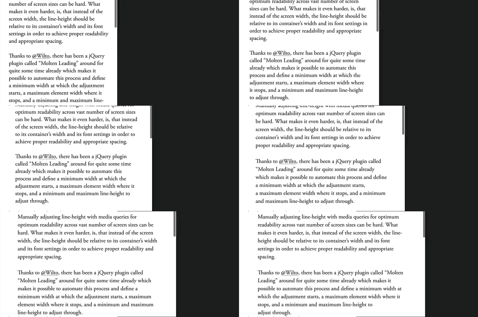
The changes are subtle. If you can’t see it in this gif above, I suggest you head over to this website, resize your browser slowly and see what happens to the line-height when measure changes.
Should You Use Molten Leading?
You need to use Molten Leading since the world’s leading expert on Typography suggested it. Right?
Nope. There are two reasons why I disagree:
First, Molten Leading breaks Vertical Rhythm of the page.
Vertical Rhythm is derived from the body text’s leading. If you change the leading, your Vertical Rhythm needs to change.
Unfortunately, the only way to perform Molten Leading consistently is through a JavaScript solution. There’s no easy CSS-only way to automatically update your margins, paddings, height, and width of other elements to remain proportional to your ever-changing leading. Your margins, paddings, height and width will all have to be written with JavaScript (or modified by it).
Which sucks. To be honest.
Second, text is still readable without Molten Leading.
To illustrate this, let’s say you decided on the following values:
- Minimum leading: 1.4 at measure of 45 characters
- Maximum leading: 1.45 at measure of 65 characters
If we wanted to test whether text is readable when Molten leading is not applied, we can compare how the text looks with leading set to 1.4 vs 1.5 at a measure of 65 characters.
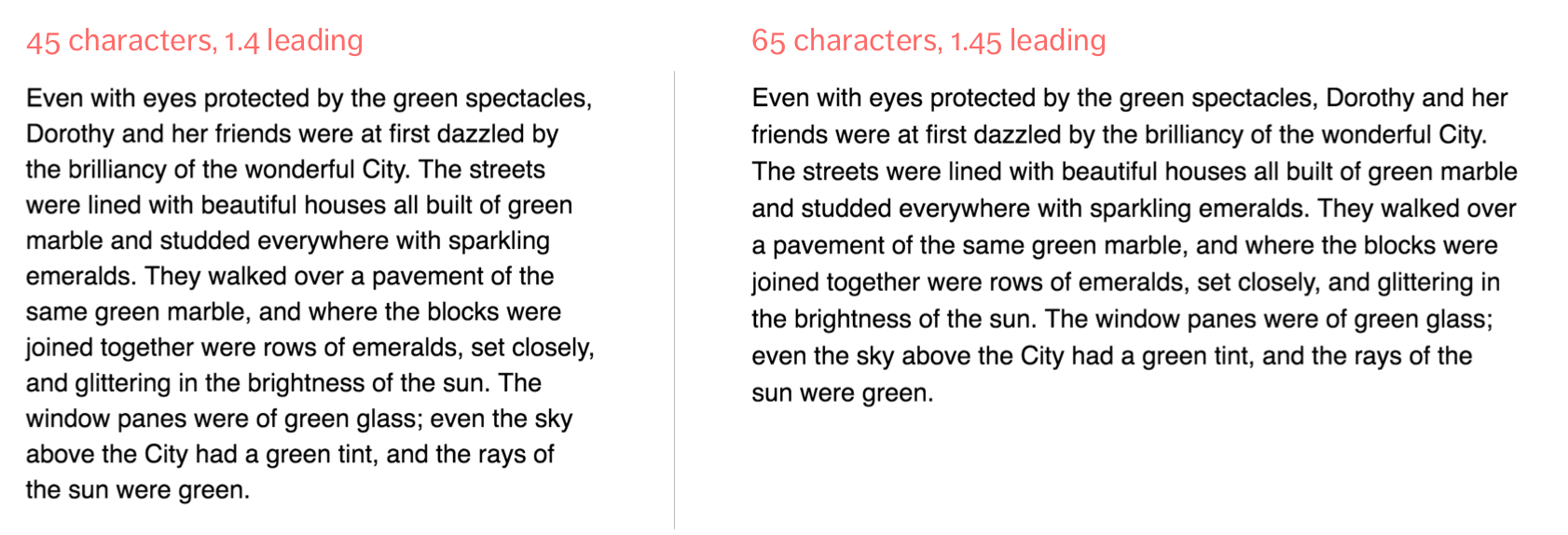
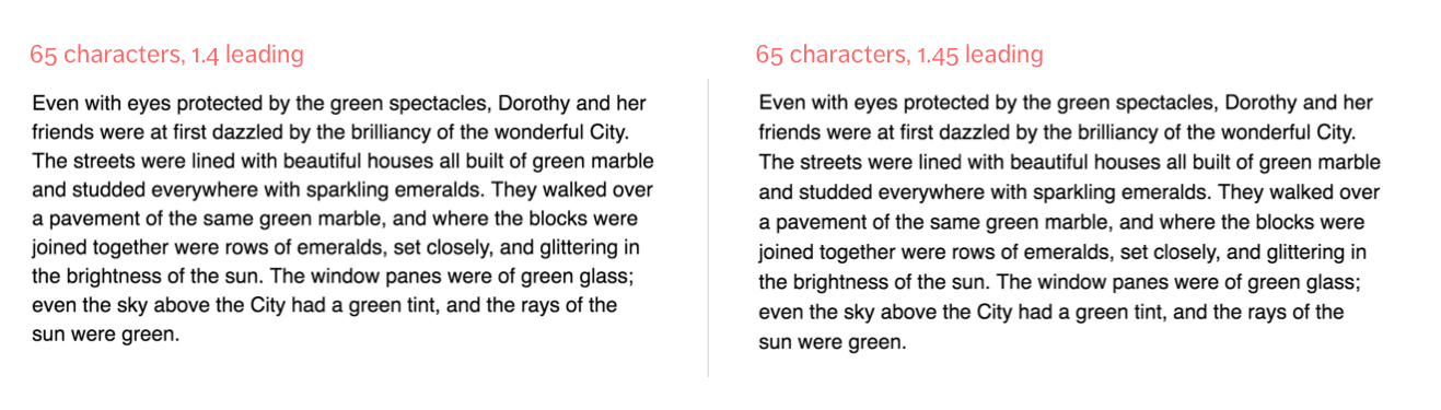
Is text readable on both situations? Definitely. Even though the leading isn’t changed, text still remains remain readable when the leading is set to 1.4.
Has the readability reduced because we didn’t set leading to 1.45? Possibility. This depends on the context of the entire design, which isn’t set in stone.
The bottom line is to remember that there’s no perfect font-size, no perfect leading and no perfect measure. The purpose of typography is to make sure text is readable.
However, if you feel that the increase in leading increases readability significantly, you’ll still want to change the leading. We’ll learn how to do that next.
Changing the leading
It’s tricky to change the leading of your body text because the Vertical Rhythm of your site depends on it. You have to change the Vertical Rhythm as well.
This means you’ll have to change the line-height of the body text, plus all properties of elements that uses Vertical Rhythm, which means a shit load of media queries…
html {  line-height: 1.4;  @media (min-width: 62.5em) {    line-height: 1.45;  }}
.selector1 {  margin: 1.4em;  padding: 1.4em;  // ...  @media (min-width: 62.5em) {    padding: 1.45em;    // ...  }}
Not a fun experience to write multiple media queries just to change the leading, I would imagine.
There’s one way we can simplify the whole process. That is to use CSS custom variables.
CSS custom variables behave very much like Sass variables. The difference between them is that CSS custom variables gets evaluated at runtime (on a user’s computer) while Sass variables are evaluated during compilation. This difference is huge, because we can change our Vertical Rhythm easily with custom variables.
To use CSS Custom Variables, you first have to define your variable within the :root selector. The custom variable you intend to create is prefixed with two dashes(--). Here’s an example where we create a custom variable called --baseline:
:root { --baseline: 1.4;}Once your variable is defined, you can use them in your code with var(--variable-name). In our case, we can use the --baseline variable with the following code:
html { line-height: var(--baseline);}The resultant CSS will behave as if --baseline is 1.4.
html { line-height: 1.4;}The magic behind custom variables is that you can redefine them whenever you need. This means we can write a media query that changes the --baseline variable from 1.4 to 1.45, and the CSS is updated automatically:
:root { --baseline: 1.4; @media (min-width: 62.5em) { --baseline: 1.45; }}The resultant CSS would behave as if this has happened:
html {  line-height: 1.4;}
@media (min-width: 62.5em) {  html {    line-height: 1.45;  }}
As you can see, we’ve only been able to use unitless numbers so far. The next step is to multiply the unitless numbers with 1em or 1rem to obtain units in em or rem.
To do so, we need to use calc():
p { margin: calc(var(--baseline) * 1em);}Now, CSS will calculate margin for p as if we’ve written the following code all along:
p {  margin: 1.4em;}
@media (min-width: 62.5em) {  p {    margin: 1.45em;  }}
That’s neat! :)
By the way, here’s an exaggerated example just to show you how CSS variables work like magic:

CSS variables are awesome!
BUT BUT BUUUUUUUT… As with all awesome (+ new) technologies, it’s inevitable that some browsers haven’t caught up yet. This time, it’s Internet Explorer. It’s not even support in edge. 😢
So, if you decide to change your leading, I suggest you progressively enhance by writing both the pure em value, and the value with CSS variables included, like this:
:root {  --baseline: 1.4;  @media (min-width: 62.5em) {    --baseline: 1.45;  }}
html {  line-height: 1.4;  line-height: var(--baseline);}
p {  margin: 1.4em;  margin: calc(var(--baseline) * 1em);}
It’ll still work, but Vertical Rhythm wouldn’t get updated in Internet Explorer and Opera mini (See caniuse for support)
So, should you change Vertical Rhythm for responsive websites?
If all browsers support CSS custom variables, the answer will be a definite yes. However, since that’s not the case yet, I’d recommend not changing the Vertical Rhythm unless it’s really necessary.
With that, let’s wrap this lesson up.
Wrapping Up
The delicate relationship between font-size, leading and measure gets mercilessly mutilated when browsers are resized from a mobile view to a desktop view. Once the font-size or measure changes, the leading ought to change to maintain readability of text.
However, changing the leading of the body text is tricky business because the Vertical Rhythm of the entire site is affected. You can’t just use molten leading and get away with it.
Instead, you learned a method to change both the leading and Vertical Rhythm easily with CSS custom variables. This method, however, isn’t usable on Internet Explorer and Opera mini browsers.
Exercise
Learn to use CSS custom variables in your code. It’ll prove to be very useful the moment Internet Explorer decides to support it.
Try getting em values to work when you change the font-size as well. (Hint: use the em() function within the calc() function. You have to evaluate Sass calculations within calc() with #{/* Sass calculations here */}).
Next
We’ve covered all the principles and practices you need to know about responsive typography. In the next lesson, we’ll wrap up everything we’ve learned in this course.
Welcome! Unfortunately, you don’t have access to this lesson. To get access, please purchase the course or enroll in Magical Dev School.
Unlock this lesson