Have you found the text of your header elements either too big on mobile, or too small on desktop? You’re not alone if you did. It’s a common problem many face when using Modular Scale for responsive websites.
In this lesson, you’ll learn why this problem occurs, (why it hasn’t), and how to craft a responsive modular scale so you always have a solution if your headers are too small or too big.
Let’s begin by looking at what caused the problem in the first place.
What caused the problem
The problem happens when people use the golden ratio for their Modular Scale. Although we spoke about why the golden ratio is bullshit back in the first module, it’s still common to see beginning designers use the golden ratio for their Modular Scale using the golden ratio for modular scale.
Unfortunately, the golden ratio isn’t suitable for creating a Modular Scale. It’s large ratio (1.618) creates large changes in font-size between each step of the scale.
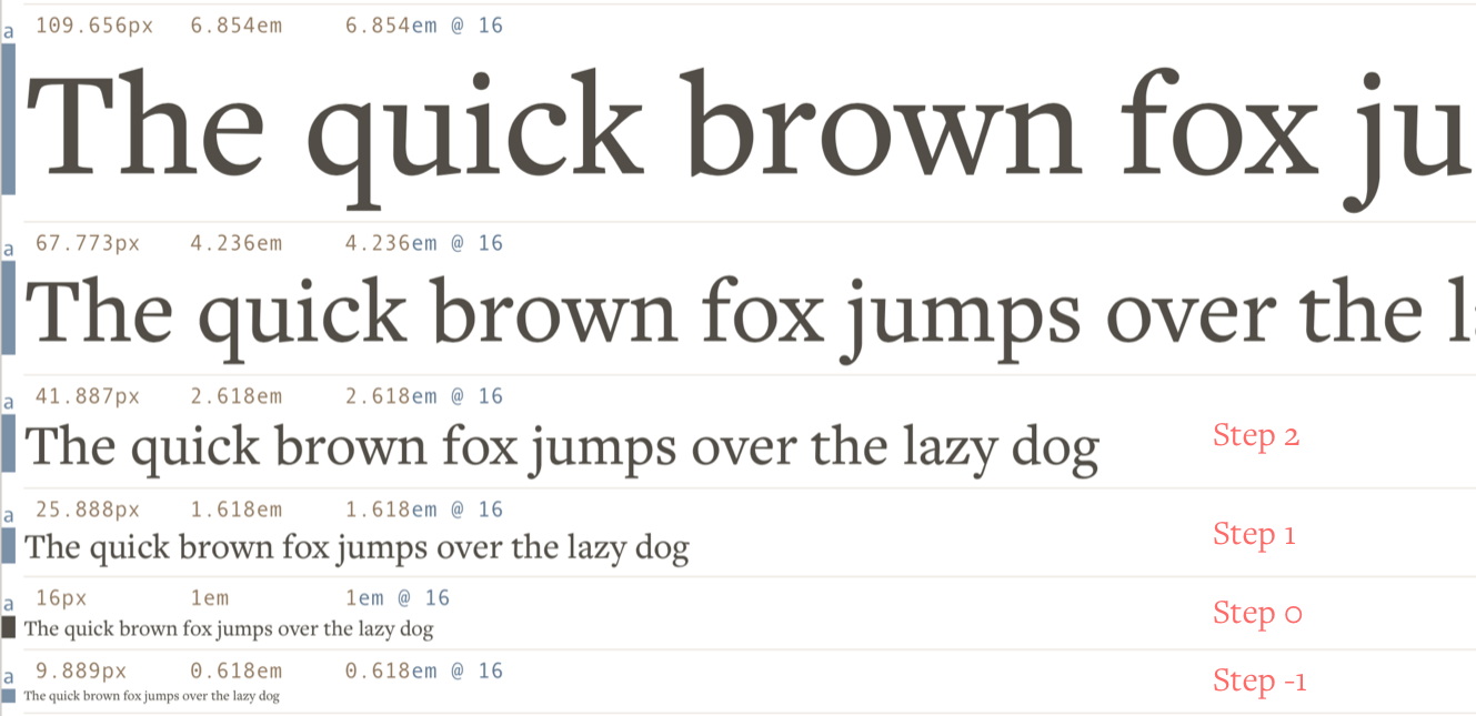
If you used 16px as your base for the golden ratio, it’s likely that you used the following sizes for you h1-h3 elements:
h1: 67.773pxh2: 41.887pxh3: 25.888px
Both 67px and 42px are HUGE on the mobile. It’s as if we’re looking at giants through our puny screens when we’re on the mobile.
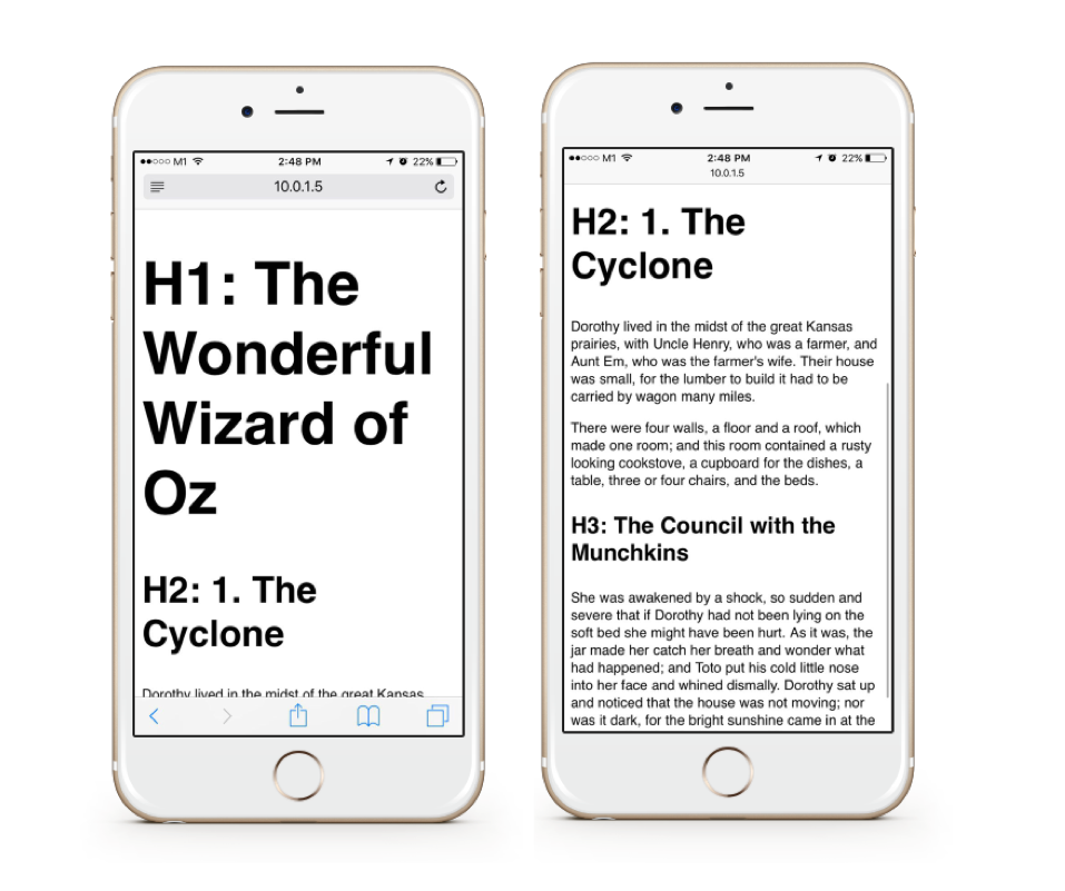
You know the sizes are too big, but you can’t decrease them because there aren’t any sizes between 25px and 42px on your Modular Scale…
Crap. 😔
The golden ratio isn’t inherently at fault here. The problem happens simply because we used a large ratio to produce our scale, which resulted in us having a limited number of font-sizes to play with.
Since we know the problem, let’s now dive into possible solutions.
The solutions
Since the problem arises because we don’t have enough font-sizes to play with, the solution, then, is to make more numbers!
You can do so in four possible ways:
- Use a smaller ratio
- Add a second base
- Add a second ratio
- Change the ratio at different breakpoints
Solution 1: use a smaller ratio
The easiest way to fix the problem is to use a smaller ratio for your Modular Scale.
This method works because a smaller ratio produces a scale with smaller differences between font-sizes at each step. It gives us more sizes that are acceptable on a mobile device.
Just take a look at the difference in sizes between these two scales and you’ll see what I mean:
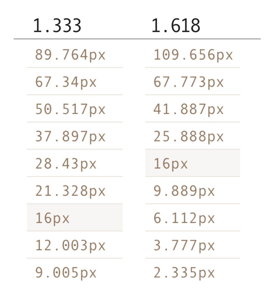
The 1.333-ratio Modular Scale contains more font-sizes you can work with on mobile. If you decided to use this scale instead, you would have been able to set h1 to 38px and h2 to 28px, both of which are smaller than 42px from the golden ratio scale.
Of course, when the viewport allows, you can increase the heading sizes by any number of steps with a media query:
h1 { font-size: 37px; // increases size by 2 steps @media (min-width: 1000px) { font-size: 67px; }}Remember, we always want to code in relative units, so the above code becomes:
h1 { font-size: 2.3125em; // increases size by 2 steps @media (min-width: 1000px) { font-size: 4.1875em; }}The great thing about a smaller ratio is that it gives you more flexibility without adding complexity to your code. It’s easy to use this method even if you don’t use a preprocessor like Sass. It just gets way easier if you do.
The downside though, is that you don’t get as much flexibility as you will with other methods. You also lose the chance to work with the golden ratio. (Some will say booooo. 😭)
Don’t be upset about discarding the almighty ratio. It’s not as beautiful as you think it is. You can still create a great design without using the golden ratio for your modular scale. For example, I used a ratio of 1.2 for the my blog.
(Look below for more answers if you still want to use the golden ratio for your scale).
Next, let’s look at the second method.
Solution 2: add a second base
The second way to fix the problem is to add a second number as the base-font-size of your modular scale. It can be any number (just don’t try to be funny and use 1px…).
Let’s say you somehow decided that 36px would make a great heading size on the mobile. All you do is to add 36px as the second base number to the scale:
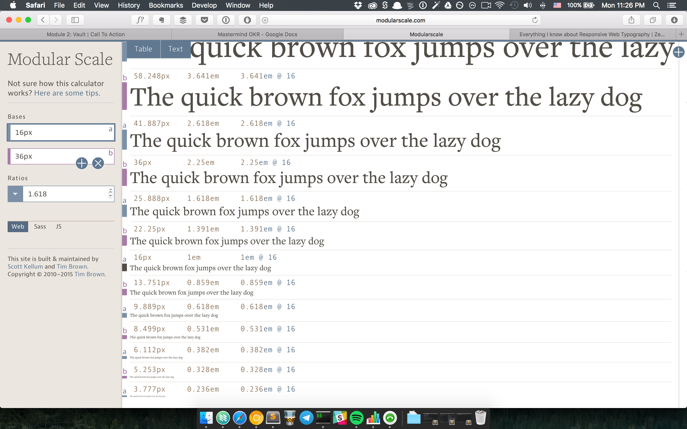
With this small change, you can already see that your header sizes could be 22.25px, 25.888px and 36px. That’s three more sizes to play with below 42px. The best part about using a second base is that you still get to use the golden ratio (great for golden ratio aficionados).
The downside is that we’ve threw an arbitrary number into the design, which can lead to a less harmonious flow if we’re not careful.
If you choose to use this method, you should make sure you understand why you chose that magic number as your second base. You also want to ensure that you only add a maximum of one base to avoid diluting the Modular Scale.
Let’s move on to the next method.
Solution 3: add a second ratio
The third method is to add a second ratio to your modular scale. This can also be any ratio you want. Let’s say you decided to use a ratio of 1.25 in addition to the golden ratio.
Your Modular Scale will become:
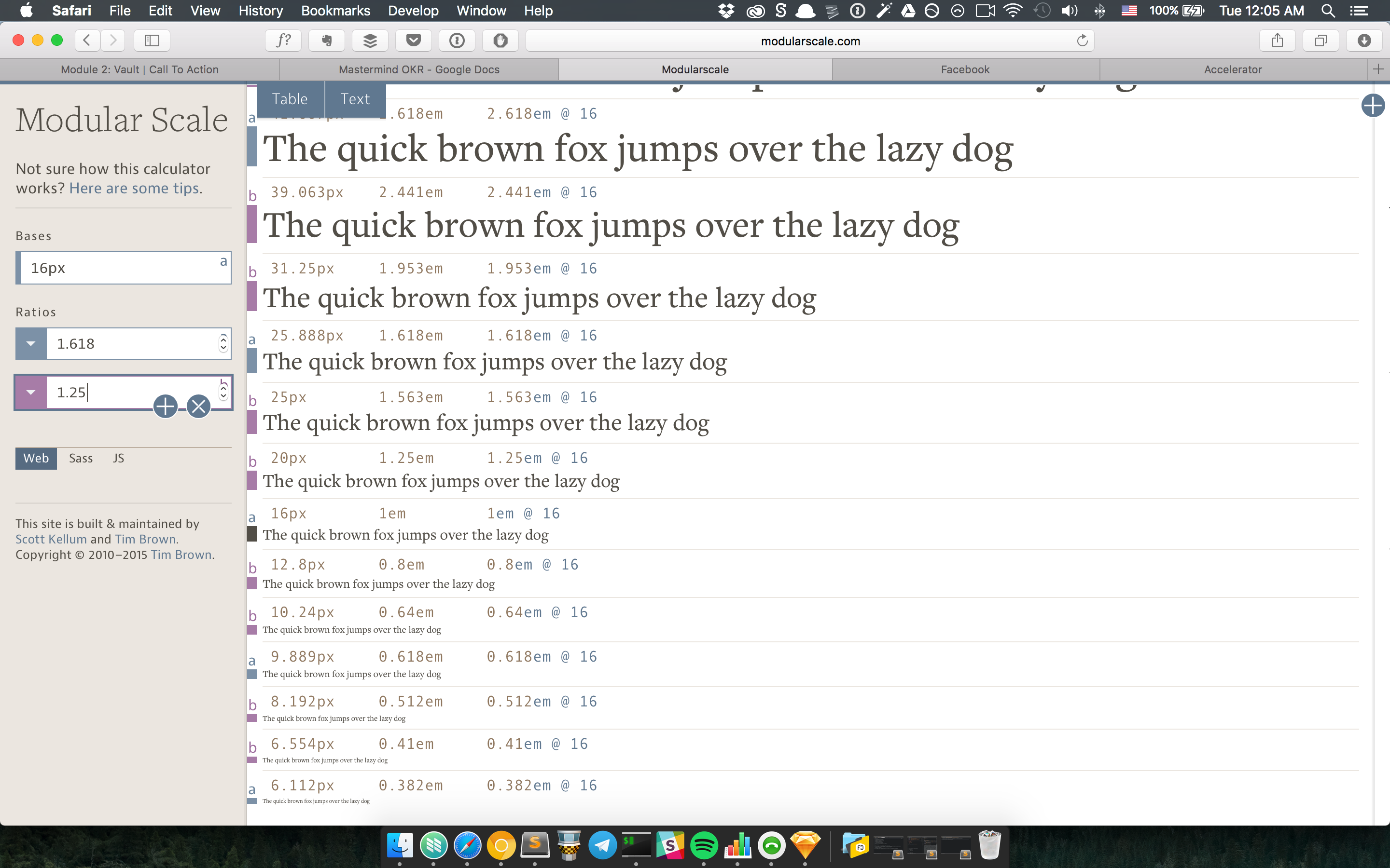
Adding a ratio allows you to have even more flexibility compared to adding a base. In this new scale, you have four helpful sizes you can use to create your headers — 20px, 25px, 31px and 39px.
Although using a second ratio gives you much more flexibility, I refrain from using it because of two reasons.
First, a second ratio disrupts the repetition between steps of the scale more than using a second base, which results in a greater loss in harmonious relationship.
Second, you may get numbers that do not fit well into the scale (like 25px and 25.888px). You have to be careful not to choose sizes that are so similar that they conflict with each other (principle of contrast).
Finally, let’s move on to the last method.
Solution 4: change the ratio at different breakpoints
The fourth method is to vary the Modular Scale ratio at different breakpoints. In this method, we use a smaller ratio on a smaller device. As the viewport increases, we increase the ratio to match the new viewport.
Here’s how it’ll look in practice. Pay attention to how headers change in size while that of the body text remains the same:
Why would you change the size of the header while keeping the body text the same? It might not make sense right away, so let’s run through why this method works.
First, we know the purpose of a header is to grab a reader’s attention to make them read on. There’s very little screen real-estate on the mobile, so a little emphasis already allows the header to do its job.
Remember earlier, we said that you can change the header sizes with media queries in the first method?
h1 { font-size: 2.3125em; // increases size by 2 steps @media (min-width: 1000px) { font-size: 4.1875em; }}We’re essentially doing the same thing here. We’re setting a smaller font-size for the header at a smaller viewport, while increasing the font-size of the header at a larger viewport.
Implementing this method, however, is more difficult compared to the previous three methods. I’ll explain how you can do this in the next lesson.
Wrapping up
In this article, you learned why you sometimes find the text of your header elements either too big on mobile, or too small on desktop. The culprit is a use of a large ratio for constructing the Modular Scale, which produces a small number of usable sizes.
There are four solutions to this problem. They are:
- Use a smaller ratio
- Add a second base
- Add a second ratio
- Change the ratio at different breakpoints
You can choose any method mentioned here to overcome your problem. They all work.
Exercise
Try to use the first three methods on your design. Identify the one you’re most comfortable with, and find out why.
Next up
By the end of this exercise, I imagine you’re sick of calculating em sizes with modularscale.com and changing them in your CSS manually.
In the next lesson, I’ll show you how to automate all modular scale calculations and implement the fourth method at the same time.
Welcome! Unfortunately, you don’t have access to this lesson. To get access, please purchase the course or enroll in Magical Dev School.
Unlock this lesson