In the last lesson, you learned that there are four types of relative units:
- em (
em) - rem(
rem) - percentages (
%), - viewport units (
vh,vw,vmin,vmax)
We’ve already covered the em unit in detail. In this lesson, you’ll learn about the other three relative units and when to use them.
Let’s start with percentages, followed by rem, and finally viewport units.
Percentages
Percentages are similar to em. The relationship between percentages and em is simple: 100% = 1em. You’ll rarely find font-sizes declared in percentages on websites because ems are shorter and more convenient to write. The only exception is in the hrml selector:
html { font-size: 100%; /* This is equivalent to 1em */}This brings about two questions:
- Why should you use relative units for the
font-sizeproperty in thehtmlselector? - Why are percentages used for the
htmlselector?
You should use relative units for the html font-size property for accessibility reasons. Let me explain.
A person with poor eyesight might find the font-sizes on your website too small. If they do, they might respond by zooming in, or increasing the font-size.
Conversely, the might zoom out if they feel that the font-size used is too large. (This rarely happens because most websites have sizes that are too small).
If they are savvy with their browsers, the might also change the browser’s font-size setting so there’s no longer a need to zoom in or out for every website they visit.
Furthermore, although common browsers (Safari, Chrome, Firefox and IE) set their default-font-size to 16px, other devices don’t.
Here’s a list of different devices and their sizes courtesy from Nicholas Hoizey:
| Device / browser | Default font size |
|---|---|
| Opera Mini 4.5 | 13px |
| Palm webOS 2.0 | 14px |
| webOS TouchPad | 14px |
| Opera Mini 7 | 17px |
| AOL 9 | 20px |
| Cybook Odyssey (e-book reader) | 21px |
| Blackberry 6.0 | 22px |
| NetFront NX | 23px |
| Kindle 3 | 26px |
The list of devices you see above are fairly old because Nicholas did his research back in 2013. It’s, however, enough to prove that device manufacturers are bound to set devices to different default sizes. It happened previously; it’ll happen in future as well.
Browsers and device manufacturers set default font-sizes because they try to find the best font-size for reading on their browser / device. If you override the default font-size with pixels, you effectively broke the reading experience for an unknown number of devices.
Hence, when we set font-size in relative units, we not only respect the user’s font-size preference, but also respect device manufacturer and their work in finding the perfect reading size for their device.
Now, let’s move on and cover the second question: Why do we use percentages.
We’ve used percentages historically because old browsers like IE 8 had problems scaling the em unit. If you’re interested in this research, Richard Rutter has a great piece that you should read.
Although you can use the em unit for most browsers nowadays, I still prefer to use percentages when setting font-sizes in the HTML selector for legacy reasons. For the purpose of your calculations, it’s safe to assume that 16px means 100%.
In the case where the user (or device manufacturer) set their browser’s font-size to 20px, 100% will be equal to 20px.
html { /* This means 16px by default for most browsers*/ font-size: 100%;}If you decide to change your body font-size at different breakpoints, just increase the font-size accordingly as the device width increases.
html {  font-size: 100%; /* This means 16px */
  @media (min-width: 800px) {    font-size: 112.5%; /* This means 18px */  }
  @media (min-width: 1200px) {    font-size: 125%; /* This means 20px */  }}
And that’s everything you need to know about percentages.
Let’s talk about rem next.
Rem
Rem means Root EM. It behaves like EM, but it’s much simpler to understand.
Remember we mentioned that 1em can take on different values in different parts of the code? Rem doesn’t. It’s always equal to the root font-size. This means 1rem is always equal to the font-size declared in the HTML selector.
Take a look at the following code and see the difference between em and rem. Notice how the value of 1em changes depending on the element’s font-size; Also, notice that the value of 1rem remains constant no matter where it’s used:
html {  font-size: 16px;}
h1 {  font-size: 32px;  /* 1em  = 32px */  /* 1rem = 16px */}
p {  font-size: 16px;  /* 1em  = 16px */  /* 1rem = 16px */}
It’s dependable. It’s simple to understand.
So, Rems or EMs?
Some developers avoid rem entirely, claiming that using rem make their components less modular. Others use rem for everything, preferring the simplicity that rem provides.
I argue that rem and em have their strengths and weaknesses. They should be used differently, depending on the circumstances.
How? I have two simple rules:
- Size in
emif the property scales according to it’s font-size - Size everything else in
rem.
Still unclear? For now, just remember that it’s important to use relative units for web typography. It doesn’t matter if you’re using em or rem. We’ll dive deeper into the debate between em and rem in the bonus parts of this course.
Next, let’s move on to Viewport units.
Viewport units
There are four types of viewport units available in CSS today. They are:
vw– Percentage of viewport widthvh– Percentage of viewport heightvmin–vworvh, whichever smallervmax–vworvh, whichever bigger
Viewport refers to the browser screen. 1vw means one percent of the browser’s width. 100vw means the full browser width.
Likewise, 1vh means one percent of the browser’s height. 100vh means the full browser height.
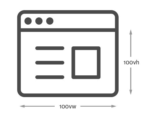
Viewport units automatically recalculate themselves whenever the viewport changes. It happens on load, resize or even orientation change. With viewport units, it becomes extremely easy to create a component that’s always a quarter of the viewport:
.component { width: 50vw; height: 50vh;}
Viewport units can be used for typography in two cases. Depending on how they’re used, we call them either:
- Fluid typography or
- Art-directed typography
Fluid typography
Fluid typography is a technique where viewport units are used to determine the font-size of the body text, and consequently, the font-size of your headers and all other elements.
It looks like this:
html { font-size: calc(1em + 0.25vw);}There’s a common misconception that you no longer need media queries (and so your code will be simpler) when you use viewport units. In reality, you still need media queries to control the minimum and maximum font-size of your site, which means the CSS code looks something like this instead:
html {  font-size: 1em;
  // Scales by 1px for every 100px from 600px onwards  @media (min-width: 600px) {    font-size: calc(1.125em + 4 * (100vw - 600px) / 400);  }
  // Sets font-size to 22px after a viewport of 1000px  @media (min-width: 1000px) {    font-size: 1.375em;  }}
Wow, this does look scary. Here are some helpful articles on fluid typography if you’re interested to find out more:
- The original article about fluid typography by Mike Riethmuller
- My tutorial on fluid typography
I’ll say it’s not important to dive into fluid typography at this stage. What’s more important is to use a relative unit. I’ll recommend you stick to em and rem for now because they’re much easier to understand.
Art-directed typography
The second way Viewport units are used in typography is for art-directed typography. This means you’re creating artworks with typography on the web as opposed to putting them in text.
Marko Dugonjić’s creation of Benton Modern is a prime example where viewport units are used to create an artwork. (Note: This is used real website. Not just a magazine. Click on the link above to see for yourself).
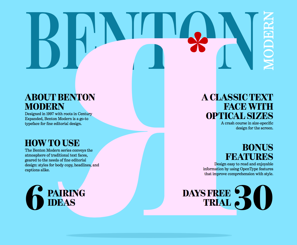
Another example is my personal creation of Devfest.Asia website for 2016. Notice how both the logo and size of all text elements changes as the browser is resized. Also, notice how the page changes on a portrait vs a landscape orientation.


Art directed typography is an advanced technique and is only used in specific areas. So, we won’t cover it for the rest of the course. However, if you’re interested, let me know.
Wrapping up
You learned the other three types of relative units in this title: percentages, rem and viewport units. You also learned the importance of using a relative unit in the html selector.
status: published
Don’t worry if you get confused about when you should use each of these units. It takes time to understand and employ them effectively.
For now, I highly recommend using only the em unit as you progress through the rest of this course. When you’re ready for more, flip over to the bonus section, and you’ll learn what you need to know about the other units.
Exercise
Here’s what you need to do for this lesson:
- Convert the
font-sizeproperties within yourhtmlselector to use the percentage unit. - Try using
remandem. Get a feel of what their similarities and differences. - If you’re up to the challenge, read up a bit more on viewport units in the links I’ve given above (optional).
Next up
Next up, we’ll revisit Modular Scale for a responsive website so your headers don’t look too big or too small at different viewports.
Welcome! Unfortunately, you don’t have access to this lesson. To get access, please purchase the course or enroll in Magical Dev School.
Unlock this lesson