you’ve learned how to use repetition and contrast in the previous two chapters + alignment!. This lesson, we’ll add another design principle to your arsenal – proximity.
You’ll learn:
- What is proximity
- Why is proximity important
- How to apply proximity to typography
Let’s begin.
What is Proximity?
Proximity refers to the closeness between two objects. Generally, the closer the physical distance between two objects, the closer their relationship.

We use proximity mainly to help organize content on a page. For example, let’s say you have series of squares and triangles placed together like this:

The relationship between squares and triangles aren’t immediately obvious. Are these squares and triangles support to be related? You have to spend some time figuring out.
Instead, if we switched it up and group things together, we can start to see a relationship immediately.

The relationship is clearer. There are four squares and four triangles in the image. It seems like they’re grouped together according to their shapes.
But why are the two groups of shapes placed together? Do they relate to each other in any way?
We can make the distinction clearer by adding spaces between the group of squares and triangles:

The relationship is obvious now. Squares are in a group, while triangles are in another.
We can make the relationships between squares and triangles even more obvious by using contrast. Watch what happens if we make the triangles blue:

Now that we’ve covered what proximity is, let’s see how to use it in typography.
Proximity in typography
As you can see from the above examples, we determine how to group things together by the relative closeness of elements to each other.
So far, we didn’t care a hoot about proximity. When we used Vertical Rhythm previously, we added the same amount of space between headers, paragraphs and other elements, like this:
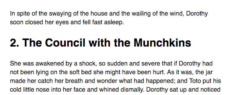
Well, we know the header should signify the start of a new block of content. However, the whitespace between paragraphs and headers doesn’t communicate the same relationship.
Let’s see what happens if we change the whitespace such that a header element would signify the start of a new block of content. To do so, we can add whitespace to the top of the header and reduce whitespace from the bottom of the header at the same time.
h2 { margin-top: 46.2px; /* 1.5 baselines */ margin-bottom: 15.4px; /* 0.5 baselines */}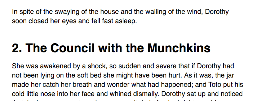
What do you think? The relationship between header and paragraph elements are now more congruent with the content, isn’t it?
Changing the whitespace between header and paragraph elements is just one of the many changes you can apply proximity to your design.
Whitespace between paragraphs
Whitespace between paragraphs refers to the amount of space above and below each paragraph of text. Previously, when we talked about Vertical Rhythm, I recommended that the space between paragraphs of text should be equal to one baseline.
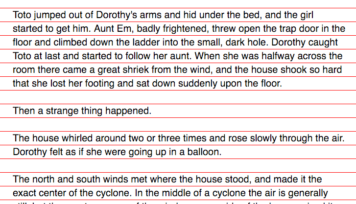
Now, we’re going to do something that seems to defy Vertical Rhythm for the next few paragraphs, but it’ll make your design ten times better.
I want you to focus on the whitespace between paragraphs closely as I take away the guidelines from the baseline grid.
Read through the three paragraphs of text. Pay attention to what you feel when moving between paragraphs.
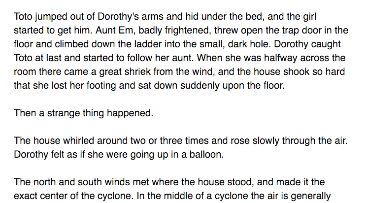
Now, do the same thing with this image below.
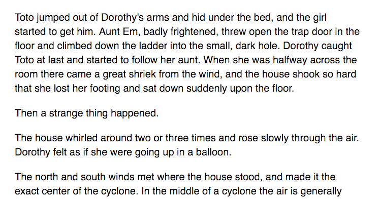
Compare your experience between the two.
Most probably, you’ll feel that it’s much easier to read through the text on the second image.
But why?
You’ll know the answer to this question if you noticed how printed books (or even the kindle) break paragraphs up.
You’ll notice that paragraphs aren’t separated by whitespace. Instead, you recognize a new paragraph when the first line is indented to the right.
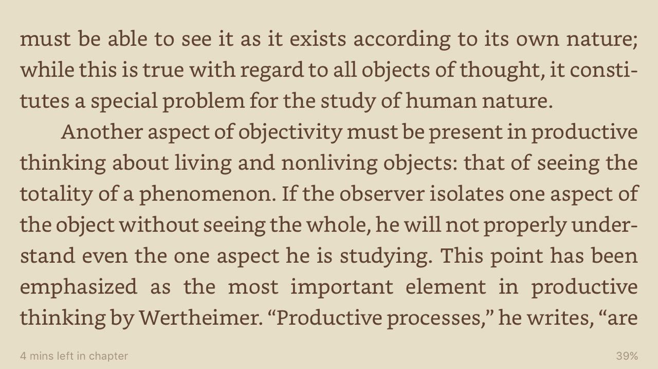
Notice your reading experience as you transit from one paragraph to the next as you read through the kindle image above. See how flawless the transition is.
Now, go back to the image where paragraphs are separated with one baseline. You’ll notice how your reading experience gets disrupted. It’s as if each block of paragraph stands as a separate entity.
Finally, go back to the second image again and you’ll notice your reading experience improves when the whitespace between paragraphs get reduced.
See the difference?
A one-baseline whitespace is too large when used between paragraphs because we’re essentially splitting each paragraph up into small blocks of content that has nothing to do with other paragraphs.
How can we expect people to continue reading when we subconsciously split the continue up for them? Recall the purpose of typography is to help readers immerse themselves fully into the content. In this case, the whitespace is an obstacle that prevents readers from flowing from one paragraph to the next.
We need to remove this obstacle.
The question is how.
At this point, you’re probably thinking that learning about Vertical Rhythm is the worst decision you’ve made so far; that I have led you on a wild goose chase in the wrong direction.
Relax. We haven’t gone off course.
Recall that Vertical Rhythm is about the principle of repetition. The key to figuring out the correct whitespace is to rely on the same principle — repetition. As long as we’re repeating whitespace across the design, we’re still using Vertical Rhythm (although in a different sense than what 99% of the folks out there believe).
If we do so, we can use values like 0.5, 0.66, and 0.75 baselines, depending on how you’ve chosen to vary your repetitions across your design. In my experience, 0.75 baselines is usually a good number for most occasions.
Moving on, you don’t always have to rely on spatial relationships to organize content. You can also make use of lines and shapes.
Organizing content with lines and shapes
For example, a list apart uses a 1px border to separate its articles from the comments section. It also uses the same 1px border to separate comments from other comments.
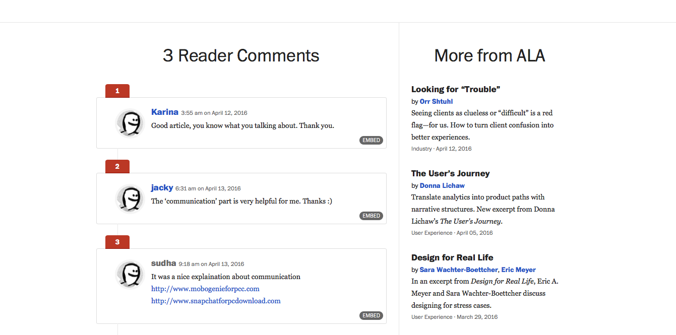
In addition to the 1px border, a list apart also uses equal whitespaces between blocks of content separated by the border. Notice how the repetition comes into play as well? We’ll talk about combining all four principles like this in the next lesson.
Another example is Semplice Labs, which uses a rectangle (just a thick short border) to separate the headline from the description text.

Let’s wrap up this lesson now.
Wrapping Up
In this lesson, you learned that proximity is used to help people organize content into different segments. The closer two objects are with each other, the closer their relationship.
You also learned how to apply proximity to typography in two occasions — between headers and paragraphs, and between paragraphs. Here, you have also discovered how proximity can help enhance a reader’s reading experience.
Finally, you learned that can also make use of lines, shapes in addition to whitespace to organize content.
Exercise
Group elements in your design together with the principle of proximity. Try reducing whitespace between elements are related closely, and increasing whitespace between elements that are further apart.
Also, try using shapes and lines to help organize content into different segments so readers can quickly grasp the different sections.
Next up
Next, in the final lesson of the module, we’ll take a look at how to integrate lessons from these four design principles by looking at an example.
I know you’re excited. Go on, flip to the next lesson :)
Welcome! Unfortunately, you don’t have access to this lesson. To get access, please purchase the course or enroll in Magical Dev School.
Unlock this lesson