You’ve learned the four essential design principles — repetition, contrast, alignment and proximity — in the previous four chapters. So far, all we’ve done is to dissect each of these principles so you learn the core of what they are.
In reality, these principles don’t work alone. They augment each other in every component of your design. The next lesson for you is to integrate these four principles flawless into your designs, which is what we’re doing this lesson. We’re going to design a list together.
You’ll learn:
- How to integrate all four principles into a component
- How to structure your thoughts around designing a new component
Let’s begin.
Building the list
The first step to styling a component is to think about how it’s used.
Let’s say the list we’re making is used within a blog post. The markup of the list will be similar to this:
<p>Paragraph of text</p><ul> <li>List item</li> <li>List item</li> <li>List item</li> <li>List item</li></ul><p>Paragraph of text</p>Once you’ve decided on what the component is used for, the second step is to populate it withe real content.
In our case, a list can contain single words, phrases and, or even sentences that spans two or more lines. We need to replace contents within the list with real content so we have a sense of what it feels like when it’s used.
<p>Paragraph of text</p><ul> <!-- Replace list items with actual content --> <li>Be specific</li> <li>Be clear and concise</li> <li>Show your work</li></ul><p>Paragraph of text</p>You can already see from the list above that it’s made up of phrases. Contents within list items are common. If the first item is a phrase, every other item in the list will be a phrase. If it’s a sentence, every other item will be a sentence, and so on.
Normally, just using real content is good enough. However, since our component contain sentences as well, we want to add a few sentence in to make sure it works as well.
<p>Paragraph of text</p><ul> <!-- Replace list items with actual content --> <li>Be specific</li> <li>Be clear and concise</li> <li>Show your work</li> <li> I (might) have answered your question before. You can search for them easily on the Github issues. </li> <li> It’s much easier for me to search through Github issues and point people towards the correct answers than write a new reply for every question that comes my way. </li></ul><p>Paragraph of text</p>(I know it doesn’t make sense to put completely unrelated things together in the same list. Bear with me for this example. You can split it up when you’re building your own.)
With that, we’re done with our markup. Let’s move on to styling.
Styling the list
When styling a component, we first have to think about the flow between the component and others.
In our case, the list is a block of content that behaves like a paragraph. We want readers to move into, and out of a list smoothly, as if they’re reading through paragraphs of text.
Since we want readers to move into, and out of a list like paragraphs, the margins between lists and paragraphs should be consistent (repetition).
ul,ol { margin: 23.1px 0; /* 0.75 baselines top and bottom margin */}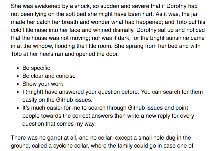
Great. Now that the vertical position of the list is set properly, we’ll look at the horizontal position. Here, we see that the browser has already indented list items inward for us.
The indentation is great, because it shows readers that list items are different from paragraphs (alignment). The bullet points on each list item also tells you that the list is different from a paragraphs (contrast).
The unfortunate thing is that the indentation doesn’t follow the rhythm we’ve set on the page. As such, it feels slightly out of place (A combination of misalignment and repetition causes this feeling).
To fix the indentation, we first have to reset left paddings of the list.
ul,ol { padding: 0;}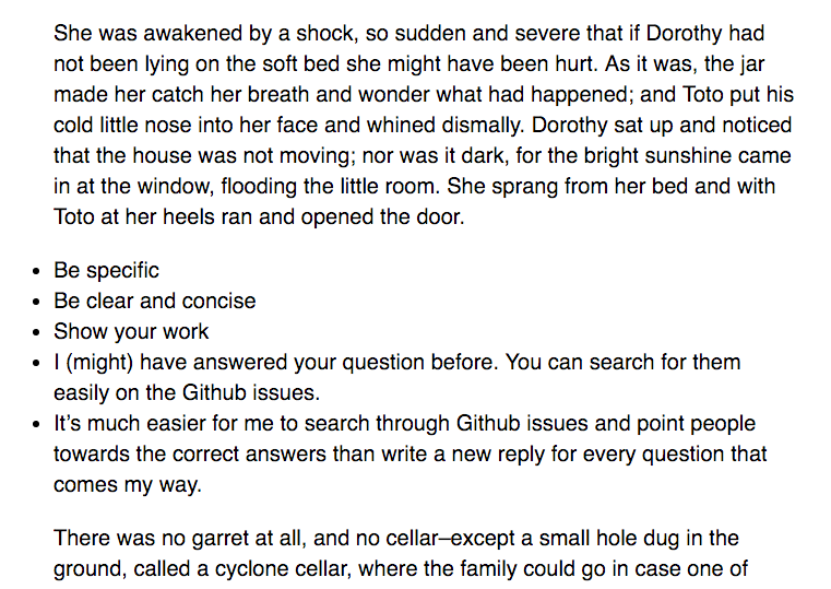
Here, we see that bullet point are outside aligned outside of the text. Text within the list are aligned to the rest of the paragraphs. This is a great start.
The next thing to do is to align the bullet points to the start of a paragraph so we form a strong visual line on the left (alignment).
One simple way to do so is to change the list-style-position from outside to inside.
ul,ol { list-style-position: inside;}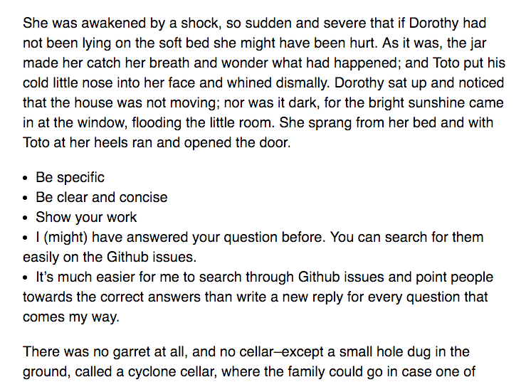
The alignment looks much better straight away.
The only problem is list items with more than one line will begin the new line at the start of the bullet point, which makes the item much harder to read. (Weak, chaotic alignment).
So, instead of taking the easy path with list-style-position: inside, we set list-style-position to outside, and a correct margin-left property such that the bullets are aligned to the paragraph text.
Turns out, this margin-left value is equal to the font-size:
ul,ol { margin-left: 22px; /* Assuming font-size is 22px */ list-style-position: outside;}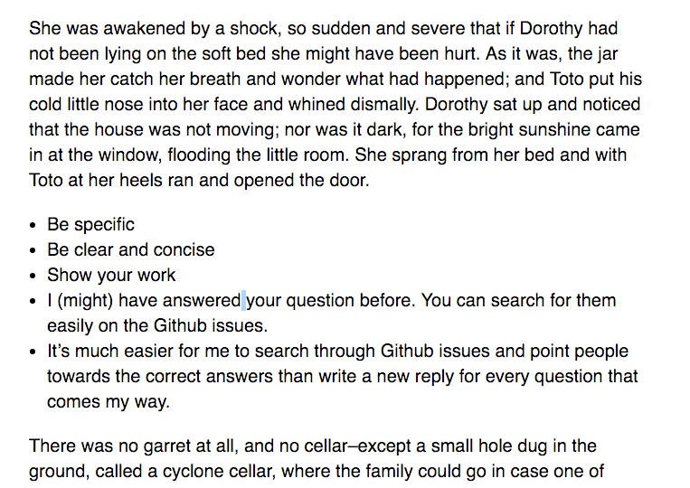
Great, notice how the list items with more than one line of text is properly aligned with the first line (alignment).
We can stop here for the horizontal position, but we also can indent the list items to the right by a multiple of the Vertical Rhythm to increase contrast (contrast and alignment).
I’ve found that half a baseline works best for most situations. You can play around with this value to find the sweet spot for your design.
ul,ol { /* Assuming 1 baseline = 30.8px */ margin-left: 37.4px; /* 22px + 15.4px */}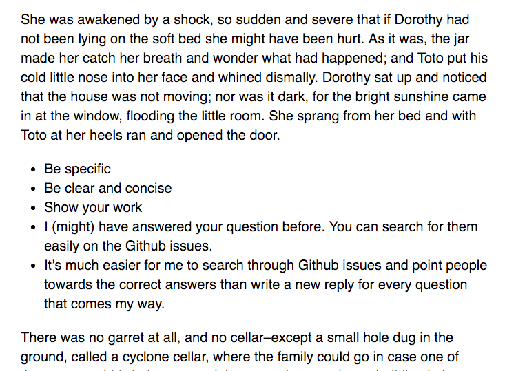
Much better.
The overall structure between paragraphs and list items are set now. The next step is to make sure items within a list a distinguishable from each other. Here, we have to read the text within each item.
Read it and notice how you feel.
Seems like list items are just one big paragraph right now, doesn’t it?
It seems this way because the vertical space between list items are exactly the same as the vertical space between lines in a paragraph. Since the whitespace is the same, our brains associate these two components as the same thing. We’re already conditioned to see list items as a big paragraph (proximity).
But list items aren’t paragraphs. We want each of them to be distinct. The best way to make them distinct is to add whitespace between each list item. This whitespace must be smaller than the whitespace between paragraphs (proximity).
li + li { margin-top: 7.7px; /* 0.25 baseline */}Note: I’m using an adjacent sibling selector in this example. Learn it. It’s useful.
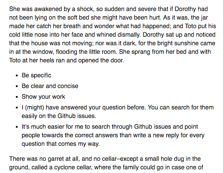
Much better.
Of course, adding whitespace between list items isn’t only on way to design the list component. You can choose from a combination of properties you learned in the contrast lesson. The key thing is to make sure list items look visually different from paragraphs.
And this marks the end of our example.
You can now see how the 4 principles I spoke about (repetition, contrast, alignment and proximity) come together while designing the list item.
Wrapping Up
In this lesson, we designed a list component together. You seen how each of the four principles comes into consideration while we design the component, and you’ve learned how to integrate them.
The next step is to design your own components and learn to use these principles on your own.
Exercise
Design a component. Integrate these four design principles as you work through your component.
Try building:
- a list
- a divider between elements
- a fancy subhead
- or anything you can think of.
Next up
We’ve come to the end of things you need to know about designing with typography. Next up, you’ll learn everything you need to implement code these principles in a responsive website.
Welcome! Unfortunately, you don’t have access to this lesson. To get access, please purchase the course or enroll in Magical Dev School.
Unlock this lesson