Welcome to Module 3!
Congratulations for getting this far.
You’ve learned essential typography and design principles that’ll allow you to create better-looking sites confidently over the last two modules.
The warm up is now over.
We’re going to kick into high gear in from this lesson onwards. You’ll learn about the best practices for responsive typography and how to convert everything you’ve learned into real code at the same time.
There are four responsive practices in total. They are:
- Use different font-sizes at different viewports
- Use relative units
- Use responsive Modular Scales
- Use responsive Vertical Rhythm
Let’s jump into the first one right now.
Use different font-sizes at different device widths
Let’s understand this practice with a quick exercise.
Hold your phone as if you’re using it normally. Notice at the distance between your eyes and the phone. Remember this distance.
Let’s call this distance between the eyes and the screen “viewing distance.”
Now, look at your laptop as if you’re using it normally. Notice the distance between your eyes and the screen. Compare this viewing distance with the viewing distance between your eyes and the phone.
What did you notice?
The phone is held at a closer proximity to our eyes as compared to the laptop. The viewing distance increases as you switch to larger devices (like a monitor, the TV screen, etc.)
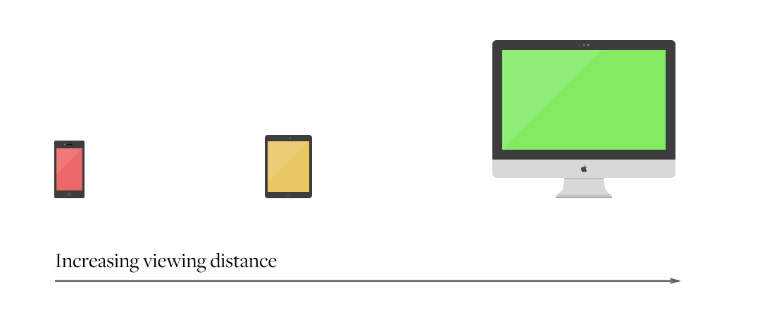
We perceive the size of objects differently when they’re placed at difference distances from our eyes. The farther the viewing distance, the smaller the object becomes.
This relationship between size and viewing distance holds true with text as well.
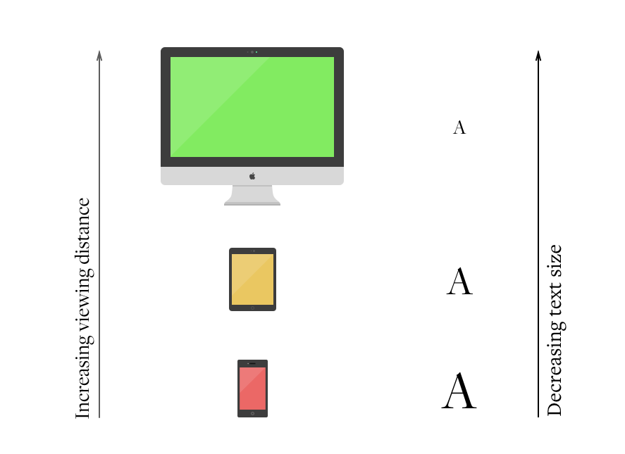
You probably have the experience where you had to squint your eyes or zoom in on a website to read text comfortably. It happens more when you use a larger device. (I cannot tell you how many times I had to zoom in to read properly on my Thunderbolt display.)
Squinting (or zooming), is a discomfort. As we mentioned before, the purpose of typography is to allow your readers to immerse themselves into text. So, we want to remove the discomfort.
To do so, we increase font sizes when viewing distance increases. Correspondingly, the decrease font-sizes as the viewing distances decrease.
Unfortunately, there’s no way to detect the actual distance between a reader’s eyes and their screen (unless all device makers devise a way to calculate the distance from their device to all their users). What we can do now, is to place ourselves in similar situations when designing.
So, we physically take up the phone and read if we’re designing for the mobile. We use the large screen whenever we want to design for users with a similar screen.
Because the viewing distance increases as we switch to larger devices, we can use the device width as a proxy for viewing distance. That’s the reason why we increase font sizes when the device width gets larger.
Before we move on to implement the practice, let’s go through what things are required for a responsive website.
Things required for a responsive website
You only need two things to make a website responsive.
- Meta Viewport Tag
- Media Queries
Let’s walk through each of them
Meta viewport tag
Devices today have a screen width that’s larger than the actual width of the device. The iPhone 5s, for example, has a device resolution of 640px x 1136px. The actual screen size, however, is half of that at 320px x 568px.
Browsers render the width according to screen resolution by default. They will think our iPhone 5s has a width of 640px instead of 320px. This would mean that everything will be zoomed out to be half its intended size on an iPhone 5s if we don’t do something about it.
To fix this, we need to add a meta viewport tag that will tell the browser to render the width of the page as the width of its screen at the <head> of the website.
<head> <meta name="viewport" content="width=device-width, initial-scale=1" /></head>Now, the iPhone 5s will render at 320px.
Media queries
If you resize your browser on a responsive website, you will notice that the layout of the website changes at certain points. These points are called breakpoints.
Media queries are used to specify where these breakpoints are, and how the browser should respond when the conditions are matched. They have the following syntax:
/* CSS */@media [<media-type> and] (<condition>) { /* properties here */}@media is the keyword for media queries. It signifies the start of a media query.
<media-type> is an optional argument that tells browsers to filter for a specific media type. The most common media types are all, screen and print.
Print only applies when the page is printed out while screen works when the site is viewed on the screen. <media-type> defaults to all when not specified, will apply to both print and screen.
condition is a required argument in a media query that allows us to specify how the browser should render a page if the condition is true. They are written in a property and value pair like:
@media (min-width: 600px) { /* This applies when the browser width is equal to or larger than 600px */}You can chain more than one conditions with the and keyword, like:
@media (min-width: 600px) and (max-width: 1200px) { /* This applies only when the browser width is BETWEEN 600px and 1200px */}Media queries have to be written as the first level wrapper in a CSS file. As such, every media query declaration would have the following format:
/* CSS */@media (min-width: 600px) { .content { /* Content properties */ }}That’s all you need to prepare yourself for changing font-sizes at different device widths.
Implementing the practice
To change font-size at different device widths, we just create media queries at different breakpoints in CSS, like this:
html {  font-size: 16px;}
@media (min-width: 600px) {  html {    font-size: 18px;  }}
@media (min-width: 1000px) {  html {    font-size: 20px;  }}
What this means is:
- Set font-size to 16px when a device is smaller than 600px
- Set font-size to 18px when a device is larger than 600px
- Set font-size to 20px when a device is larger than 1000px
Notice we used min-width media queries in the code above? This approach allows us to write mobile-first CSS. I highly recommend you learn to write mobile-first CSS because its results in code that’s easier to maintain. (Click the link for more info).
Let’s move on.
Changing font-sizes of different elements
A real website requires you to change font-sizes of other elements in addition to the body font-size. It gets much harder, so let’s walk through a simple code exercise.
Let’s say you have to:
- Set body font-size to
- 16px below 600px
- 18px above 600px
- 20px above 1000px
- Set h1 font-size to
- 50.517px below 600px
- 56.832px above 600px
- 63.147px above 1000px
(The funny pixel numbers are derived from Modular Scale with a base of 16px and a ratio of 1.333. Still remember how to get them?)
Here’s the code to do so:
/** * Setting body font-size */html {  font-size: 16px;}
@media (min-width: 600px) {  html {    font-size: 18px;  }}
@media (min-width: 1000px) {  html {    font-size: 20px;  }}
/** * Setting h1 font-size */h1 {  font-size: 50.517px; /* 16px * 1.333 * 1.333 * 1.333 * 1.333*/}
@media (min-width: 600px) {  h1 {    font-size: 56.832px; /* 18px * 1.333 * 1.333 * 1.333 * 1.333*/  }}
@media (min-width: 1000px) {  h1 {    font-size: 63.147px; /* 20px * 1.333 * 1.333 * 1.333 * 1.333*/  }}
/* Setting h2, h3, h4 font-sizes... */
From the code above, you can see that there’s a need to write additional media queries for every new heading size… Not very ideal.
Good luck writing font-sizes for h2, h3, h4 and other typographic elements :(
There’s one way to make media queries much easier to write. It’s to use a preprocessor called Sass.
Easier media queries with Sass
Sass is a CSS preprocessor. It gives you the ability to add logic into CSS, which makes CSS much easier to write.
One of the good things about Sass is that it gives you the ability to write media queries within selectors. So, the code above can be written as:
html {  font-size: 16px;
  @media (min-width: 600px) {    font-size: 18px;  }
  @media (min-width: 1000px) {    font-size: 20px;  }}
// Repeat for h1
This code will become the following after it’s compiled into CSS:
html {  font-size: 16px;}
@media (min-width: 600px) {  html {    font-size: 18px;  }}
@media (min-width: 1000px) {  html {    font-size: 20px;  }}
Notice that you no longer need to write the body selector multiple times. It’s a modest improvement that can go a long way.
I highly recommend you learn to use Sass. It’s an essential tool in a frontend developer’s arsenal, and we’ll write a lot of Sass from this point onwards.
If you don’t know anything about Sass at this point, don’t freak out. I’ll explain everything you need to know as we go through them (just like what I did with media queries above).
It’s important that you know how to compile Sass into CSS before we move on from this chapter. If you already know how to, skip directly to the next section and read on.
If you don’t know how to, I highly recommend you download the free chapters of my book, Automate Your Workflow, where I explain in-depth on how you can setup a development workflow that contains Sass. You’ll thank me for it once you complete the free chapters.
There are also other ways to make typography easier to implement across different devices, but we’ll leave it for the next lesson.
Wrapping Up
In this chapter, you learned the #1 rule in responsive typography — to use font-sizes for different devices widths.
Recall that the purpose of typography is to help readers immerse themselves in the content. Nothing else matters if you get the typesetting wrong, and one key to typesetting is font-size.
Unfortunately, changing font-sizes for different device widths makes code difficult to write. One way out is to use Sass, which helps us write lesser code to achieve the same effect.
There are also other ways we can make code easier to write too, but we’ll talk about them in the next lesson.
Exercise
There are three tasks I’ll like you to practice for this lesson:
First, find the right font-size for your body text for these devices:
- Mobile
- Tablet
- Desktop
- Monitor / Large display
The right font-size for each device is slightly different. As the device width increases, your font-size should also increase.
Second, write media queries for your body text and other typography elements you’ve decided on using in the previous exercises.
Third, install and prepare yourself mentally to use Sass. Go through the free chapters of Automate Your Workflow if you need help to getting started.
Next up
Next, we’ll learn another way to make responsive typography easier to write. It will form the foundation of all your code from this point onwards.
Welcome! Unfortunately, you don’t have access to this lesson. To get access, please purchase the course or enroll in Magical Dev School.
Unlock this lesson