Welcome to the third lesson on Design Rules in Typography. In this lesson, we’re going to cover the Principle of Alignment. You’ll learn:
- What the Principle of Alignment is.
- How alignment affects humans
- How to apply the Principle of Alignment to typography
What is the Principle of Alignment?
Which side feels better to you?
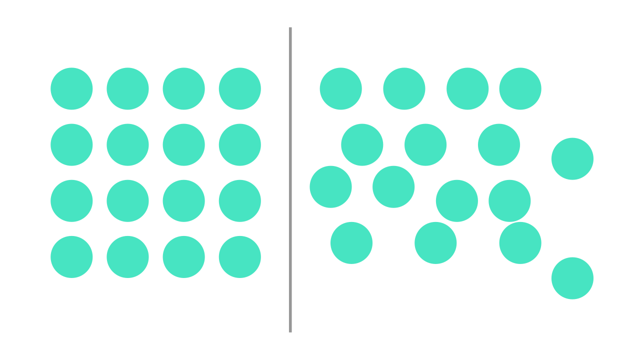
The left one, because it’s neatly aligned. But why? Why don’t we like the chaotic mess on the right one?
When things are lined up like you see in the above image, there’s order. Humans are suckers for order. When there’s order, we feel secure; We’re in control of the situation.
On the flip side, we lose control when things become chaotic. Our emotions run wild. To illustrate this point, just look at the state of your bedroom. Is it orderly or messy? How does it make you feel?
The same need for order applies everywhere in life, even on the web. If we can make visitors feel that they are in control, their internal voices subside, and they’re able to use our site as we intended.
Of course, we can’t possibly force a visitor to feel that safe and in control, so we try to facilitate the process by making sure things are arranged neatly for them. That’s the Principle of Alignment.
Repetition and Alignment
Alignment accentuates or diffuses the effects of Repetition. Take a look at this image again:
Even though we repeated the same circles on both left and right areas, the left one feels more secure than the right one. The neat alignment has helped us feel safer by accentuating familiarity with order.
On the flipside, the chaos and confusion from an erratic placement of circles on the right undermine the familiarity and safety produced by the repeated circles.
Hence, we want to make sure things are aligned properly (unless you deliberately choose not to).
Contrast and Alignment
When everything but one element is neatly aligned, the element stands out (according to the Principle of Contrast). This is true even if there’s just a slight misalignment.
Take a look at this image:

Notice how you feel uneasy when you spot the misaligned circle in the image above. It’s the same uneasy feeling you get when there’s not enough contrast.
In addition to restlessness, visitors may also feel that the work is unprofessional since they can spot visual defects.
However, watch what happens if the misaligned circle is clearly off the line. Let’s also accentuate it further by changing it’s color to blue.
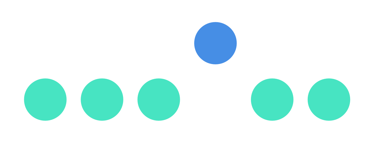
The blue circle stands out much farther than before because it has a different color, and because it’s not aligned to the rest. It’s there for a reason. You don’t feel uneasy anymore.
Alignment in typography
There are two things to note about alignment in typography.
- Alignment of content blocks
- Alignment of text
Let’s go through them one by one.
Aligning Content Blocks
The alignment we spoke of so far concerns the alignment of content blocks on a page. These blocks are images, blocks of text, components, etc.
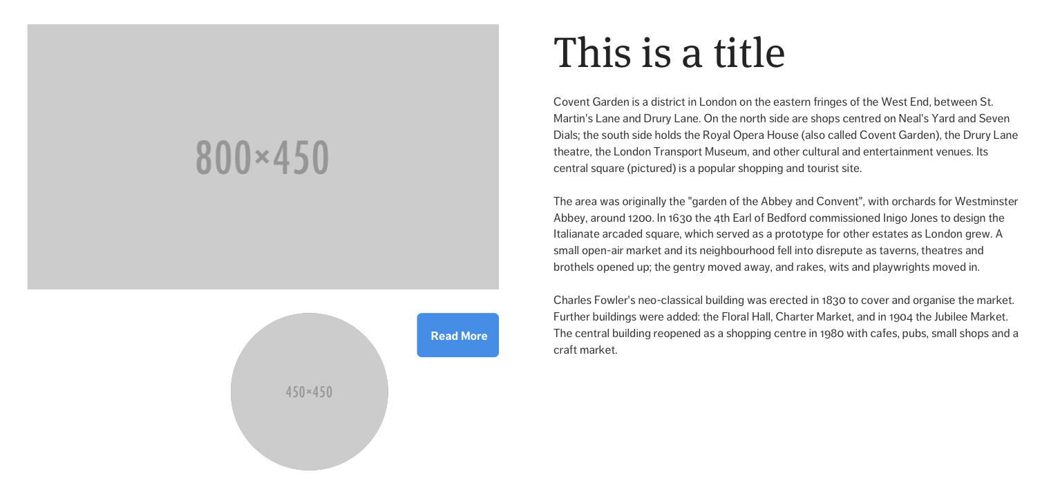
There are three ways to align content blocks — left, right and center.
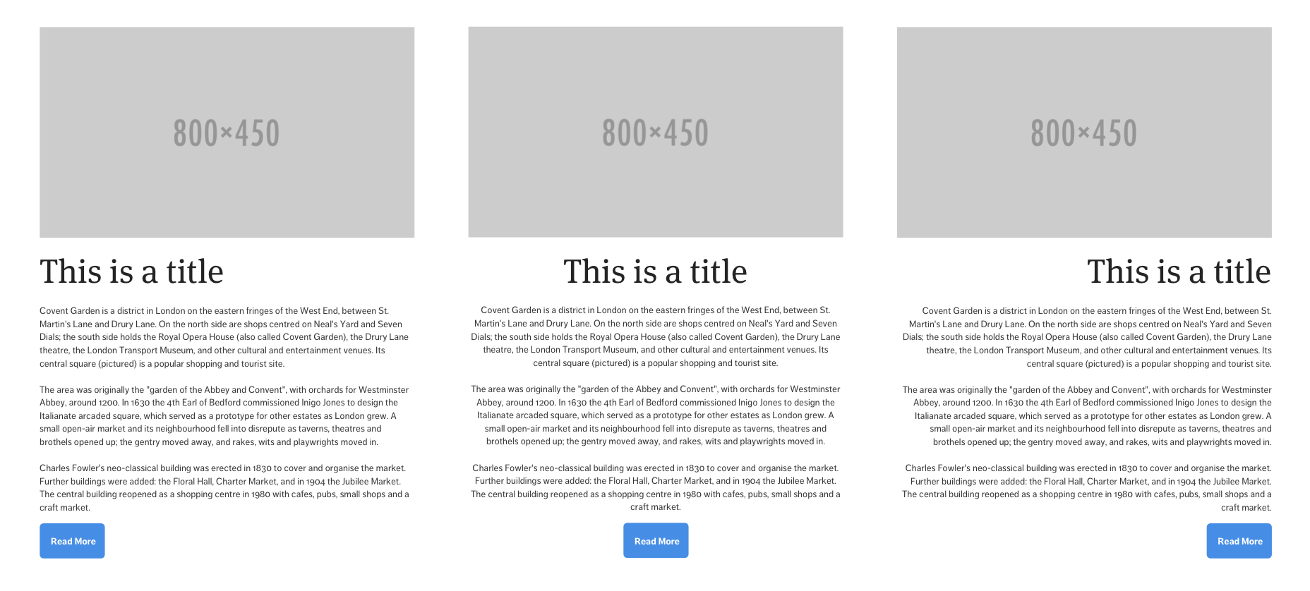
People instinctively choose to center blocks when the first began to learn design. I did it myself too.
We do so because there’s symmetry. It’s a safe choice because we see symmetry everyday. It looks good enough too.
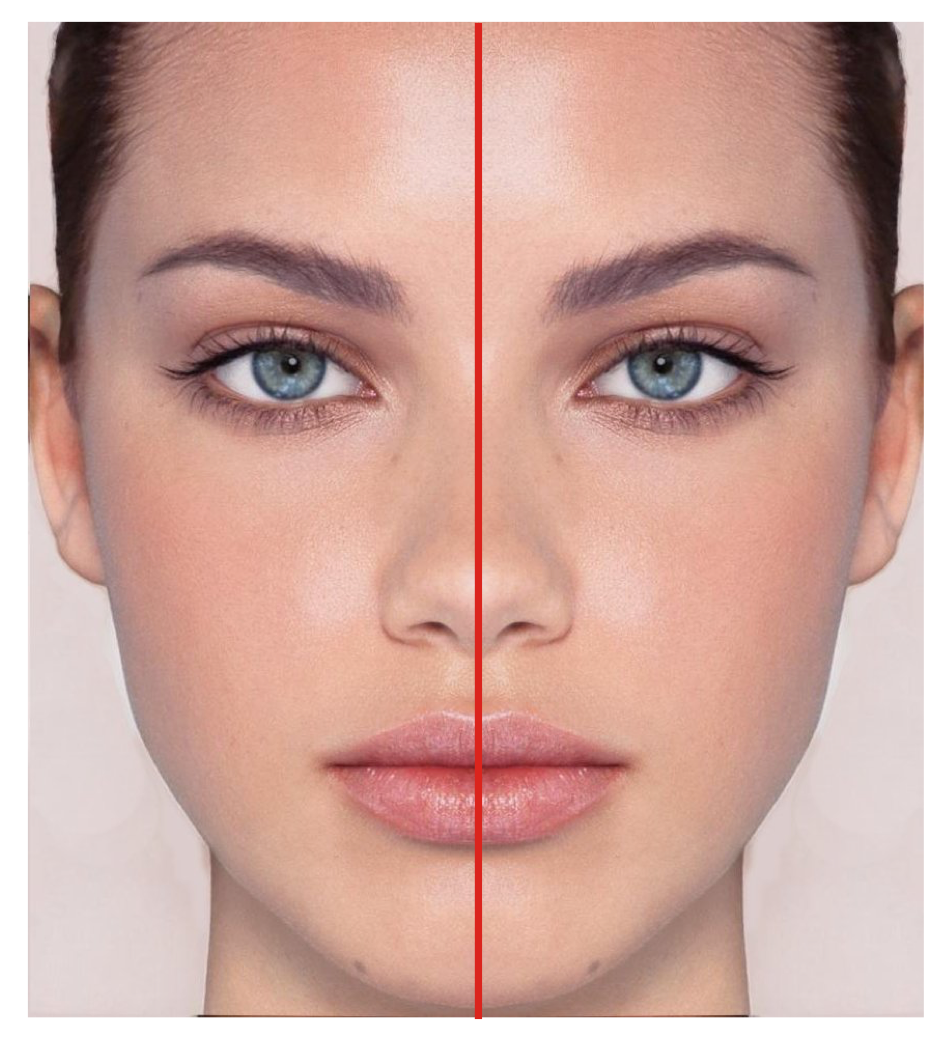
For example, You can draw a vertical line in the center of the human face, and you’ll see symmetry. There’s one eye, one ear, half a nose and half a mouth on each side:
However, precisely because symmetry is safe, websites that are primarily centered looks amateurish and boring. We’ve already seen too much of it. Yawns.
Want an example? Check out Bootstrap’s website:
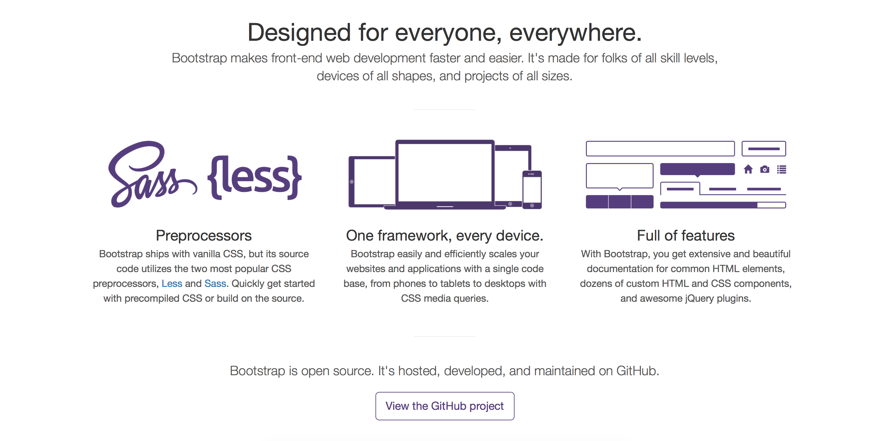
Compare Bootstrap’s website with a design that has a strong left or right alignment like Jarrod Drysdale’s Tiny Designer. Which one catches your attention more?
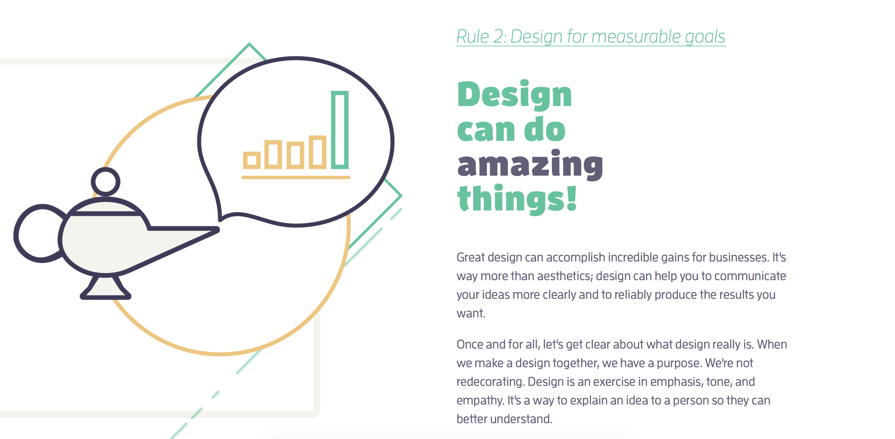
Designs with a strong left or right alignment are asymmetrical, which instantly improves the design because we cannot take our eyes off it.
Besides being asymmetrical, designs with a strong left or right alignment creates an imaginary vertical line that connects elements together. This imaginary line brings about the order we mentioned above.
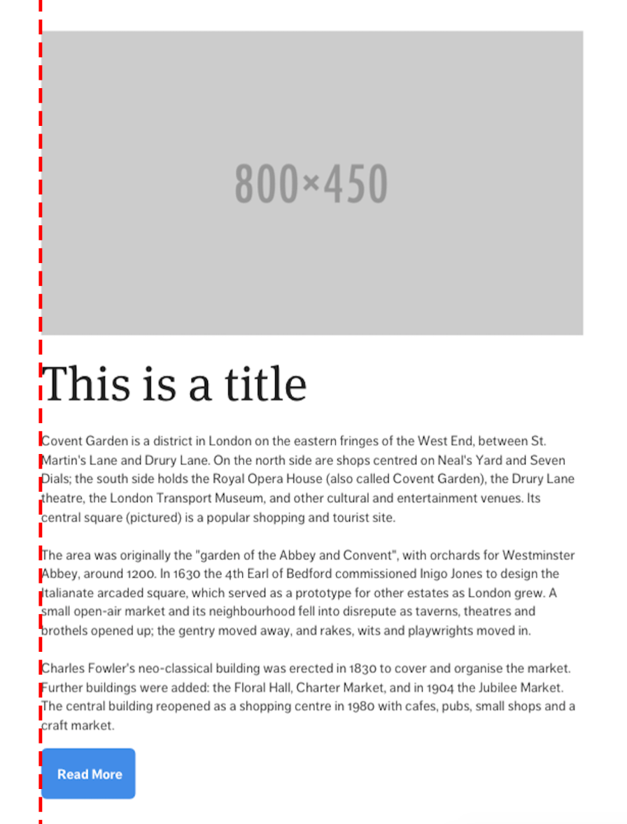
Centered designs also contain an imaginary line that runs through the center of all elements.
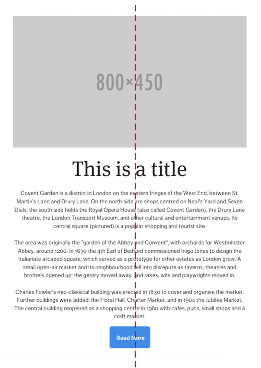
The imaginary line that’s created by centered blocks doesn’t coincide with edges of any element, which causes the alignment to be considerably weaker compared to left or right alignments. It lacks visual interest if used excessively.
I can talk about the alignment of content blocks for hours if you let me. However, since this book is primarily about typography, I’ll like to move the focus towards aligning text.
If you’re interested in the art of aligning blocks of content, I highly recommend you pick up Robin William’s design for non-designers.
Next, let’s talk about aligning text.
Aligning Text
Pick up an English book (any book will do).
Did you notice that text in the book is aligned to the left?
Text is aligned to the left in english books for a reason. When text is left-aligned, the left edge of the start of every letter forms an imaginary line that runs across the entire column.
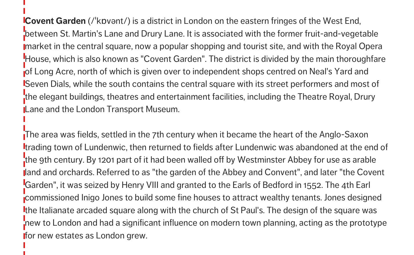
This imaginary line isn’t present at the start of each row of text in center nor right alignments:
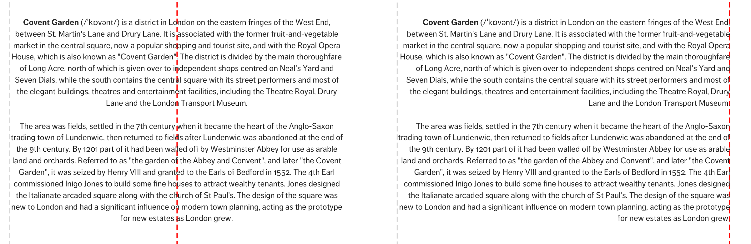
This line is the reason why English books are primarily left-aligned. It acts as an anchor that helps readers return to the start of the next line. It improves readability.
So, your first choice for setting large blocks of text on a page should be left-align (unless you’re building for a language that reads right to left).
The next preferred alignment for text is to the right. This is because right-aligned text also has an imaginary vertical line. The only difference is it’s at the end of the text instead of the start.
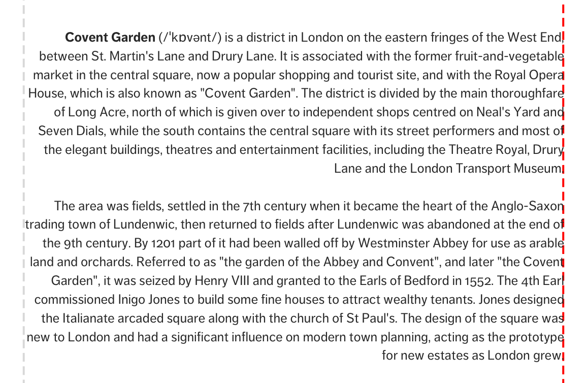
Although it doesn’t have an ideal anchor like left-aligned text, the right line acts as a proper ending anchor so a reader can start looking for the next line of text even before they reach the final word.
So, right alignment works for text as well. It’s just not as ideal for long-form text. If you decide to align the to text right, you might want to improve readability by either reducing the measure or making sure text is no longer than two paragraphs.
The third preferred alignment for text is center. Center-aligned text, like center-aligned blocks, has the weakest imaginary line of three.
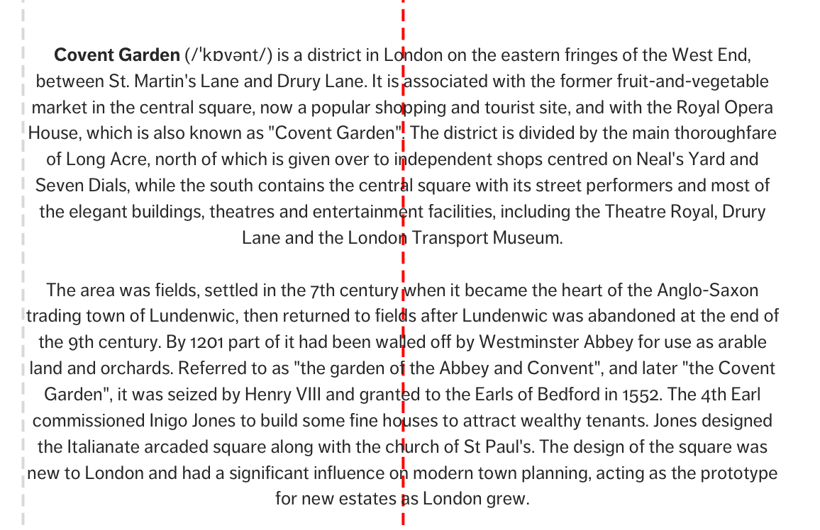
Readers don’t have good anchor points at both the start and end of every line. They can’t get a good mental model on where to begin or end the line they’re reading. As a result, it takes much more effort to read a centered-aligned text compared to a left or right-aligned ones.
Centered-aligned text aren’t suitable for long-form text. Make sure you use them only sparingly to bring attention to important elements.
The final type of alignment you can use is justify.
When you justify text, you fix the start and end points of a line and distribute spaces within words evenly on the line:
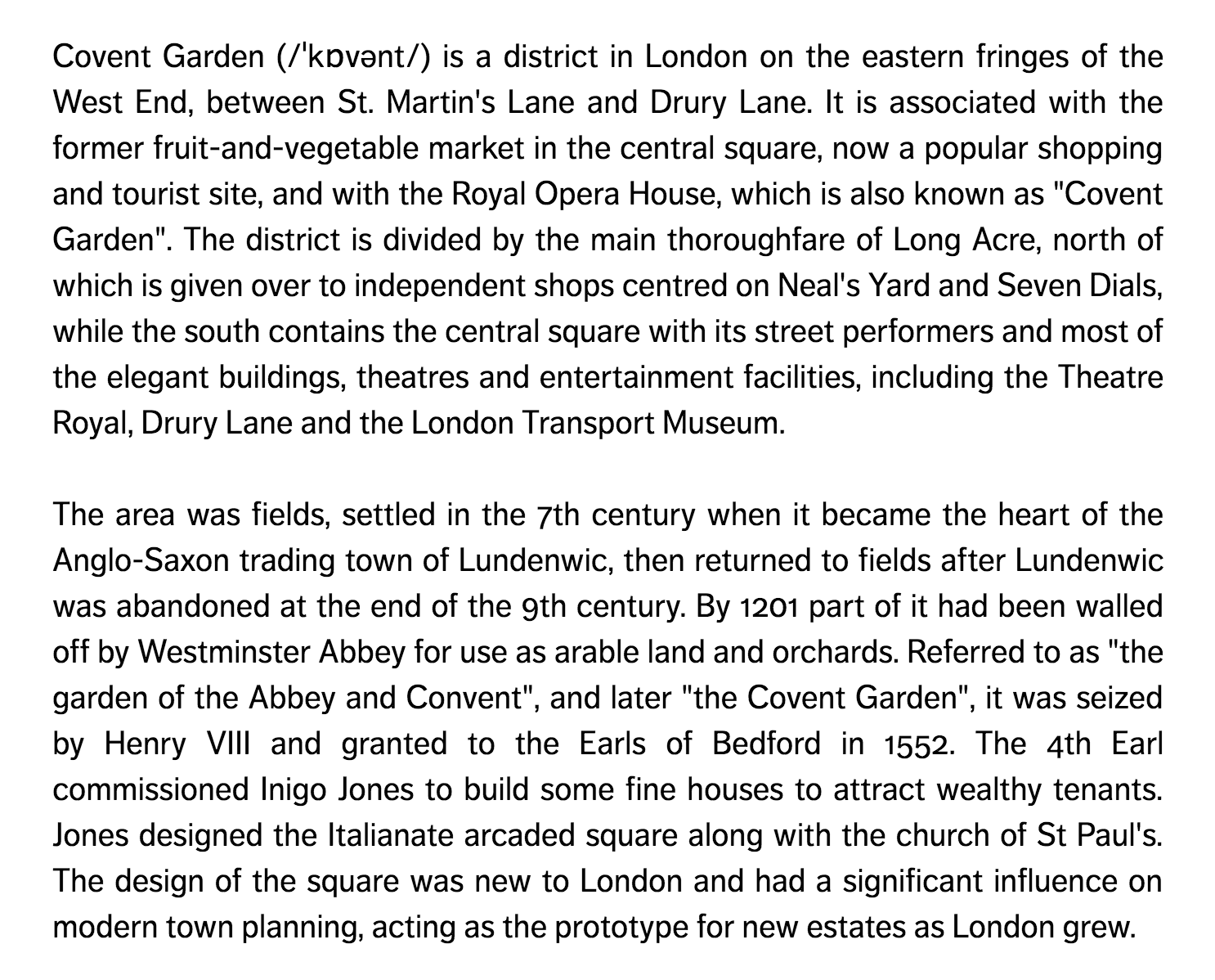
It is often used in print, especially in newspapers or magazines to help squeeze more words into a page.

It is, however, is rarely used on the web because of two reasons.
First, there’s no need for multiple columns of text. We have an infinite canvas on the web. Readers are used to scrolling, and it’s much easier to read if there’s only one column of text. In most cases, there’s no need multiple columns unless the design calls for it.
Second (this is the real reason), hyphenation on the web is unreliable. Evey browser implements hyphenation differently because there’s no clear specification on how hyphenation should be done on the web. Besides, many browsers don’t support hyphenation for less well-known languages.
The question is, why is hyphenation important when using justified text?
When hyphenation isn’t available, spaces between words are spread out evenly on the line, which can create gaps that make it hard to read.
Here’s an example to show the differences between left-aligned text and justified text on the web. As you look at the GIF, notice the change in spaces between words when the alignment is switched to justify and vice versa.
So, as much as possible, don’t justify text on the page unless you’re sure you know why you’re using it.
Wrapping Up
You learned about the Principle of Alignment and how to apply it to typography in this lesson. You learned:
- What the Principle of Alignment is.
- How alignment affects humans
- How to apply the Principle of Alignment to typography
The key to alignment is being precise about every detail. One slight misalignment and you’ll get the opposite effect.
When aligning text, make sure you choose the alignment that’s suitable for your length of text.
Alignment supports both Repetition and Contrast when used correctly. When aligning text, make sure you choose the right alignment — left, right or center for your design.
Exercise
Stop aligning things to the center. Come up with 3 ideas to make your layout stand out more by aligning text and content blocks either to the left or right.
Be conscious of how you choose to align text in these three ideas. Should text be on the left, right or center?
Play around and experiment. You’ll be surprised by what you find.
Next up
Next up, I’ll show you the final principle — the Principle of Proximity.
Welcome! Unfortunately, you don’t have access to this lesson. To get access, please purchase the course or enroll in Magical Dev School.
Unlock this lesson