In the last lesson, you saw why the Principle of Repetition was important and how to use both in design and typography. In this lesson, we’ll dissect another principle — the Principle of Contrast.
You’ll learn:
- What the Principle of Contrast is.
- How contrast affects human psychology
- How to apply the Principle of Contrast to typography
Let’s begin.
What is the Principle of Contrast?
Contrast means to make one object different from the rest so it stands out. You can distinguish objects from each other by making attributes (like color, size, and shape) different from other elements:

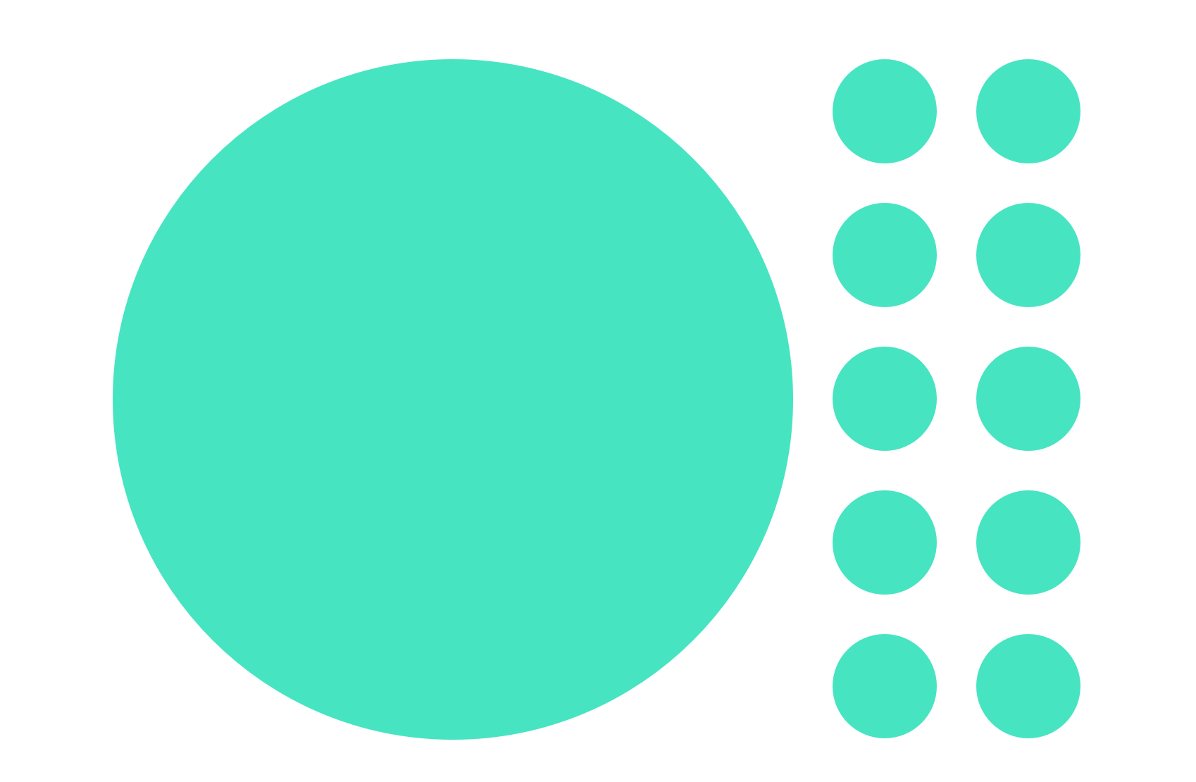

You get the drift. Just make one object completely different and it stands out. That’s contrast.
Contrast is used for many different purposes, like giving warnings, grabbing attention, showing the relationship between two objects, etc.
For example, a wasp uses bright yellow and black to warn others not to come close. A flower, on the other hand, uses attractive colors to entice creatures towards it.

The key to contrast is to make something so different that it stands out immediately.
How contrast affects human psychology
Remember the lizard brain? It’s here to help us stay alive. It enters into a flight or fight situation whenever it senses anything unexpected or unfamiliar.
Imagine you’re all alone in a forest. It’s dark. There are trees and bushes around you, but no one else in sight. It’s quiet, except for the sounds of crickets echoing in the dark forest.

Out of the corner of your eyes, you saw some bushes rustle. It’s a small movement, but you can’t make out what’s happening because it’s so dark.
Is something there? Should you run?
You brain kicks into high gear.
This reaction is normal. We want to know what’s lurking in the shadows so we can make a decision to save our skin.
The same reaction kicks in if elements are different by a bit on the web design. Watch how your brain reacts to this image below.
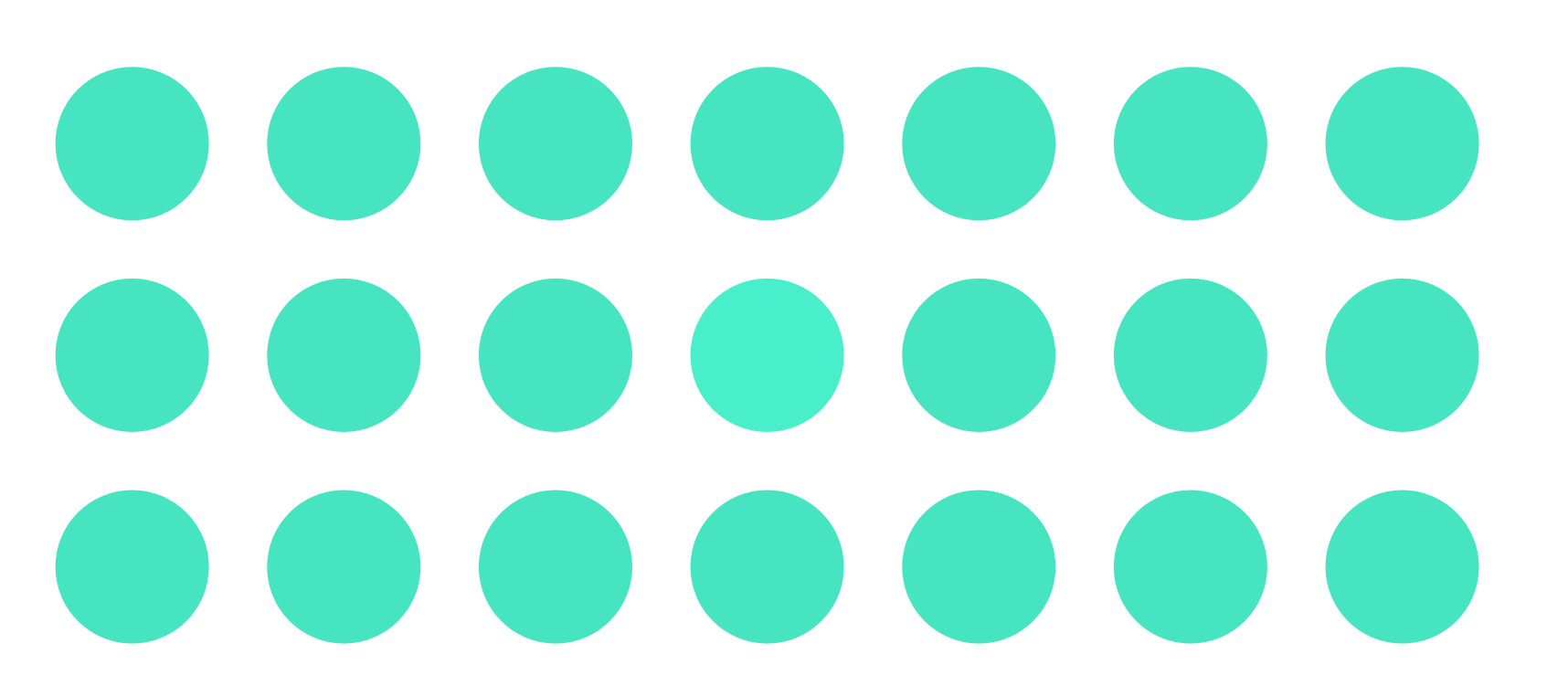
“Something is off” is likely to be your initial reaction when you noticed the slight difference in the shade of green.
You zoom in on the circle that’s slightly different. Your eyes focus on the offending circle while you begin to ask questions. But your questions remain unanswered, as always.
It’s the same process as what happened in the last lesson with the lonely circle, except it’s much stronger? Uncomfortable isn’t it.
Watch what happens we change to a color that stands out.
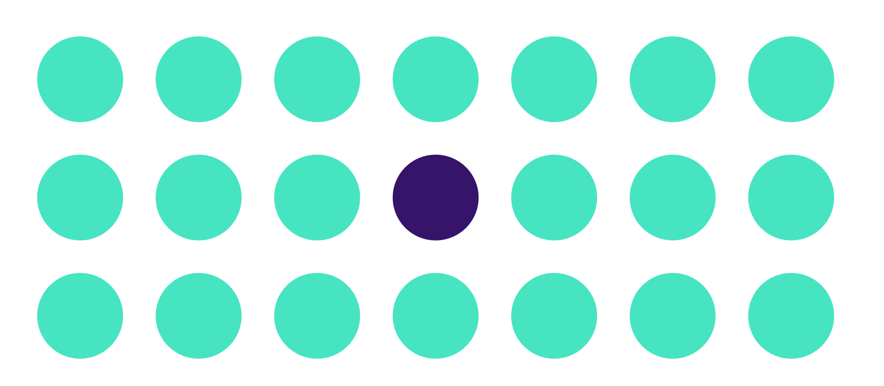
Your mind becomes quieter. Your eyes relax. Your attention first goes towards the blue circle, but you’re able to move away and relax soon after.
Now, watch what happens if we change the blue circle into a star.
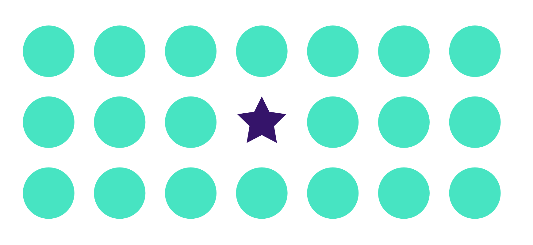
What did you notice?
The blue star stands out even more than the blue circle because we changed the shape as well. Your eyes zoom in quicker than before, but you relax quicker as well.
This exercise tells us that the Principle of Contrast affects humans even before we can consciously interpret what it’s trying to say. Without enough contrast, your visitors will feel extremely uncomfortable. They’ll be tensed up without even knowing what happened. Nobody likes that feeling, so they’ll flee from your website faster than you can imagine.
This also means you need to be bold about your contrast whenever you employ it.
Using contrast in typography
Contrast is used to create a visual hierarchy in typography. You use it to create attention grabbers, then proceed to guide visitors’ attention towards text.
The simplest way to create a visual hierarchy is through font-size. We have already done so in previous chapters by using Modular Scale.
Here’s an example:
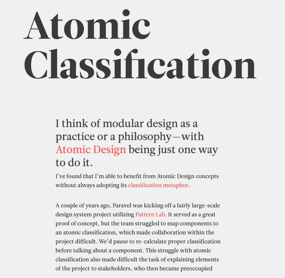
Notice Trent used a huge font-size for his article title. See how he creates a hierarchy and redirects your attention into the meat of the article.
You don’t necessarily need font-size to create contrast. There’s total of six ways:
- Change the font-size
- Change the font-weight
- Change the font-style
- Change the typeface
- Change the color
- Change word to uppercase, title case or lower case
These methods open up possibilities for you to style your typography elements differently. For example, you can change the style, weight, and color at the same time:
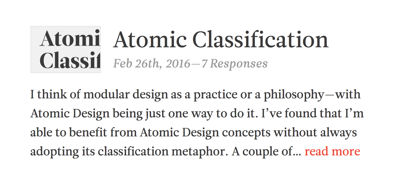
When you stack contrast in this manner, be careful not to add too much contrast to a point that it takes attention away from the most important thing on the page — the text.
For example, a large header with a heavy font-weight might be overdoing it if text that follows it are small. Watch what happens if I removed the intermediate font-size on Trent’s blog:
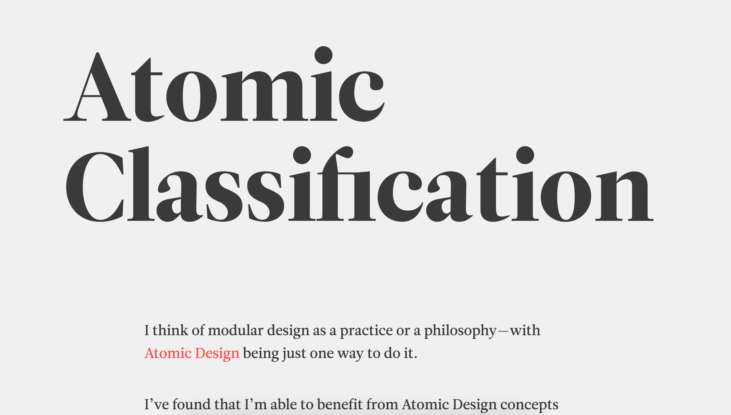
Notice how the title caught and retained your attention. It refuses to redirect your attention to the main content of the page.
This example doesn’t mean you shouldn’t use a large font-size. It just means you need to be deliberate about how you create contrast. Look at Trent’s original design and see how he pulled it off beautifully.
The key is to create a way to redirect a reader’s attention from the attention-grabbing element to the text you want them to read.
Balancing contrasts
The six ways mentioned above can be used to decrease contrast as well. For example, notice how I used a light gray text in this example below:
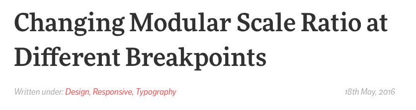
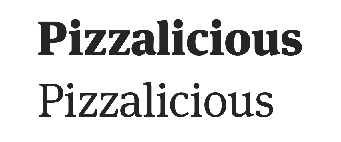
You can increase and decrease contrast at the same time too. One example is to use a lighter font-weight when you use a larger font-size.
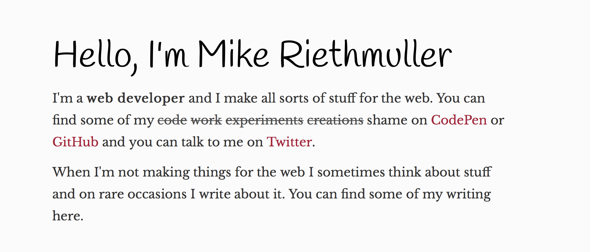
Before we wrap up, here’s another example where Mike Riethmuller adds enough contrast to his header such that it stands out completely from the body text without being overbearing.
Notice your eyes get drawn first towards the title, then it moves automatically towards the text.
Wrapping up
You learned about the Principle of Contrast and how to apply it to typography in this lesson. You learned:
- What the Principle of Contrast is.
- How contrast affects human psychology
- How to apply the Principle of Contrast to typography
Remember, always be bold with your contrast, but don’t go overboard. If you find a reader (or yourself) focusing on anything other than what you want them to, then you know something needs tweaking.
Exercise
The Principle of Contrast adds a realm of possibilities for your typography. Try creating three subheader styles. Start by applying contrast to your typography in each of the six ways mentioned above:
- Change the font-size
- Change the font-weight
- Change the font-style
- Change the typeface
- Change the color
- Change word to uppercase, title case or lower case
Then, try combining two or more contrast-changing properties at once. Remove any assumption why things might not work when you do so. You invariably create the best contrast when you’re not consciously trying to control it.
Next up
Next up, I’ll show you the third principle — the Principle of Alignment.
Welcome! Unfortunately, you don’t have access to this lesson. To get access, please purchase the course or enroll in Magical Dev School.
Unlock this lesson