Welcome to Module 2. In the previous module, you learned about the fundamentals of setting typography on the web.
In this one, we’ll dive into four design principles and how you can use them to improve both your design and typography skills. These four principles are:
- Repetition
- Contrast
- Proximity
- Alignment
In the following four chapters, we’ll understand what each principle is, how they work and how to apply them in typography.
Let’s kick off with the Principle of Repetition since you’ve heard about it in the previous two lessons.
What is the Principle of Repetition?
Repetition means to increase the occurrence of one or more aspects of the design. Anything can be repeated.
Some examples are:
- a typeface
- a font weight
- a font size
- a color
- a line
- a shape (like circle, square or triangle)
- etc.
We’ve already applied the Principle of Repetition to many elements since the beginning of this course.
For example, we’ve repeated the use of typefaces (Helvetica in this case), the color (black), and font-weight (normal) to paragraph text so far.
We also used the Principle of Repetition in advanced ways through Modular Scale and Vertical Rhythm.
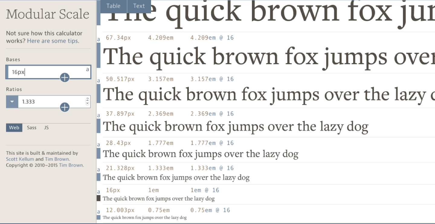
When we use Modular Scale, we repeat the relationship between font-size of different text elements through a common ratio.
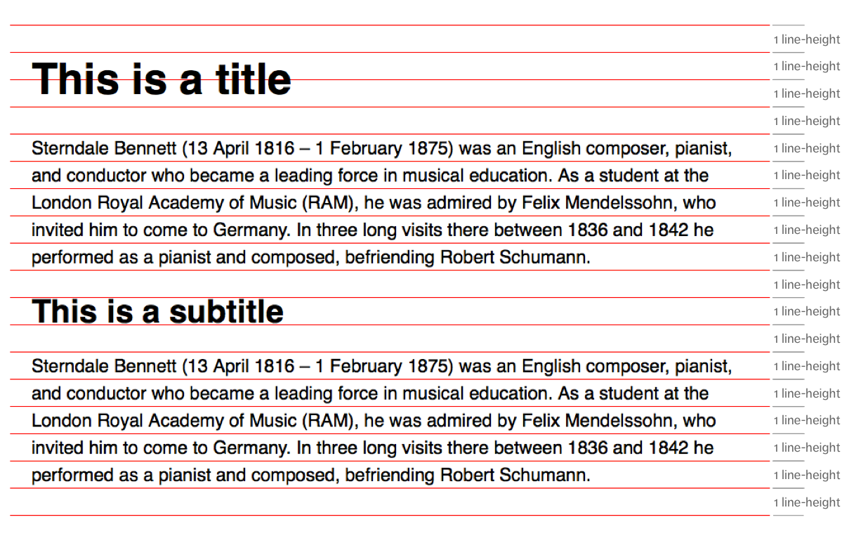
When we use Vertical Rhythm, we repeat the amount of white space between elements:
Repetition is important because it breeds familiarity. The more we see an object, the more we know it, the more we feel safe and comfortable.
Making readers comfortable is important. It’s to first step to allowing them to put away any distractions to focus on the text.
Let’s illustrate the idea of “comfortableness” with an example. Imagine you see one lonely circle in a design.

Notice what you are thinking. Notice what you feel.
Your head is probably full of questions if you only see a circle on the design. Some questions may include:
- What is this circle here?
- What is it supposed to do?
- What does it mean?
- What is the design trying to say?
- Does the color mean anything?
- Will anything happen if I wait for a while? Will it change?
- Will anything happened if I moused over it?
- Will…
You feel anxious, and you frantically search for an answer to this mysterious circle, consciously or unconsciously.
Unfortunately, you’ll never find coherent answers to your questions. You can’t verify the answers you came up with. As a result, you feel unsettled.
This behavior is normal. It’s an automatic reflex that’s triggered by the oldest part of the brain — the amygdala. Some people affectionately call it the lizard brain.
The lizard brain is there to make sure we stay alive. It enters into a fight or flight situation whenever it senses anything unexpected or unfamiliar. We can’t control the initial reflex and emotional impulses. This process happens before it cedes powers to the cognitive parts of the brain (the newer parts) where we think logically.
So, if you want your design to be any good, you need to surpass these natural defense mechanisms that the we throw up naturally. It means you need to make your readers comfortable before they can even begin to think.
Yes, the danger may be non-existent when you’re safely in front of your computer screen. But the fact doesn’t change, you mind is still pretty active, isn’t it?
Now, watch what happens if we add a few more circles to the group.

Again, the same questions run through your head, but they don’t seem so out of place anymore, don’t they?
The intensity and speed of your questions are reduced. You may also become more curious about these circles as you try to see a pattern.
See what happened here?
Without conscious effort on your part, the lizard brain has declared that the circles are safe, and it cedes control to the cognitive parts of the brain. You become comfortable enough to begin poking around the design.
Now, watch what happens again if you add even more circles into the picture.
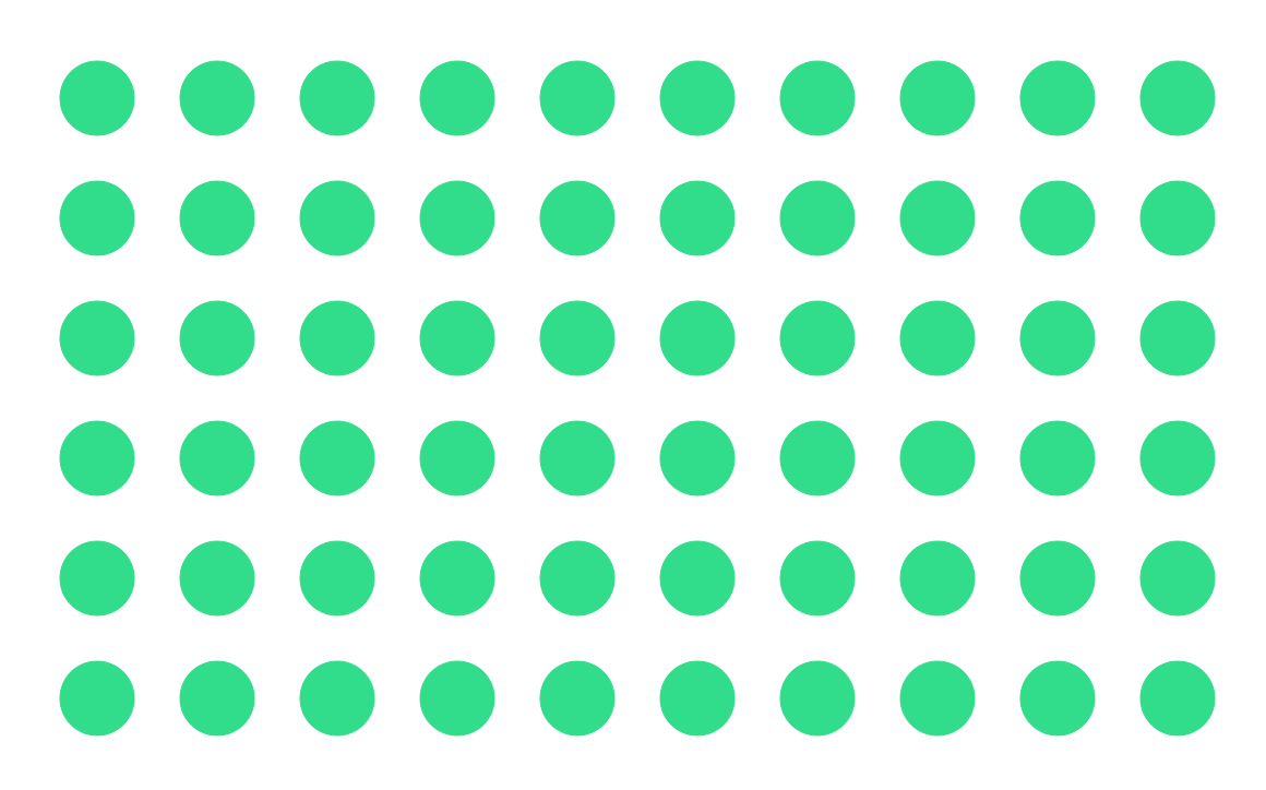
Oh, they’re just circles.
Your mind has settled on an answer. You see that these circles are just a pattern. Someone has orchestrated the pattern carefully. It’s there for a reason. You may not necessarily know what it’s for, but you feel safer.
That’s exactly what we’re trying to achieve with good typography. We want to make the reader so comfortable with the text that they can put their mind on reading the content.
Unfortunately, it can become so safe that it’s boring. Your brain switches off and goes in search for something more interesting.
Just imagine if all your headers, subheaders, and text use the same font-size and font-weight.
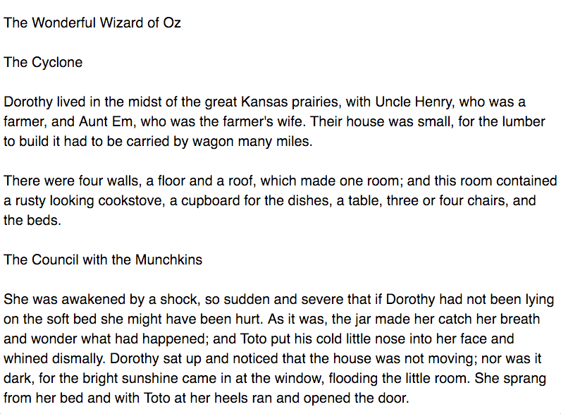
Boring! You wouldn’t want that, would you?
There are two ways we can retain a readers’ visual interest to keep him engaged.
The first way is to vary attributes of the object, (like font-size, font-weight, colors, etc of the headers). This method uses the Principle of contrast which we’ll cover in the next lesson.
The second way is to vary spaces around the object so readers get a sense of the relationship between elements on a page. This method draws on the Principle of Proximity which we’ll cover in the lesson after.
For the remaining of this chapter, let’s look at various ways we can apply repetition to Vertical Rhythm and Modular scale and why they work.
Varying repetitions in vertical rhythm
So far, you’ve learned that you can vary the leading of elements by using half or even quarter multiples of the baseline.
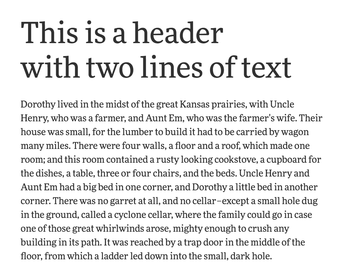
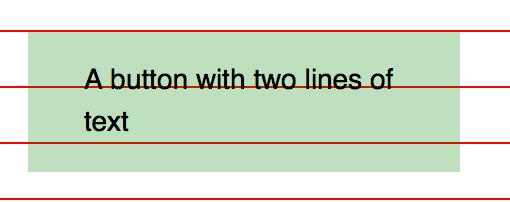
The reason we can use half or even a quarter of the baseline as a repetition is because half and quarters are subsets of the main repetition (the leading). The lowest common denominator of all repetitions is 7px.
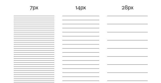
You don’t necessarily need to use halves or quarters. You can even use thirds. The key is to make sure the repetitions you choose are consistent, and they disrupt the main repetition as little as possible.
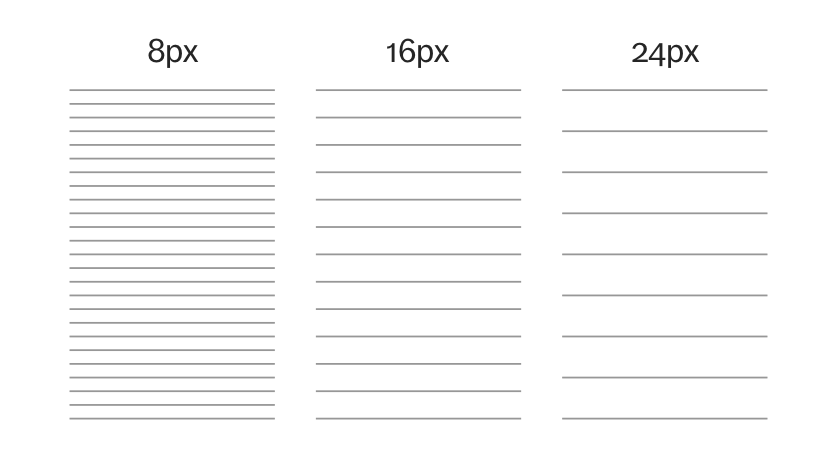
Don’t reduce the variations too far to a point where you use 1px or 2px variations. They’re too small. You need to make sure there’s enough contrast even when repeating the objects or you’ll get the opposite effect. We’ll discover why this is so in the next lesson.
Varying repetitions in modular scale
So far, our understanding of Modular Scale is that you’ll pick one base and one ratio, and you repeat the ratio to get your scale. There’s only one repetition in this process.
However, as you’ll discover in later lessons, you’ll sometimes need to vary your repetitions to make the Modular Scale more flexible for responsive websites.
When this happens, you can vary the scale by adding another base, or another ratio.
Let’s say you decided to use a base of 20px and the Golden Ratio as your ratio of choice. If you add another base, say 30px, you’ll get a scale like this:
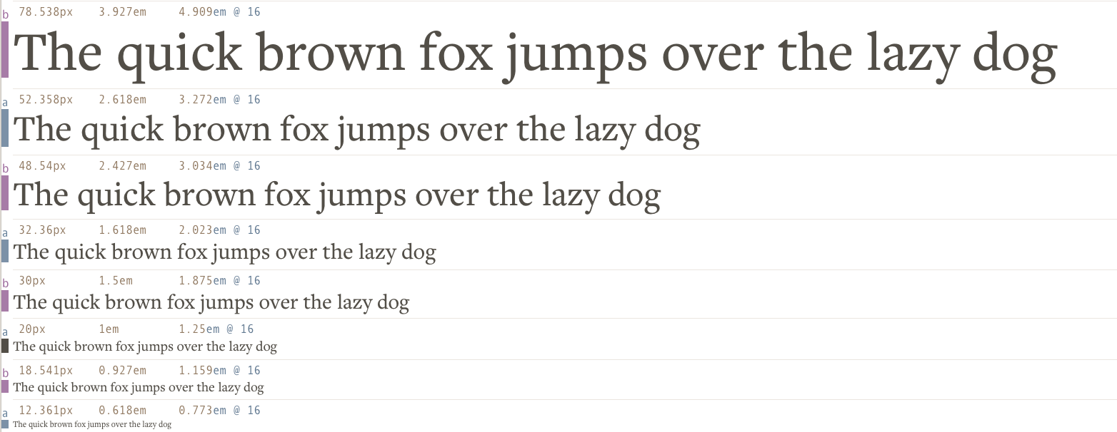
If you add another ratio, say 1.3333, you’ll get a scale like this:
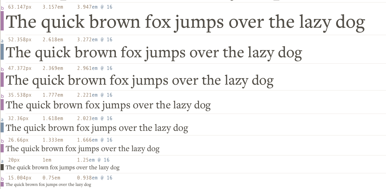
Both methods work because we’re adding some variety by modifying the Modular Scale. When you modify your scale, make sure you only change one variable or you might get a scale that’s completely unrelated to your text.
We’ll talk about why you’ll want to vary your Modular Scale and how to do it in the next module.
Repeating elsewhere
You can repeat anything in your design. You can repeat it anywhere. Don’t trap yourself into thinking that the Principle of Repetition can only be applied to Vertical Rhythm and Modular Scale.
The key is to experiment. Go crazy. Try anything you get your hands on and see the effects for yourself.
For example, have you thought about repeating the baseline horizontally as the padding on your components?
.component { padding-left: 28px; /* 1 baseline */ padding-right: 28px; /* 1 baseline */}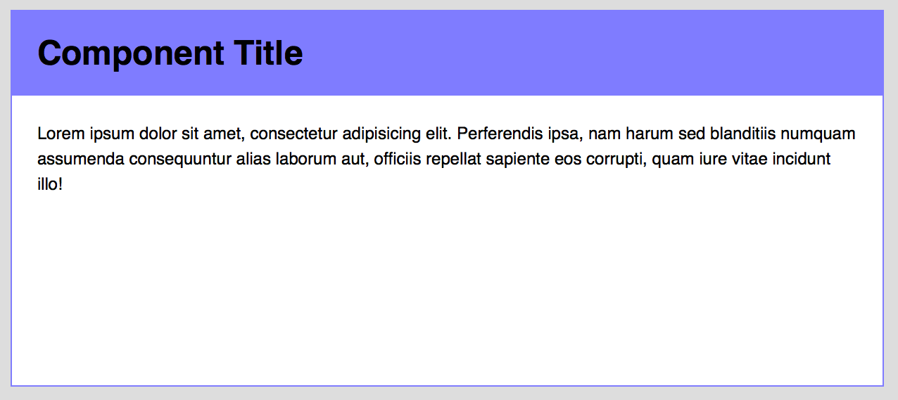
Have you thought about repeating the baseline as a gutter in your grid?
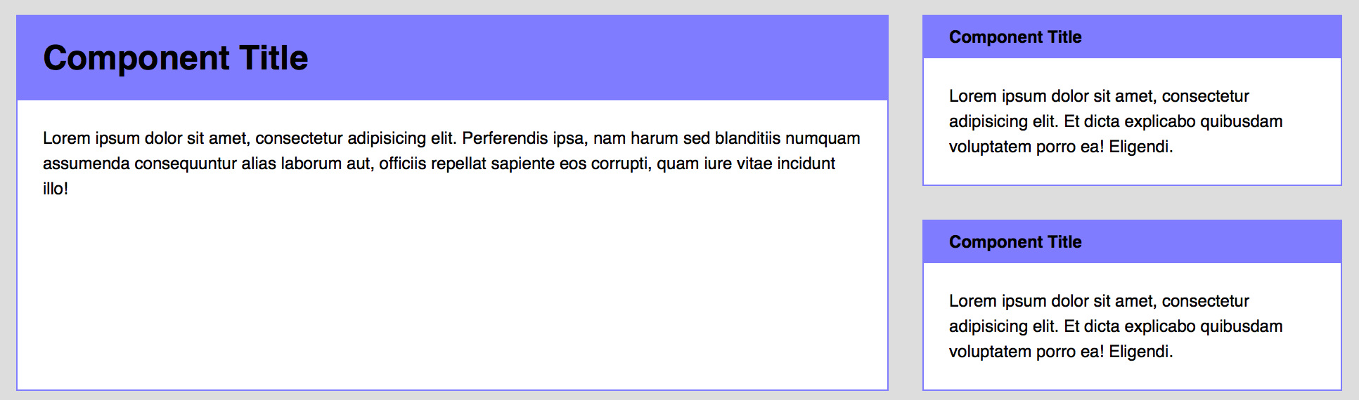
These are experiments that you can try out. Give yourself some room to play with. Design is all about experimenting. You can only learn these principles while experimenting and playing with their boundaries.
Wrapping up
In this lesson, you learned the Principle of Repetition. You found out that:
- Repetition makes people feel safe and comfortable.
- Why we can relax the rules for Vertical Rhythm in the previous chapter.
- How you can apply the Principle of Repetition to other areas in your design.
The key to grasp these design principles is to experiment. Work on the exercises. Play around and you’ll get your hands on it in no time!
Exercise
There are a few things to try in this exercise session.
- Try varying the repetitions of your baseline. See if you like halves, quarters, thirds or any other combinations
- Try varying your Modular Scale. Add a base, add a ratio and experiment with the different sizes you get.
- Find a shape and repeat it in your design. Create multiple forms of repetitions and learn to use them.
Don’t worry if you can’t get the process right straightaway. Design is a process where you fail many times while trying things out. The key is to go crazy and remove any assumptions you might have.
Next up
The Principle of Repetition is the first of four design principles that we’re going through in this course. Next up, I’ll show you what the Principle of Contrast is, why it works, and how to apply it to your design.
Welcome! Unfortunately, you don’t have access to this lesson. To get access, please purchase the course or enroll in Magical Dev School.
Unlock this lesson