The term flexbox is short for flexible box, which means that the size of the flexbox can grow and shrink to adapt to the amount of free space available in its parent container. This concept was completely different from what most web developers were used to when it was first introduced, and many folks found it hard to understand.
This was because the size of a box was usually a direct reflection of the width or height values we set on it, but in a flex formatting context, the final size of a flexbox may not necessarily be that exact value you declared. Today, we have the benefit of Devtools that can break down and show you what the browser is doing when calculating the sizes of your flexboxes.
The flex property only applies to flex items and specifies the components of a flexible sizing. flex is actually the shorthand property for flex-grow, flex-shrink and flex-basis. The specification encourages you to use the shorthand instead of the individual longhand properties because the shorthand resets unspecified component values to accommodate the most common use-cases.
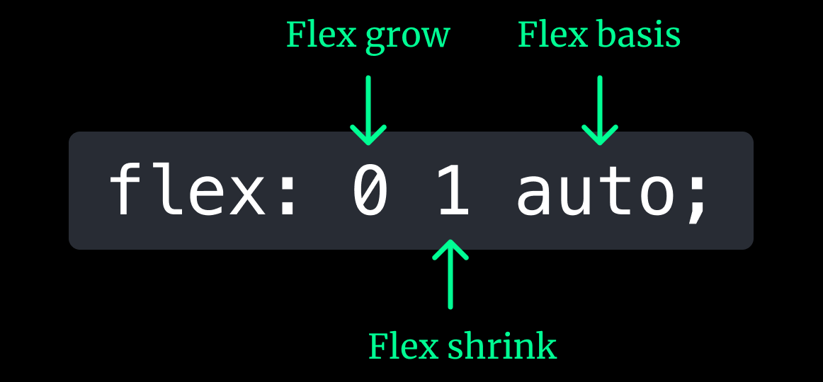
The initial value of flex is 0 1 auto, which resolves to a flex-grow of 0, a flex-shrink of 1 and a flex-basis of auto. As mentioned in CSS syntax and terminology, the use of shorthands may come with some unintended consequences if you are not aware of what values get reset, so we will have dedicated section on the flex shorthand once you get familiar with the individual longhand components.
flex-grow
This property determines how much of the available free space ought to be distributed to a particular flex item. It is only apparent when the flex container is larger than the total widths of the flex items within it, hence the available free space for distribution.
Let’s say we have 3 boxes, A, B and C, and their widths are 170px, 140px and 160px respectively. These 3 boxes live within a parent container of 800px. Which means there is 330px of free space within that container.
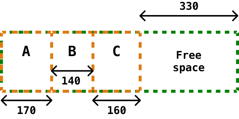
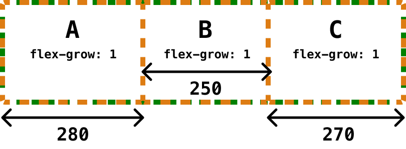
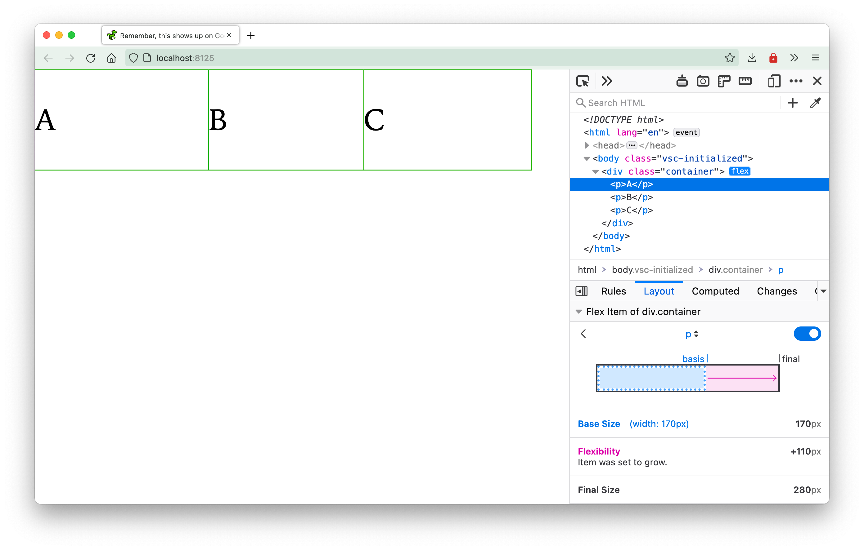
In a flex formatting context, how this extra 330px is distributed between the 3 boxes is determined by the flex-grow value. It is a number value that determines the flex grow factor of a flex item. If all 3 boxes have a flex-grow of 1, then they each an equal amount of free space and end up with an extra 110px each.
Or if you only want space evenly distributed to the first 2 boxes but none to the last, you would set the flex-grow for A and B to be 1 and leave C alone, which would give A and B an extra 165px each and C would not grow at all.
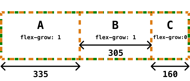
It is important to understand that the flex grow factor impacts the amount of extra free space distributed and not the size of the flex item directly. You can see how the browser does these calculations via Firefox Devtools.
flex-shrink
This property is very similar to flex-grow but in the opposite direction. In other words, this value determines how much a flex item should shrink so it can still fit within the bounds of its parent container. It only becomes apparent when the width of the parent container is less than the sum of all the widths of the flex items.
The calculations for how much a flex item should shrink is not as straightforward as for flex grow. For each of the flex items that needs to be shrunk:
- Multiply its
flex-shrinkvalue by itsflex-basis - Divide the resultant value by the sum of
flex-basisvalues of all the flex items - Take this value and multiply by the total amount of space that needs to be shrunk
- That final value is the amount your flex item needs to shrink by
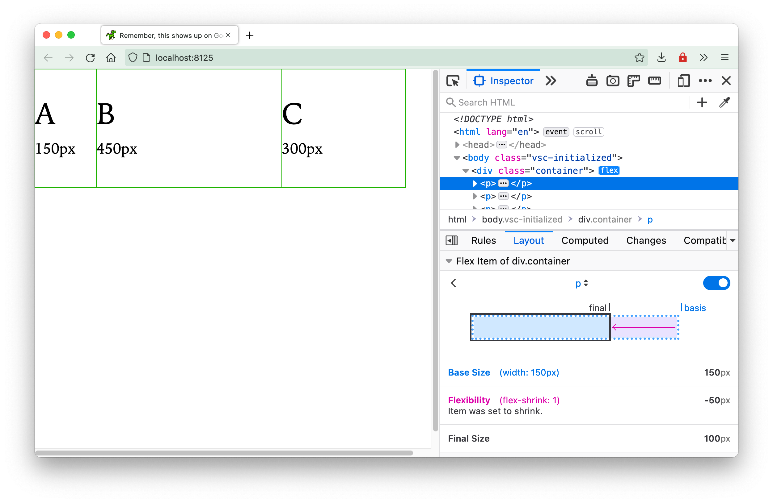
Let’s say we have a container that is 600px and our 3 flex items are 150px, 450px and 300px respectively with the default flex value of 0 1 auto. In this case, our 3 items’ calculations for the amount to shrink would look like this:
A: (1 * 150) / (150 + 450 + 300) * 300 = 50px
B: (1 * 450) / (150 + 450 + 300) * 300 = 150px
C: (1 * 300) / (150 + 450 + 300) * 300 = 100px
Again, if you have Firefox Devtools, you will be able to see the calculations up to 2 decimal points but that’s how the browser got to those values.
If you do not want any shrinking to occur, you set the flex-shrink value on your flex item to 0. This will prevent the flex item from shrinking below its original width but may result in your flex items overflowing their parent container.
flex-basis
This property is key for understanding how sizing works with flexbox. The flex-basis value determines the starting value of the flex item, which, depending on the situation, may not be the final value of the flex item.
The initial value of this property is auto, which is the width value of the flex item if one was explicitly set. If no width value was set, then this value will be whatever the size of the content is in the flex item.
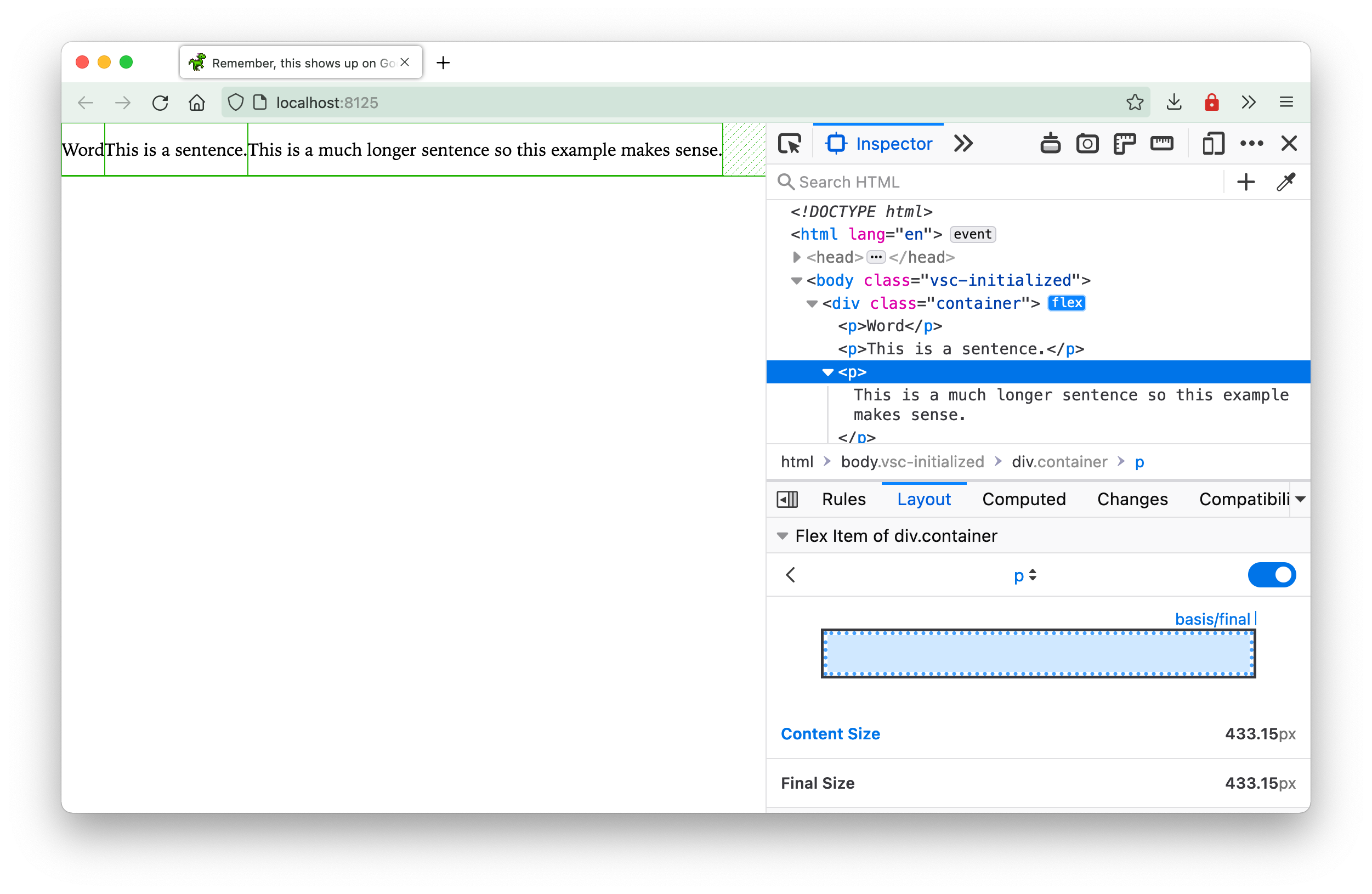
If a width value is present while the flex-basis value is set to auto, then width will be used as the starting value from which the browser calculates the final size.
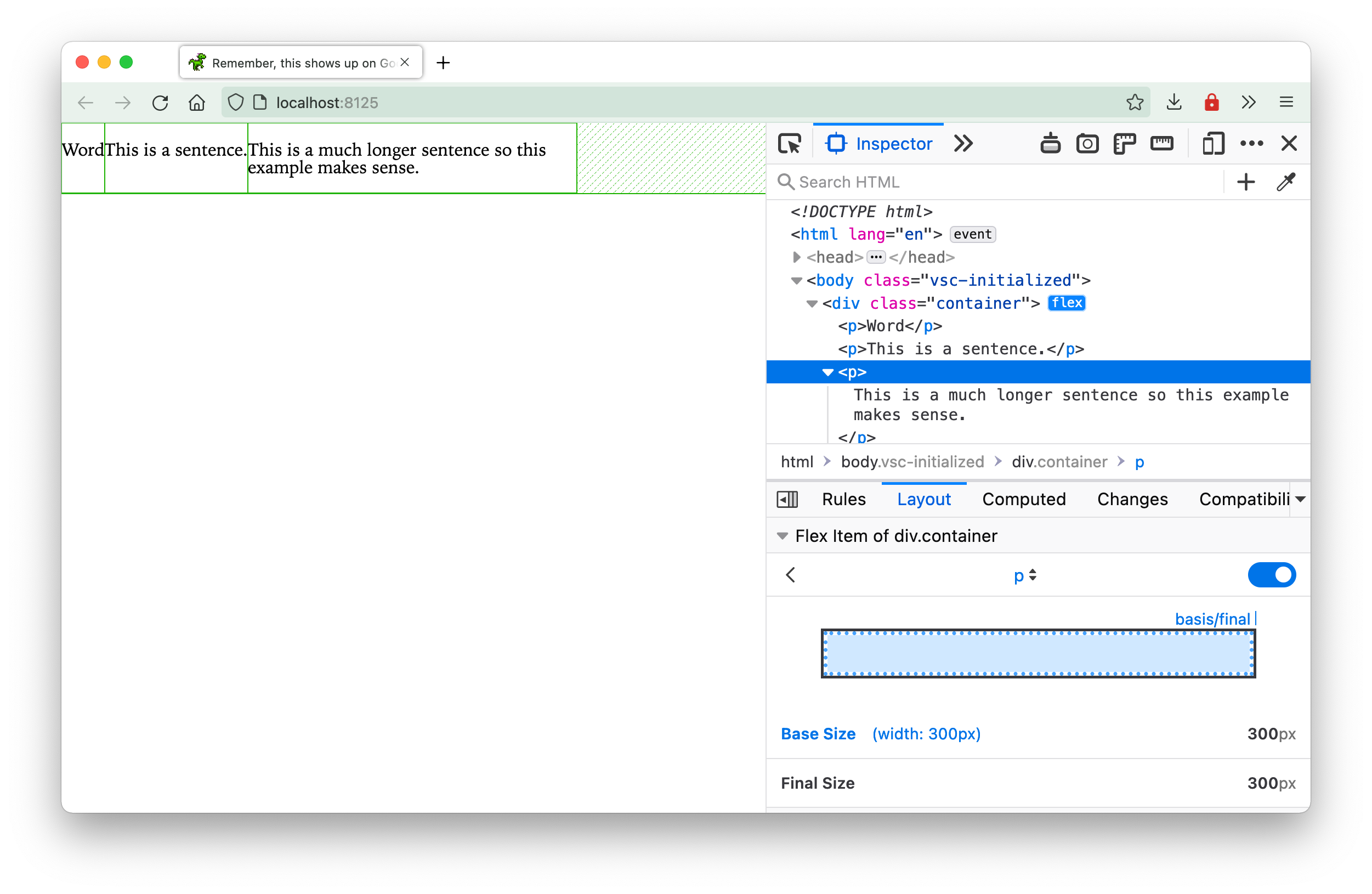
But if an explicit flex-basis value is set, then that value is used as the starting value from which the browser calculates the final size.
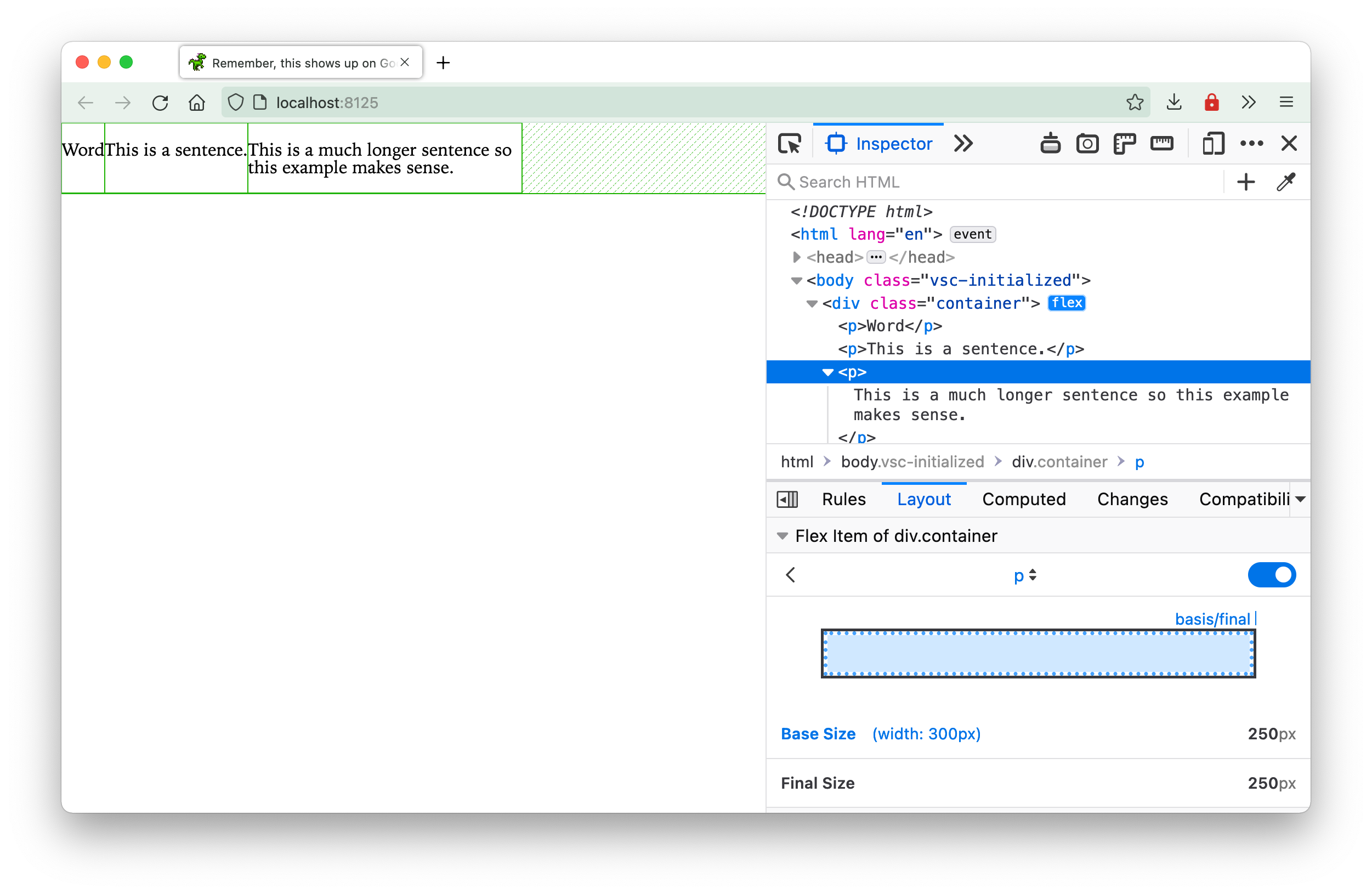
Earlier, in the flex-grow section, I mentioned that free space is whatever space is leftover in the parent container after accounting for the space taken up by the flex items. This space can either be the width of the content in the flex item, an explicit width set on the flex item or the flex-basis value.
However, there is a way to let the browser take the entire width of the parent container as “free space”. You can do this by setting flex-basis to 0. Just for comparison’s sake, this is how the browser handles flex items with their flex value set to flex: 1 1 auto:
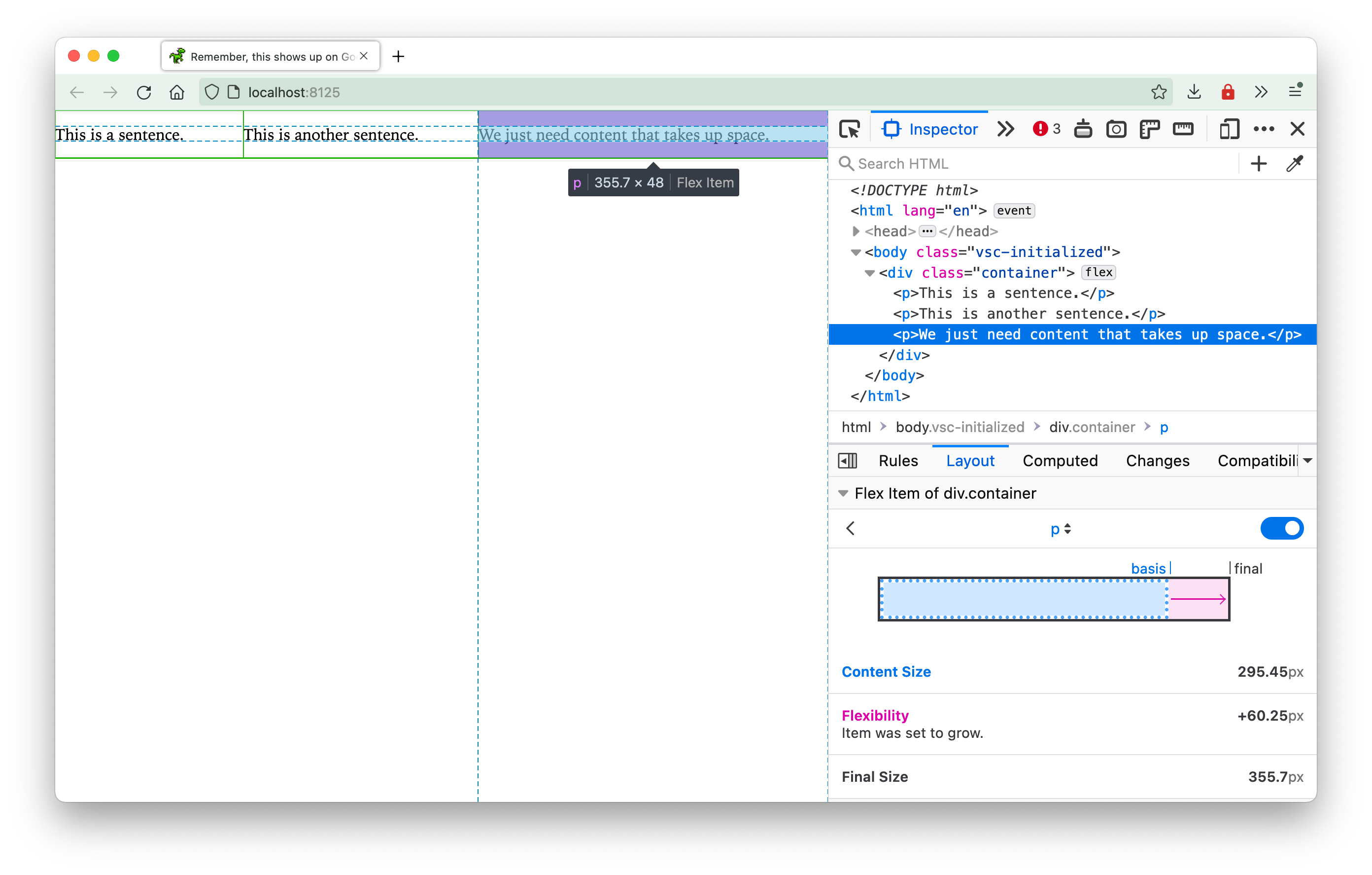
You can see that the starting size is the content size for this example. However, if you set the flex basis value to 0, the browser will use the entire width of the flex container as free space for distribution, like so:
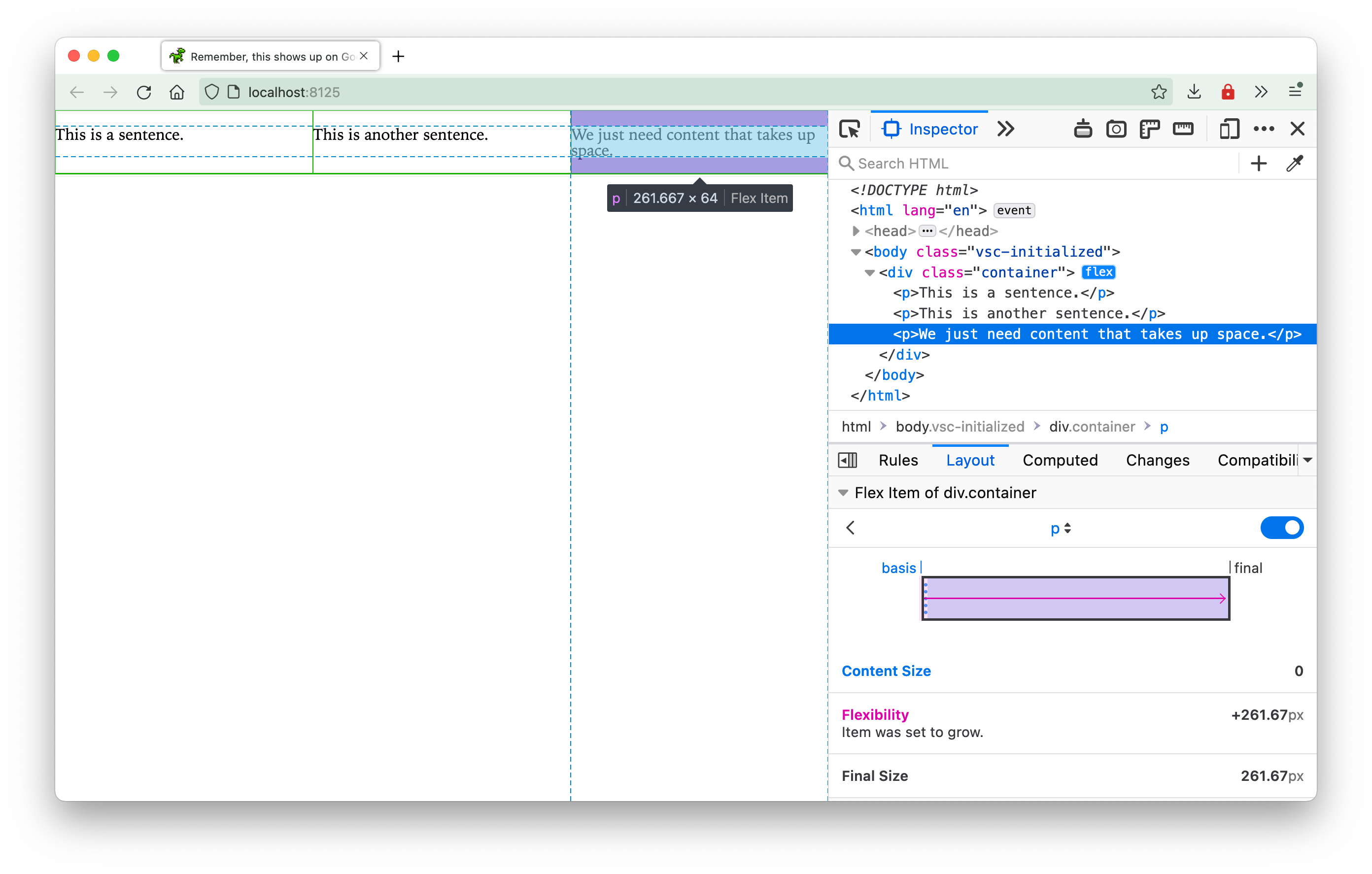
You can see that the 3 flex items end up being exactly the same width despite having different amounts of content. This is because the content width no longer factors into the final size calculation in this particular case.
Welcome! Unfortunately, you don’t have access to this lesson. To get access, please purchase the course or enroll in Magical Dev School.
Unlock this lesson