In the previous sections on block boxes and inline boxes, you might have noticed that content flow is closely related to the writing system being used.
For a language like English, text flows from left-to-right, and blocks of text are stacked top-to-bottom. So we say left-to-right is the inline direction, and top-to-bottom is the block direction. But you cannot really change this flow direction easily.
Same issue happens if you are using a language that flows from right-to-left, like Hebrew or Arabic, in that case, making your boxes flow in the opposite direction from left-to-right is very challenging as well. And bottom-to-top is nearly impossible to do.
The flex layout model introduces the concept of flex direction, that makes it possible for your boxes to flow in any of the 4 directions, not just in the directions dictated by the used writing system. This provides a lot more options when it comes to laying out content on your web page.
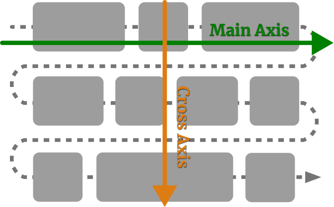
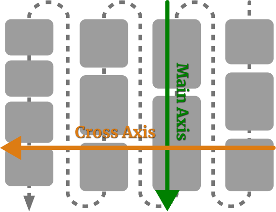
The terminology for flex directions is illustrated in the diagram below, and they are determined by the writing mode of the element in question.
In the default horizontal, top-to-bottom writing mode, flex items along the main axis flow from left to right and if they wrap, will continue down along the cross axis.
If the writing-mode is vertical, right-to-left, then the flex items along the main axis flow from top to bottom, and wrap from right to left along the cross axis.
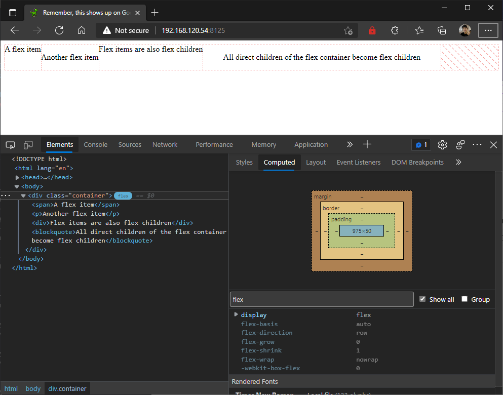
You can control the direction which the flex items are flowing via the flex-direction property. Its initial value is row. This means flex items flow along the main axis, as seen in the example below.
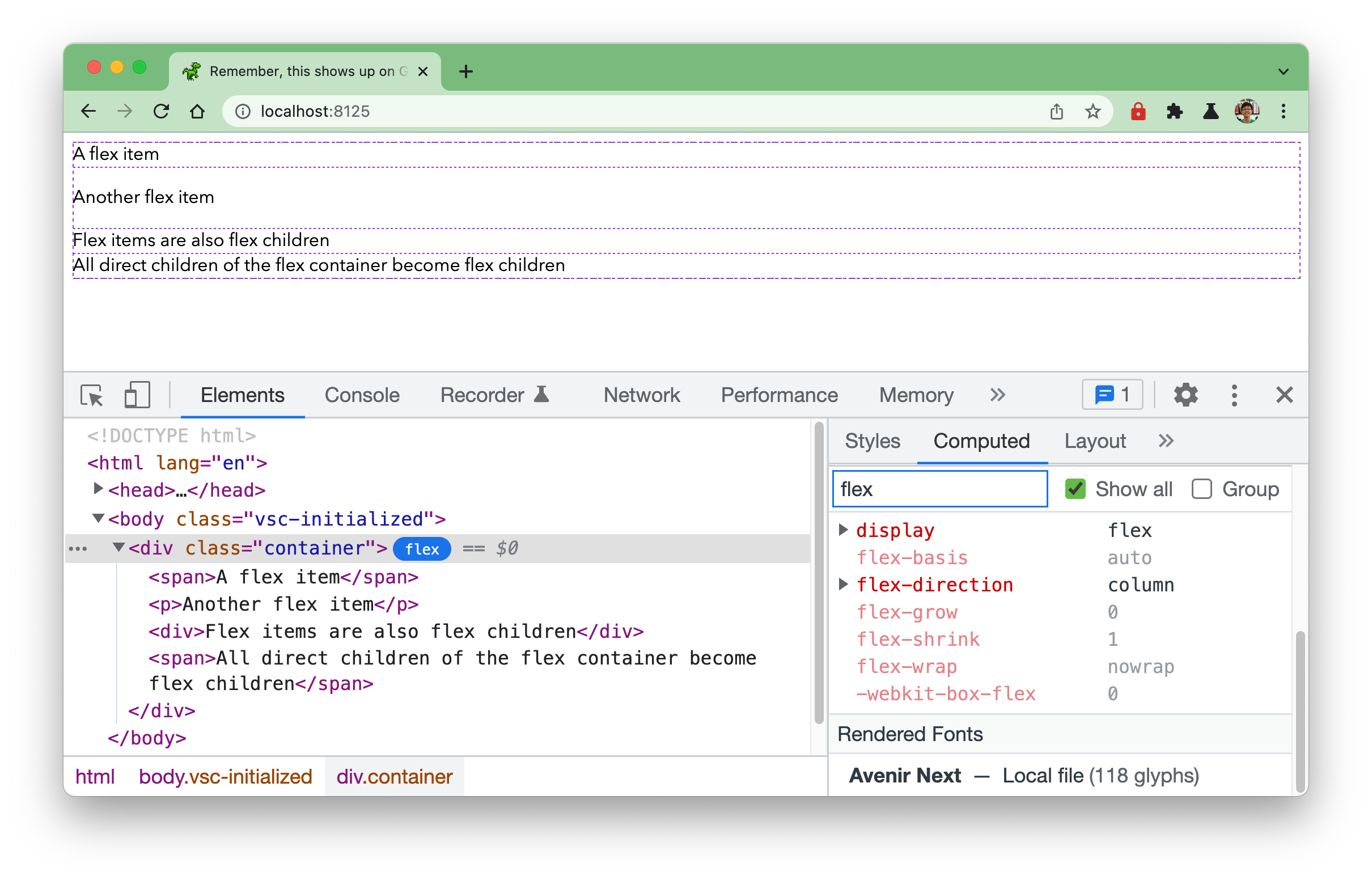
You can change the flex direction by setting the value to column, which changes your flex container’s main axis direction. The flex items now flow from top to bottom instead of left to right.
With the different writing mode directions and the ability to change the flex direction, it is possible to make your content flow in either of the 4 directions when the properties are combined in various ways.
Welcome! Unfortunately, you don’t have access to this lesson. To get access, please purchase the course or enroll in Magical Dev School.
Unlock this lesson