Similar to flex boxes, when you set the display property of an element to grid, the element becomes a grid container and its immediate children become grid items within a grid formatting context. What’s special about the grid layout model is that it allows developers to control 2 dimensions of space in which grid items can be laid out.
All other layout models on the web only provide control in a single dimension. Elements in every layout model are laid out one after another. However, other than in a grid formatting context, every element has no idea of its own position in relation to any other element around it.
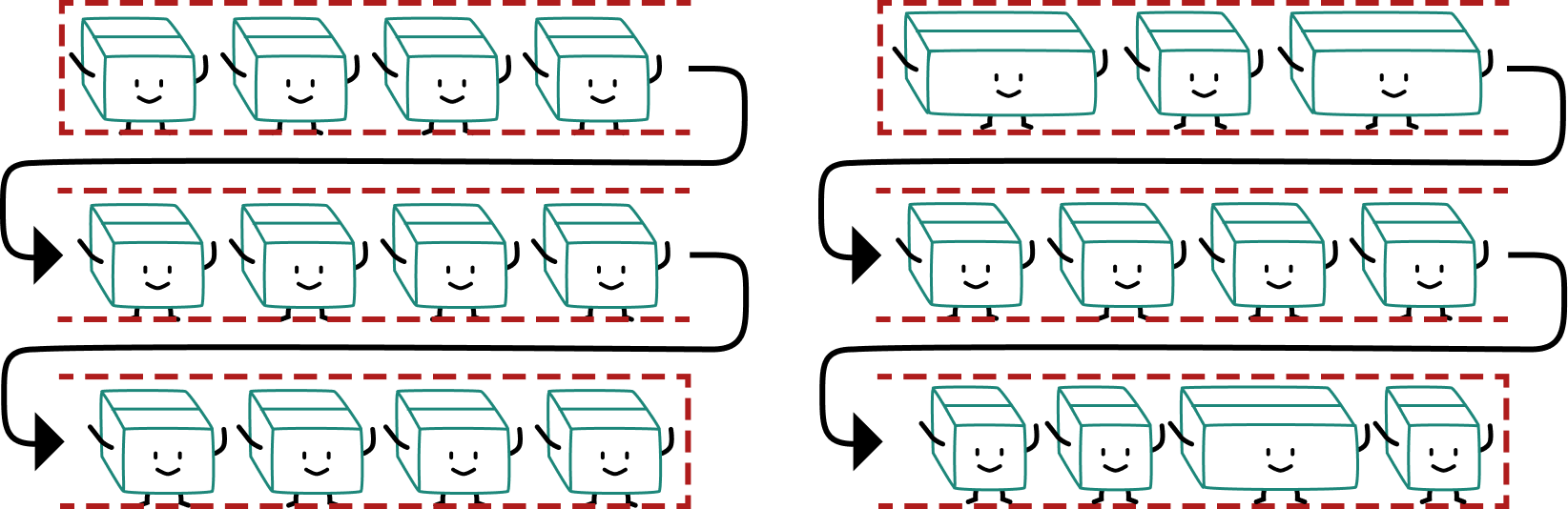
Grid systems built on these single dimension layout models rely on math to get items to line up neatly in rows and columns, however, there isn’t an actual underlying grid.
This is a large reason why there were numerous grid libraries that would do the math for you and provide you the appropriate CSS classes to apply to your elements instead.
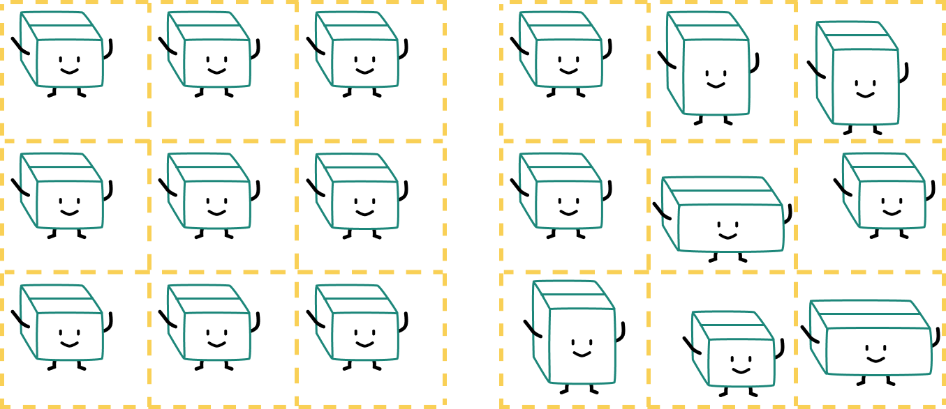
CSS grid provides an actual two-dimensional grid which you can explicitly place your grid items in based on their row and column positions. It requires the developer to have a clear picture of the entire grid’s structure and sizing so grid items can be presented in the desired manner.
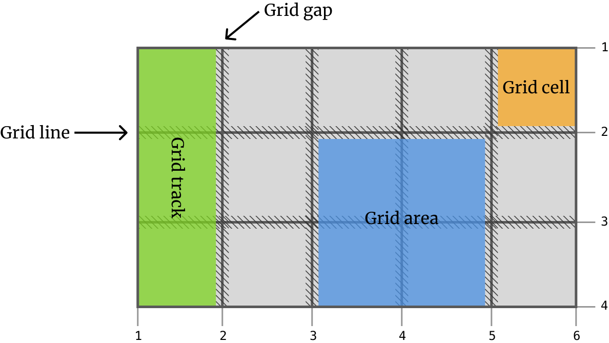
Grid uses some standard terminology to facilitate the explanation of various grid concepts, and we will be using them as well (this makes it easier to Google for when you need to as well).
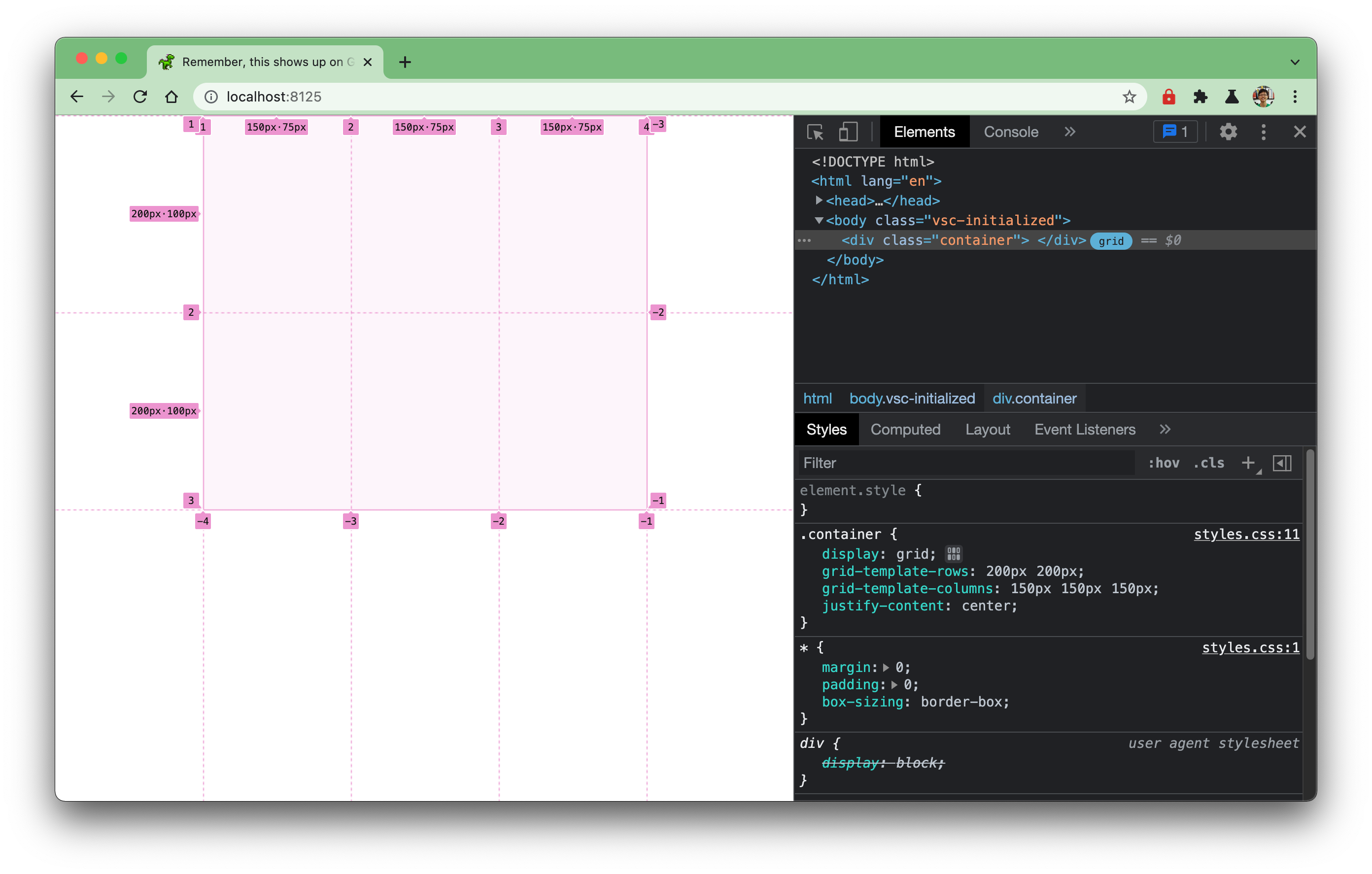
There are a couple more CSS properties required to set up a grid other than just display: grid. You also need to tell the browser how you want the rows of the grid and the columns of the grid to be set up. The most basic declaration block for creating a simple 3-by-2 CSS grid is as follows:
.container { display: grid; grid-template-rows: 200px 200px; grid-template-columns: 150px 150px 150px;}This will give you a grid that looks like this (visible in the browser once you turn on the grid overlay via Devtools). If you look at the values for the grid-template-rowsand grid-template-columns properties, you can see that they reflect the grid structure that gets rendered on the screen. 2 values for grid-template-rows give you 2 rows, while 3 values for grid-template-columns give you 3 columns. Lovely.
If you turn on the grid overlay via Devtools, you will see that each row and column are made up of numbered grid lines. This becomes useful when you want to explicitly place items in specific parts of the grid.
The browser does need to know how many rows or columns your grid should have and how big you want them to be. But that doesn’t mean you have to always explicitly declare a fixed number of rows or columns at fixed widths. The web is a medium where you often don’t know how much space a piece of content would take up beforehand, or even how much space you have to display that content.
Thinking of a design or layout as fixed goes against this nature of the web, where the canvas is almost never fixed. Web design can take references from other mediums, especially print, but it plays by a different set of rules because it is way more dynamic and interactive. Layout properties like Flexbox and Grid embrace this behaviour, and provide web developers a means to account for those unknowns without “breaking” the page’s layout.
In addition to fixed values to define the size of your rows and columns, there are also options that allow the browser to infer how to size rows and columns based on content or free space available. CSS grid was developed to cover a wide range of use cases, and so it also introduced a number of new properties and values.
Welcome! Unfortunately, you don’t have access to this lesson. To get access, please purchase the course or enroll in Magical Dev School.
Unlock this lesson