Although most grids we see used in web design are uniformly-sized, they don’t have to be. CSS grid introduces a number of new properties that make the task of defining a grid much more intuitive and straightforward than before.
Let’s use a basic scenario to illustrate how Grid is used, and better understand some of these new properties. Say you would like to have a grid with 4 equal width columns that have a 20px gap between each column. How would you go about coding this up? Maybe you could do something like this:
.container { display: grid; grid-template-columns: 200px 20px 200px 20px 200px 20px 200px; grid-template-rows: 150px 150px;}This code gives you a 7x2 grid that would look like this:
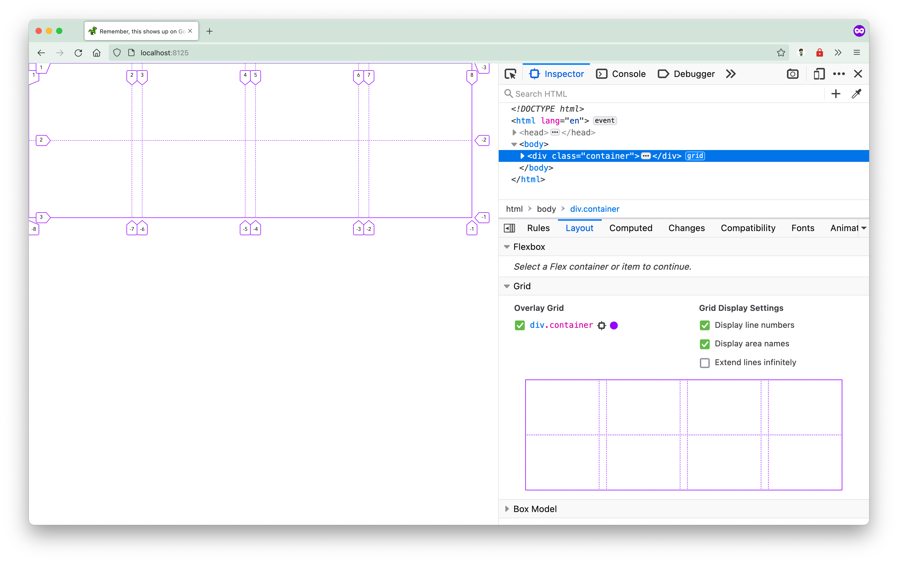
This sort of works but there are a couple issues with this approach. In this grid, the spacing between our “main” columns are actually columns themselves, which means content could get rendered in these “faux” gaps. There is a better way.
The gap property
The gaps between columns should be actual empty space, and Grid does provide a means of doing that cleanly, with the gap property.
.container { display: grid; grid-template-columns: 200px 200px 200px 200px; grid-template-rows: 150px 150px; gap: 20px;}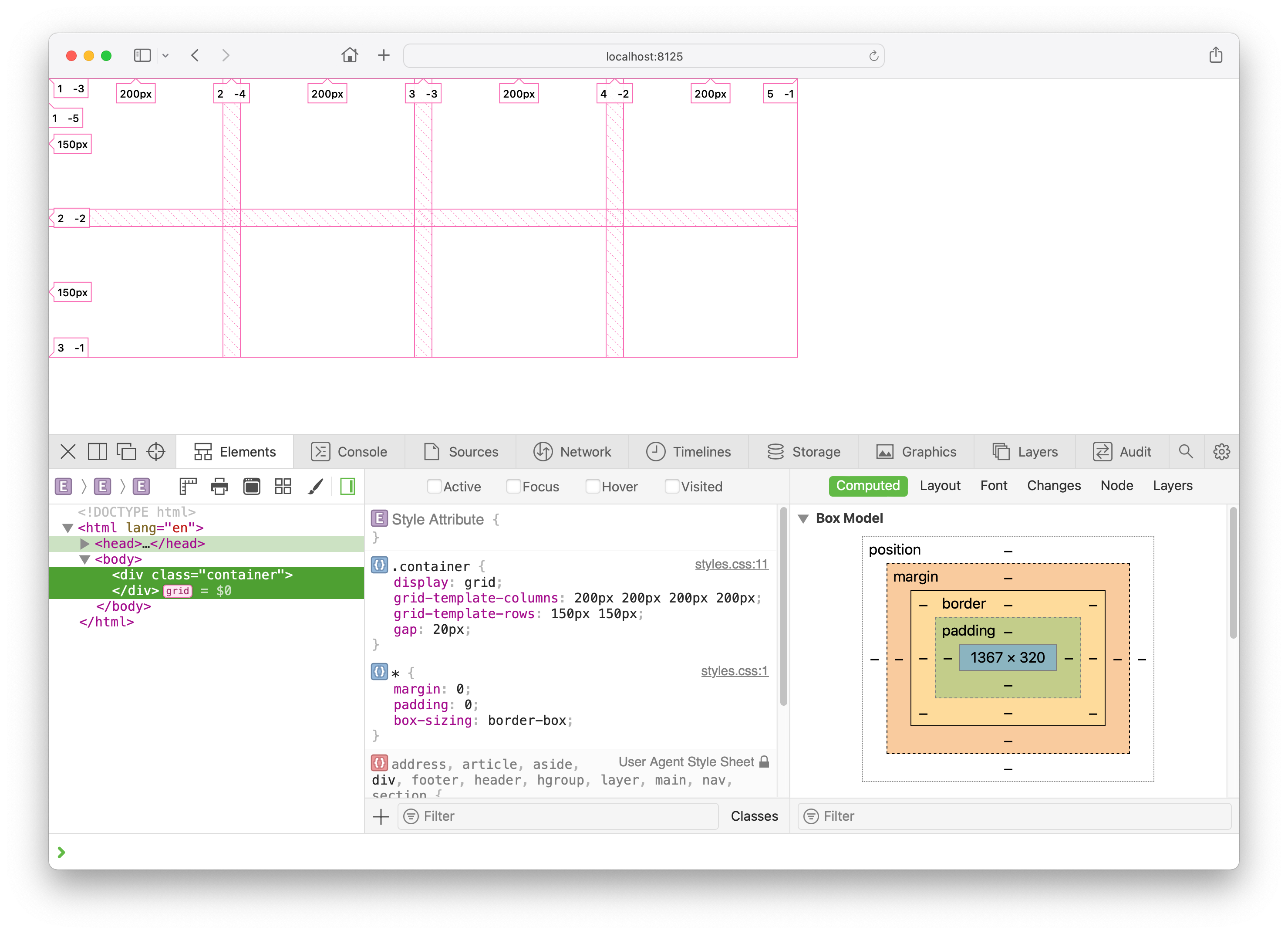
A responsive grid
The next issue is with the use of fixed values. If the viewport is any bigger or smaller than the size of the grid container, you would end up with either empty white space or having the grid overflow. You can make the column widths relative to the width of the viewport with percentages, so for 4 columns, you might try setting the column widths to 25%:
.container { display: grid; grid-template-columns: 25% 25% 25% 25%; grid-template-rows: 150px 150px; gap: 20px;}However, you would end up with a situation where your grid overflows the size of its container because the total size of the columns plus the requisite gaps have exceeded 100%. That means you would have to take into account the size of the gaps when setting the column widths.
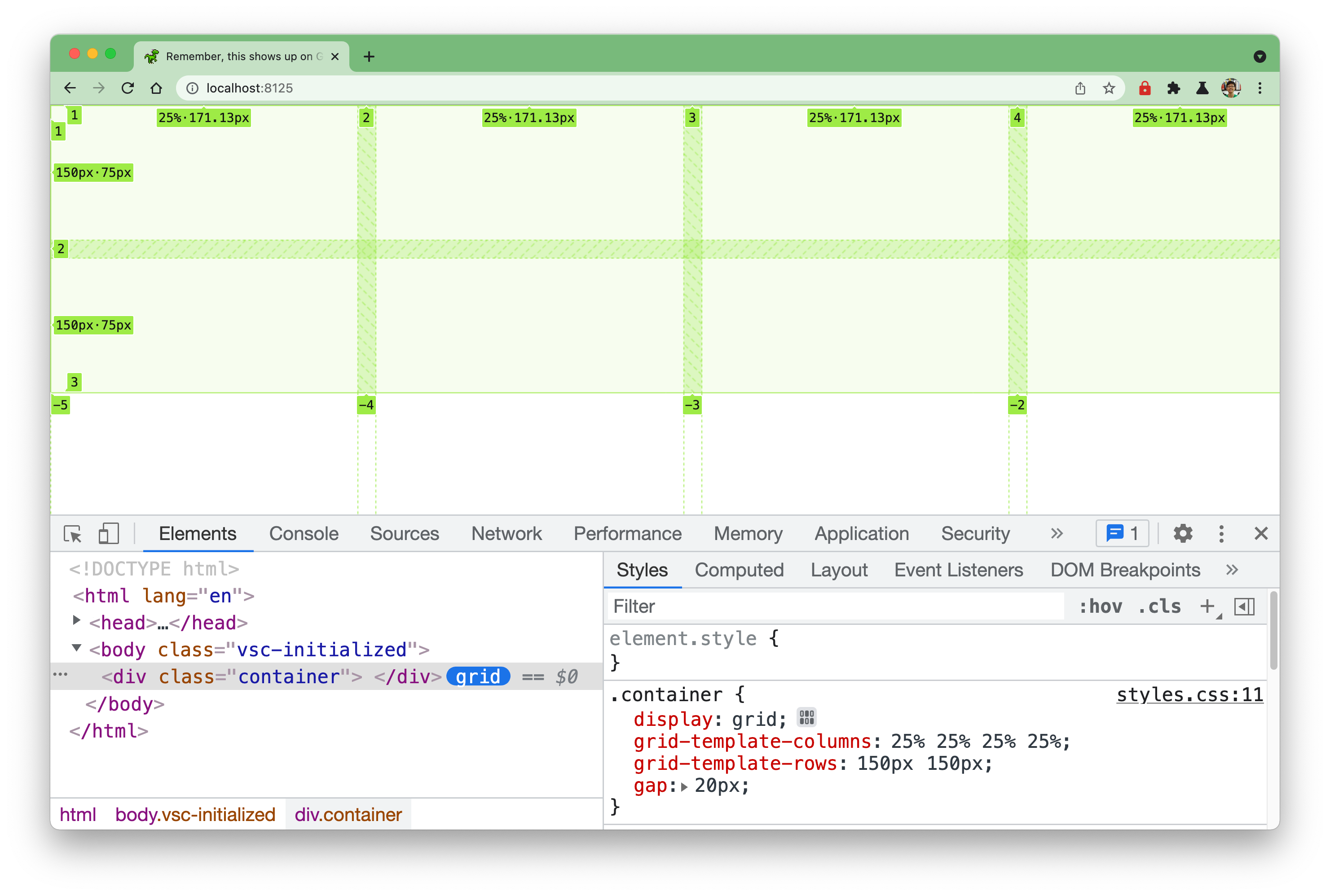
You could fix this situation manually by doing some math in your code with the calc() function. You would subtract the total width of all the 3 gaps (3 * 20px) between the columns from the entire viewport width (100%), then divide that value by 4.
.container { display: grid; grid-template-columns: calc((100% - 60px) / 4) calc((100% - 60px) / 4) calc((100% - 60px) / 4) calc((100% - 60px) / 4); grid-template-rows: 150px 150px; gap: 20px;}Finally you end up with a 4 column grid that has a 20px spacing between each column which responds to the size of the viewport.
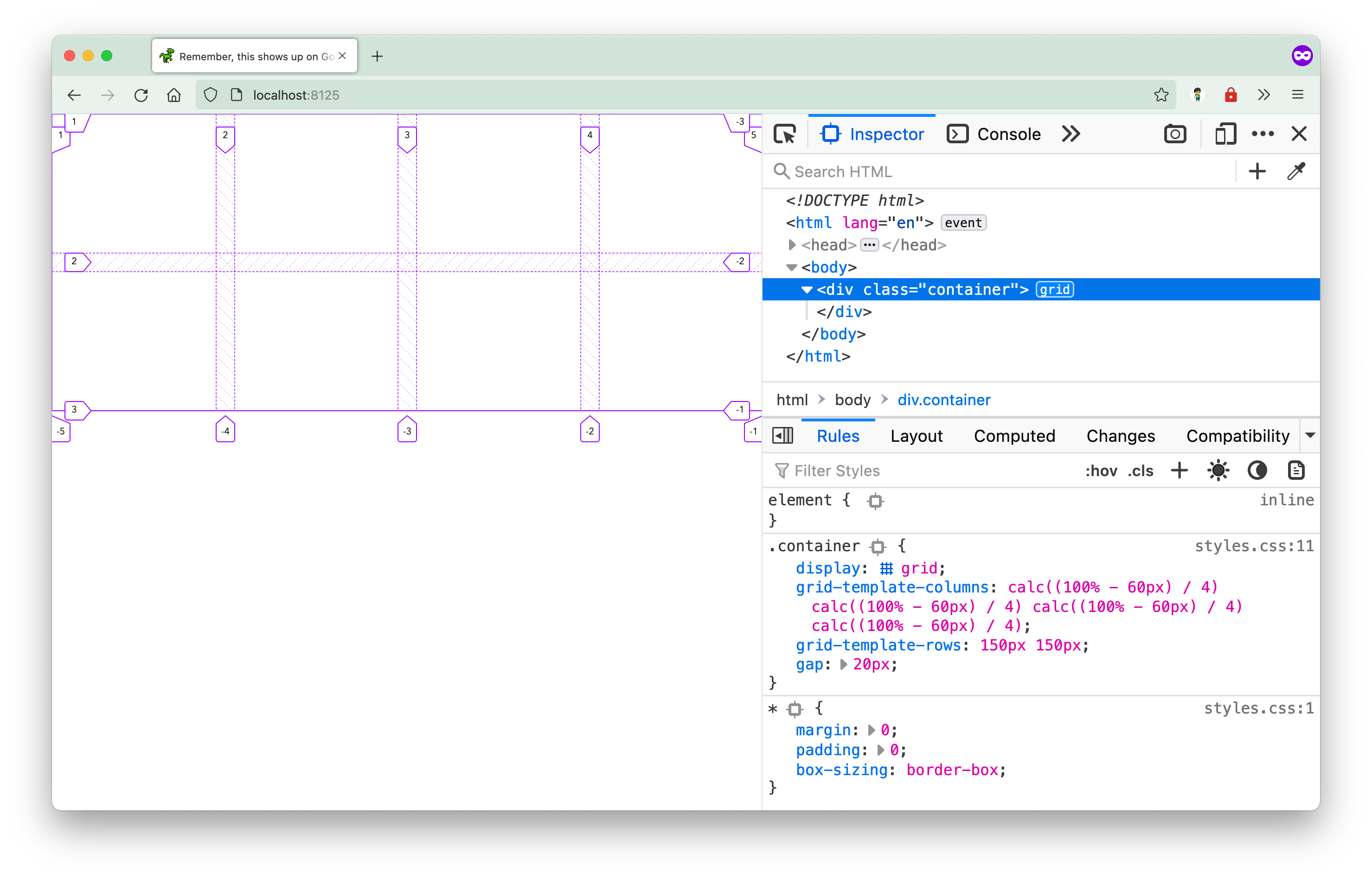
But honestly, this is not ideal. Can you imagine having to update this code with new calculations everytime you want to change the size of the gap or the number of columns?
The repeat() function
A grid with 4 columns is reasonably easy to define. But what if your grid has a lot more columns or rows? It would get rather tedious to list out all the values, especially if the column or row widths are exactly the same. In this case, you can use the repeat() function to save you from having to repeat yourself incessantly.
This function allows you to repeat patterns of grid row or grid column sizes. It takes in 2 arguments. The first argument defines the number of repetitions, while the second argument defines the pattern to be repeated. So you could rewrite the grid-template-columns value to as follows instead:
grid-template-columns: repeat(4, calc(100% - 60px) / 4);This looks slightly better, but there is still the issue of manual recalculations in the event something about the grid changes.
The fr unit
Fortunately, Grid also introduces something called the fr unit. It is a flexible length unit that represents a fraction of leftover space in the grid container. The advantage of having the browser figure out how to handle free space in the browser reduces the odds of having layouts “break” when you hit certain edge cases.
The fr unit becomes very useful in this use case because it lets the browser decide how to allocate space to each column. Instead of doing all that math yourself, you can let the browser handle that for you. Honestly, browsers are better at math than we are. So if you want the browser to allocate all the space available equally between 4 columns, you would do something like this:
.container { display: grid; grid-template-columns: repeat(4, 1fr); grid-template-rows: 150px 150px; gap: 20px;}The value repeat(4, 1fr) translates to: give 1 unit of available free space to each of the 4 columns. And you end up with a grid that looks like this:
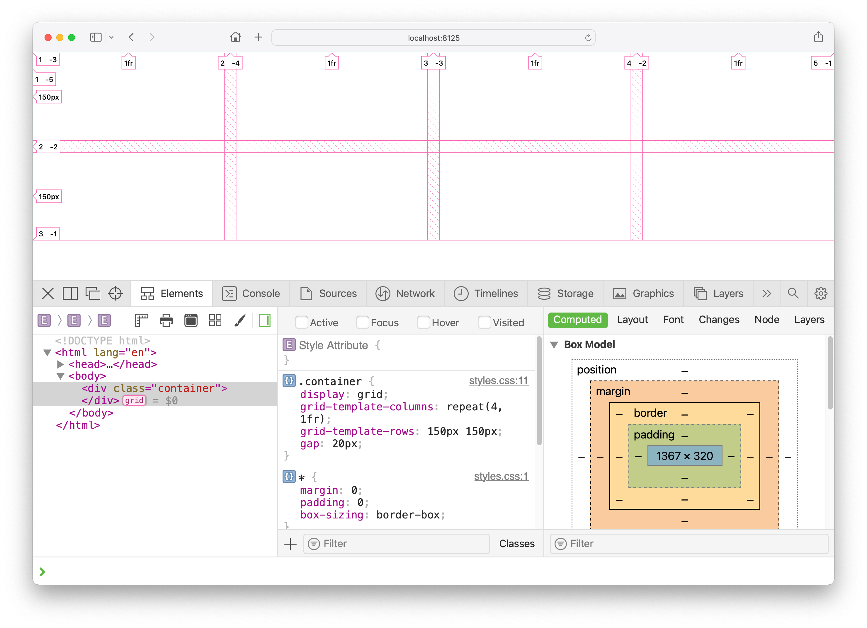
It looks exactly like the version where you used calc() but the code is much shorter and easier to write because you don’t have to do the math. We managed to cover a few of the grid-specific properties in this relatively straight-forward example and will go into more of them when we get to the chapter which dives into layout.
Welcome! Unfortunately, you don’t have access to this lesson. To get access, please purchase the course or enroll in Magical Dev School.
Unlock this lesson