The key difference between the grid formatting context and other formatting contexts is that you have granular control over exactly where you can place your grid items on the grid, very much like placing chess pieces on a chess board.
Let’s add 3 items to your responsive 8-cell grid from the previous lesson.
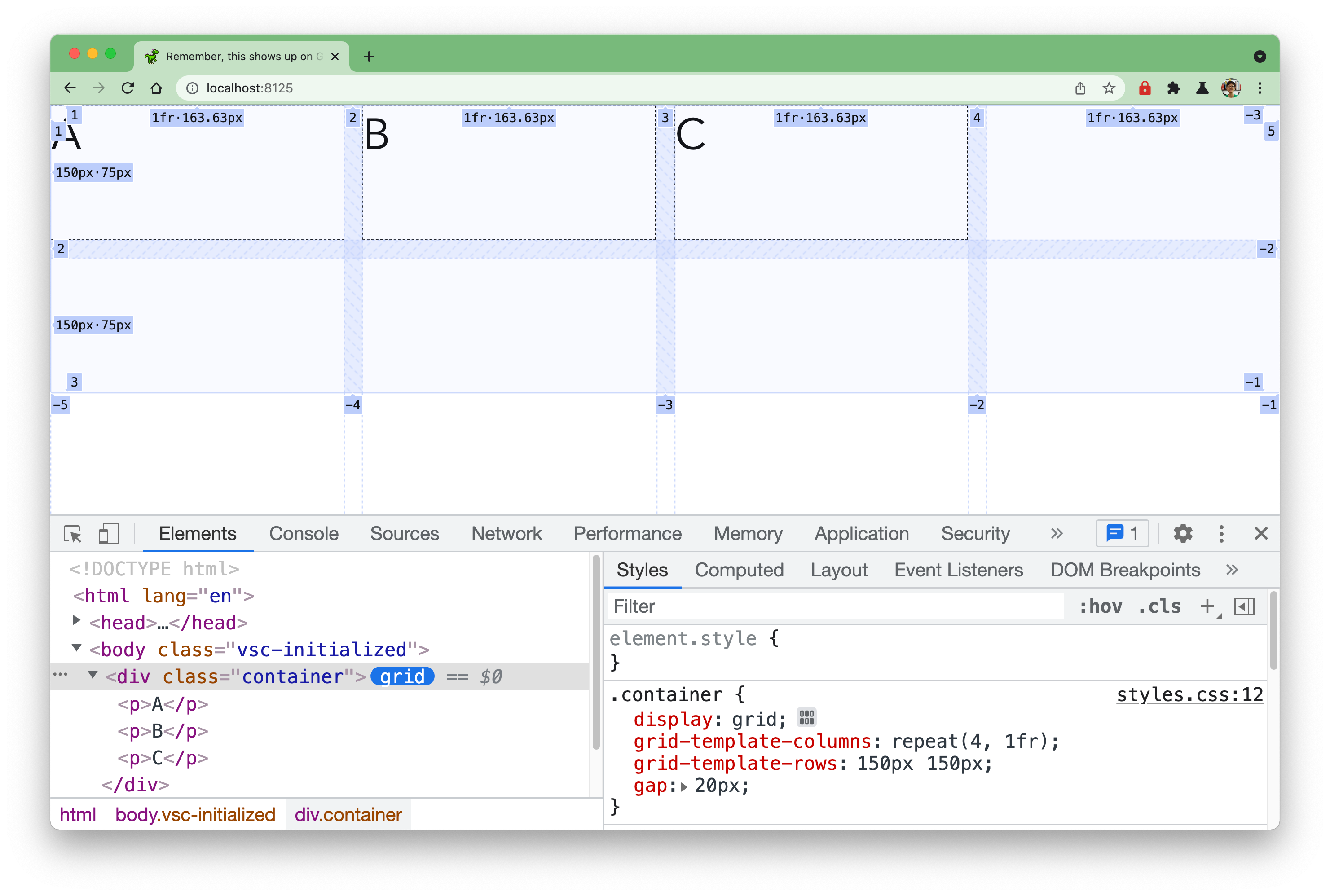
<div class="container"> <p>A</p> <p>B</p> <p>C</p></div>If you don’t explicitly place the grid items, they will fill up the grid one after another according to the writing mode direction. So the default horizontal left-to-right will look like this:
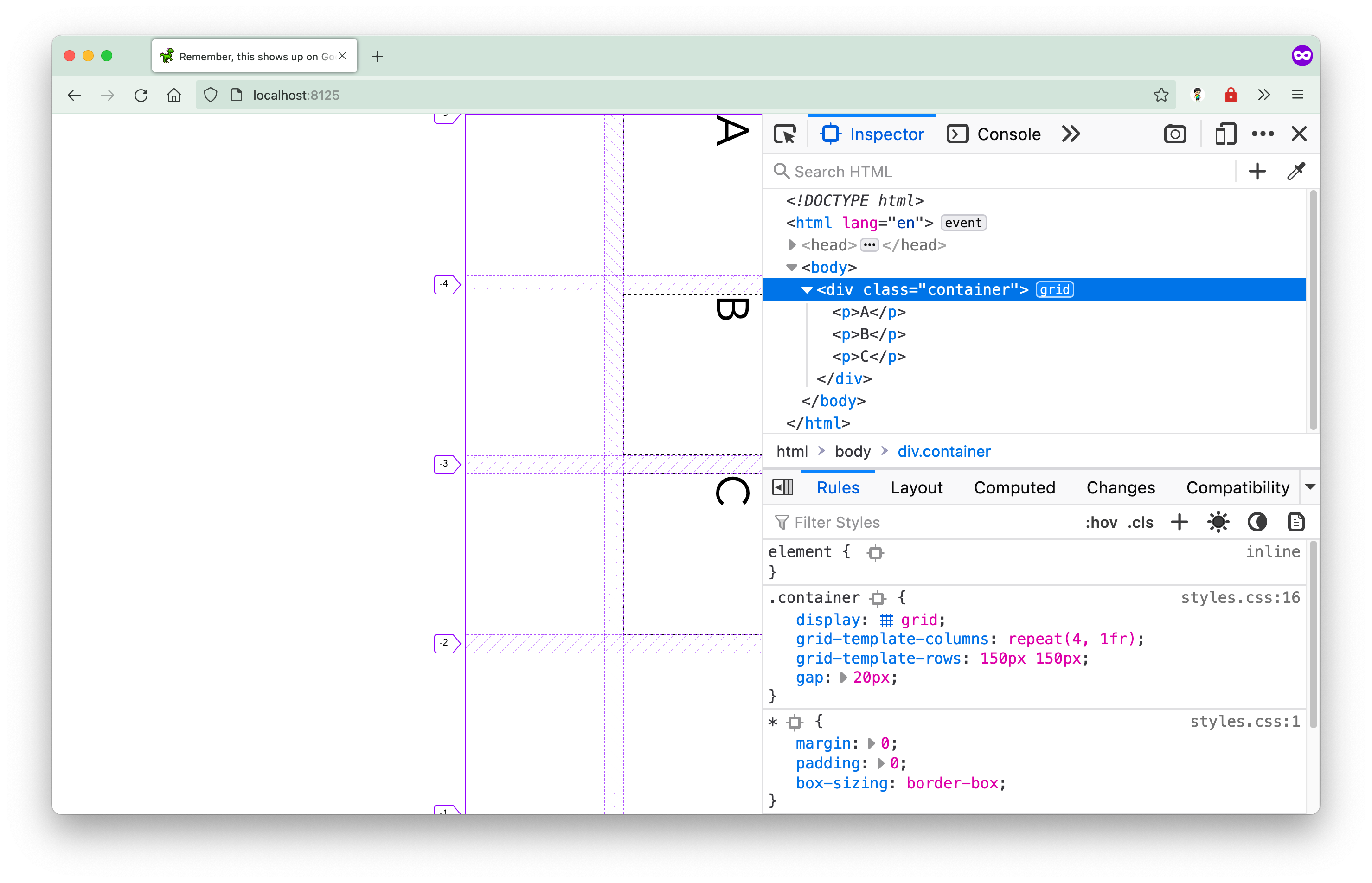
While the grid in a vertical right-to-left writing mode will have its grid items automatically placed like this:
Explicitly placing items on the grid is similar to plotting points on a graph using x and y coordinates. You would set these properties on the grid item itself, and define the position on the grid via grid line numbers.
The grid-column and grid-row properties
Let’s say you want items A and B to be on the left-most column of the grid and item C to be at the bottom-right corner of the grid. You would use the grid-row and grid-column properties on item B and C to get them to the right spots.
p:nth-child(2) {  grid-row: 2;}
p:nth-child(3) {  grid-row: 2;  grid-column: 4;}
You don’t have to do anything for item A because it’s the first item on the grid and by default is placed in the top-left grid cell. To move item B to the spot right below item A, you need to tell the browser to place it at grid-row 2.
However, because there was nothing else on that row, the browser will by default place item B in the first column even without you specifying to place it at grid-column 1. And your item will only take up the space of 1 single grid cell unless otherwise specified.
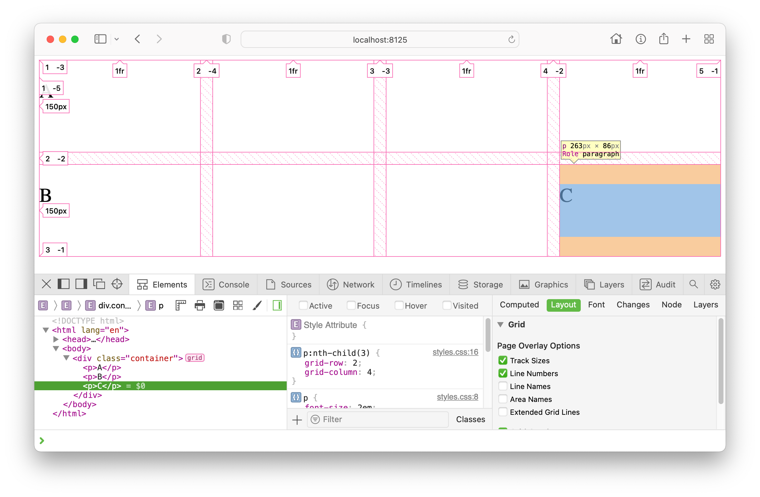
If there had been something there already, the browser would place your item in the next available empty cell. For item C, however, it is necessary to be explicit about both the grid-row and grid-column position to get it to the bottom right corner position.
Both grid-row and grid-column are actually shorthand properties. grid-row being the shorthand for grid-row-start and grid-row-end while grid-column covers grid-column-start and grid-column-end.
This makes sense, because you want to allocate your element to an area of space, which is defined by where that space’s four sides start and end. So if you want your element to span more than just the default single grid cell, you could do something like this:
p:first-child { grid-column-start: 2; grid-column-end: 4; grid-row-start: 1; grid-row-end: 3;}This tells the browser that you want your element to start on the 2nd column line and span until the 4th column line, and start on the 1st row line and span till the 3rd row line. Giving it a total area of 4 grid cells.
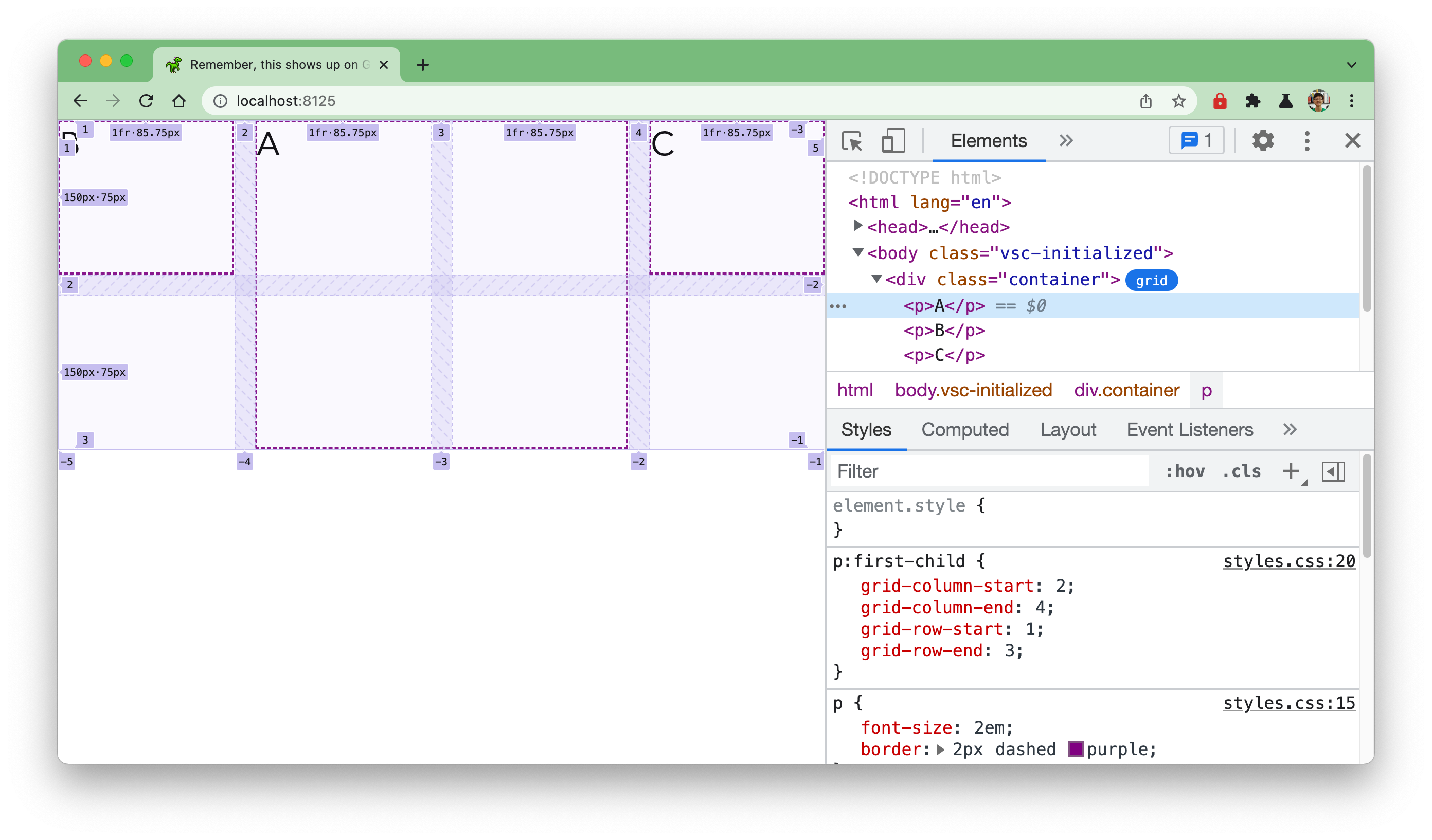
For the other 2 items which did not have any placement specified, the browser will lay them out one after another in order of empty grid cells available. So the item B ends up in the top left corner while item C ends up in the top right corner of the 4x2 grid in this example.
To specify this in a more concise manner with the grid-row and grid-column shorthands, you would do something like this:
p:first-child { grid-column: 2 / 4; grid-row: 1 / 3;}The first value for both properties indicates the start line, and the second value for both properties indicates the end line in each respective dimension.
There is a lot more to Grid (as well as Flexbox) but for now, you have the basics covered. We will continue to dive into more properties in the next section when we look at more practical examples and how the new properties can simplify our code.
One thing to remember about CSS is that there are numerous combinations of different CSS properties that can achieve the same visual effect. And there is no definitive “right” way to build something. It really depends on the context in which you are operating and the constraints you may be facing.
Welcome! Unfortunately, you don’t have access to this lesson. To get access, please purchase the course or enroll in Magical Dev School.
Unlock this lesson