When using Flexbox or Grid for laying out your boxes, you also have a variety of options for adjusting the alignment of the content within those boxes, using the box alignment properties.
For now, they will only apply to display modes that utilise the parent-child relationship. The properties that are applied onto the container will affect all the items within the container, while properties that are applied on the individual item are used for adjustments within that item only.
Box alignment properties will only have a visual effect if there is free space within the box for the content to move around.
The justify-* keyword always aligns in the inline direction or the direction of content flow. So when the text is flowing horizontally from left-to-right and down the page, justify-* will adjust your content along the horizontal axis.
If your content is flowing vertically from top-to-bottom, say when the flex-direction is set to column, then justify-* will adjust your content along the vertical axis instead.
The align-* keyword always aligns in the block direction, which is the direction perpendicular to content flow. Given there are only 2 possible axes, it might make sense to just remember what justify does, since align will always affect the other axis.
Properties for the container
There are 4 properties that can be used on the container:
justify-contentalign-contentjustify-items* (does not apply in flex formatting contexts)align-items
The justify-content / align-content properties are used to adjust the content within the parent container, provided there is extra space available around the content.
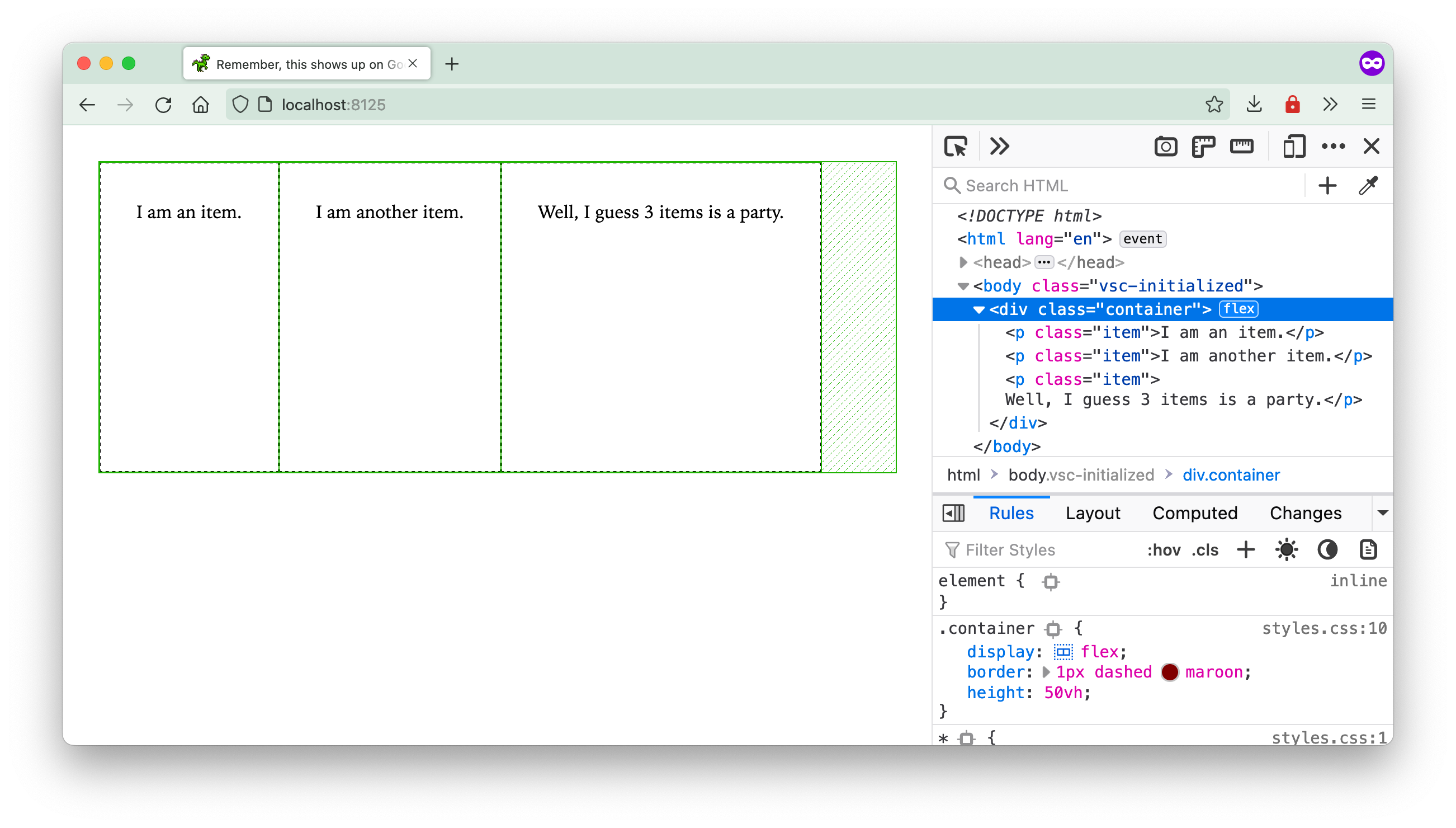
In the layout above, there is additional space on the right side of the flex container, which means we are able to use the justify-content property to control how we want this free space distributed.
The available options are:
startcenterendspace-aroundspace-betweenspace-evenly
If you are using Chrome Devtools, you will be able to see icons describing the behaviour of these values if you hover over the icon next to the display property.
As for align-content, it will take effect if there is free space along the cross-axis or block direction. If a flex or grid item does not have an explicit height set, its alignment along the cross-axis or block direction will be stretch, taking up all the free space available.
If you find that setting align-content does nothing for your layout, you might want to check if your items have already taken up all the free space available or not.
In the example below, the grid items’ height is less than the container’s height and you can use the same 6 values as justify-content to control how you want this free space to be distributed in your container.
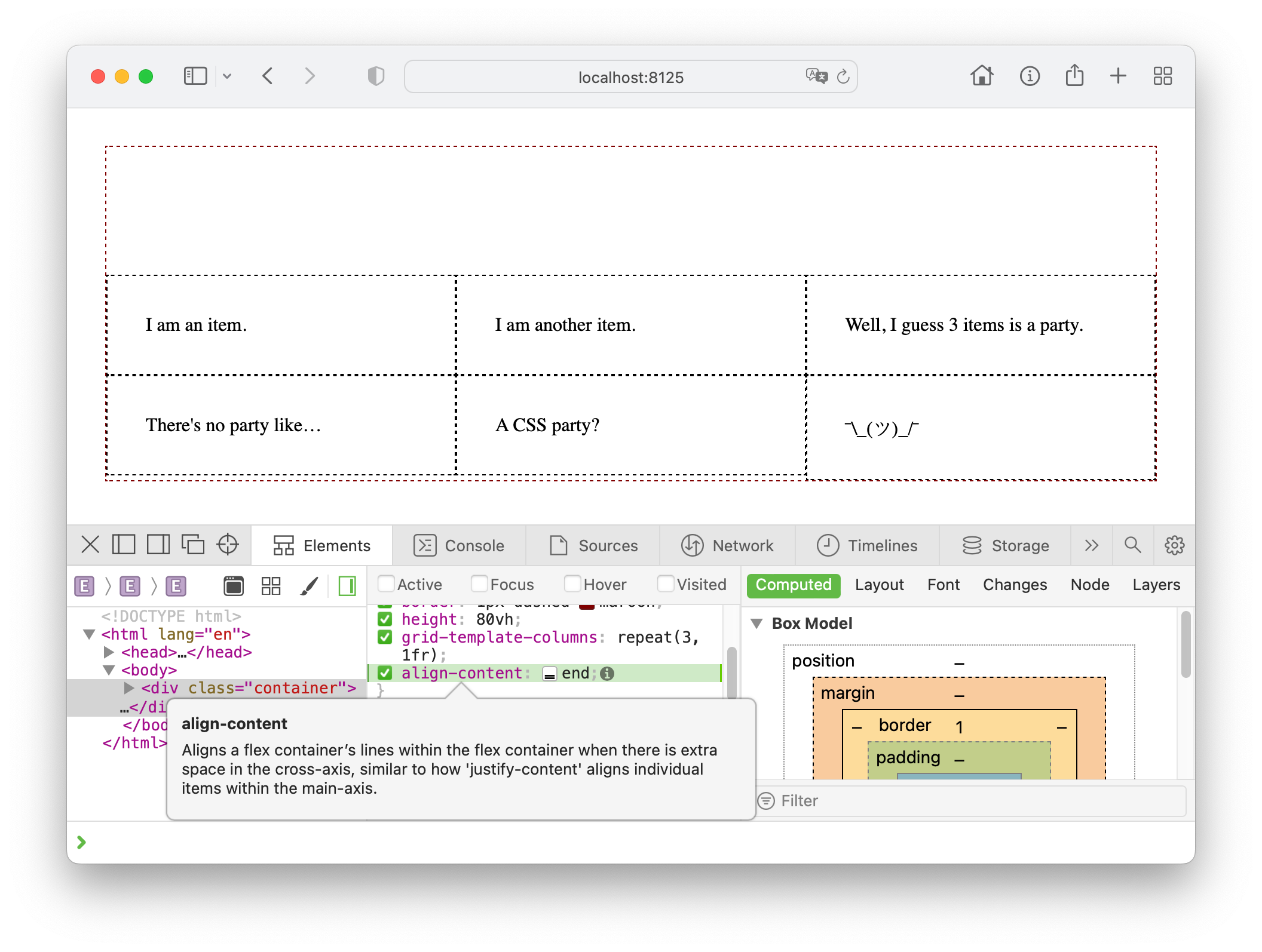
The align-items property is used to align all the flex items or grid items along its flex line or grid row respectively. As mentioned earlier, without an explicit height set, the default state of the items is stretch.
However, when you set a value for align-items which is anything other than stretch, the item automatically shrink to its content height, and then be aligned to either the start, center or end of the flex line or grid row.
Where align-content is used to manage the overall free space in the entire container, align-items is used to manage the items’ positions in their respective “lanes”.
The justify-items property only applies to grid items because only grid items potentially have space along the inline-axis to “move around”. Flex items are always flush against their adjacent siblings along the main axis, and only have space to move along the cross axis.
Properties for the item
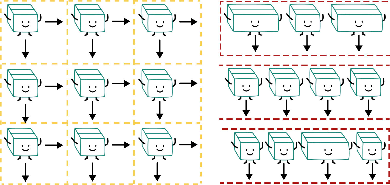
If you need to adjust individual flex items position along the flex line, you can use align-self. And if you need to adjust individual grid items within the available space in a grid cell, you can use align-self and justify-self.
Welcome! Unfortunately, you don’t have access to this lesson. To get access, please purchase the course or enroll in Magical Dev School.
Unlock this lesson