While block and inline layouts were part of CSS since its inception, flex layout was introduced much later and describes a box model that is, as its name suggests, flexible when it comes to sizing, and provides more granular options for controlling alignment and spacing.
Grid layout came next and gave developers unprecedented control for laying out content in a two-dimensional context, a true grid system with rows and columns, which had not been possible previously.
These 2 new layout models worked slightly differently than all the previous layout models by creating an explicit parent-child relationship between a container box and its children.
As with all the other layout models, the key property involved is display. A flex formatting context is generated when you apply display: flex to an element, by making it a flex container. All the immediate children within this flex container become its flex items.
Grid works in the same way, where applying display: grid to an element makes it a grid container, and all its immediate children become grid items.
Parent-child relationship
Laying out and sizing block boxes or inline boxes involves applying properties onto the boxes themselves. Block and inline boxes are, in a way, unaware of the boxes around themselves. In order to layout boxes in a specific manner, you would have to adjust each box individually.
For elements using flexbox or grid as their layout model, there is a clear parent-child relationship between the container and its children. For example, properties applied onto a flex container will affect the flex items within it, and the flex items themselves will have an “awareness” of their fellow flex children within the same flex formatting context.
Say we have the following markup:
<div class="container"> <span>A flex item</span> <p>Another flex item</p> <div>Flex items are also flex children</div> <blockquote> All direct children of the flex container become flex children </blockquote></div>Without adding any styles of your own, all these different HTML elements have display values set by the user-agent stylesheet. However, once you apply the following CSS:
.container { display: flex;}All the direct child elements within the container div become flex items (or flex children). If you happen to be using Firefox, you can turn on the overlay via Devtools and see how the browser interprets this style rule.
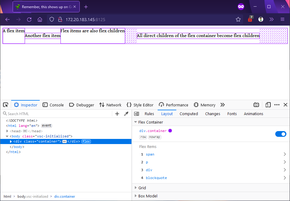
The CSS properties applied on the flex container largely allow you to orchestrate how all the flex children behave as a whole, while the CSS properties applied on the flex children are more for individual tweaking of each item within the flex formatting context.
Grid containers and their grid children also have this behaviour. We will examine how to make use of these characteristics to layout a webpage in the section on building web layouts. Meanwhile, the upcoming lessons will introduce the unique characteristics which flex items and grid items possess.
Welcome! Unfortunately, you don’t have access to this lesson. To get access, please purchase the course or enroll in Magical Dev School.
Unlock this lesson