Even though everything on the web is a box, there are different types of boxes, each with characteristics and behaviours that distinguish them from each other. Understanding these differences will help you immensely when it comes to laying them out on the page.
The structure of a HTML document also fits well with the mental model of boxes nested within boxes containing other boxes. Laying out a web page involves adjusting how boxes are placed with respect to each other within the same level.
Direction of flow
By default, browsers will lay out elements one after another without extra gaps between them unless otherwise specified. This is known as normal flow.
There are 2 directions which content can flow, the block direction and the inline direction. These directions are determined by the writing mode of the content’s containing block.
The default writing mode value is horizontal-tb which means lines of text flow from left-to-right, and continue down from top-to-bottom.
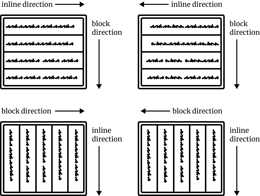
However, for languages like Hebrew or Arabic, lines of text would flow from right-to-left instead. And there are also languages like Japanese or Chinese, which can be typeset vertically. In those cases, the physical directions for block-flow would no longer be top-to-bottom.
For ease of explanation, the majority of our examples will assume the default directions, but it is good to keep in mind that top, bottom, left and right may not make sense when the writing system flows differently.
Different box types
Block boxes and inline boxes have been around since the earliest days of CSS, and they are the mainstays of how content is presented on a web page. If you recall in How browsers handle CSS, we talked about how every HTML element on a web page has a value for every CSS property available.
Every HTML element will generate a different type of box based on its display property value. An individual box’s behaviour is influenced by its own characteristics as well as the characteristics of the environment it exists in, which is referred to as a formatting context. We will thoroughly cover formatting contexts in the next lesson.
The initial value of the display property for all elements is inline but browser stylesheets set certain elements, like div or p to display: block.
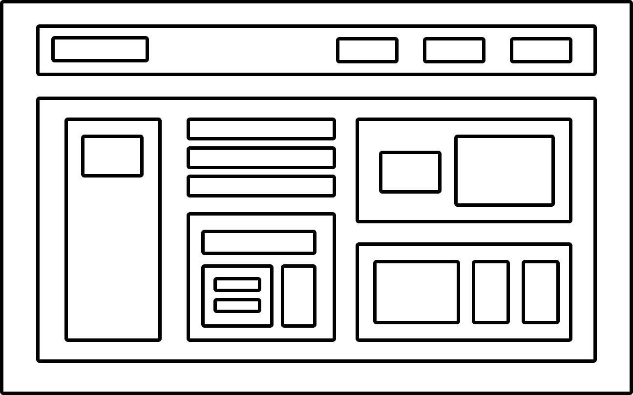
Every element has an outer display type and an inner display type, which is determined by the display property. The outer display type determines how a box interacts with other boxes around it on the same level.
There are 2 outer display types you will encounter most while building your layouts, block and inline. Both have distinct behaviours and we will cover them in detail in their respective lessons.
The inner display type defines how an element’s direct children are laid out within it by generating a formatting context. Flex and grid are both inner display types and generate a flex formatting context and grid formatting context respectively. Child elements in these contexts have very distinct behaviours, which will be covered in detail in the next section.
Welcome! Unfortunately, you don’t have access to this lesson. To get access, please purchase the course or enroll in Magical Dev School.
Unlock this lesson