The box model has many different layers, and each of them could take up space that adds to the size of your box. When it comes to how the browser calculates the size of a box, the box-sizing property can affect the final sizing values.
The default value of box-sizing is content-box, which implies that the sizes applied on properties like width and height exclude any margins, borders and paddings.
Say we have a div with the following CSS properties set on it:
div { width: 100px; height: 100px; padding: 10px; border: 2px dashed; margin: 10px;}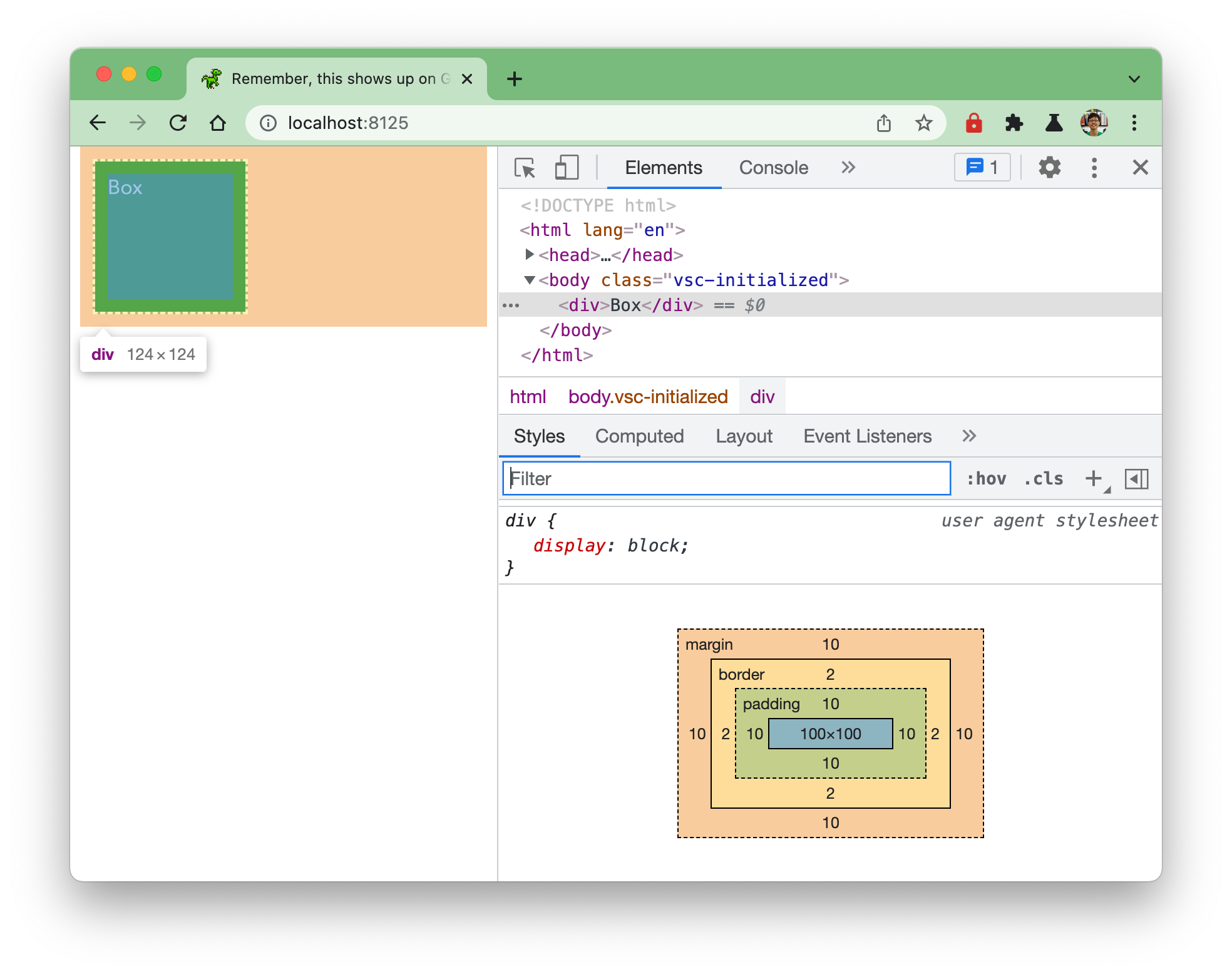
Devtools will show you how the final width of the box is calculated, in the example above, you will notice that the box is 124 x 124. This is from the content itself which is 100px, plus padding (10px + 10px) and borders (2px + 2px).
If the box-sizing was set to border-box, this implies that sizing values applied to the element include padding and borders. So the width value of 100px will be made up of the content plus any padding and borders.
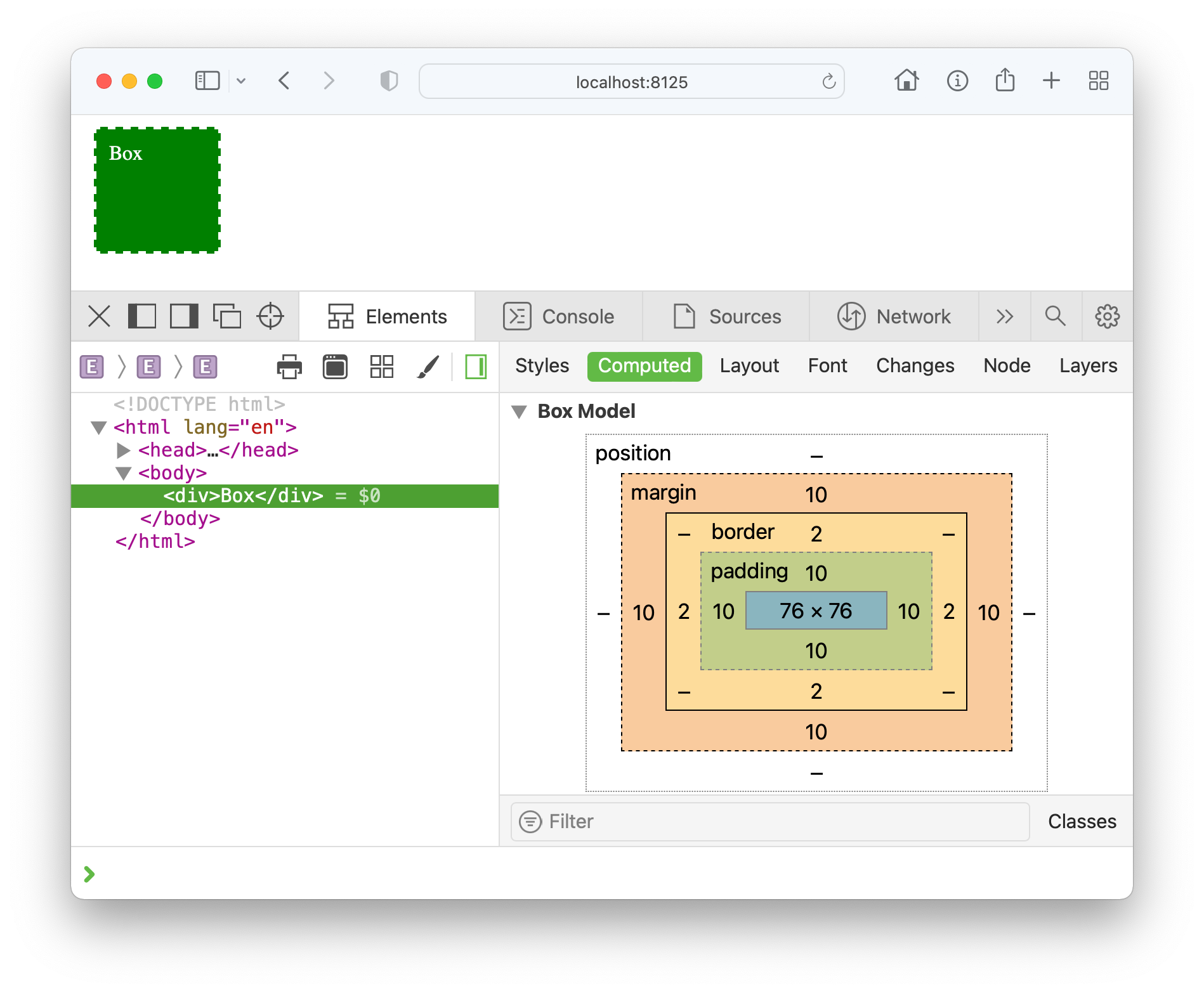
Once you set the box-sizing property to border-box, you can see from Devtools that the content box is now sized to 76px because the 10px padding and 2px border are included in the 100px width calculation.
It is common to set box-sizing to border-box because often folks treat the padding and border as part of the content. Especially now that it is more common to size layouts with relative values, border-box makes things a lot more intuitive.
You can this manifest in the following example of a box with some child elements in it, all sized using percentages:
<div class="parent"> <div class="pair"></div> <div class="pair"></div> <div class="child"></div></div>.parent { width: 40%; border: 3px solid green; float: left;}
.pair { width: 50%; padding: 10px; border: 2px solid tomato; float: right;}
.child { width: 75%; padding: 20%; border: 2px solid orange; float: left;}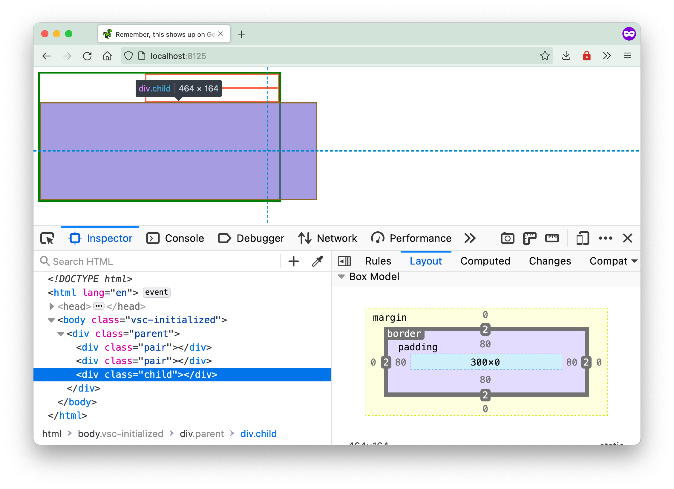
The child element of class name child ends up being longer than its parent container even though its content width is 75% of its parent. This is because the padding and borders are not factored into this 75%, and so the final width of the child ends up being 464px.
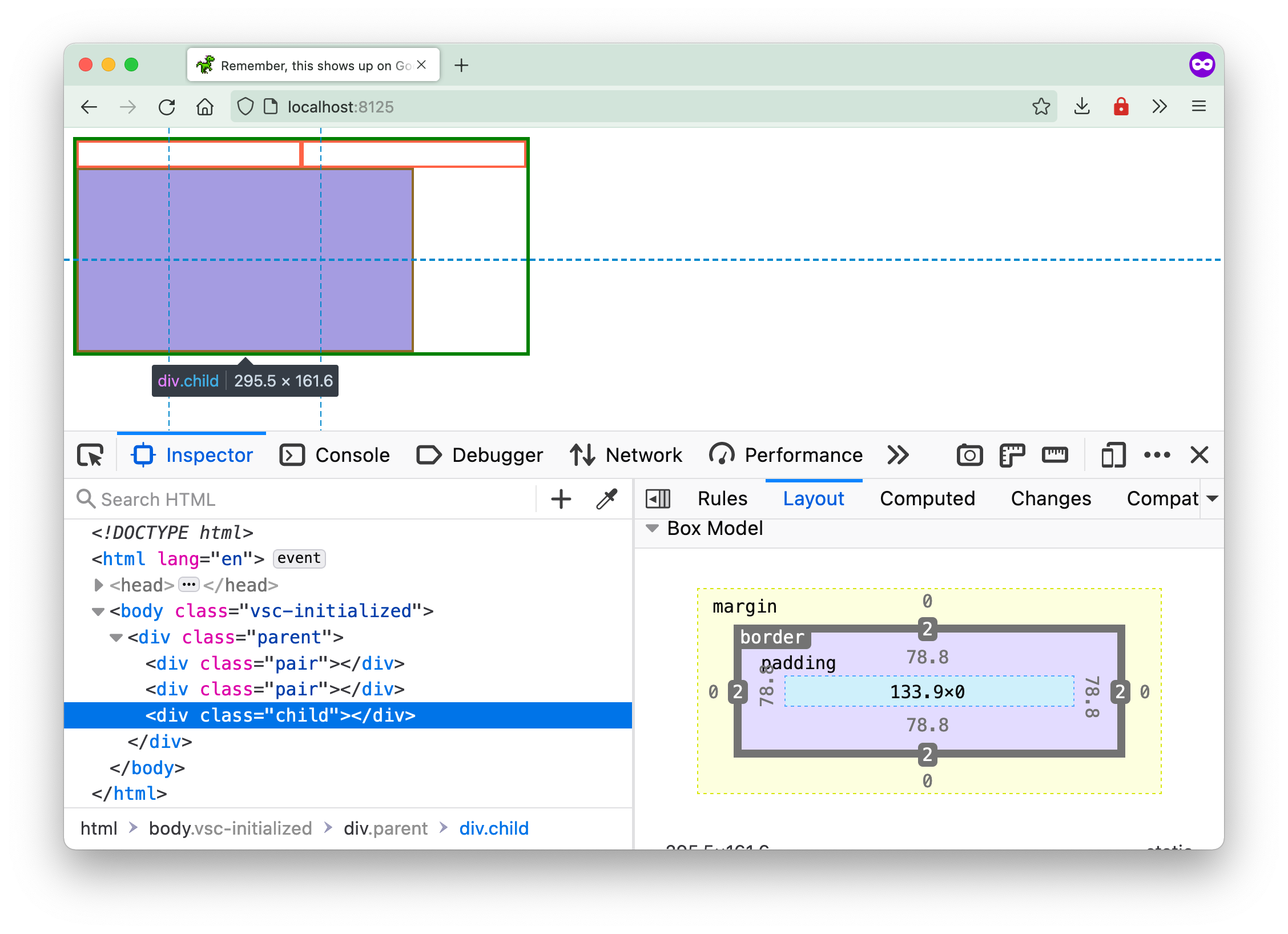
Once we set the box-sizing for all these boxes to border-box, their behaviour becomes more inline with what most people expect.
Welcome! Unfortunately, you don’t have access to this lesson. To get access, please purchase the course or enroll in Magical Dev School.
Unlock this lesson