Earlier when we talked about user agent stylesheets, you learned that every browser provides some sensible default CSS values to ensure that even “unstyled” content is presented in a fairly readable manner.
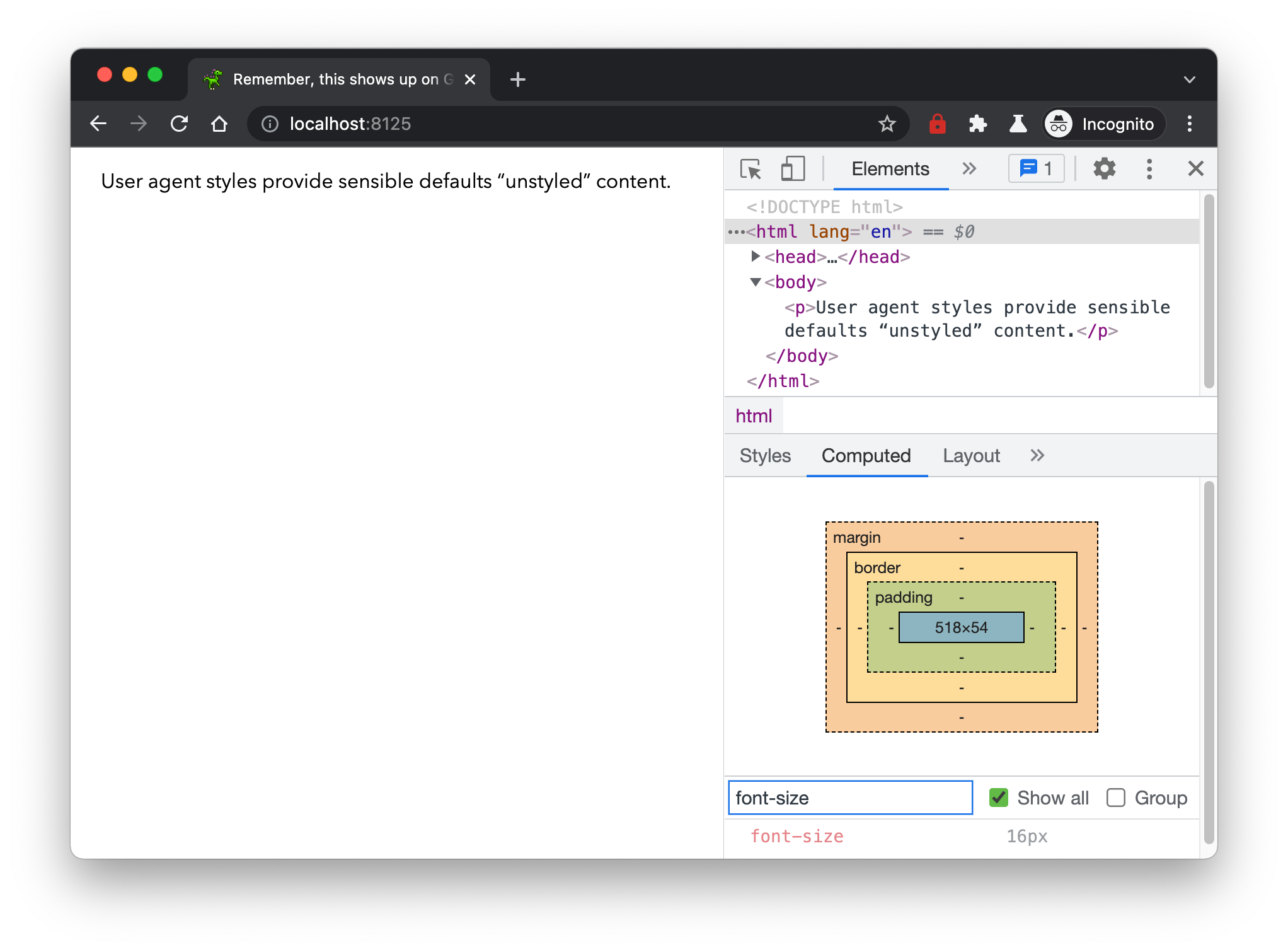
The sensible default that browsers have set for the font-size property happens to be 16px, and it is an inheritable property. This means the font-size of a parent element also applies to its children. It makes sense for a property like font-size to be inherited because can you imagine how tedious it would be to set the font-size for every single nested element on your web page?
The em unit represents the font size of the element being referenced. This means if you set a margin of 1em on an element, the browser will equate this to the font-size value of the element itself.
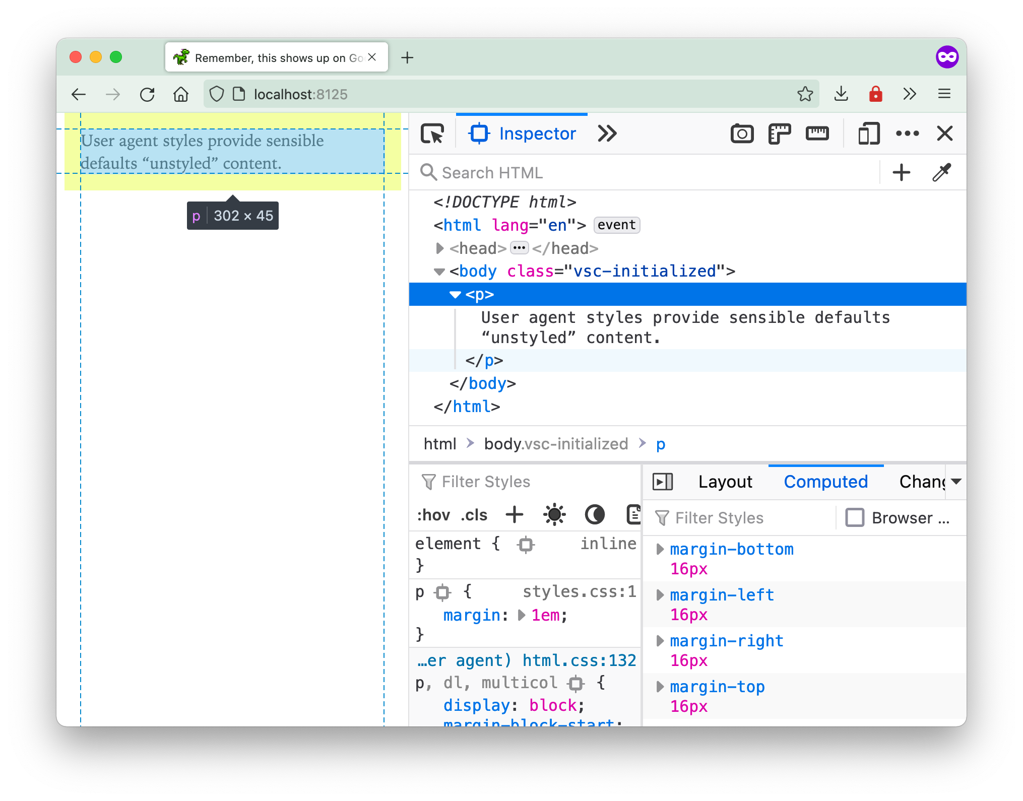
The browser treats the element’s font size as 1 em unit, so if the font-size value is 16px, then 2em will compute to 32px for that element. Because font-size is an inheritable property, this makes things interesting when it comes to nested elements.
Let’s say you have some markup consisting of nested elements like this:
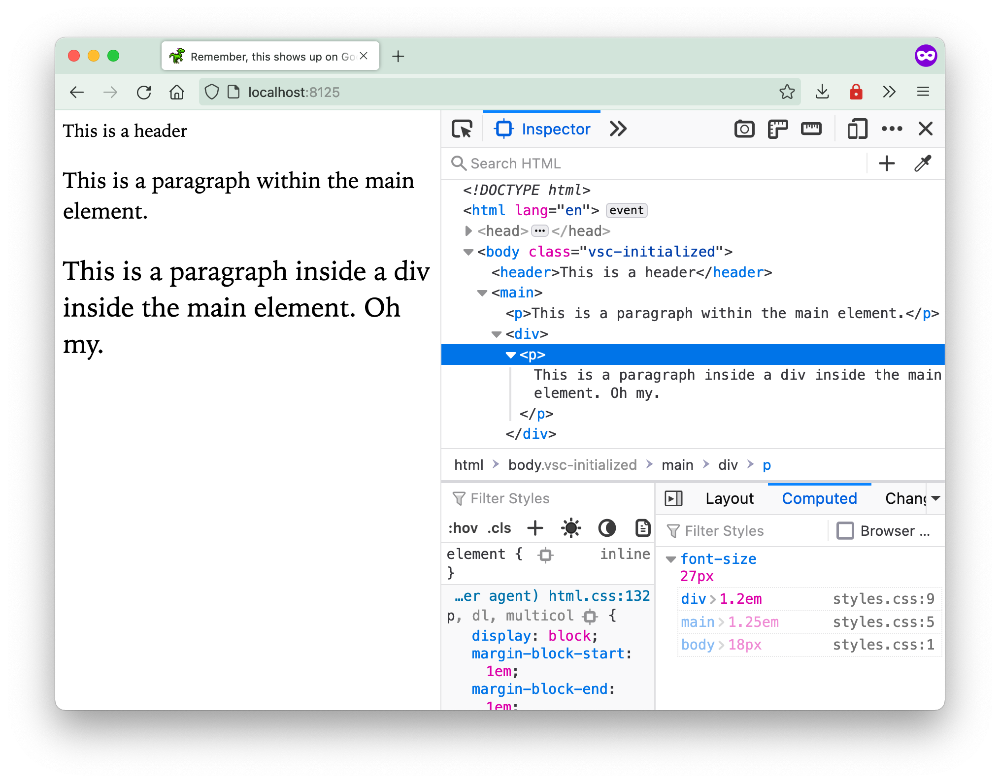
<body> <header>This is a header</header> <main> <p>This is a paragraph within the main element.</p> <div> <p>This is a paragraph inside a div inside the main element. Oh my.</p> </div> </main></body>And you have applied some font sizes on each level of nesting:
body {  font-size: 18px;}
main {  font-size: 1.25em;}
div {  font-size: 1.2em;}
The em sizing has a compounding effect as each child element inherits the font-size of its direct parent. This results in the most nested p element having a final computed font-size of 27px. Because 18 _ 1.25 _ 1.2 = 27.
Being aware of this behaviour and understanding how em values work will help you when you are building out (and debugging) full page layouts. We will go into this in greater detail in the later section on layouts.
Welcome! Unfortunately, you don’t have access to this lesson. To get access, please purchase the course or enroll in Magical Dev School.
Unlock this lesson