Inline-level elements generate inline-level boxes, which are dealt with differently from block boxes. As the name suggests, the behaviour of such boxes within an inline formatting context is more like a stream rather than discrete blocks. Content is laid out in the inline direction, which is the direction that text flows, and this is dependent on the writing system of the content being displayed.
According to the specification, all HTML elements have an initial value of inline for the display property. But browser stylesheets set certain elements to display: block to make unstyled HTML look better out-the-box. We can see how things would look by resetting every element on the page to have a display of inline just to see how it looks with the following CSS.
body * { display: inline;}This example contains a new selector that we hadn’t covered in the earlier introduction. The * symbol is called a universal selector. It selects all elements. So this particular style rule, in English, reads: select all elements nested in the body element and make them inline elements.
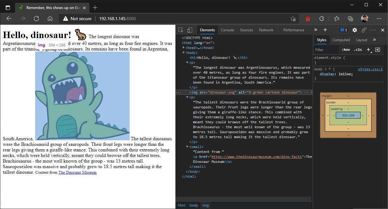
An interesting thing to note, especially if you’re new to web development, is that images, which are declared in a web page using the img tag, have no browser styles applied to them. So they will always be display: inline unless you state otherwise. When an image is inline within a run of text, the text will run on either side of the image.
Images, videos and iframes are considered replaced elements, because their contents cannot actually be controlled by CSS. There is no way you can change the contents of an image or video file with CSS, because the image data or video data can only be edited and accessed with dedicated software. CSS only allows you to adjust how such elements are displayed.
When everything is inline, you will notice that there is no clear separation of paragraphs of text any longer. The text continually flows onto the next line. So one way to think about the two different types of boxes, is that block boxes behave like solids while inline boxes behave like liquids.
Can you measure the width and height of a liquid? Not really. A liquid takes up whatever shape and space its container does. It is similar with inline elements. So the width and height properties will have no effect on inline boxes.
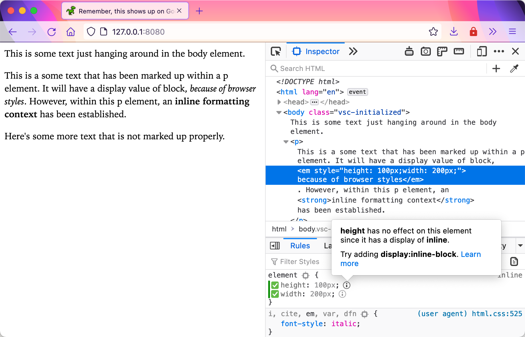
Firefox Devtools will tell you if you are using a property that is not applicable, by greying it out and when you hover over the information symbol icon, a pop-up will attempt to tell you the reason why.
Only margins and paddings along the inline-axis will have a visible effect on an inline box. And if an inline box is split over more than 1 line box, margins, borders and paddings will not apply on the “split” side of the box. Think of how you would slice a Snickers bar, the part that is cut will not have any chocolate coating on it.
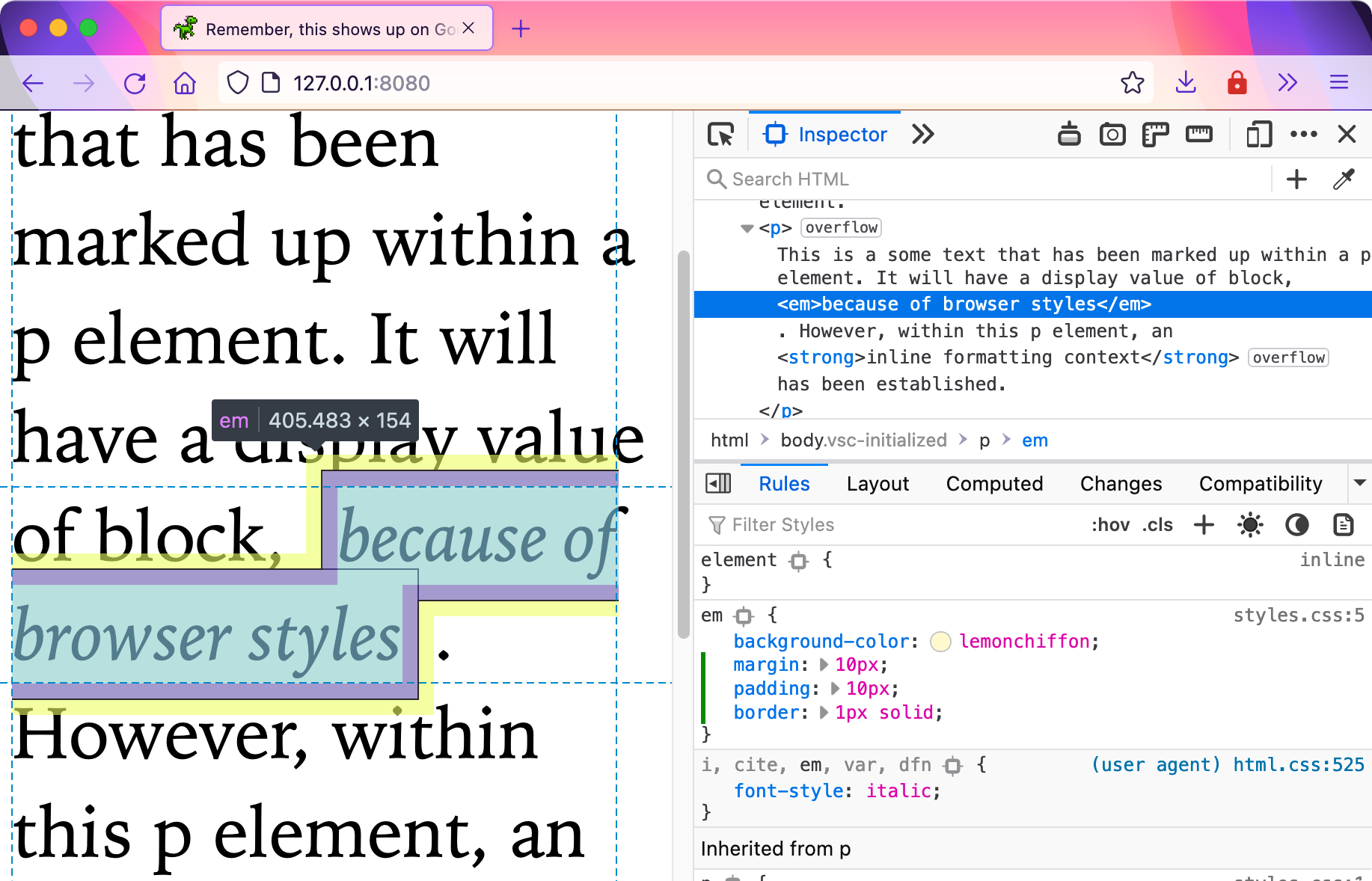
You can see this from the browser when you highlight the element to inspect the margin and padding. Even though they are applied on all 4 sides, the top and bottom distances between lines don’t change at all. The additional spacing only occurs between text on the same line. The height of a line box is determined by the text’s font-size and the line-height property.
These properties will be covered in more detail in the Typography section of this course.
Welcome! Unfortunately, you don’t have access to this lesson. To get access, please purchase the course or enroll in Magical Dev School.
Unlock this lesson