A block box has a display property of block, and the environment in which is operates in is called a block formatting context. Block boxes are laid out one after another in the block-flow direction.
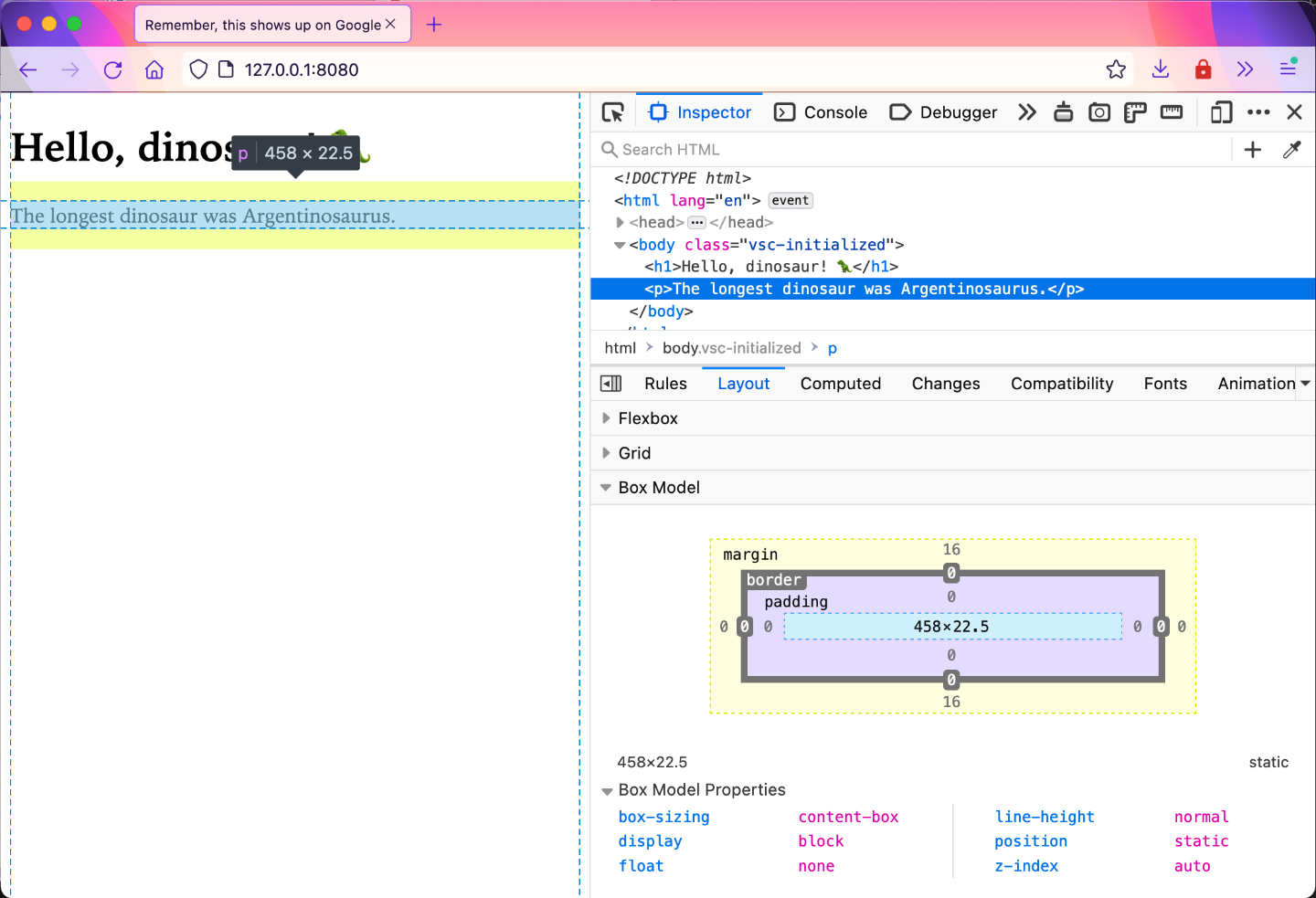
Block boxes will take up the entire width of its containing block. Your example code is a good way to see this in action, because there are not many elements on the page at the moment. We have three block boxes nested within each other.
If you bring up Devtools, you can highlight over the root element (html) and see that it is the width of the viewport. Its immediate child element, body is a block box which takes up the width of the html element, and within it, the h1 element also takes up the width of the body element.
If you add another block element, like a p, it will be laid out below the heading and span the full width of its parent element as well.
You can control the size of your block boxes with the width and height properties. Add more content to your demo file so you can play around with these properties and values. Remember to save your files and reload the page on the browser so your changes are reflected.
<body> <h1>Hello, dinosaur! 🦖</h1> <p> The longest dinosaur was Argentinosaurus, which measured over 40 metres, as long as four fire engines. It was part of the titanosaur group of dinosaurs. Its remains have been found in Argentina, South America. </p> <p> The tallest dinosaurs were the Brachiosaurid group of sauropods. Their front legs were longer than the rear legs giving them a giraffe-like stance. This combined with their extremely long necks, which were held vertically, meant they could browse off the tallest trees. Brachiosaurus - the most well known of the group - was 13 metres tall. Sauroposeidon was massive and probably grew to 18.5 metres tall making it the tallest dinosaur. </p> <small >Content from <a href="https://www.thedinosaurmuseum.com/dino-facts" >The Dinosaur Museum</a ></small ></body>You can use a relative values, like percentages, or absolute values using px or em to adjust the width and height of the p elements in your CSS file. Using the p selector means both p elements on the page will be affected by your new style.
p { width: 40%;}Even if you set a width to your block box that is less than the width of the parent element, each block box will still be stacked vertically. This is because in a block formatting context, the starting edge of every block box will touch the starting edge of the containing block.
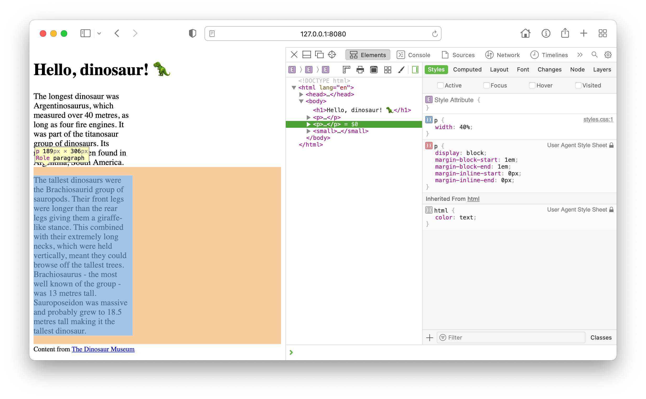
You can also set a height value for your p elements. But if the size of your box becomes insufficient to hold the content within it, then the content will spill out of the box. This is called overflow. Try this out by setting a height value like 100px. Also add a border to your box so you can see what’s going on.
p { width: 40%; height: 100px; border: 1px solid;}You will find that your content looks broken, with text overlapping each other, making the web page unusable.
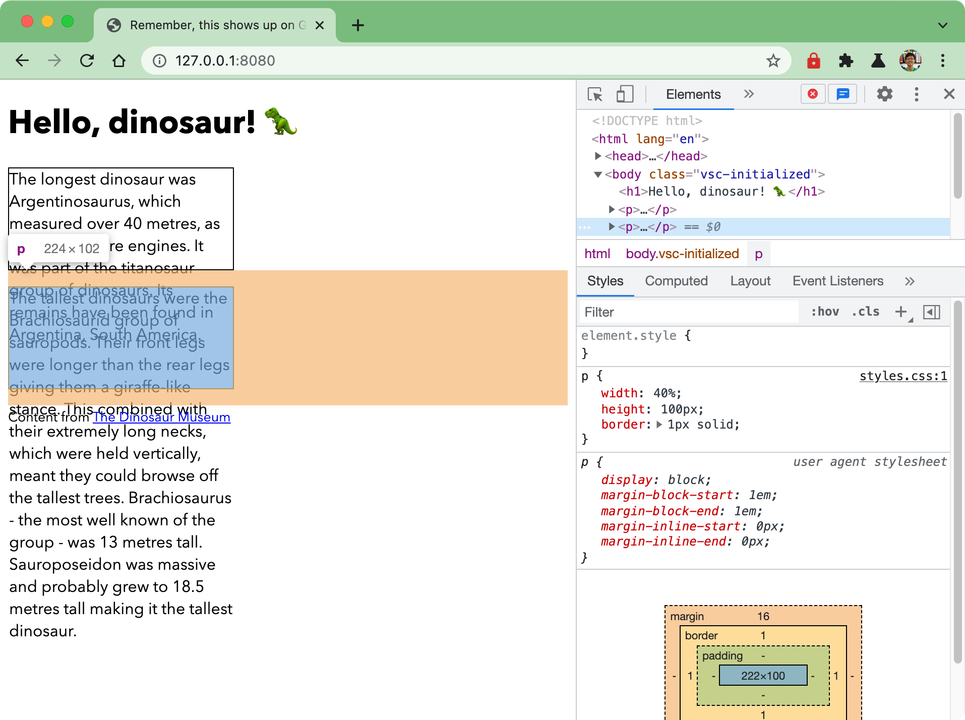
When the browser lays out boxes, it does so based on the dimensions of the boxes. When you forcibly set the size of the box to be smaller than the content it holds, the browser will ignore the space that the overflowing content takes up. You can see from the borders that the boxes are being stacked one after another without overlapping. Any content that overflows out of the box is ignored by the layout altogether.
The point here is that, we usually set the size of a box only in one dimension, either the width or the height, and let the browser figure out the other dimension based on the amount of content in the box. Unless there is some intervention from us, browsers will always lay out content in a way that never overlaps.
Welcome! Unfortunately, you don’t have access to this lesson. To get access, please purchase the course or enroll in Magical Dev School.
Unlock this lesson