Essential CSS
JavaScript Roadmap
Learn JavaScript
Mastering Web Typography
Practical Astro
Understanding Async JS
Unorthodox Tailwind
API Masterclass
Build and Deploy
The Beginner Freelancer
Real World Node
Profile Billing Logout
Unorthodox Tailwind
Lesson Plan
  1. Introduction
    1. Introduction
    2. What Tailwind brings to the table
    3. Tailwind: The Good and The Bad
    4. The First and Most Important Step
    5. Simple Unorthodox System
    6. The System I Use
  2. Tailwind Fundamentals
    1. Introduction
    2. Installing Tailwind
    3. Using Tailwind utilities
    4. Understanding Tailwind’s utility system
    5. Understanding Tailwind values
    6. Understanding Tailwind variants
  3. Unorthodox Fundamentals
    1. Introduction
    2. Making Simple Tailwind Utilities
    3. Components vs Utilities
    4. Specificity, Cascade, and CSS Layers
    5. Debugging Tailwind Styles
    6. Composable Utility System
    7. Create lots of components
  4. Layouts System
    1. Tailwind is great for layouts
    2. Four Types of Layouts
    3. Building Shell Layouts
    4. Building Macro Layouts
    5. Better Responsive Variants
    6. A collection of maximum widths
    7. A note on grid wrappers
    8. Working with sections
    9. Building Micro Layouts
    10. Positioning Layouts
  5. Typography System
    1. Introduction
    2. A system for using multiple typefaces
    3. Tailwind's font-size system
    4. Finding your font-size system
    5. My font-size system
    6. A simple responsive typography system
    7. The main body
    8. Vertical rhythm
  6. Theming System
    1. Introduction
    2. Tailwind's colour system
    3. The pigment system
    4. Tailwind's gradient system
    5. A friendlier gradient system
    6. Handling SVG fill and stroke
    7. Improving Tailwind's colour palette
    8. A simple way to theme
  7. Useful Tools
    1. Introduction
    2. Making functional utilities
    3. Custom variants
    4. Scaffolding tools
    5. Extending Tailwind
  8. Effects System
    1. Introduction
    2. Vertical text
    3. Strikethrough text
    4. Text stroke
    5. Highlighting text
    6. Nicer shadows
    7. Transitioning shadows
    8. Drop shadows
    9. Dark mode tricks
    10. Gradient borders
    11. More effects to explore
  9. Putting Everything Together
    1. The Unorthodox Tailwind process
    2. The 4 systems combined
    3. Create components liberally
    4. Advanced tips
    5. My CSS Structure
    6. A Cheatsheet
    7. Consolidating your thoughts
    8. Parting words

Components vs Utilities

2m:1s

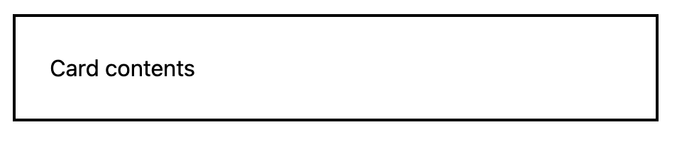
You can think of Tailwind utilities as components — because you can literally make a card “component” out of Tailwind utilities.

@utility card {
border: 2px solid black;
padding: 1rlh;
}
<div class="card">...</div>
Card

This blurs the line between “Components” and “Utilities” so we need to better define those keywords.

The Great Divide — And The Great Unification

CSS developers often define Components and Utilities like this:

  1. Component = Group of Styles
  2. Utility = Single Rule

This collective thinking has emerged from the terminologies and literature we have gathered over many years. Unfortunately, they’re not really the right terminologies.

So let’s take a step back and consider the actual meaning behind these words.

Component means: A thing that’s a part of a larger whole
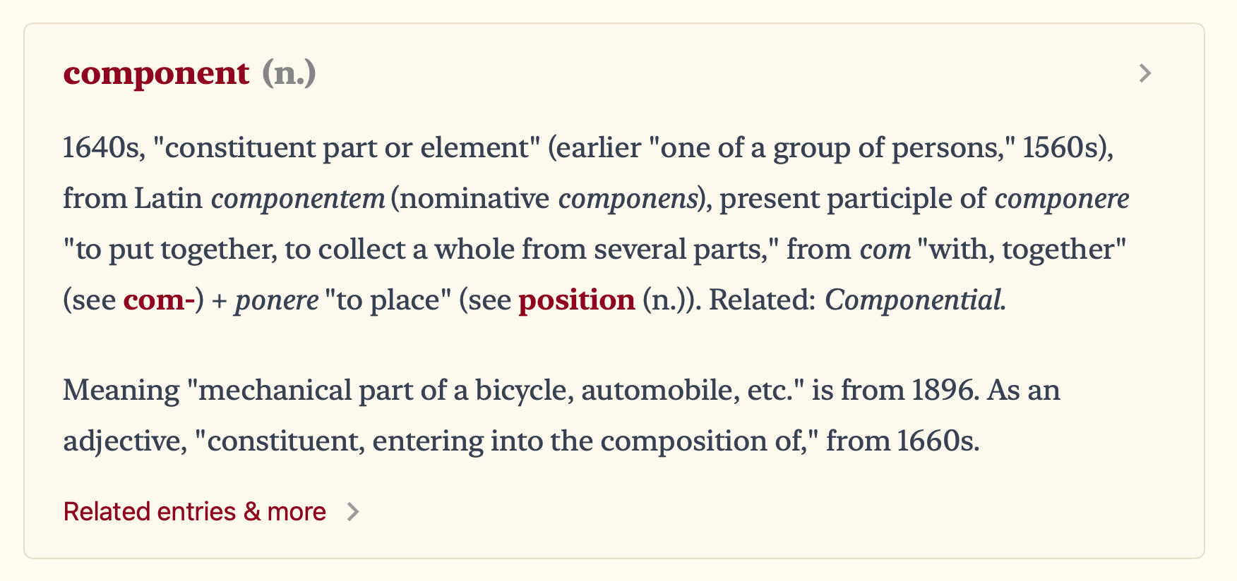
Component Definition

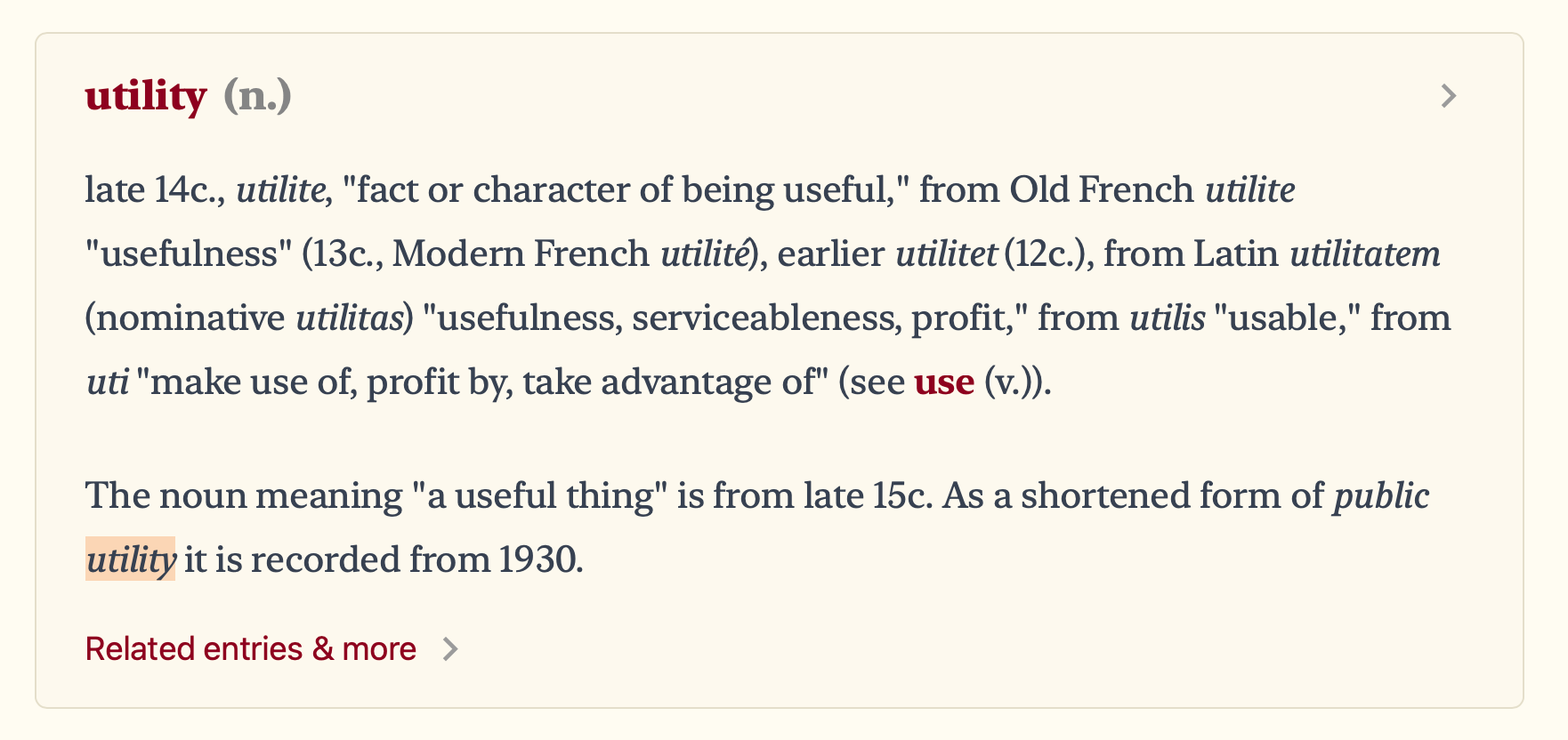
Utility means: It’s useful.

Utility Definition

So…

  • Utilities are Components because they’re still part of a larger whole.
  • Components are Utilities because they’re useful

The division between Components and Utilities is really just a marketing effort designed to sell those utility frameworks — nothing more than that.

It. Really. Doesn’t. Matter.

The meaningful divide?

Perhaps the only meaningful divide between components and utilities (in the way they’re commonly defined so far), is that we often want to override component styles.

So it kinda maps this way:

  • Components: Group of styles
  • Utility: The style used to override component styles

Personally, I think that’s a very narrow way to define something that actually means “useful”.

Just overriding the damn style

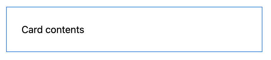
Tailwind provides us with an incredible feature that allows us to override component styles. To use this feature, you would have to:

  • Write your component styles in a component layer
  • Override the styles via a Tailwind utility
@layer components {
.card {
border: 2px solid black;
padding: 1rlh;
}
}
<div class="card border-blue-500">...</div>
Card

But this is a tedious way of doing things. Just imagine writing @layer component in all of your component files. There are two problems with doing that:

  1. You lose the ability to use Tailwind utilities as components
  2. You gotta litter your files with many @layer component declarations — which is one extra indentation and makes the whole CSS a little more difficult to read…

There’s a better way of doing this. (See the next lesson).