There are basically three ways to build a font-size system:
- The Typography Scale
- Modular Scale
- Fluid Typography
The Typography Scale
The typography scale from The Elements of Typographic Style by Robert Bringhurst is a good start for most websites. Designers generally use this as well.
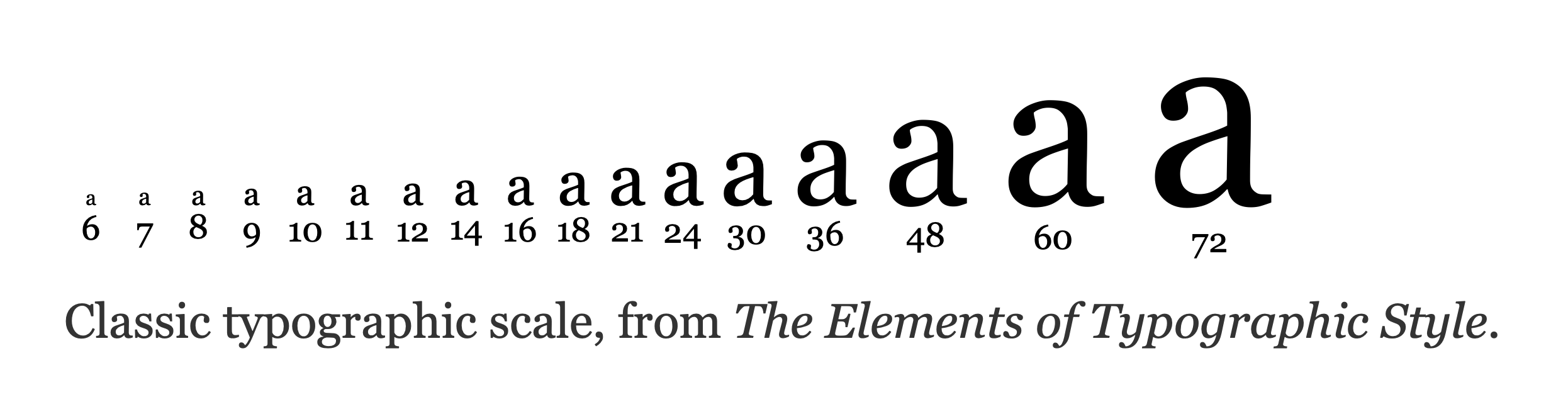
It contains sizes that are small enough for designing apps and dense interfaces, and also sizes large enough to create attention-drawing headers for marketing websites.
10pxis usually the smallest size limit that you will use for denser interfaces48pxand60pxare generally good enough for attention-grabbing headers
Personally, I ended up using the typography scale after playing around with Modular Scale and fluid typography for a long time.
And I do this for a simple reason: There is no way in hell you’re going to be able to use Modular Scale and fluid typography easily in design software like Figma. Since I want to design quickly and implement quickly, I simply chose a method that can work in both design and code.
Modular Scale
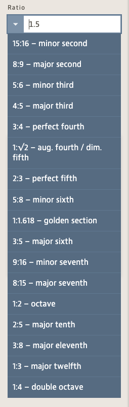
Tim Brown introduced Modular Scale in “More Meaningful Typography” in 2011. It took off like a storm during the period.
The premise here is simple.
Modular Scale is built on the idea that ratios are harmonious, just like how music is harmonious, and these ratios could be used to create harmonious font-sizes.
Examples here include:
- Golden ratio:
1:1.618 - Perfect fourth:
3:4 - Major third:
4:5 - And so on…
I’ve used Modular Scale for a long time, but I always run into a large problem — if I choose a large ratio, it is impossible to get the right size for smaller values.
So I always ended up using either:
- a mix of values like
1.2and1.618together (which makes it very complex to calculate). - Or I can just end up using
1.2
After a while, it just fell out of favor for me.
Quick aside…
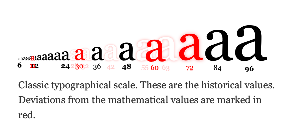
I was curious, so I did a search to see if the typographic scale is based on harmonious proportions or not. I found this article by Spencer.
And it looks like the typography scale is very close to actual mathematical ratios. So this is really not too bad!
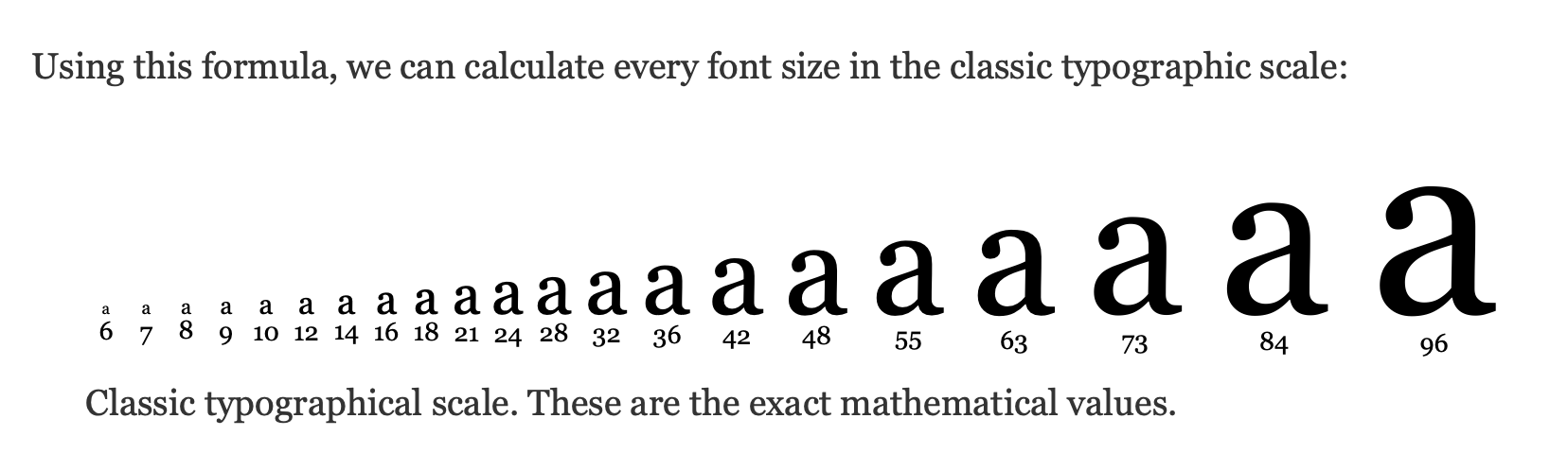
If you really want to dive into the weeds, Spencer has created a typography scale with the exact mathematical values for harmonious relationships. This could be a solid starting point as well. (It looks really good.)
Fluid Typography
The last kind of typography used in websites nowadays is fluid typography, where you adjust font sizes based on the viewport width.
body { font-size: clamp(1rem, 2vw, 1.25rem);}The idea here is fluid typography makes responsive typography easier by abstracting away the need to change font sizes at different breakpoints.
Personally, I don’t use this because:
- I find it unnecessarily complicated
- I prefer knowing my font sizes
- I still need to change font sizes at different breakpoints anyway, so what’s the point of this additional complexity?
But if you are happy with fluid typography, please go ahead and use it. I am not judging you. I am just expressing my opinion that it’s overkill.
Welcome! Unfortunately, you don’t have access to this lesson. To get access, please purchase the course or enroll in Magical Dev School.
Unlock this lesson