Tailwind has a great colour system that is derived from Steve Schoger’s Refactoring UI.
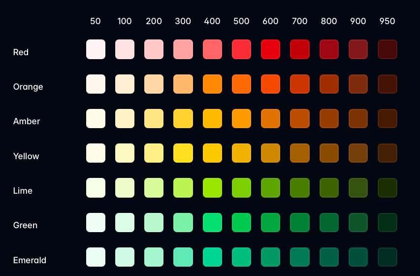
The basic idea is that you can refer to a colour with the name (like red) and a corresponding shade number (like 500).
<p class="text-red-500">Red text</p>Red text
Where colours can be applied
Tailwind allows you to use the colours with many utilities, but in practice I only use it on three of them.
bg-*- for background colourtext-*- for text colourborder-*- for border colour
Here’s the full list of utilities you can use the colour system with.
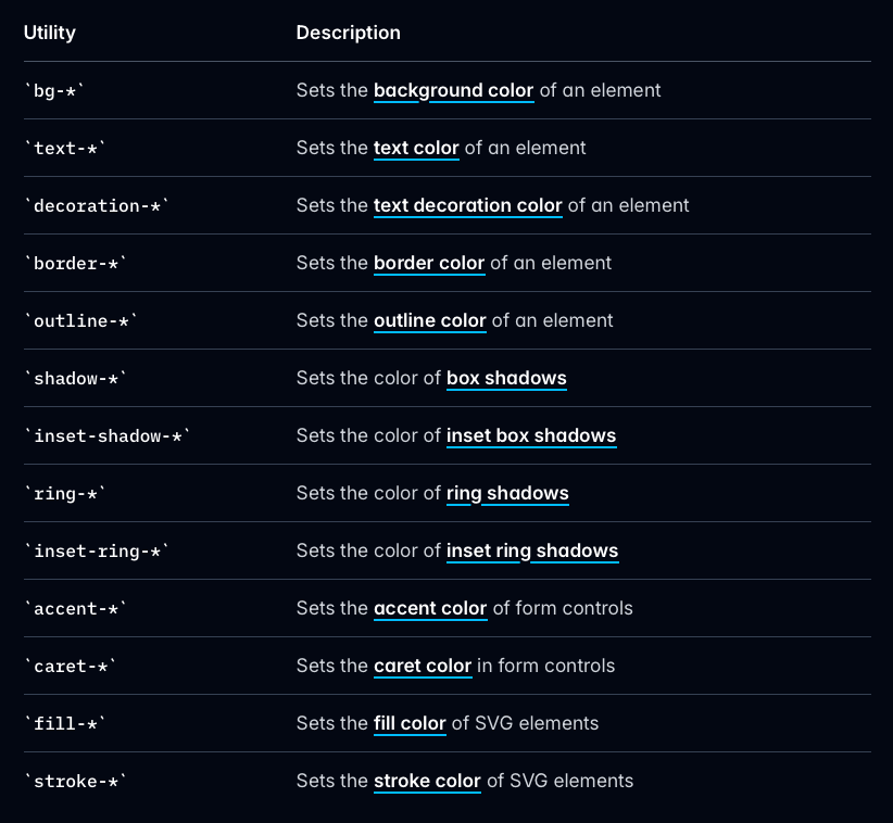
I only use the three I mentioned because I have another system for SVGs, outlines and shadows. I’ll talk more about these later in the course.
Controlling opacity of colours
Tailwind has a very nice way to control the opacity of its colours. You can add a slash followed by the opacity value like (bg-red-500/25) to add the opacity to this colour.
<div class="bg-red-500/25">Red with opacity</div>Doing this in CSS
If you use @apply, the color/opacity syntax also works in CSS.
.selector { @apply bg-red-500/25; /* this works */}But if you want to use the CSS variable, you have to write the color-mix function yourself.
/* equivalent to the above output */.selector { background: color-mix(in oklab, var(--color-red-500) 25%, transparent);}This kind of thing is difficult to write, so I recommend you either use the Tailwind version or use a function like --alpha when CSS functions have baseline support.
@function --alpha(--color, --amount) { result: color-mix(in oklab, var(--color) var(--amount), transparent);}Colours on interactive variants
These colours can also be used together with variants such as hover:, focus:, active: to change the colour when the element goes into a different state.
Here’s an example where the button turns to a different background colour and text colour on hover.
<button class="bg-blue-300 hover:bg-blue-700 text-black hover:text-white"> Button</button>Unfortunately, the code gets annoying, repetitive, and bloated if you want to include more states.
If you want to set the colour and background colour for this button on the standard state, hover, focus, active, you need to set eight utilities — this is hardly maintainable.
| State | Utility for background | Utility for text |
|---|---|---|
| Normal | bg-blue-300 |
text-black |
| Hover | hover:bg-blue-700 |
hover:text-white |
| Focus | focus:bg-blue-700 |
focus:text-white |
| Active | active:bg-blue-800 |
active:text-white |
<button class=" bg-blue-300 hover:bg-blue-700 focus:bg-blue-700 active:bg-blue-800 text-black hover:text-white focus:text-white active:text-white"> Button</button>It gets way worse if you want to include a border or even handle transitional states…
I shudder to even write that code here…
<button class=" bg-blue-300 hover:bg-blue-700 focus:bg-blue-700 active:bg-blue-800 text-black hover:text-white focus:text-white active:text-white border border-blue-300 hover:border-blue-700 focus:border-blue-700 active:border-blue-800"> Button</button>So it’s quite clear to see that Tailwind sucks when it comes to colours and theming with interactive states — this is where CSS is much better.
.button {  background-color: var(--color-blue-300);  color: black;  border: 1px solid var(--color-blue-300);
  &:hover,  &:focus {    background-color: var(--color-blue-700);    color: white;    border-color: var(--color-blue-700);  }
  &:active {    background-color: var(--color-blue-800);    border-color: var(--color-blue-800);  }}
But it is also tedious to keep writing hover, focus, and active states for each element — especially if you have a lot of them.
So I came up with something far better called the pigment system, and I’m going to introduce that to you in the next lesson.
Welcome! Unfortunately, you don’t have access to this lesson. To get access, please purchase the course or enroll in Magical Dev School.
Unlock this lesson