How great would it be if we no longer had to type :hover, :focus, and :active pseudo-classes for each element we want to have an interactive state?
This concept was not even possible in the past. But it’s possible today because we have CSS variables.
Imagine this:
.button { --bg-color: var(--blue-300); --text-color: black; --border-color: var(--color-blue-300); --bg-hover: var(--color-blue-700); --text-hover-color: white; --border-hover-color: var(--color-blue-700); --bg-active-color: var(--color-blue-800); --border-active-color: var(--color-blue-800);}Versus this:
.button {  background-color: var(--color-blue-300);  color: black;  border: 1px solid var(--color-blue-300);
  &:hover,  &:focus {    background-color: var(--color-blue-700);    color: white;    border-color: var(--color-blue-700);  }
  &:active {    background-color: var(--color-blue-800);    border-color: var(--color-blue-800);  }}
We can make this possible by creating a utility that encompasses the logic needed to create the actual CSS properties.
I call this utility pigment.
The Pigment utility
Here’s a simplified version of what it looks like:
@utility pigment-scaffold {  --_bgc: var(--bg-color);  --_tc: var(--text-color, currentcolor);  --_bc: var(--border-color, currentcolor);  border-color: var(--_bc, currentcolor);  color: var(--_tc);  background: var(--_bgc);
  &:hover {    --_bgc: var(--bg-hover-color, var(--bg-color));    --_tc: var(--text-hover-color, var(--text-color));    --_bc: var(--border-hover-color, var(--border-color));  }
  &:focus {    --_bc: var(      --border-focus-color,      var(--border-hover-color, var(--border-color))    );    --_tc: var(--text-focus-color, var(--text-hover-color, var(--text-color)));    --_bgc: var(--bg-focus-color, var(--bg-hover-color, var(--bg-color)));  }
  /* ... continue for active, selected, aria-selected, and other selectors */}
Does this look like overkill? Yes!
But watch what happens when we use it in practice.
Using Pigment in practice
In every design system, you have buttons of different variations. For example:
- a primary button for most things
- a secondary cancel button
- a big red warning button
- a button that doesn’t have any background until you interact with it.
- a button with borders but no background
- a button with borders and some background, but lightly coloured…
Now that is a lot of different types of buttons. It is a nightmare to try and classify them with semantic names, because you can’t tell which is which!
/* what color is this? * what style? * nobody knows */.button-secondary { /* ... */}But we can classify all of these buttons into four major categories:
heavy: saturated backgroundlight: light background, possibly with bordersoutline: borders only, no backgroundghost: no borders, no background, until you interact with it
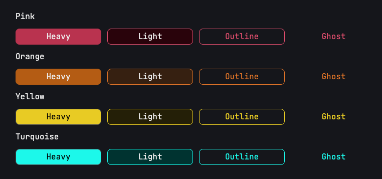
Then creating the variations of buttons suddenly becomes clear and easy — we can just use CSS variables and the pigment system to style each of these states.
@utility pigment-pink-heavy {  --bg-color: var(--color-pink-600);  --bg-hover-color: var(--color-pink-800);  --text-color: white;  --text-hover-color: white;  --border-color: transparent;}
@utility pigment-neutral-light {  --bg-color: var(--color-neutral-100);  --bg-hover-color: var(--color-neutral-800);  --text-color: black;  --text-hover-color: var(--color-neutral-50);  --border-color: transparent;}
@utility pigment-pink-outline {  --bg-hover-color: var(--color-pink-200);  --color: var(--color-pink-600);  --border-color: var(--color-pink-600);}
@utility pigment-neutral-ghost {  --bg-color: transparent;  --bg-hover-color: var(--color-neutral-200);  --border-color: transparent;}
Tada!
Notice we never needed to style the focus state?
I’ve realized that for most sites, we can just use the same state for hover, focus and active. So when I designed pigment, I made focus and active inherit from hover, mostly for convenience.
If you want to kick it up a notch, you can always style the focus, active, selected, or even check states.
.your-pigment {  /* focus states */  --bg-focus-color: '#B4D4SS';  --text-focus-color: '#B4D4SS';  --border-focus-color: '#B4D4SS';
  /* active states */  --bg-active-color: '#B4D4SS';  --text-active-color: '#B4D4SS';  --border-active-color: '#B4D4SS';
  /* selected states */  --bg-selected-color: '#B4D4SS';  --text-selected-color: '#B4D4SS';  --border-selected-color: '#B4D4SS';}
The nice thing about the selected state is that it also works together with ARIA attributes such as aria-pressed, aria-selected, aria-expanded and aria-current.
The full code
The full code for the pigment utility can be found at Splendid Styles. Check it out if you’re interested!
Welcome! Unfortunately, you don’t have access to this lesson. To get access, please purchase the course or enroll in Magical Dev School.
Unlock this lesson