Tailwind has fill-* and stroke-* utilities that let you set the fill and stroke properties of an SVG, but they are not useful.
Why Tailwind’s fill and stroke utilities are not useful
They are supposed to help you colour your SVGs easily, according to Tailwind’s docs:
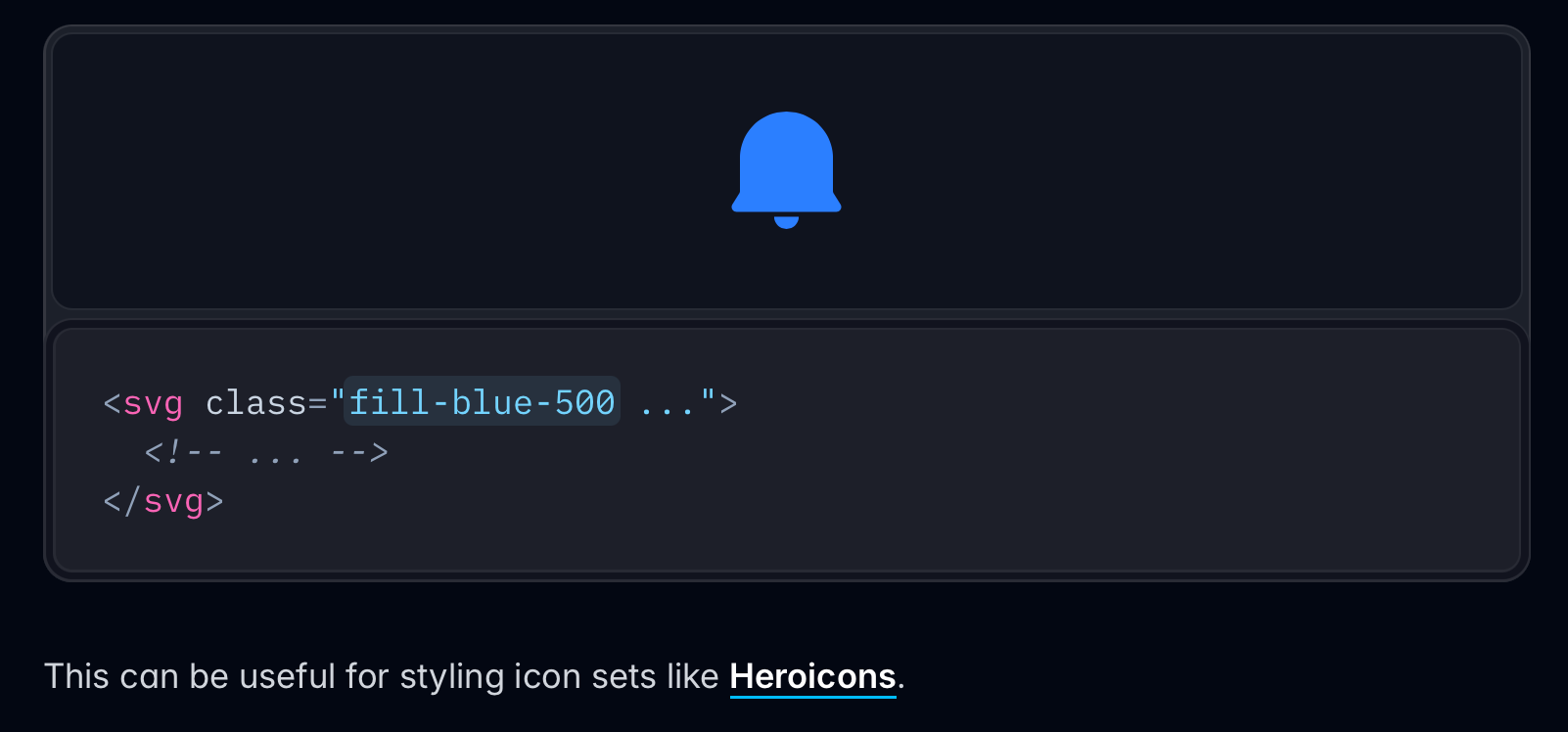
But this only works for SVGs without children that have fill or stroke properties.
<!-- This works because <rect> doesn't have fill --><svg viewBox="0 0 100 50" class="fill-blue-700">  <rect width="100" height="50" /></svg>
<!-- This doesn't work --><svg viewBox="0 0 100 50" class="fill-blue-700"> <rect fill="currentcolor" width="100" height="50" /></svg>fill fill To make fill-* work with such SVGs, you have to reach into the SVG and use fill-* directly on the affected child element… but it’s not worth the effort.
<!-- fill-blue-700 overwrites fill="currentcolor" --><svg viewBox="0 0 100 50"> <rect class="fill-blue-700" fill="currentcolor" width="100" height="50" /></svg>So you’re only going to find fill and stroke useful if you’re working with specialized icon sets without any fill or stroke.
Just change the text colour
I typically use SVGs through my Icon svelte component. It draws icons from Iconify, so I can switch between icon sets easily.
Here’s an example of how I’d use two different icons from Phosphor and Tabler.
<Icon icon="ph:user" client:idle /><Icon icon="tabler:user" client:idle />Phosphor user icon
Tabler user icon
They both use <path> to create the icon, but they do it differently:
- Phosphor uses
fillfor the icon’s colour. - Tabler uses
strokefor the icon’s colour.
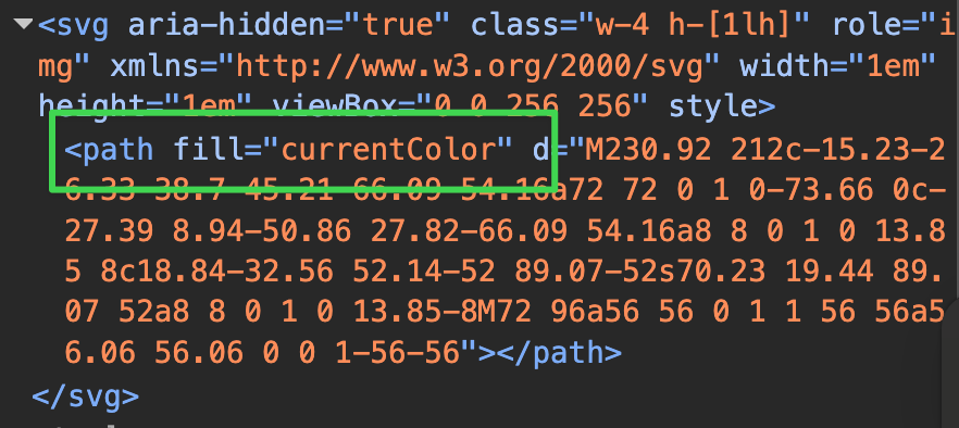
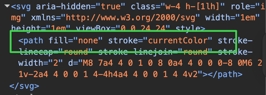
We can see from here that they both use currentColor to denote the icon’s colour — so adjusting the icon’s colour is as simple as changing the color of the element (or containing element).
<Icon class="text-red-500" icon="ph:user" client:idle /><Icon class="text-blue-500" icon="tabler:user" client:idle />Phosphor user icon
Tabler user icon
This is a simple way to make things work.
Sizing and aligning SVG icons
Icons need to be sized correctly or they may overpower the text they’re used with. Usually, a number between 0.8em and 1em is the right size.
<div class="horizontal items-center"> <svg class="text-[1em]">...</svg> <div>Your text here</div></div>0.9em
1em
Centering icons
If the icon and text are in a single line, you can center the items vertically with items-center. (This is built into horizontal by default).
If icons are paired with multiple lines of text, they should be aligned with margins instead. A simple way to do this is to set both the icon’s height and margin-block in lh.
<div class="horizontal"> <svg class="w-[1em] h-[0.8lh] my-[0.1lh]">...</svg> <div>Your text here</div></div>Lorem ipsum dolor sit amet consectetur adipisicing elit. Quam cum asperiores quod deleniti saepe illum molestias cumque facere sit repellat minima, magnam id, possimus maxime beatae? Dolore sit eum possimus?
Welcome! Unfortunately, you don’t have access to this lesson. To get access, please purchase the course or enroll in Magical Dev School.
Unlock this lesson