Tailwind’s colours are a good starting point for a web design, but I argue you’ll almost never want to use them.
That’s because colours create differentiation. Differentiation creates distinction. And distinction creates identity.
You know it without me telling you:
- Sites that use Bootstrap look like Bootstrap
- Sites that use Tailwind look like Tailwind
- Sites that use shadcn look like shadcn
The reason those sites look similar to the frameworks they’re built in, is not because they have to. It’s because the people who built them give away their design power to the frameworks themselves.
You have the power to design
Lots of people break the mold even if they use a framework.
Jack McDade is an example. He built sites with Tailwind, but the sites never look like Tailwind. He adds his own flair into everything he builds. And he has a course that teaches you how to design that way.
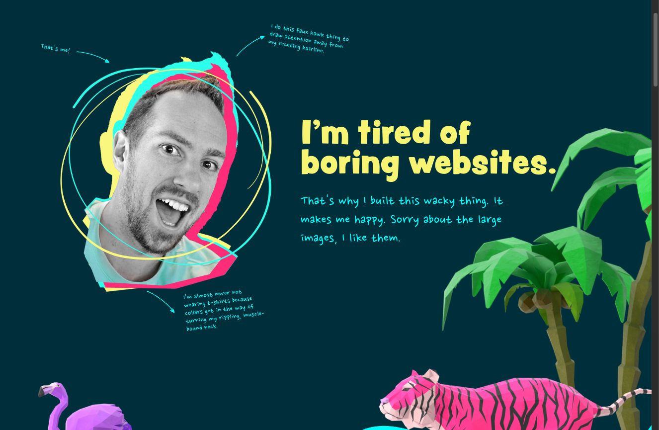
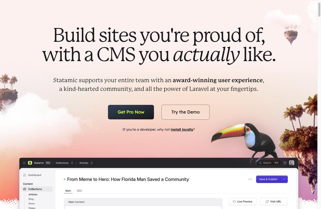
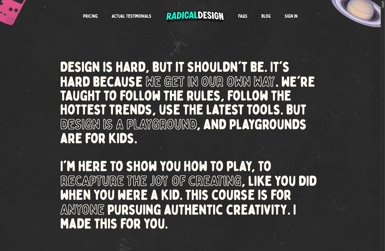
I’ve been designing my way too.
Here is some of my work. I know I have lots of room for improvement — but at the very least, my sites have a distinct flavour different from most sites out there.

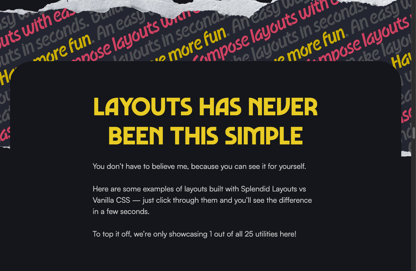
There are only two things you need to change to make your site look unique. Just two:
- Typography
- Colours
You don’t have to master them — but you gotta start, if you don’t want your sites to look like everyone else and drown in the sea of sameness.
Accessibility concerns are not so concerning
Lots of work goes into creating accessible colour palettes. If you have read any of these writings about the amount of work that goes into doing something like this, you may have become overwhelmed.
Don’t be.
If you want to create a corner of the internet that looks like you (or your company), breathes like you, acts like you, and exudes fun like you do, then gotta do what you gotta do.
There are only two words you have to remember. Just two words and you’re set for accessibility (design-wise, at least).
Sufficient contrast.
That’s it.
No need to create a colour palette upfront
I find it’s impossible for me to pick a range of colours from 50 to 950, like what most frameworks give you up front.
So I pick up my colours as I go along.
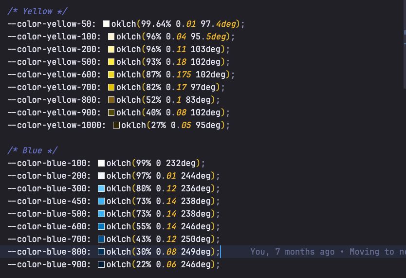
For example, this site uses a lot of blue and yellow. But here are the only colours I picked:
On another site (Splendid Labz), I use a lot of pink. But I don’t fill up the entire range too.
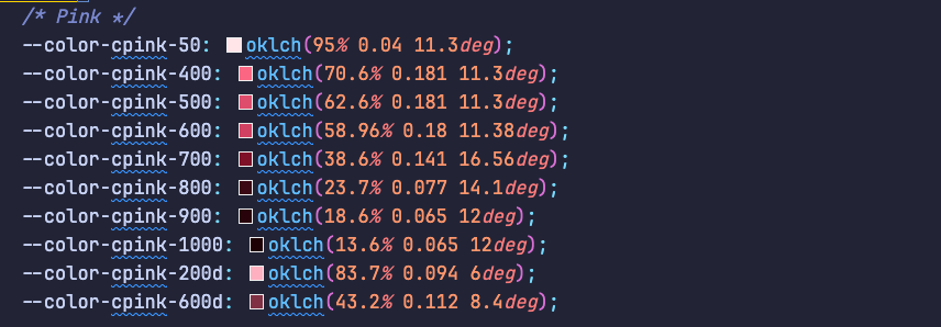
So it’s okay not to have the full colour range — you can just top up along the way.
Bring your colours to the world
This is not really a “lesson”, but more of a call for you to bring out your innate design talents into the world. Only you have the chance to bring it out — and I hope this helps as a wake-up call, or accelerates you towards the manifestation of your talents.
Welcome! Unfortunately, you don’t have access to this lesson. To get access, please purchase the course or enroll in Magical Dev School.
Unlock this lesson