I really mean it when I told you to create components liberally in an earlier lesson.
The idea is to make things easy for you by creating reusable “functions” or code pieces that you can plonk and use easily with a few variables here and there.
I call that writing higher-level CSS.
That is because when CSS is written in a way that is understandable and quick to apply, we don’t have to dive into the nitty-gritty details and spend our time there.
This is why I create components at every opportunity — so I don’t have to go through the grind of writing smaller utilities one-by-one when they can be re-used.
Now let me dive a little bit deeper into this concept.
Two ways to create components
The two ways are:
- Make a CSS component
- Make a framework component file
Making a CSS Component
Whenever writing Tailwind classes in the HTML becomes clunky, I almost always create a CSS component file. These components are what you’d expect. Examples of these include accordions, tabs, pricing cards, etc.
Their purpose is to store groups of styles that are similar to each other. So you’ll have an easier time finding them.
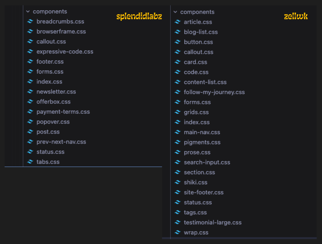
I’m using “utility” and “component” interchangeably here because they mean the same thing in this system.
It doesn’t matter whether you choose a @utility or a .class. But if you want some rules, I would choose @utility over .class if:
- I want to
@applythe utility later - I don’t want the utility to show up in my CSS unless it is used
Since I’d use almost everything I build on a site, it doesn’t really matter whether I build components with utilities or classes. But when I build a library (like Splendid Styles), I use @utility.
Component File
Component files are files that house the HTML for a component. One for an accordion might look like this:
<div class="accordion"> <h3> <button> <!-- header goes here --> </button> <svg> <!-- svg icon --> </svg> </h3> <div class="accordion-content"> <!-- content goes here --> <slot /> </div></div>I use my utilities in these framework files as well. But I have no problems transferring more complex declarations into a CSS component file.
An example here is a pricing plan card. It might contain stuff that’s too complex to recreate multiple times. But simple enough if we encase it into a component.
<!-- Pseudo code makes more sense here as an example --><div class="pricing-card"> <!--recommended tag --> <!--price --> <!--discounted price --> <!--title --> <!--items --> <!--link to purchase --></div>Common gotcha when building component files with Tailwind
Tailwind needs the entire utility name + value written as one string. It cannot contain variables mid-string.
// doesn't workconst theme = 'yellow'const color = `text-${theme}-500`To circumvent this, you might want to create a theme map for your component. Then extract the necessary classes from it.
// worksconst theme = 'yellow'
const themes = {  yellow: {    bg: 'bg-yellow-50',    text: 'text-yellow-900',  },  // other themes ...}
// Then you can use your values like this:const chosenTheme = themes[theme]const { bg, text } = chosenThemeWelcome! Unfortunately, you don’t have access to this lesson. To get access, please purchase the course or enroll in Magical Dev School.
Unlock this lesson