When I talk about layouts, I’m referring to how you place items on a page. The CSS properties that are widely used here include:
display— oftengridorflexnowadaysmarginpaddingwidthheightpositiontop,left,bottom,right
I include border-width as a minor item in this list as well.
At this point, there’s only one thing I’d like to say.
Tailwind is really great for making layouts.
There are many reasons why:
- Layouts are dependent on the HTML structure
- There’s no need to name layouts
- Just-in-time layout requirements
- Responsive variants can be created on the fly
Layout styles are highly dependent on the HTML structure
When we shift layouts into CSS, we lose the HTML structure. And it takes mental effort to reestablish them.
Imagine you have this two-column grid in CSS:
<div class="grid"> <div class="grid-item"></div> <div class="grid-item"></div></div>.grid { display: grid; grid-template-columns: repeat(3, 1fr); gap: 1rem;
> :first-child { grid-column: span 2; }
> :last-child { grid-column: span 1; }}Now cover the HTML structure and just read the CSS. As you do that, notice you need to exert effort to imagine the HTML structure that this applies to.
Now imagine the same, but built with Tailwind utilities:
<div class="grid grid-cols-3"> <div class="col-span-2"></div> <div class="col-span-1"></div></div>You might almost begin to see the layout manifest in your eyes without seeing the actual output. It’s pretty clear: 3 column grid, first item spans 2 columns while the second one spans 1 column.
But grid-cols-3 and col-span-2 are kinda weird and foreign-looking because we’re trying to parse Tailwind’s method of writing CSS.
This obviously isn’t the best way — and that’s why I stress so much on creating utilities.
Use your utilities over Tailwind’s utilities
If you do this, you can define your own syntax and make the layout crystal clear to you.
For example, I defined the number of columns for the grid and the number of --columns an item should --span with CSS variables. This layout is extremely clear to me.
<div class="grid-simple [--cols:3]"> <div class="[--span:2]">...</div> <div class="[--span:1]">...</div></div>It’s the same 3-column layout.
But this is much easier to see — and know — what’s going on. Perhaps better than both the CSS and Tailwind version.
Why not use 2fr 1fr?
If you’re new to CSS grid, you may ask this question: “Why not use 2fr and 1fr for a 3-column grid?”
.grid { display: grid; grid-template-columns: 2fr 1fr;}The answer is simple. Because it doesn’t work.
This is because fr is calculated based on the available space that remains after subtracting away the grid’s gutters (or gap).
Since 2fr 1fr only contains 2 columns, the output from 2fr 1fr will be different from a standard 3-column grid.
Alright. Let’s continue with the reasons that make Tailwind great for building layouts.
There’s no need to name layouts
Tailwind removes the need for you to name layouts. I rarely come up with better names than:
- Number + Columns like
two-columns - Semantic names like
content-sidebar
But these names don’t do the layout justice — you can’t really tell what’s going on even if you use two-columns, because two-columns can mean a variety of things:
- Two equal columns
- Two columns with
1fr auto - Two columns with
auto 1fr - Two columns that span a total of 7 “columns” and the first object takes up 4 columns while the second takes up 3…
You can already see me tripping up when I try to explain that last one there…
Instead of forcing ourselves to name the layout, we can let the numbers do the talking — then the whole structure becomes very clear.
<div class="grid-simple [--cols:7]"> <div class="[--span:4]">...</div> <div class="[--span:3]">...</div></div>The variables paint a picture.
Layout requirements can change depending on context
One of the hardest things to do within Vanilla CSS is to create layouts that have different spacing in different contexts.
Consider the example below where we have two-column layouts.
- The bigger one with wider gaps
- The smaller one with smaller gaps
The difference in gap sizes is subtle, but it is used to show that the items are of separate groups.
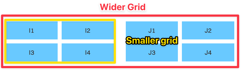
In this case:
- The wider grid has a wider gap
- The smaller grid has a smaller gap
So, if you are building with CSS only, you typically need to name a modifier, which means you need to name the classes.
.two-col-wider {  /* ... */  gap: 1rem;}
.two-col-narrow {  /* ... */  gap: 0.5rem;}
Whereas for Tailwind, you can just add the gap property, and that changes the layout on the fly.
<div class="grid-simple [--cols:2] gap-6"> <div class="grid-simple [--cols:2] gap-2">Left 4 blue rectangles</div> <div class="grid-simple [--cols:2] gap-2">Right 4 blue rectangles</div></div>A real example
So let’s move from theory into an actual real-world scenario where I use this concept in my site design.
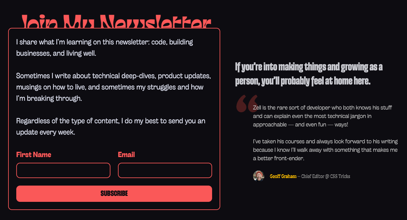
Here you can see:
- There is a larger gap between the newsletter box and the quotes,
- And a smaller gap between the form items within the newsletter itself.
Another real example
Let’s say you’re writing a header.
Your subscription has been confirmed
Conventional typography wisdom says that you should vary the maximum width of the content based on how you want it to be displayed.
In this case, I believe that it is much nicer to add a max-width property to this heading so that it reads in a nicer way. It also prevents a word from being an orphan.
Your subscription has been confirmed
Without Tailwind, you’ll need an inline style for something of this nature.
<h2 class="h2" style="max-width: 12em;"> Your subscription has been confirmed</h2>With Tailwind, you can specify the max-width in a terser way:
<h2 class="h2 max-w-[12em]"> Your subscription has been confirmed</h2>Responsive variants can be created on the fly
Tailwind has the ability to create responsive layouts without leaving the HTML.
I think this is a superpower that has not been found in any other CSS framework, and this is the feature that makes layouts incredibly easy!
With CSS grid, if you want to define a responsive layout, you might need media queries.
.two-column {  display: grid;  grid-template-columns: 1fr;  /* other properties */
  @media (width >= 768px) {    grid-template-columns: 1fr 1fr;  }}
With Tailwind, you do not need the media query. You just need to specify the breakpoint with a responsive variant. (Which has this syntax variant:utility).
<div class="grid-simple md:[--cols:2]">...</div>If you’re not a fan of writing responsive variants in the HTML, you can still choose to apply your Tailwind utility and extend the column count with media queries — still much easier than writing the CSS from scratch.
.two-column {  @apply grid-simple;  /* --cols: 1 is the default */
  @media (width >= 800px) {    --cols: 2;  }}
To top it off — we can even reuse the same simple-grid utility to create various different grid variants. For example, I have two columns on mobile and five columns on desktop in here.
<div class="grid-simple [--cols:2] md:[--cols:5]">...</div>

Of course, this is just another example where you don’t have to name your layouts. So you can tell by the number of times I’m emphasizing this, that naming layouts is a real pain point for me.
Welcome! Unfortunately, you don’t have access to this lesson. To get access, please purchase the course or enroll in Magical Dev School.
Unlock this lesson