Shell layouts are the layouts that create the application’s shell. It’s the outermost layout of the website or application. It’s kind of like the outer wrappings of a house.
This category includes styles for the header, content, sidebar, and footer.
Building Shell Layouts
Through the process of building this layout, I realized that shell layouts are very unintuitive to build — mostly because I have to remember to deal with the height property of the body element and all other gotchas that I typically would not have to wrestle with when I’m building a normal layout.
That’s why I’ve created two different utilities to build almost any shell layout we want.
Shell Simple
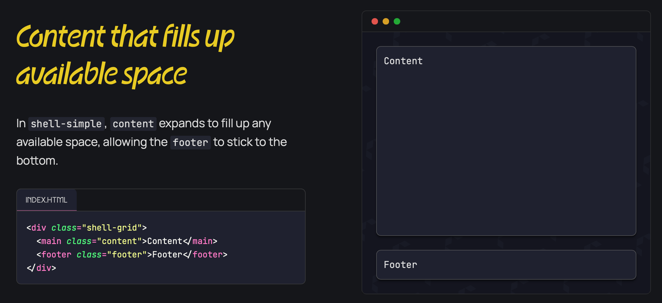
shell-simple creates a simple one-column layout for the shell, which basically means there is a header and content and a footer. You can include other sections as you need.
One example of this is the single-column page like Astro’s blog.
To build this, all you have to do is add the shell-simple class along with the children elements that you want to include in it. For the Astro blog, it might look like this.
<div class="shell-simple"> <header>...</header> <main class="content">...</main></div>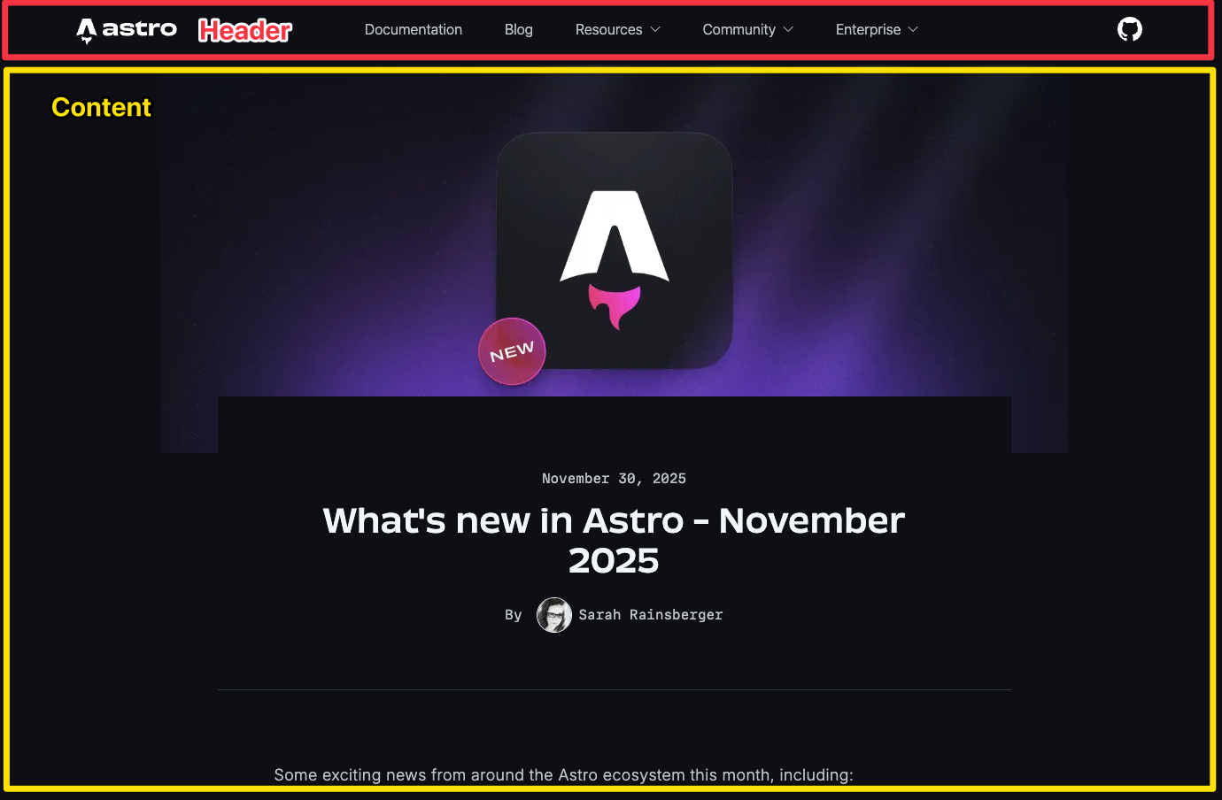
These layouts typically have a footer that sticks to the bottom of the page when there is insufficient content to fill out the entire viewport height.
One prime example of this is a 404 page when there is not enough content.
To build this layout, you just have to include the footer element, and shell-simple will take care of it for you automatically.
<div class="shell-simple"> <header>...</header> <main class="content">...</main> <footer>...</footer></div>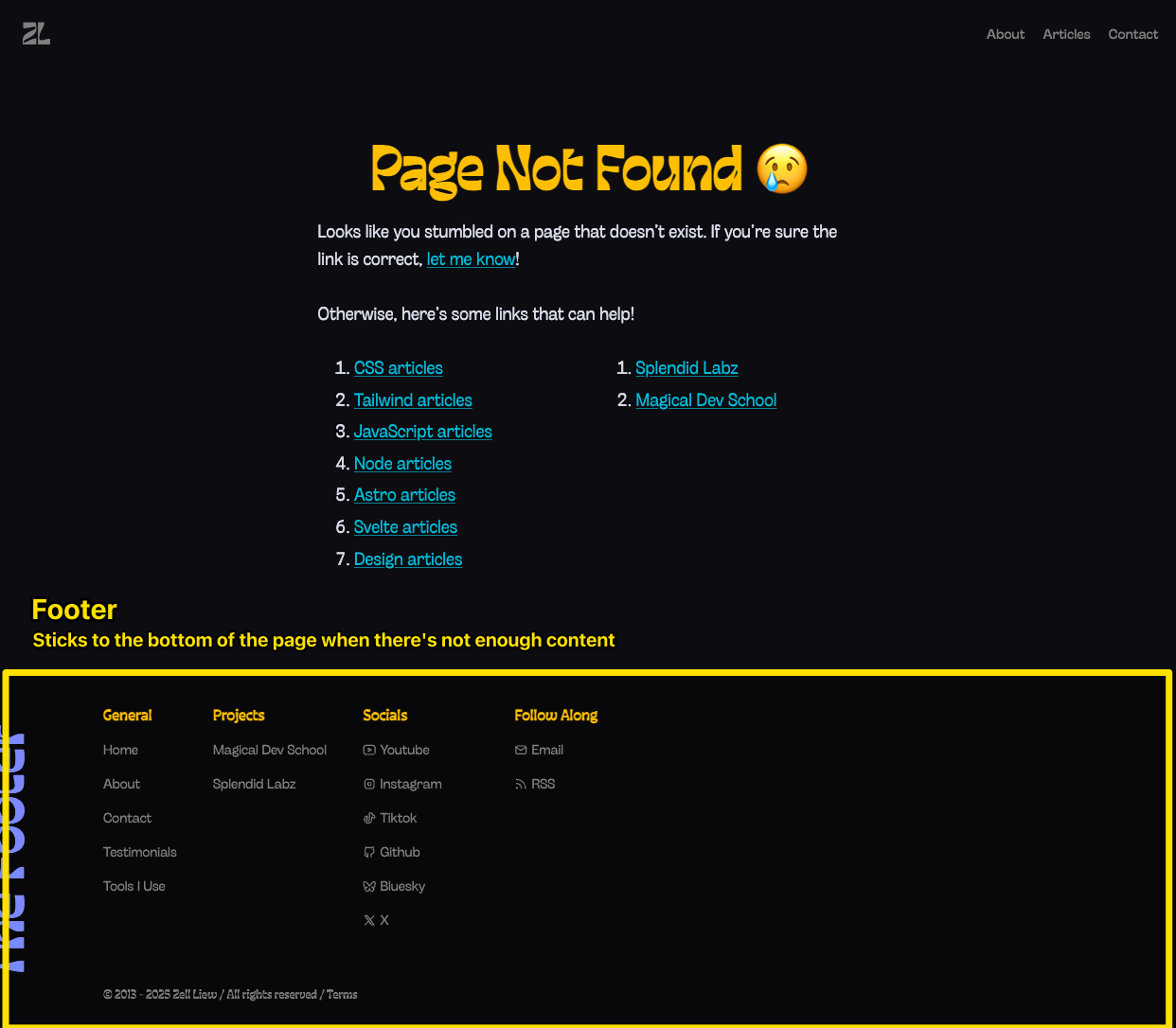
You can also use shell-simple to create a layout that contains multiple columns of content. The whole idea here is that the content within is centered together as one column.
The concept here will be much easier to explain with a picture. If we take CSS-Tricks as an example, you can see that the center content, although it contains two columns, they are centered in a bigger one-column grid.
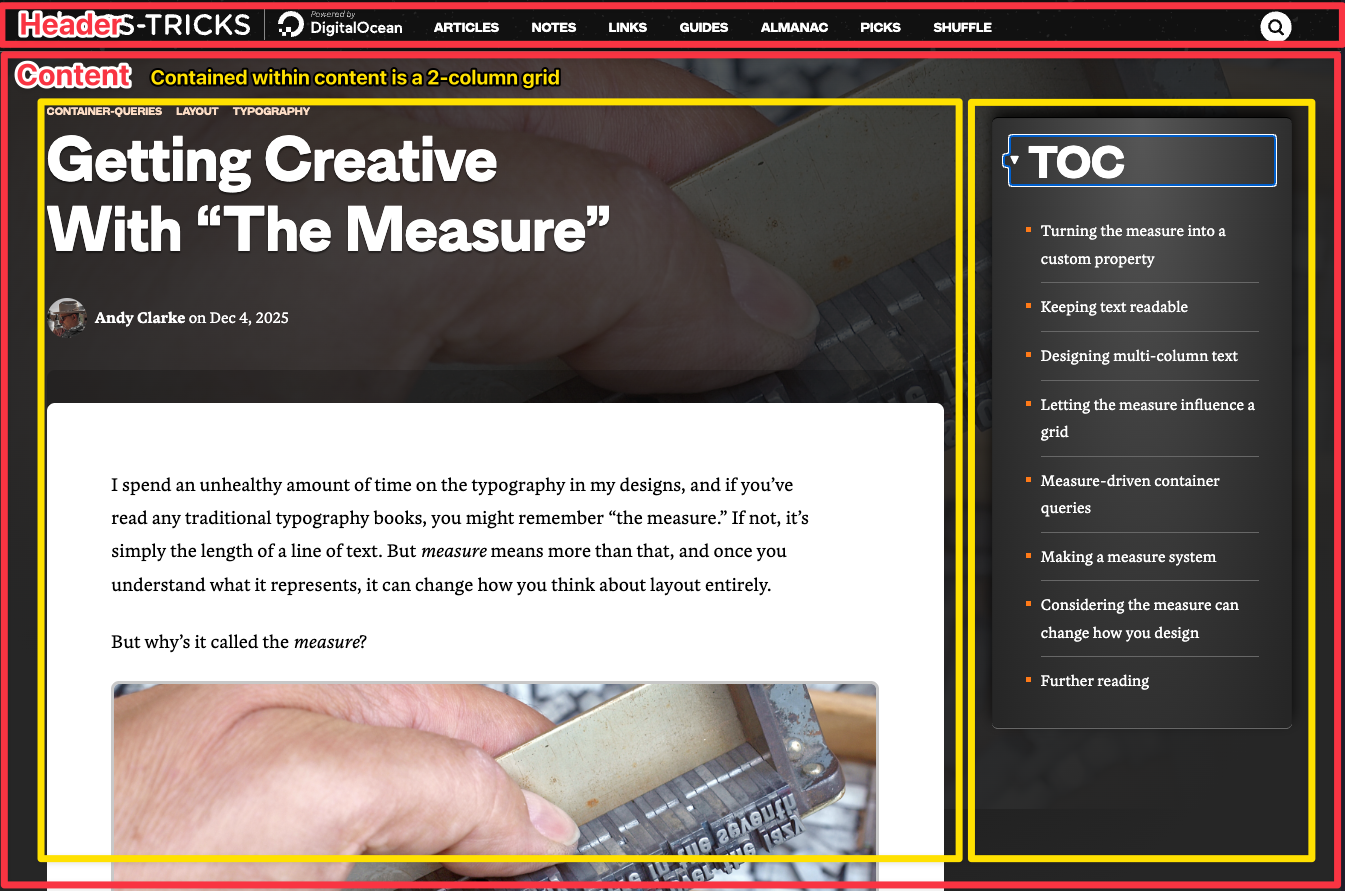
This layout can be easily created by using a macro layout like grid-simple.
<div class="shell-simple"> <header>...</header> <div class="content"> <div class="grid-simple [--cols:3]"> <main class="[--span:2]">Article goes here</main> <aside>Sidebar goes here</aside> </div> </div></div>Shell Grid
shell-grid is made for more complicated layouts that typically have a left or right sidebar to go along with it.
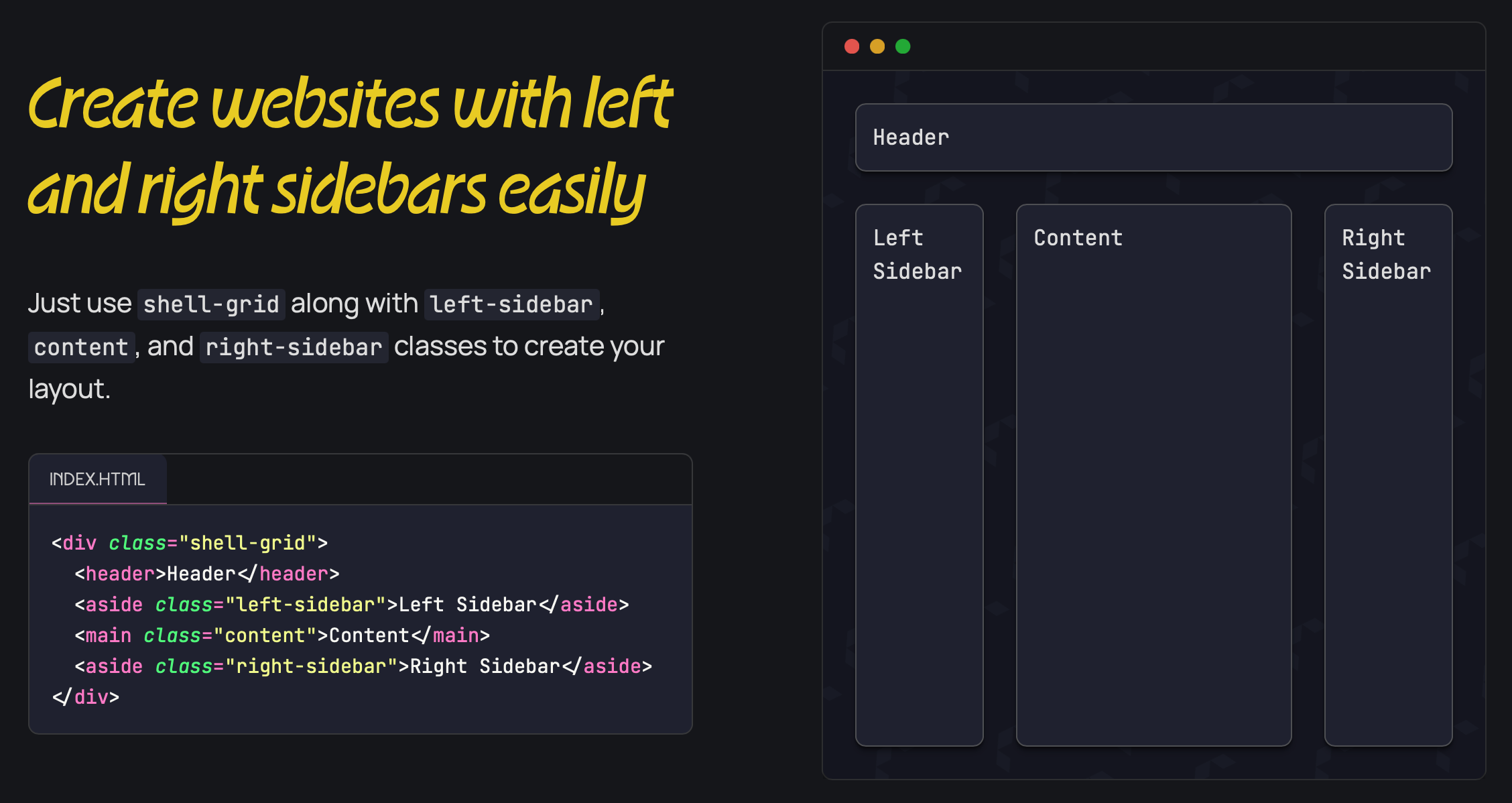
Sites that use this layout typically include complex content — like Twitch.
<!-- Example of building Twitch's shell with shell-grid --><div class="shell-grid"> <header>...</header> <div class="left-sidebar">...</div> <div class="content">...</div> <div class="right-sidebar">...</div></div>
The right sidebar of shell-grid is optional, so you can opt to exclude it if you want to, which makes it very flexible for creating a wide variety of layouts.
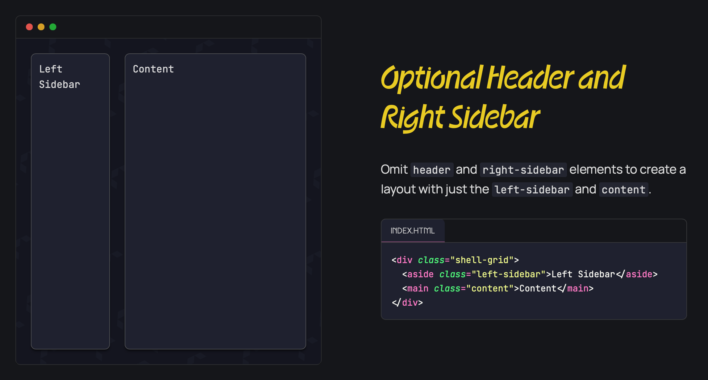
This makes it possible to create most application shells where there is only a left sidebar (like Cloudflare’s and Stripe’s).
<!-- Example of building Application shells --><div class="shell-grid"> <div class="left-sidebar">...</div> <div class="content">...</div></div>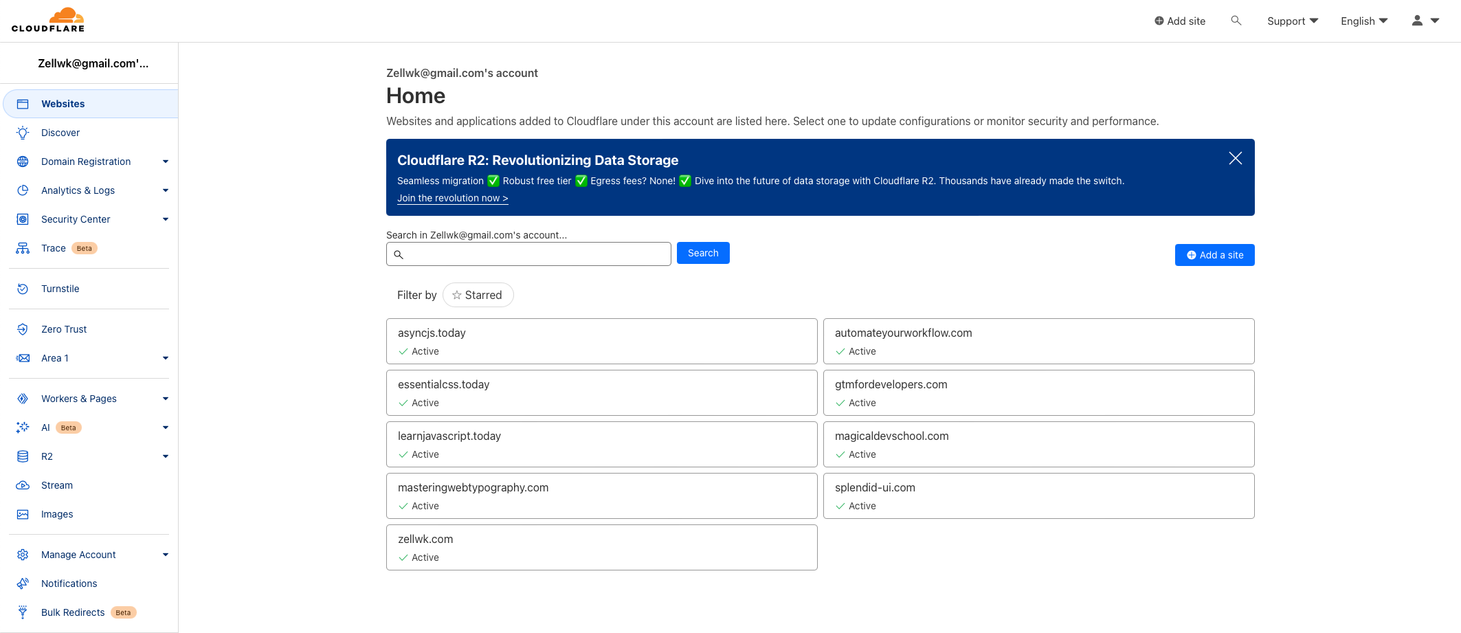
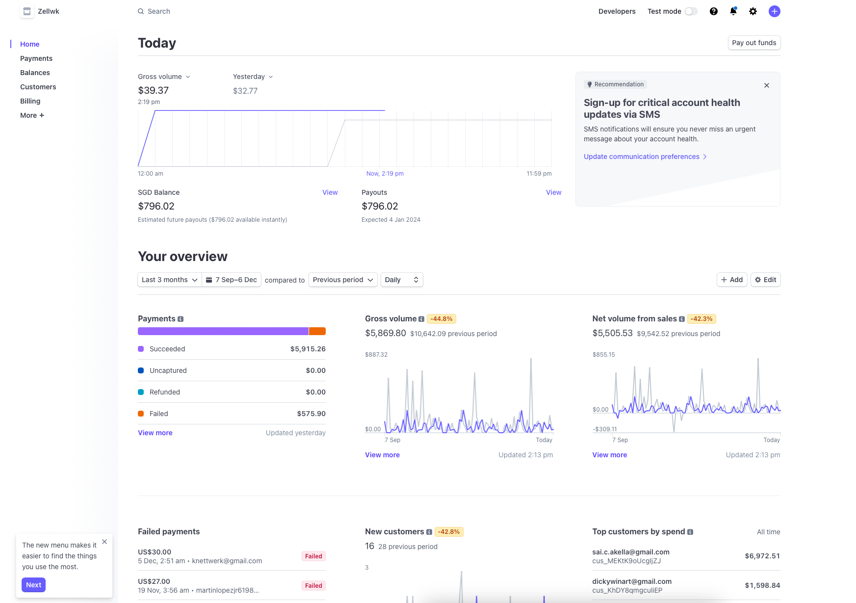
The only caveats to note are:
- The header is fixed in place, so it looks like a sticky header.
- Scrollbars are created on the
sidebarand thecontentsections themselves, respectively, instead of the mainbodyelement.
Hybrid Grid Layouts
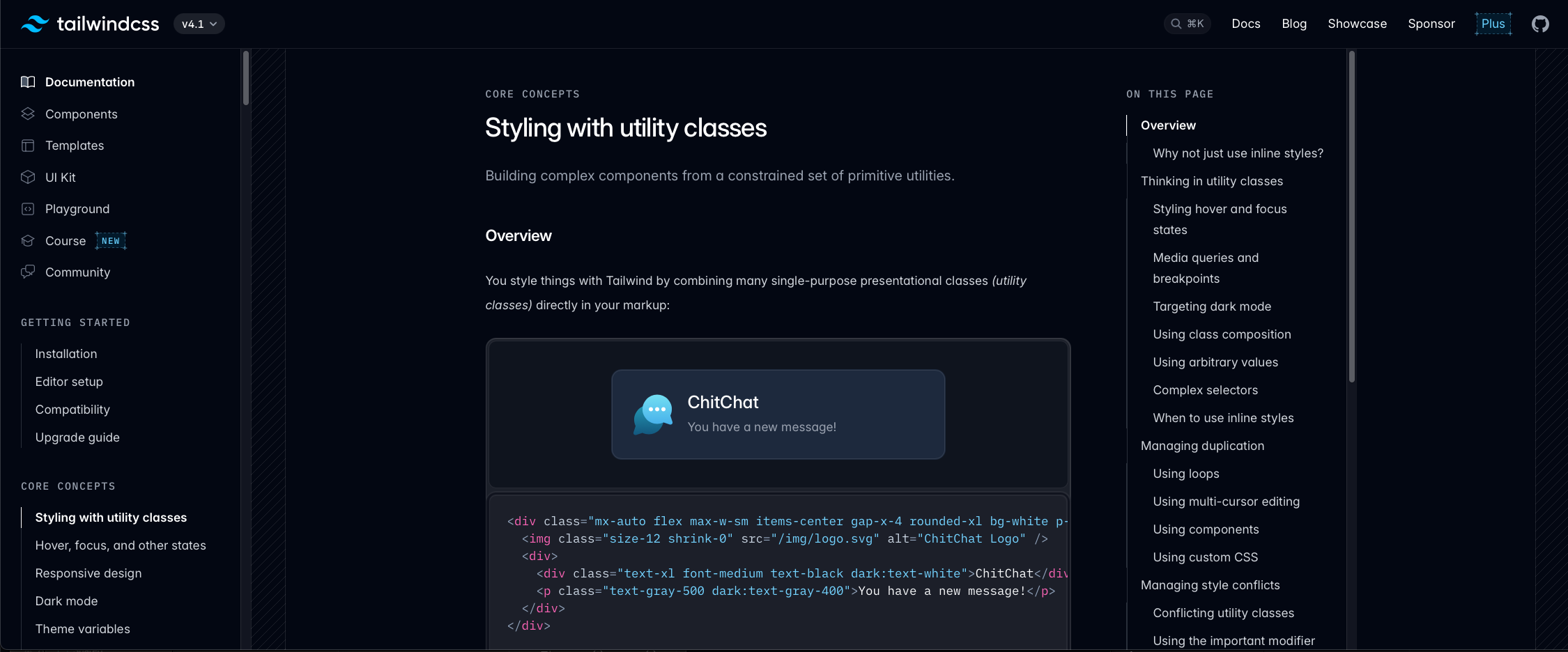
Many content websites actually do not need the right-sidebar for shell-grid. Instead, they are best created by using a two-column macro layout within the content of shell-grid. This allows you to center the content like Astro’s and Tailwind’s documentation pages.
<div class="shell-grid"> <!-- Header and left sidebar goes above --> <div class="content"> <div class="grid-simple [--cols:3] max-w-[60rem] mx-auto"> <main class="[--span:2]">Main Content</main> <aside>Sidebar</aside> </div> </div></div>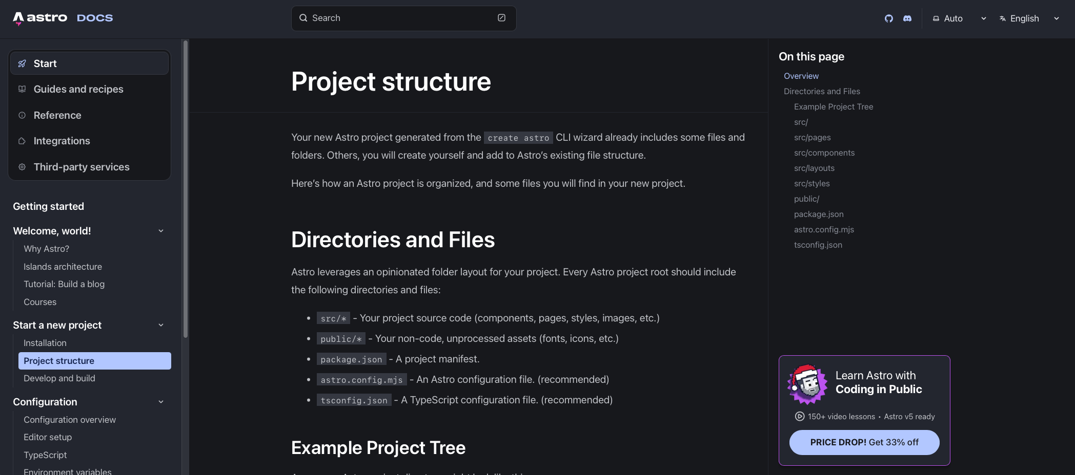
Sticky Sidebar
Article sites like CSS-Tricks and documentation like Astro’s documentation often have a tiny list of the contents on the page — very much like the table of contents you see on the right of this website.

This is not considered a shell layout, but more of a macro layout with a two-column grid and the use of a sticky utility from positioning layouts. So I’m going to talk more about this in the positioning lesson.
But here’s an example for you to play with right now.
Content goes here.
Lorem ipsum dolor sit amet consectetur adipisicing elit. Quisquam, quos
Lorem ipsum dolor sit amet consectetur adipisicing elit. Quisquam, quos
Lorem ipsum dolor sit amet consectetur adipisicing elit. Quisquam, quos
Lorem ipsum dolor sit amet consectetur adipisicing elit. Quisquam, quos
Lorem ipsum dolor sit amet consectetur adipisicing elit. Quisquam, quos
Lorem ipsum dolor sit amet consectetur adipisicing elit. Quisquam, quos
Lorem ipsum dolor sit amet consectetur adipisicing elit. Quisquam, quos
Choosing between Shell Simple and Shell Grid
The answer here is really easy:
- Choose
shell-simpleif you have one content block. - Choose
shell-gridif you need fixed left and right sidebars.
I hope this helps you, and now you no longer have to struggle with building shell layouts by yourself by copy-pasting code from who knows where.
Welcome! Unfortunately, you don’t have access to this lesson. To get access, please purchase the course or enroll in Magical Dev School.
Unlock this lesson