Macro layouts are a term I use for the major layouts of a site — things like 1-column, 2-column, 3-column, and 4-column layouts.
Building 1-column layouts
One-column layouts are the easiest. We basically have to do nothing at all, and you get that. So why even talk about one-column layouts?
Well, yes, they are easy, but there are two major ways of building this — and that is to use block or flex.
Block vs Flexbox
The major difference is this:
- With block, you need to use
marginorpaddingbetween children elements to create spaces between them. - With Flexbox, you can use
gapon the element itself
<!-- Block --><div class="space-y-4">...</div><!-- Flexbox --><div class="flex flex-col gap-4">...</div>I prefer using Flexbox for two reasons:
- I prefer using
gapoverspace-ybecause it’s easier to write. (And it doesn’t feel spacey 🤭). gapworks when you have child content that usesdisplay:contents, butspace-ydoesn’t.
The second reason is obvious when you look at the code. It’s because space-y targets the direct descendant of the class. So it cannot reach into elements that use display: contents.
/* simplified explanation. not the actual code */.space-y-4 > :not(:last-child) { margin-block-end: 1rem;}<div class="space-y"> <!-- Element with display:contents. No CSS applies on this element --> <div class="contents"> <!-- So space-y doesn't actually create margins here --> <div>Actual Content</div> </div></div>Because gap doesn’t reach into the child elements to add margins, it is also more robust since it has a separation of concerns:
- The parent handles the gap between elements
- The child handles itself and the gaps within it
Last but not least — a framework-related reason. I use Astro heavily, and Astro uses display: contents lavishly. So I have an easier time using flexbox than block.
Easier way to use flexbox
Of course I don’t write flex, flex-col and gap every single time because there are a lot of things to write. So I did what I recommended to you, which is to create a utility.
In this case, I named the utility vertical — for a very simple reason, it creates a vertical layout.
/* simplified version of vertical */@utility vertical { display: flex; flex-direction: column; gap: 1rem;}Then to create one-column vertical content with flexbox, I just need to write vertical, and adjust the gap accordingly.
<!-- Before --><div class="flex flex-col gap-4">...</div><!-- After --><div class="vertical">...</div>One example
Now making a vertical layout becomes very easy because I can just use:
- the vertical class
- together with
max-w-*for determining the max width - and
mx-autoformargin-inline: auto.
<div class="wrap vertical max-w-[60rem] mx-auto"> <h2 class="text-center mx-auto ">Header</h2> <div class="text-center">Content</div> <a class="button"> Shop gifts </a> <img src="..." alt="..." /></div>Which means, creating a centered single-column layout like Apple’s example here… is as simple as writing a few lines of HTML.

Quite cool, huh?
Let’s move on.
Building 2-column layouts
Building 2-column layouts is simple with simple-grid as you can tell by now, because:
- We can use
--colsto determine the number of columns the grid should have. - And
--spanto determine the number of columns each child item should take up
Equal-column layouts
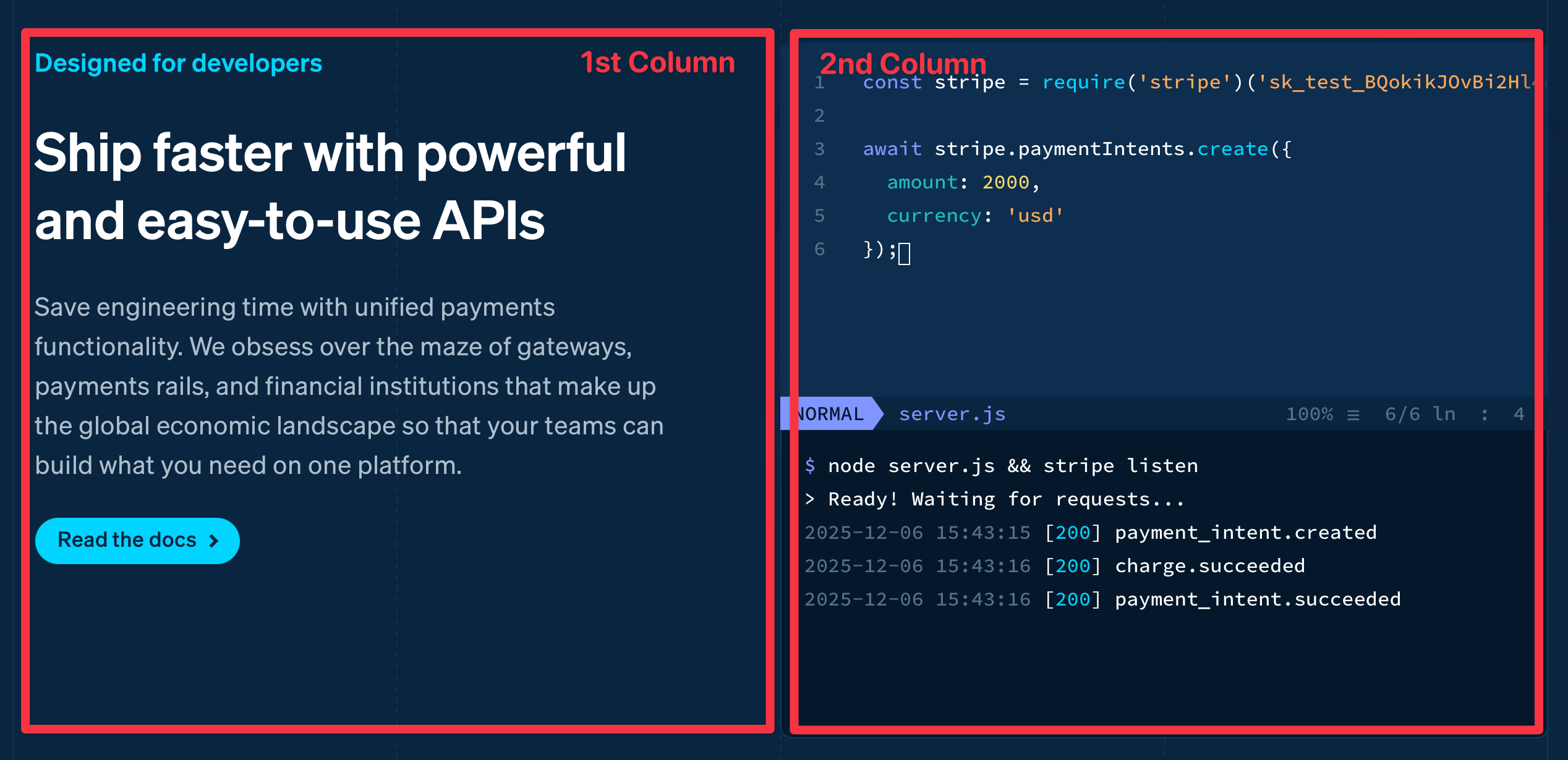
Since --span is 1 by default, to create an equal column grid, we just have to use --cols.
<div class="grid-simple [--cols:2]"> <div>...</div> <div>...</div></div>Which means we can create a two-column layout just like that…
Unequal-column layouts
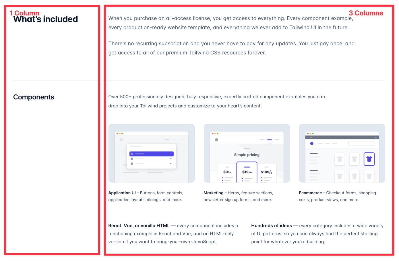
If you need a layout with a different number of columns, we can just change the --cols and --span to make it.
<div class="grid-simple [--cols:4]"> <div>...</div> <div class="[--span:3]">...</div></div>And this scaffolds a layout like this quickly…
Columns with a specified width
For layouts where you want to specify a custom width, like a sidebar with a specific width, I like to use another utility called grid-fr-auto.
I’m pretty sure you can guess what this does just by its name:
- It creates a CSS grid.
- It sets the first column to
1fr - And it sets the second column to auto.
/* simplified version of grid-fr-auto */.grid-fr-auto {  display: grid;  grid-template-columns: 1fr auto;  gap: 1rem;
  > * {    max-width: 100%;  }}
In this case, I can specify the width of the second column with the width property.
<div class="grid-fr-auto"> <div>...</div> <div class="w-[10rem]">...</div></div>There are two reasons here why I set width instead of max-width.
- The child will not blow out since
max-widthis already set to100%. - CSS
gridhas this weird thing where the internals can sometimes collapse. Settingwidthprevents the collapse.
Making them responsive
We can use Tailwind’s responsive variant to make any of our layouts responsive.
For grid-simple, we use it to adjust the --cols and --span
<!-- example for simple grid --><div class="grid-simple md:[--cols:3]"> <div class="md:[--span:2]">...</div> <div>...</div></div>For grid-fr-auto, we use vertical on mobile and swap it in at the breakpoint we desire.
<!-- example for grid-auto --><div class="vertical md:grid-fr-auto"> <div>Content</div> <div class="md:w-[10rem]">Sidebar</div></div>3-columns and beyond
When it comes to 3+ column layouts, I generally reach for one of these 4 utilities depending on what I’m trying to accomplish.
grid-simplegrid-flexgrid-gallerymasonry
I’ll walk you through each use case.
Standard 3-column layouts
The most standard 3-column layout is to have one single column on the mobile and three columns on a larger viewport. We can do this by changing --cols, which you know by now.
<div class="grid-simple md:[--cols:3]"> <div>...</div> <div>...</div> <div>...</div></div>Galleries
Once in a very blue moon, I might want to create a gallery using auto-fit or auto-fill. If that happens, I will use grid-gallery and set the minimum width of each item.
It creates the results you expect of a CSS grid using auto-fit or auto-fill.
/* simplified grid-gallery */.grid-gallery { display: grid; grid-template-columns: repeat( var(--fit, auto-fill), minmax(min(var(--item-width, 3rem), 100%), 1fr) ); gap: 1rem;}When the minimum width is reached, the grid will automatically adjust the number of columns to fit the content.
<div class="grid-gallery [--item-width:200px]"> <div>...</div> <div>...</div> <div>...</div></div>Centering orphans
This is honestly one of the hardest things to do, but by some sheer stroke of luck or insanity, I managed to discover a formula that makes flexbox work the same way as CSS Grid when you specify --cols.
So grid-flex behaves exactly the same way as grid-simple.
<!-- They are equivalent--><div class="grid-simple [--cols:3]">...</div><div class="grid-flex [--cols:3]">...</div>But grid-flex retains the properties of flexbox that allow for orphans to be handled nicely — this means we can center the orphans or justify the orphans instead of leaving them on the left.
<!-- justifying orphans --><div class="grid-flex [--cols:3]">...</div>
<!-- centering orphans--><div class="grid-flex [--cols:3] [--grow:0] justify-center">...</div>grid-flex is responsive too — just change the number of --cols or --span like grid-simple. You already know how to do this so I won’t do another demo here.
Masonry
Masonry is a very nice way of tiling elements of uneven heights and widths together. It is great for a photo gallery, a testimonial wall, or things like that.
Using it is very simple as well. What we need to do is just use the masonry together with the familiar syntax in grid-simple.
<div class="masonry [--cols:2] md:[--cols:3]">...</div>At the time of writing, Masonry is not built into CSS yet. But it works natively on Firefox.
So what I have done is to create a simple polyfill script that allows you to use masonry with very little cost. (Only 66 lines of JS). If you want to use Masonry as well, you need to enable the script.
// enabling masonryimport { masonry } from '@splendidlabz/styles/scripts'masonry()(More info here if you’re curious about the behind-the-scenes of this layout).
The best part
Have you noticed how easy it was for me to showcase various layouts to you without writing an additional line of CSS?
This is why I say Tailwind, when combined with custom utilities, is really the best in class for building layouts.
The utilities I’ve built in Splendid Layouts have made my website building experience much more enjoyable because they are now so intuitive, so quick to build, and so easy to adjust.
Documentation and other utilities
At the time of writing, Splendid Layouts contains 10 utilities. We have covered 5 of them here.
grid-simplegrid-fr-autogrid-gallerygrid-flexmasonry
There are 5 more utilities that I have not covered yet, and they can be quite useful as well.
wrapsectiongrid-auto-frgrid-with-breakoutsubgrid
Here’s the link to the documentation if you’re interested in finding out more about each of these macro layout utilities.
Welcome! Unfortunately, you don’t have access to this lesson. To get access, please purchase the course or enroll in Magical Dev School.
Unlock this lesson