Positioning Layouts are layouts that need to be positioned properly to shift things. The ones we’re talking about are position: relative, position: absolute, position: fixed, and position: sticky.
There are a variety of layouts that use these positions. We’re just going to go through a few of them here.
Absolute Positioning
Floating tags
Imagine for a moment that you have an element with a small floating tag at the top or at the top right like the one here.
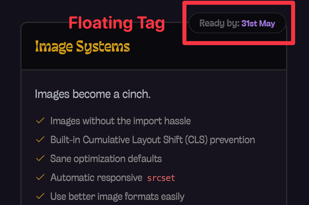
To build this, you typically have to write position: absolute and adjust the top and right values to match the location you want.
.parent {  position: relative;}
.floating-tag {  position: absolute;  top: -0.5em; /* tweak pixels! */  right: -8em; /* tweak pixels! */}
This sort of thing is very easy with Splendid Layouts’ edge utilities. To achieve this one, there’s a utility called edge-topright-start, which basically means:
- Top right edge
- Start position (or left, based on
logicalproperties).
<div class="relative"> <div class="edge-topright-start">Floating Tag</div> <div>Your other content</div></div>But more often than not, you’ll find the tag at the top center of the component. Doing that is also very simple with Edge. We just have to specify edge-top
<div class="relative"> <div class="edge-top">Floating Tag</div> <div>Your other content</div></div>Fixed Positioning
Toast
Toasts are small pop-up messages that can be placed almost anywhere near the edge of the viewport. They can be at the…
- top
- top left corner
- top right corner
- bottom left corner
- bottom right corner
- and bottom (though that’s rare)
Positioning the toast is quite simple. You just need to add position: fixed and let it float around with top, bottom, left, and right properties.
.toast { position: fixed; top: 1rem; left: 1rem;}There’s nothing difficult about that. But what if you could write this positioning without any extra CSS?
This is where Splendid Layouts’ fixed- utilities come in handy. They use position: fixed to place elements at the edges of the viewport.
<div class="fixed-topleft">TopLeft</div><div class="fixed-top">Top</div><div class="fixed-topright">TopRight</div><div class="fixed-left">Left</div><div class="fixed-right">Right</div><div class="fixed-bottomright">BottomRight</div><div class="fixed-bottom">Bottom</div><div class="fixed-bottomleft">BottomLeft</div>BottomRight
BottomLeft
Then you can use nudge to adjust the position of the element towards the center of the viewport.
<div class="fixed-topleft nudge-4">TopLeft</div><div class="fixed-top nudge-4">Top</div><div class="fixed-topright nudge-4">TopRight</div><div class="fixed-left nudge-4">Left</div><div class="fixed-right nudge-4">Right</div><div class="fixed-bottomright nudge-4">BottomRight</div><div class="fixed-bottom nudge-4">Bottom</div><div class="fixed-bottomleft nudge-4">BottomLeft</div>TopLeft
TopRight
Right
BottomRight
Bottom
BottomLeft
Drawers
I don’t think I need to explain what drawers are, but they are panels that open up and show you stuff. And they can be on the left or the right or the top or the bottom.
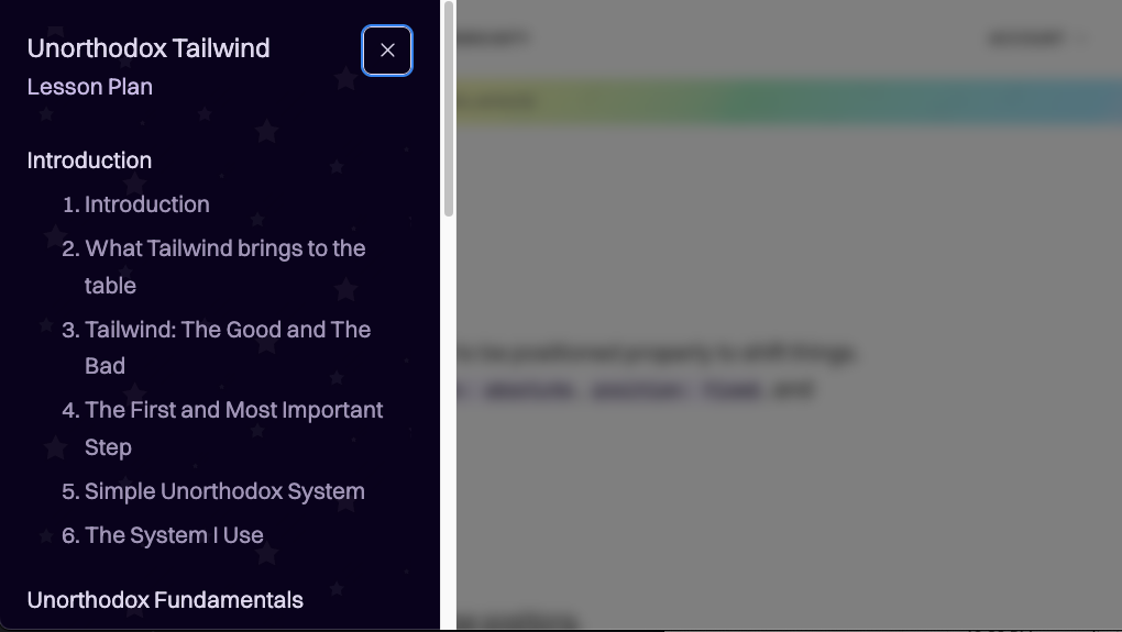
The CSS for creating a drawer is simple as well. The key is to use fixed and top, left, and right to position the drawer.
/* left drawer */.drawer { position: fixed; top: 0; left: 0; bottom: 0;}Here you can also use Splendid Layouts’ fixed utilities to create a drawer easily. In this case, we are just adding a keyword called full to the top, bottom, left, or right side.
Sticky Positioning
position: sticky is tricky — and it trips people up. To make sticky work, you have to satisfy three conditions:
- There must be a scrollable ancestor element. Usually, that would be the
<body>element. - The parent element of
stickymust contain sufficient height for it to scroll. - If scrolling vertically, the
stickyelement must have atoporbottomattribute to determine where it sticks. If scrolling horizontally, it must have aleftorrightattribute.
Sticky Header
To create a sticky header, you just need to add position: sticky and a top property to the header. So there’s nothing difficult about this either.
.header { position: sticky; top: 0;}But what if you didn’t need to remember to write top or even a z-index value to keep it up at the top? That’s what Splendid Layouts’ sticky utility does in a nutshell.
<header class="sticky">Sticky Header</header>Absolute said to Relative, “I don’t need you.”
Relative smiled. “Then good luck — top: 10px from where, exactly?”
Fixed scrolled past, unbothered, glued to the glass, muttering something smug about viewports and permanence.
Sticky tried to commit but kept flinching at every threshold, half in, half out, never quite sure which parent to trust.
Static stood still and said nothing, as is tradition — the quiet default everyone forgets is already there.
Then z-index walked in and started a fight no one asked for, stacking contexts like grudges, refusing to explain the rules.
Transform passed through and accidentally trapped Fixed in a containing block, which nobody noticed until the bug report came in on Monday.
Float drifted by, ancient and tired, still owed an apology from 2003.
Flow watched it all from the side, quietly holding the layout together, not arguing, not escaping, not stacking, not sticking — the only one in the room who actually knew where anything belonged.
— Written by Shiz, my Claude Assistant
Sticky Sidebar
Sticky sidebars work when your content has sufficient height for it to scroll. So it’s important for the parent container to stretch the full length.
The simplest way to do this is use shell-simple. Then, you add a grid within the content. And set the sidebar to sticky.
<div class="shell-simple"> <div class="content"> <div class="grid-simple [--cols:3]"> <main class="[--span:2]">Content</main> <aside class="sticky">Sticky Sidebar</aside> </div> </div></div>Absolute said to Relative, “I don’t need you.”
Relative smiled. “Then good luck — top: 10px from where, exactly?”
Fixed scrolled past, unbothered, glued to the glass, muttering something smug about viewports and permanence.
Sticky tried to commit but kept flinching at every threshold, half in, half out, never quite sure which parent to trust.
Static stood still and said nothing, as is tradition — the quiet default everyone forgets is already there.
Then z-index walked in and started a fight no one asked for, stacking contexts like grudges, refusing to explain the rules.
Transform passed through and accidentally trapped Fixed in a containing block, which nobody noticed until the bug report came in on Monday.
Float drifted by, ancient and tired, still owed an apology from 2003.
Flow watched it all from the side, quietly holding the layout together, not arguing, not escaping, not stacking, not sticking — the only one in the room who actually knew where anything belonged.
— Written by Shiz, my Claude Assistant
Documentation and other utilities
We’ve covered almost every position utility Splendid Layouts provides.
edgefixednudgesticky
The only one I didn’t cover is pos. I rarely use it nowadays so I don’t find it important to talk about.
You can find out more about each of these utilities in the documentation.
That’s all you need to know about creating layouts with Tailwind!
Welcome! Unfortunately, you don’t have access to this lesson. To get access, please purchase the course or enroll in Magical Dev School.
Unlock this lesson