Micro layouts can be thought of as the layouts for a component. They are somewhat synonymous, but the word micro fits into the whole macro-micro system, so it’s easier to remember them that way.
For example, if you have a two-column macro layout, then everything within each of these two columns is a micro layout.
There are lots of variations of micro layouts — most components you create will live within this category. Examples of these include: Accordions, Cards, Login components, and others.

Building real examples
Let’s take a look at how to build some components so you have an idea how to use the micro layout utilities.
A hero component
One of the most common layout patterns is the content for a hero. Here, you have a header, some text, and a couple of buttons.

The easiest way to do this is to use the vertical utility we talked about in macro layouts to build the vertical portion. Then I have a horizontal utility to build the horizontal portion.
<div class="vertical gap-2"> <h2>Header</h2> <p>Text</p> <div class="horizontal gap-2"> <a href="#">Button 1</a> <a href="#">Button 2</a> </div></div>Here’s an example of this working:
Never miss the cache again
Cache every single thing your app could ever do ahead of time, so your code never even has to run at all.
A responsive card
Many micro layouts — even responsive ones — can be built just with vertical and horizontal utilities.
The Product Hunt card below is a good example:
Here we have three major parts.
- The app icon
- The content
- Comment and Upvote buttons
The general layout is a horizontal one, but the content needs a vertical layout.
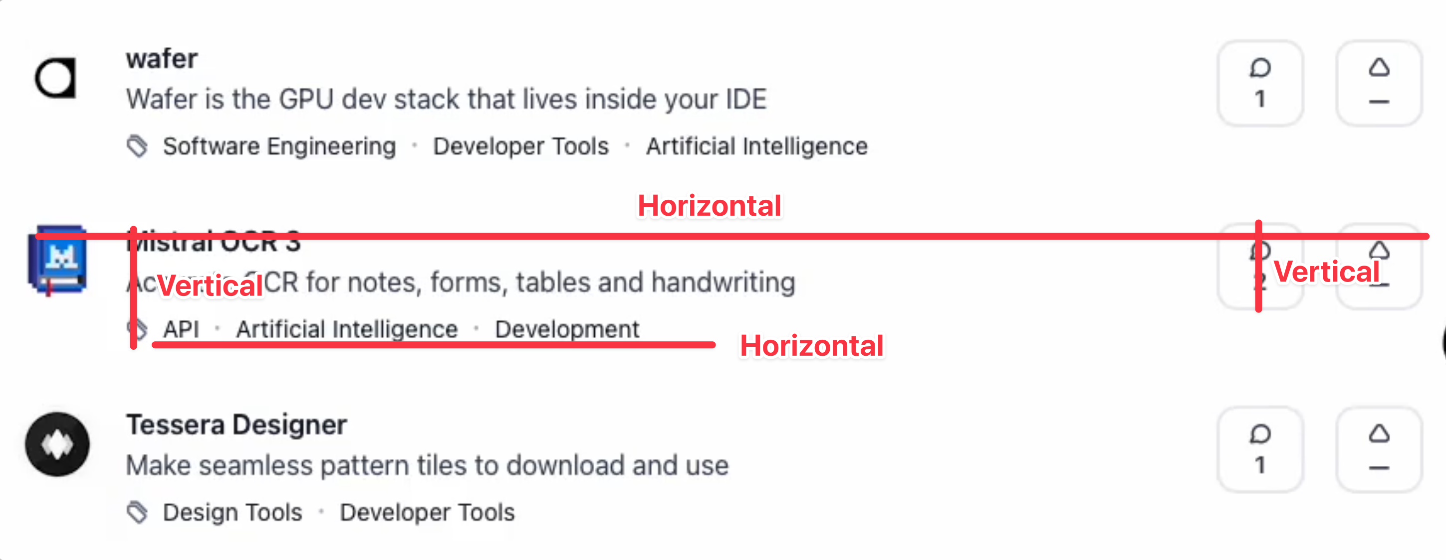
We can scaffold this quite quickly with the following HTML.
<div class="horizontal">  <img src="app_icon" alt="icon_alt" />
  <div class="vertical flex-grow">    <!-- Card content -->  </div>
  <!-- Comment and upvote buttons -->  <button class="vertical">    <svg> Icon </svg>    <span> 10 </span>  </div>  <button class="vertical">    <svg> Icon </svg>    <span> 100 </span>  </div></div>
The content needs a vertical to house the title and text. Then another horizontal to house the tags.
<div class="vertical flex-grow"> <strong> title </strong> <p>Text</p> <div class="horizontal"> <svg>Tag icon</svg> <a> API </a> · <a> Artificial Intelligence </a> · <a> Development </a> </div></div>Without any spacing treatment, the component looks a little bit horrendous because the gap is set to four spacing units (gap-4) by default in both horizontal and vertical utilities.
Accurate OCR for notes, forms, tables and handwriting
Then we can adjust a few gap properties here and there to make the component look right:
<div class="horizontal gap-3"> <img ... /> <div class="vertical gap-0 ..."> <strong> ... </strong> <p>...</p> <div class="horizontal gap-y-0 gap-x-1"> <svg>Icon</svg> <div class="flow gap-[inherit]">...</div> </div> </div> <button class="... gap-0"> <svg>Icon</svg> <span> 10 </span> </button> <button class="... gap-0"> <svg>Icon</svg> <span> 100 </span> </button></div>Accurate OCR for notes, forms, tables and handwriting
To make this responsive according to Product Hunt’s original card, we can use Tailwind’s responsive variants and hidden utility to hide stuff on smaller containers.
<div class="horizontal gap-3 !text-6"> <img ... /> <div class="vertical flex-grow gap-0"> <strong> ... </strong> <p>...</p> <div class="hidden @bp7:horizontal !gap-0 !gap-x-1"> <svg>Tag icon</svg> <div class="flow gap-[inherit]">...</div> </div> </div> <button class="hidden @bp7:vertical aspect-square self-start !gap-0"> <Icon class="w-4 h-4" icon="tabler:message-circle" client:idle /> <span> 10 </span> </button> <button class="vertical aspect-square self-start gap-0"> <Icon class="w-4 h-4" icon="tabler:caret-up" client:idle /> <span> 100 </span> </button></div>And the outcome is a responsive card!
Accurate OCR for notes, forms, tables and handwriting
Fancy Backgrounds
There are many cases where a background is added to a section to increase visual interest. Here’s an example where I added an SVG background on Learn JavaScript’s website.
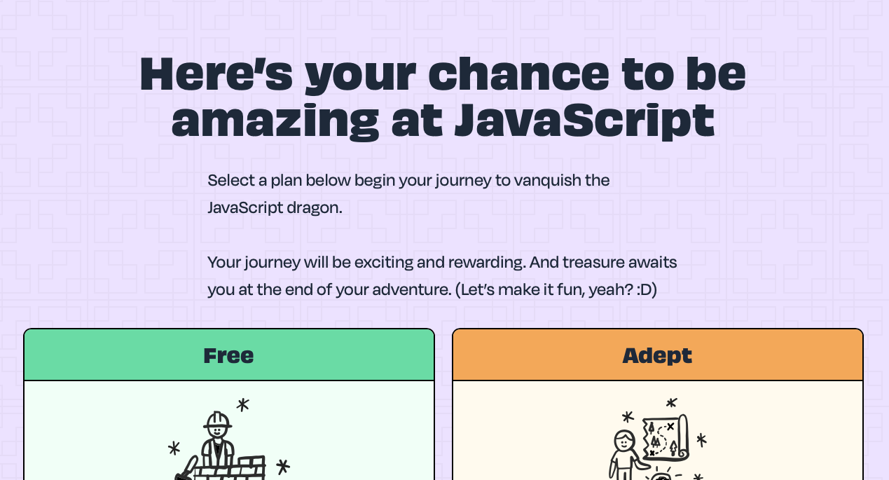
Doing this is simple with stack — it “stacks” items up with CSS Grid, positioning everything on top of each other. (Imagine 1 column, 1 row, and everything just piled on each other).
<div class="stack"> <div>Layer 1</div> <div>Layer 2</div> <div>Layer 3</div></div>To create a background image, all we need to do is to wrap the background and content inside the stack.
<div class="stack"> <div class="background"><!-- Your background here --></div> <div class="content">Content</div></div>Interactive Cards
Imagine an overlay that shows up when you hover over a component. You’ve probably seen this in the wild a lot!
stack makes this somewhat easy to create, but it doesn’t support transitions out of the box.
Since this is a common pattern, I made a stack-interactive variant that shows the overlay on hover, focus-visible, and focus-within. Then all you need to do is to adjust the transition or animation properties on the overlay.
<div class="stack-interactive"> <div>Hover over me!</div> <div class="overlay transition">This is the overlay content</div></div>Login Screen
Earlier, I showed you a login component.
This is easy to build — we just need vertical to stack the buttons and fields. The only tricky part is the divider that contains OR.
For cases like this, I have created a divider component that lets you make this rather easily. You just have to include the text within the component.
<div class="vertical"> <!-- Buttons up here --> <div class="divider-x">OR</div> <!-- Form down here --></div>Scrollbars made easy
We don’t use horizontal scrollbars much, but when you need it, you can use the
Scrollable component. It makes a container scrollable + enables scroll-snap functionality at the same time.
<div class="scrollable-horizontal">...</div>Documentation and other utilities
At the time of writing, Splendid Layouts has 9 micro-layout utilities in it. And just these 9 utilities allow me to build almost any component I want.
I’ve shown you 5 of them so far (the most useful ones).
horizontalverticalstackdividerscrollable
There are a couple more that are used contextually:
flowbreakoutcontainernew-stacking-context
You can find out more about each of them in the documentation.
Welcome! Unfortunately, you don’t have access to this lesson. To get access, please purchase the course or enroll in Magical Dev School.
Unlock this lesson