When we spoke about relative units in a previous lesson, I recommended you to stick with rem or em. In that lesson, I also mentioned my rules for choosing between rem and em.
If you’re new to relative units, these rules would have been confusing for you. We’ll dive deeper into the rules in this lesson. By the end of it, you should be able to decide whether to use rem or em by yourself.
Let’s start by recapping the two rules.
(Note: If you don’t remember what rem or em is, you should return to the chapter on “using relative units”)
The Two Rules
Whenever I decide between Rem or Em, I apply the following rules:
- Size in
emif the property scales according to it’s font-size - Size everything else in
rem.
But when should you scale a property according to it’s font-size? We’ll figure this out with an example. Let’s create a header element using only the rem unit.
Using only rems
Say you have a header element (<h2>) that looks like this:
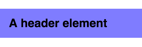
If you sized everything in rem, this header’s styles should be similar to the following:
.header { font-size: 1rem; padding: 0.5rem 0.75rem; background: #7f7cff;}(Note: I’m not using Vertical Rhythm in this example. It makes the math slightly simpler explaining)
Now, let’s say you need to create a bigger version of this header element. The font-size of the header in this bigger version is twice that of the original one.
The markup of this bigger version might look like this:
<a href="#" class="header header--large">header!</a>On first thought, your CSS might be to this:
.header {  font-size: 1rem;  padding: 0.5rem 0.75rem;  background: #7f7cff;}
/* Twice the font-size of the original .header */.header--large {  font-size: 2rem;}
Even though the code makes sense, the results don’t turn out well. From the image below, you can see there’s insufficient breathing space between text and the edges of the element in this bigger version.

If you insist on using only rems, the only way to fix this problem is to redeclare the padding on the larger version:
.header {  font-size: 1rem;  padding: 0.5rem 0.75rem;  background: #7f7cff;}
.header--large {  font-size: 2rem;  /* Setting padding to be twice of original */  padding: 1rem 1.5rem;}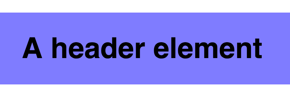
Did you notice a pattern?
.header--large font-size is twice that of .header. Consequently, padding is twice as large as well.
Since padding scales proportionally with the font-size, we can simplify the code by setting padding in em.
.header {  font-size: 1rem;  /* Setting padding in em */  padding: 0.5em 0.75em;  background: #7f7cff;}
.header--large {  font-size: 2rem;}
As you can see, em can be incredibly helpful when you have a property that needs to scale with it’s font size. The first rule is created from this thought process.
Next, let’s see what happens if you use an em only approach for the same header.
Using Only EMs to Make a Header Element
An em implementation isn’t far from the rem code we left off. All we have to do is change rem to em.
.header {  font-size: 1em;  padding: 0.5em 0.75em;  background: #7f7cff;}
.header--large {  font-size: 2em;}
With this set of code, both header and header--large is identical to the previous code we had. (Shouldn’t be a surprise for though).
On an initial glance, there doesn’t seem to be a problem with the code. The problem appears only later, when your element interacts with other elements on the page.
Let’s say there’s text before and after the header, like this:
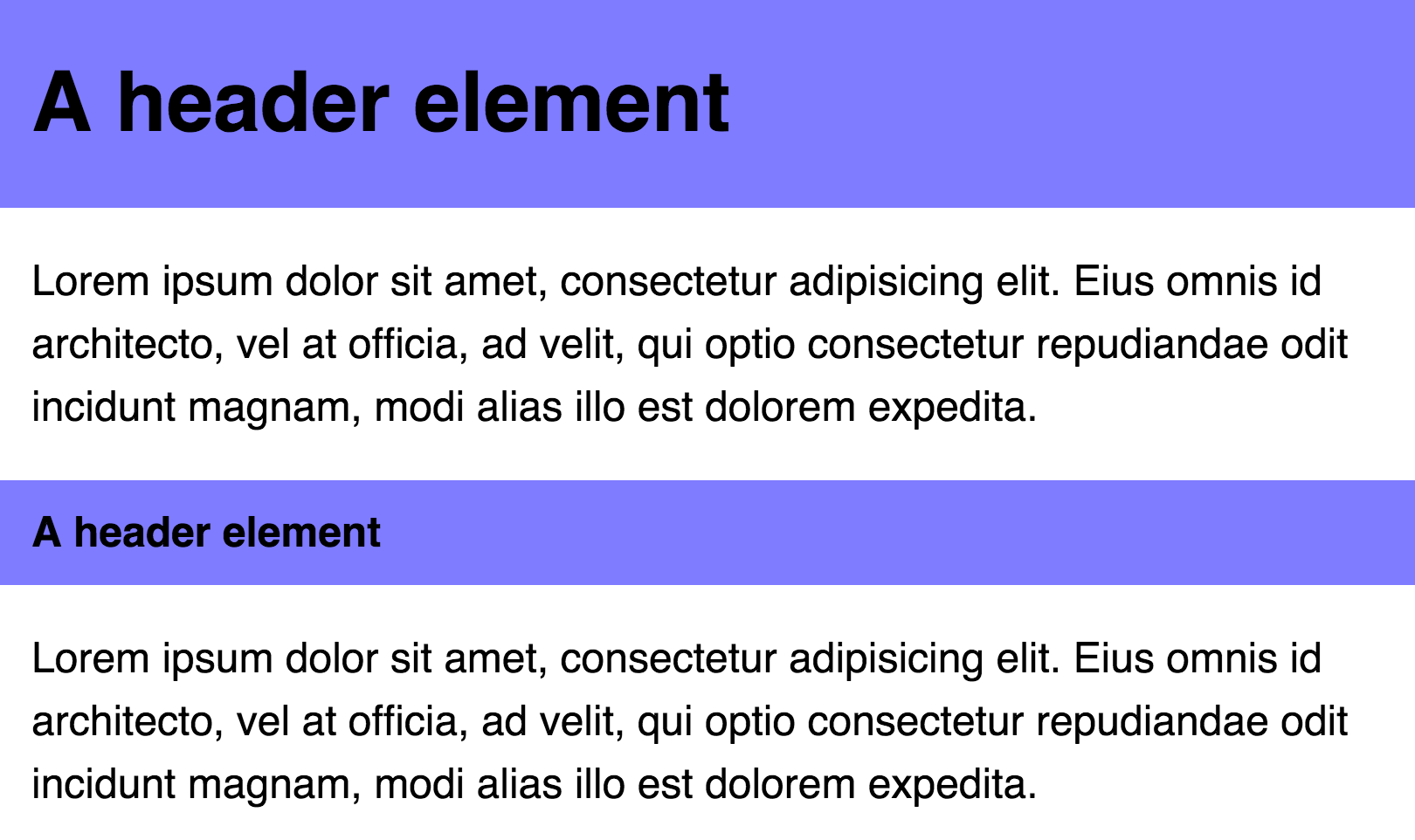
And the markup for this set of elements is:
<div class="header header--large">A Header Element</div><p>A paragraph of text</p><p>A paragraph of text</p><div class="header">A Header Element</div><p>A paragraph of text</p>If you pay attention to the above image, you should see that there are margins to the left and right of the paragraphs:
p { margin-left: 0.75em; margin-right: 0.75em;}Now, if we left our code here, we’ll get the following image. Notice the large header contains extra padding on the left, which pushes it out of alignment.
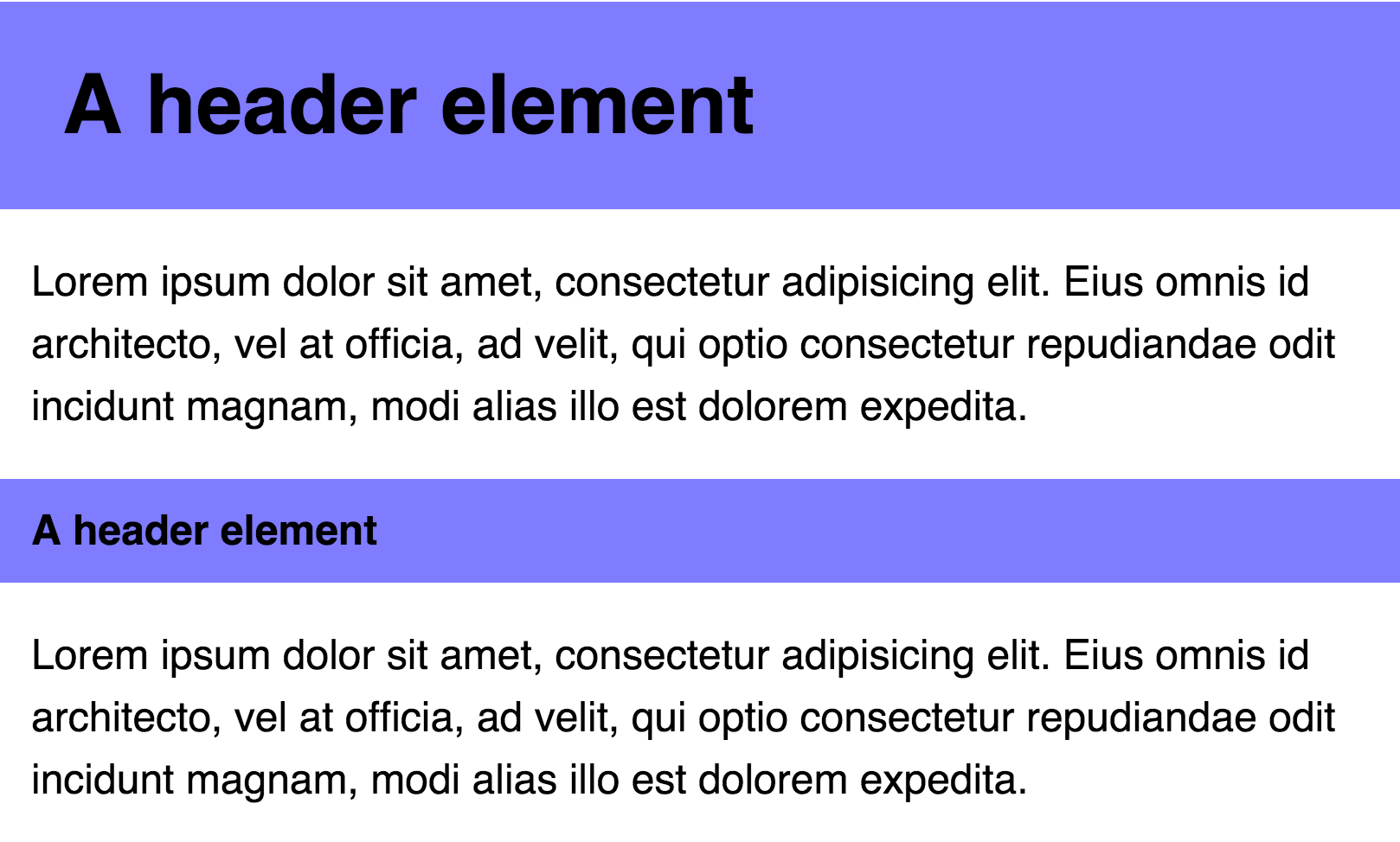
padding on the large header are doesn’t align with the text If you insist on using only em, the only way to fix this problem is to redeclare the padding-left and padding-right properties on the large header:
.header {  font-size: 1em;  padding: 0.5em 0.75em;}
.header--large { font-size: 2em; /* left/right padding is halved */ padding-left: 0.375em; padding-right: 0.375em; margin: 0.75em 0;}Notice what happened here?
The left and right padding does not scale together with the font-size of the header. To keep them the same as before, we halved the left and right padding on the larger header.
Since left/right padding doesn’t scale with the header, we can use a combination of rem and em to get the best of both worlds. Specifically, we use rem for left and right padding and em for top and bottom padding:
.header {  font-size: 1em;  /* Top/bottom in em, left/right in rem */  padding: 0.5em 0.75rem;  background: #7f7cff;}
.header--large {  font-size: 2em;}
As you can see, the em unit is useful when you need to scale a property with it’s font-size. However, you’ll run into problems if you need to size the property accordingly to the root font-size.
Everything we’ve talked about so far is quite simple. Let’s go a step further and see how it our components interacts with each other on a grid, which brings us closer to what you’ll code in real life.
Rem vs Em in a component on a grid
Before we move on, let’s combine the header and paragraph elements together into a single component:
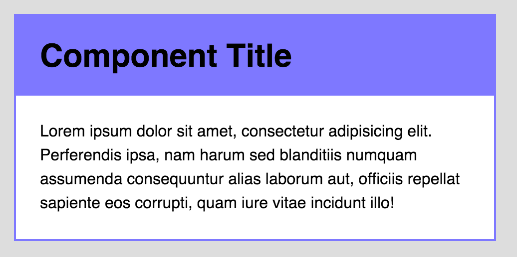
<div class="component"> <div class="component__header">A header element</div> <p>Some paragraph text</p></div>The basic styles for this component are:
.component {  background: white;  border: 2px solid #7f7cff;}
.component__header {  font-size: 2rem;  padding: 0.5em 1.5rem;  background: #7f7cff;  margin: 0;}
.component p {  padding-left: 1.5rem;  padding-right: 1.5rem;  margin: 1.5rem 0;}
So far so good. This was everything we covered in the earlier sections.
Let’s say this component is generic and can be placed almost anywhere in the website. Potential areas include
- The main content area
- The sidebar
- In a 1/3 grid layout
- (etc.)
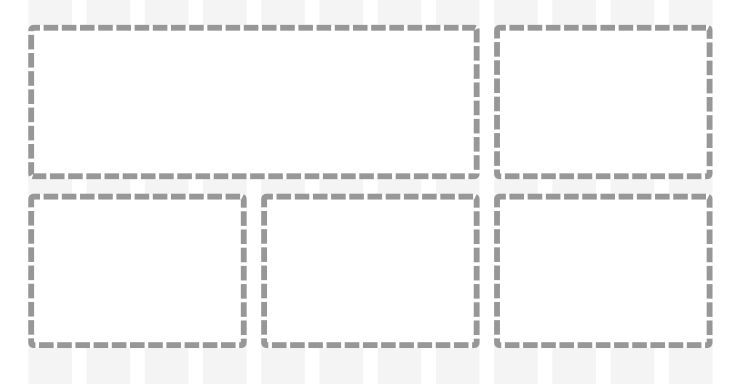
The header element might be rendered with a smaller font-size when the component is placed a narrow location, like the sidebar.
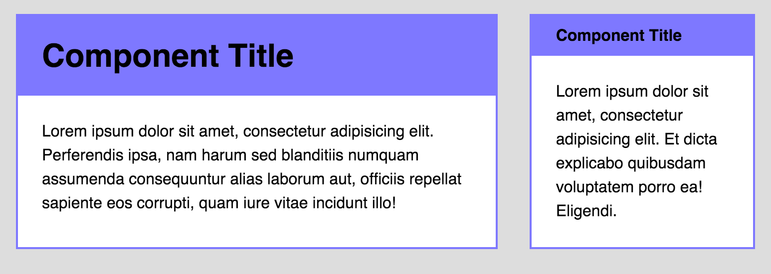
We can create a variant for this by modifying the component’s class. The markup would look like this:
<div class="component component--small"> <!-- Contents of the component. --></div>And the style for this variant is:
.component--small .component__header { font-size: 1rem;}Now, on to the component’s styles. The same two rules still apply:
- Size in
emif property should scale according to it’sfont-size - Size everything else in
rem.
As with the header element, you can identify which properties to size in em by seeing if they interact with the rest of the page. There are two different ways to think about building this component:
- Properties of all inner elements scale with the component’s
font-size. - Properties of some inner elements scale with the component’s
font-size.
Let’s build the component in both ways and you’ll see what I mean.
If properties of all elements scale with the component’s font-size…
…all properties will change once the font-size changes. Such a component may look like this:
If your component behaves in this manner, you need to size everything (except the font-size property) in ems. The code then becomes:
.component {  background: white;  border: 2px solid #7f7cff;}
.component__header {  font-size: 2rem;  padding: 0.5em 0.75em; /* Changed padding into em */  background: #7f7cff;  margin: 0;}
.component p {  padding-left: 1.5em; /* Changed padding into em */  padding-right: 1.5em; /* Changed padding into em */  margin: 1.5em 0; /* Changed margin into em */}
// Small variant.component--small .component__header {  font-size: 1rem;  padding-left: 1.5em; /* Added em-sized padding */  padding-right: 1.5em; /* Added em-sized padding */}
Then, to activate the change in sizes, all you have to do is to change the component’s font-size property.
.component { // Other styles @media (min-width: 800px) { font-size: 1.5rem; }}So far so good?
Let’s bring the complexity up another notch by examining the whitespace between components. For this part, I want to you pay attention to the whitespace between A and B (see below)
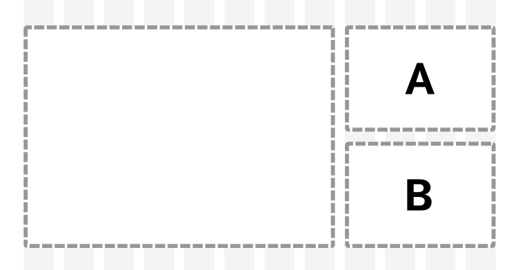
If the gutter between the main content area and the sidebar is 2em, the whitespace between A and B needs to be 2em as well (principle of repetition). How should you write the margin between A and B so that it remains consistent with the gutter? (I’m sure you’ll figure this one out 😉)
Let’s move on.
The downsides to this approach is that it’s tough for you to stay true to your modular scale, main good vertical rhythms and ensure that every component is sized well at the same time (especially when building responsive websites).
Most of the time, you just need to tweak a one property in your component instead of resizing everything, which brings us to the second scenario.
If properties of some elements scale with the component’s font-size…
…you need to selectively choose whether to use rem or em in your component. For example, let’s say the header font-size changes at different viewports while everything else remains the same:
Since we’re only changing the headers’ font-size we have to size all other properties in rem (with the exception of the header’s padding-top and padding-bottom properties since they remain proportional)
.component {  background: white;  border: 2px solid #7f7cff;}
.component__header {  font-size: 2rem; /* Sized in rem instead */  padding: 0.5em 1.5rem; /* Sized in rem instead */  background: #7f7cff;}
.component p {  padding-left: 1.5rem; /* Sized in rem instead */  padding-right: 1.5rem; /* Sized in rem instead */  margin: 1.5rem 0; /* Sized in rem instead */}
.component--small .component__header {  font-size: 1rem; /* Sized in rem instead */}
You can then change the header’s font-size at different viewports by simply adding a media query on them:
.component__header {  font-size: 2rem;  @media (min-width: 1200px) {    font-size: 3rem;  }}
.component--small .component__header {  font-size: 1rem;  @media (min-width: 1200px) {    font-size: 1.5rem;  }}
Vertical Rhythm with Rem and Em
If you try following the above code while using Vertical Rhythm (go on, try it!), you’ll probably run into math complications when you use the em unit.
That’s because the value of the em unit is tied to the font-size property of the current selector. You need to do extra math to figure out the root font-size before you can calculate the value of baseline within the selector.
Furthermore, if you change the font-size of your component, you need to recalculate your em values to ensure Vertical Rhythm remains correct, which becomes tedious.
I highly recommend you stick with rem for most of your code to make Vertical Rhythm easier to handle. Only consider using em if the hassle of writing a few more lines of code outweighs the performance gains from having a super scalable element.
Wrapping Up
In this lesson, you learned when to use the rem unit and when to use the em unit when building components. Bear in mind that there’s no perfect answer. You can always switch between the two units if one doesn’t perform as well as you wanted it to.
You should also consider how your components interact with it’s font-size property and other elements on the page before deciding whether to use rem or em.
Exercise
Try playing around with both Rem and Em values by creating the above components (or build your own) without looking at the code above.
Try adding Vertical Rhythm to the code and see which one you prefer to use in the end. I suspect it’ll be rem :)
Welcome! Unfortunately, you don’t have access to this lesson. To get access, please purchase the course or enroll in Magical Dev School.
Unlock this lesson