Have you thought about how you would code your typography for a real project?
How do you write font-sizes and line-height properties? Do you use classes or HTML tags as your selectors? What about margins and paddings? How do you make your typography modular and scalable?
Answers to these questions may seem straightforward. At least that’s what I thought at first. If you were anything like me, you might be tempted to write typography in the same way as we’ve done through the course. I hate to break it to you, but it’s not as simple as that (it’s not too difficult though, don’t worry!).
Which is why, in this lesson, I want to share with you everything I learned about creating a solid typography structure for your website or application. I want to help you shortcut your learning process so you don’t have to go through the same mistakes I made.
Ready to learn more? Great!
First things first—A reset
I highly recommend you use a CSS reset for every web project. This CSS reset standardizes the differences between browsers so you don’t need to worry about initial browser inconsistencies.
Of all possible reset files out there, the one I use and recommend is Normalize.css.
(By the way, it’s an industry best practice to use normalize.css. Any additional reset from this point onwards stems from my personal preferences.)
Normalize.css is great, but it’s not enough. After normalizing browser differences with Normalize.css, I always remove margins and paddings from common HTML elements like <h1> to <h6>, <p> and list items.
Here’s the additional reset I use:
h1,h2,h3,h4,h5,h6,ol,ul,li,p,figure,blockquote { margin: 0; padding: 0;}Now this additional reset is completely optional. In fact, it’s frowned upon by some experts because they believe it adds unnecessary code.
But I love it.
I love this reset because I care about Vertical Rhythm. I always change all margin and padding values for Vertical Rhythm as I work through my code. This reset saves me from instances where one particular whitespace feels whacky because I forgot to take the default margins into account.
These resets are the minimum I do to prepare project. It’s up to you whether to use both (or just stick with Normalize.css).
With that, let’s move on to another thing I want to share with you—writing font-size and line-height properties.
Writing font-size and line-height properties
We have been writing font-size, line-height, margin and padding properties on the HTML tag selector throughout the course. To jog your brain a little, what we write looks awfully similar to this:
h2 { font-size: 2.369rem; line-height: 1.2; margin-top: 1.4rem; margin-bottom: 1.4rem;}This format works, but only for simple websites. It gets unusable quickly when you work with something more complex. (We wrote this way because it’s easier to explain the mechanics of responsive typography by isolating concepts from real world applications).
Instead, I recommend you to the four properties up into two groups:
- Group 1: font-size and line-height properties
- Group 2: margin and padding properties
Then, I’ll recommend you write properties in group 1 (font-size and line-height) in class selectors instead of the HTML tag selector.
Here’s what it might look like:
.h2 { font-size: 2.369rem; line-height: 1.2;}Why classes, not tags?
Well, that’s a good question.
Whenever we write HTML, we always try to be as semantic as possible. In our industry, writing semantic code means to write code that contains meaning. As much as possible, we use tags, because other devices and also draw meaning from them.
Writing semantic HTML has result in us writing code that looks like this:
<article>  <h1>Dr. Strange is a strange one.</h1>
  <p>    Although Dr. Strange is awesome, the ancient one is not too bad either!    After all, she's where he learned his powers from.  </p></article>
Without the need for classes and extra descriptors, we already know the article contains a header and a paragraph. That’s awesome!
Unfortunately, we sometimes become so ingrained with semantic HTML that we sometimes confuse semantics with presentation. We think they’re the same.
Don’t believe that? Well, here’s a question for you. What do you do if the <h1> from the above example needs a <h2> style instead of the usual <h1> style?
You’ll probably get conflicted. Maybe you’ll change the h1 in this instance to a h2 style with a higher specificity:
/* DON'T DO THIS */article h1 { /* h2 styles */}If you do this, modularity goes out of the window. Just imagine what you’ll do if you need to change the font-size of that new h2 style and you’ll understand why…
Here’s another example. What do you do if your design contains a navigation that has links that are styled exactly like a h5?
Maybe this?
/* DON'T DO THIS */nav a { /* h5 styles */}You can imagine how quickly it goes downhill from here on.
Marry semantics with presentation always make things complicated. You become less flexible. You need to hack your way around things (like the examples above).
Fortunately, these problems go away the moment you decide to uncouple semantics from presentation. Think about it this way: you can keep the semantics from HTML tags intact, but you’ll style these elements with classes.
In the first case, we can simple use a .h2 class to provide the presentation we need:
<article> <h1 class="h2">A H1 that looks like a H2</h1></article>.h2 { font-size: 2.369em; line-height: 1.2;}Much simpler, isn’t it?
Handling the second scenario is easy as well. Likewise, we need a .h5 class that contains the h5 styles. If we have it, we can simply add a class to the navigation, like this:
<nav class="h5"> <a href="#">Link to somewhere</a> <a href="#">Link to somewhere</a> <a href="#">Link to somewhere</a></nav>How does this compare to the previous solution?
The best part about using classes for presentation is that it allows you to remain semantically correct while retaining the flexibility to style elements however you want it to.
(By the way, I do both).
Naming your classes
When naming your classes, I suggest you refrain from using h1 to h6 classes. My argument against these classes mainly comes from my view on maintenance.
Let’s say you’ve decided to use the h2 class for a specific element.
<article> <h1 class="h2">H1 that looks like a H2</h1></article>What do you do if you need to change all occurrences of this h2 to something else at a later stage? You can’t do a simple find and replace to change all h2 classes since there are also <h2> tags. 😢
However, say if you used t2 instead of h2, your chances of a find-and-replace naming collision greatly reduces. Of course, you don’t have to use the t prefix. Feel free to use anything you want.
With that, let’s put our focus on writing margin and padding properties next.
Writing margin and padding properties
I used to think margin and padding properties are straightforward. I should be able to add them together with my font-size declarations and I’ll be good to go. So, in the past, this is what I’ll do:
.h2 { font-size: 2.369em; line-height: 1.2; margin-top: 1.4rem; margin-bottom: 1.4rem;}Unfortunately, as the project gets more complex, I always find instances where I had to overwrite these margins either with 0 or another margin value. I don’t like overwriting as much possible, because it hints of a possible code smell.
So, I came up with two rules to help me determine where to write margins and paddings. They are:
- Write margins and paddings in components
- Use adjacent sibling selectors whenever possible
1. Write margins and paddings in components
Any element, like a header for example, can be placed in different components. When placed in different components, the whitespace to the top or bottom of the element may be different.
So, instead of adding padding to a global class (like .t2), I suggest you write margins or paddings within components as they are required. Unless, of course, you know that the whitespace for your header is always consistent throughout your design.
.component__title { margin-bottom: 2.1rem;}2. Use adjacent sibling selectors whenever possible
This second rule is slightly harder to grasp, so let’s walk through with an example.
Let’s say we’re building an article component, and you’ve added margins to your paragraphs this way:
.article p { margin: 1.4rem 0;}The output for your article resembles the following image. Notice there are extra margins to the top and bottom of the article:
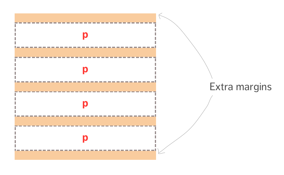
You won’t want the extra first and last margin/padding in the component most of the time. So, what happens is you’ll have to remove them with either :first-child or :last-child (or both, depending how you coded it up).
Now, this isn’t ideal because you have to reset the margins and paddings. There’s a simpler way.
The idea is to use the adjacent sibling selector (+) to perform selections so you never target the first element. Then, you can add a margin or padding to the top of every selected item so you no longer need to reset the first or last margin/padding.
p + p { margin-top: 1.4rem;}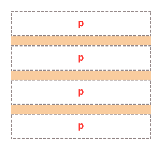
If you happen to have different elements within the component, you can augment the adjacent sibling selector with the CSS universal selector (*). An more robust implementation will might look like this:
* + h2,* + p { margin-top: 1.4rem;}This targets all paragraph tag that’s not the first element and gives it a margin-top of 1.4rem.
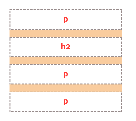
You can even expand it into Heydon’s lobotomized owl selector that targets every element (except the first) with * + *. I find this selector too general most of the time though.
Wrapping up
Responsive typography is not only tough when it comes to scaling across different devices and viewports. We also need to make sure our code remain clean so it’s easy to maintain in future.
In this lesson, you’ve learned a few principles that I use and stick by. Hopefully, they’ll help you understand how to structure typography for a larger application.
Welcome! Unfortunately, you don’t have access to this lesson. To get access, please purchase the course or enroll in Magical Dev School.
Unlock this lesson