Essential CSS
JavaScript Roadmap
Learn JavaScript
Mastering Web Typography
Practical Astro
Understanding Async JS
Unorthodox Tailwind
API Masterclass
Build and Deploy
The Beginner Freelancer
Real World Node
Profile Billing Logout
Learn JavaScript
Lesson Plan
  1. JavaScript and its ecosystem
    1. Welcome to Learn JavaScript!
    2. What is JavaScript used for?
    3. The JavaScript ecosystem
    4. Varying versions of JavaScript
  2. JS Basics
    1. Linking your JavaScript file
    2. Preparing your text editor
    3. The Console
    4. Comments
    5. On semicolons
    6. Strings, numbers and booleans
    7. Understanding Variables
    8. Understanding Functions
    9. The Flow of a Function
    10. Arrow functions
    11. Intro to objects
    12. If/else statements
    13. Comparing Objects
    14. The NOT operator
    15. Null and Undefined
    16. The BOM and the DOM
    17. Selecting an Element
    18. Changing Classes
    19. Listening to events
    20. Callbacks
  3. Building simple components
    1. How to think like a developer
    2. Starter files and Source codes
    3. Do this for every component
    4. 🛠 Off-canvas menu: Building an off-canvas menu
    5. 🛠 Modal: Building a Modal
    6. Lessons from the building process
    7. Debugging errors
    8. How to use a linter
  4. Arrays and loops
    1. Introduction to Arrays
    2. Array methods
    3. For loops
    4. The forEach loop
    5. Selecting multiple elements
    6. Nodes vs Elements
    7. 🛠 Accordion: Building an accordion
  5. Dom basics
    1. Id, classes, attributes, and tags
    2. Changing CSS with JavaScript
    3. Getting CSS with JavaScript
    4. Changing Attributes
    5. Finding an element's size and position
    6. DOM Traversals
    7. 🛠 Tabby: Building Tabby (A Tabbed component)
    8. 🛠 Carousel: HTML and CSS
    9. 🛠 Carousel: Switching slides with JavaScript
    10. 🛠 Carousel: Working the dots
    11. 🛠 Carousel: Positioning slides with JavaScript
  6. Events deep dive
    1. The listening element
    2. Default Behaviors
    3. Event propagation
    4. Event delegation
    5. Removing Event Listeners
    6. 🛠 Modal: Closing the modal
    7. 🛠 Accordion: Event delegation
    8. 🛠 Tabby: Event delegation
    9. 🛠 Carousel: Event delegation
  7. Transitions and Animations
    1. CSS Transitions
    2. CSS Animations
    3. Silky-smooth animations
    4. Integrating CSS transitions and animations with JavaScript
    5. Animating with JavaScript
    6. GreenSock Animation API (GSAP)
    7. 🛠 Off-canvas menu: Animations
    8. 🛠 Modal: Animating the modal
    9. 🛠 Modal: Animating the pointing hand
    10. 🛠 Modal: Animating the waving hand
    11. 🛠 Modal: Wave hand animation with JavaScript (using GSAP)
    12. 🛠 Accordion: Animations
    13. 🛠 Carousel: Animations
  8. Useful JS features
    1. Ternary operators
    2. AND and OR operators
    3. Early returns
    4. Template Literals
    5. Destructuring
    6. Default parameters
    7. Enhanced Object Literals
    8. Rest and Spread
    9. Useful array methods
    10. Looping through objects
    11. Returning objects with implicit return
    12. 🛠 Accordion: Using useful JavaScript features
    13. 🛠 Tabby: Using useful JavaScript features
    14. 🛠 Carousel: Useful JavaScript features
  9. JS Best practices
    1. Write declarative code
    2. Functions with a purpose
    3. Manage scope
    4. Reduce state changes
    5. Don't reassign
    6. Don't mutate
    7. Preventing Objects from mutating
    8. Preventing Arrays from mutating
    9. Write pure functions
    10. 🛠 Accordion: Refactor
    11. 🛠 Carousel: First refactor
    12. 🛠 Carousel: Refactoring the dots part
    13. 🛠 Carousel: Previous and next buttons
    14. 🛠 Carousel: Second refactor
  10. Manipulating text and content
    1. Changing Text and HTML
    2. Creating HTML Elements
    3. Adding multiple elements to the DOM
    4. Removing Elements from the DOM
    5. 🛠 Carousel: Creating dots with JavaScript
    6. 🛠️ Calculator: HTML and CSS
    7. 🛠️ Calculator: Happy Path
    8. 🛠️ Calculator: Testing the Happy Path
    9. 🛠️ Calculator: Easy Edge Cases
    10. 🛠️ Calculator: Difficult Edge Cases
    11. 🛠️ Calculator: Refactoring
    12. The switch statement
    13. 🛠️ Calculator: Refactoring (Part 2)
    14. 🛠️ Popover: Making one popover
    15. 🛠️ Popover: Making four popovers
    16. 🛠️ Popover: Making popovers with JavaScript
  11. Handling Forms
    1. Intro to forms
    2. Selecting form fields with JavaScript
    3. Form fields and their events
    4. Sanitize your output
    5. Generating unique IDs
    6. 🛠️ Popover: Dynamic ID
    7. 🛠️ Todolist: The HTML and CSS
    8. 🛠️ Todolist: Creating tasks with JavaScript
    9. 🛠️ Todolist: Deleting tasks with JavaScript
    10. 🛠️ Typeahead: The HTML and CSS
    11. 🛠️ Typeahead: Displaying predictions
    12. 🛠️ Typeahead: Selecting a prediction
    13. 🛠️ Typeahead: Bolding search terms
  12. Handling Dates
    1. The Date object
    2. Getting a formatted date
    3. Getting the time
    4. Local time and UTC Time
    5. Setting a specific date
    6. Setting a date with Date methods
    7. Adding (or subtracting) date and time
    8. Comparing Dates and times
    9. 🛠️ Datepicker: HTML and CSS
    10. 🛠️ Datepicker: Building the calendar
    11. 🛠️ Datepicker: Building the datepicker with JavaScript
    12. 🛠️ Datepicker: Previous and Next buttons
    13. 🛠️ Datepicker: Selecting a date
    14. 🛠️ Datepicker: Positioning the datepicker
    15. 🛠️ Datepicker: Showing and hiding
    16. Formatting a date with toLocaleString
    17. setTimeout
    18. setInterval
    19. 🛠️ Countdown timer: HTML and CSS
    20. 🛠️ Countdown timer: JavaScript
    21. 🛠️ Countdown timer: Counting Months
    22. 🛠️ Countdown timer: Daylight Saving Time
    23. 🛠️ Countdown timer: Counting Years
  13. Async JS
    1. Introduction to Ajax
    2. Understanding JSON
    3. The Fetch API
    4. Possible data types
    5. JavaScript Promises
    6. Requests and responses
    7. Sending a POST request
    8. Authentication
    9. Handling errors
    10. Viewing response headers
    11. CORS and JSONP
    12. XHR vs Fetch
    13. Using an Ajax library
    14. Reading API documentation
    15. Understanding curl
    16. 🛠️ Todolist: The Todolist API
    17. 🛠️ Todolist: Fetching tasks
    18. 🛠️ Todolist: Creating tasks
    19. 🛠️ Todolist: Editing tasks
    20. 🛠️ Todolist: Deleting tasks
    21. 🛠️ Todolist: Creating tasks with Optimistic UI
    22. 🛠️ Todolist: Handling Optimistic UI errors
    23. 🛠️ Todolist: Editing tasks with Optimistic UI
    24. 🛠️ Todolist: Deleting tasks with Optimistic UI
    25. 🛠️ Todolist: Refactor
    26. 🛠️ Typeahead: How to add Ajax
    27. 🛠️ Typeahead: Adding Ajax
    28. 🛠️ Typeahead: Handling errors
    29. 🛠️ Google Maps Clone: Creating your first Google Map
    30. 🛠️ Google Maps Clone: Fetching JSONP via JavaScript
    31. 🛠️ Google Maps Clone: Drawing directions
    32. 🛠️ Google Maps Clone: Driving directions
    33. 🛠️ Google Maps Clone: Handling errors
    34. 🛠️ Google Maps Clone: Adding stopovers
    35. 🛠️ Google Maps Clone: Refactor
  14. Advanced Async JS
    1. Requesting many resources at once
    2. Asynchronous functions
    3. Handling multiple awaits
    4. Asynchronous loops
    5. 🛠️ Dota Heroes: Listing heroes
    6. 🛠️ Dota Heroes: Filtering heroes (Part 1)
    7. 🛠️ Dota Heroes: Filtering heroes (Part 2)
    8. 🛠️ Dota Heroes: Refactoring
    9. 🛠️ Dota Heroes: Hero Page
    10. 🛠️ Dota Heroes: Making the hero page robust
    11. 🛠️ Dota Heroes: Heroes page refactor
  15. Handling Keyboard Events
    1. Keyboard users
    2. Handling commonly used keys
    3. Keyboard events
    4. Understanding Tabindex
    5. Detecting the focused element
    6. Directing focus
    7. Preventing people from tabbing into elements
    8. How to choose keyboard shortcuts
    9. Creating single-key shortcuts
    10. 🛠️ Off-canvas: Adding keyboard interaction
    11. 🛠️ Modal: Adding keyboard interaction
    12. 🛠️ Accordion: Adding keyboard interaction
    13. 🛠️ Tabby: Adding keyboard interaction
    14. 🛠️ Tabby: Refactoring
    15. 🛠️ Carousel: Adding keyboard interaction
    16. 🛠️ Carousel: Displaying help text
    17. 🛠️ Calculator: Adding keyboard interaction
    18. 🛠️ Popover: Keyboard
    19. 🛠️ Popover: Refactor
    20. Keyboard shortcuts with Command and Control modifiers
    21. 🛠️ Todolist: Keyboard
    22. 🛠️ Typeahead: Keyboard
    23. 🛠️ Typeahead: Selecting a prediction with the keyboard
    24. 🛠️ Google Maps Clone: Keyboard
    25. 🛠️ Dota Heroes: Keyboard
    26. 🛠️ Datepicker: Tabbing in and out
    27. 🛠️ Datepicker: Keyboard shortcuts
  16. Screen reader accessibility
    1. What is accessibility?
    2. How to use a screen reader
    3. Using NVDA
    4. Using Voiceover
    5. Aria roles
    6. Landmark roles
    7. Document structure roles
    8. Live region roles
    9. Widget roles
    10. Window and Abstract roles
    11. Accessible names and descriptions
    12. Hiding content
    13. ARIA properties and ARIA states
    14. ARIA for expandable widgets
    15. 🛠️ Off-canvas: Accessibility
    16. ARIA for modal dialogs
    17. 🛠️ Modal: Screen reader accessibility
    18. 🛠️ Accordion: Screen reader accessibility
    19. ARIA for Tabbed components
    20. 🛠️ Tabby: Screen reader accessibility
    21. 🛠️ Tabby: Refactor
    22. 🛠️ Carousel: Screen reader accessibility
    23. Roles that trigger Forms and Application modes
    24. What's next for accessibility?
  17. Handling Scroll
    1. The Scroll event
    2. 🛠️ Auto-hiding Sticky-nav: HTML and CSS
    3. 🛠️ Auto-hiding Sticky-nav: JavaScript
    4. 🛠️ Auto-hiding Sticky-nav: Natural reveal
    5. Intersection Observer API
    6. Intersection Observer Options
    7. 🛠️ Slide & Reveal
    8. 🛠️ Slide & Reveal: Always fade-in when you scroll down
    9. 🛠️ Slide & Reveal: Fine-tuning the animation
    10. 🛠️ Infinite Scroll: Anatomy
    11. 🛠️ Infinite Scroll: Infinite load
    12. 🛠️ Infinite Scroll: Refactor
    13. 🛠️ Infinite Scroll: Implementing the Infinite Scroll
  18. Mouse, Touch, and Pointer events
    1. Mouse Events
    2. 🛠️ Spinning Pacman: HTML and CSS
    3. 🛠️ Spinning Pacman: JavaScript
    4. Touch events
    5. Pointer events
    6. Touch-action
    7. 🛠️ Spinning Pacman: Supporting Touch
    8. Cloning elements
    9. 🛠️ DragDrop: HTML and CSS
    10. 🛠️ DragDrop: JavaScript
    11. 🛠️ DragDrop: Creating a drop preview
    12. 🛠️ DragDrop: Sortable drop preview
    13. 🛠️ DragDrop: Robustness
    14. 🛠️ DragDrop: Refactor
  19. Object Oriented Programming
    1. Before we begin
    2. What is Object Oriented Programming?
    3. Four Flavours of Object Oriented Programming
    4. Inheritance
    5. This in JavaScript
    6. Call, bind, apply
    7. Creating Derivative Objects
    8. Composition vs Inheritance
    9. Polymorphism
    10. Encapsulation
    11. Closures
    12. Encapsulation in Object Oriented Programming
    13. Getters and Setters
    14. What OOP flavour to use
    15. When to use Object Oriented Programming
  20. Writing reusable code
    1. Creating reusable code by writing libraries
    2. Two Types of libraries
    3. Including libraries with Script tags
    4. Including libraries with ES6 Modules
    5. Dynamic imports
    6. 🛠️ Off Canvas: Building a Library
    7. 🛠️ Modal: Library setup
    8. 🛠️ Modal: Opening the Modal
    9. 🛠️ Modal: Closing the modal
    10. 🛠️ Modal: Inheritance and Polymorphism
    11. 🛠️ Modal: Resolving differences between subclasses
    12. 🛠️ Modal: Exposing properties and methods
    13. 🛠️ Accordion: Building a library
    14. 🛠️ Tabby: Building a library
    15. 🛠️ Carousel: Building a library
    16. 🛠️ Calculator: Library
    17. 🛠️ Calculator: Fixing the Clear Key
    18. 🛠️ Calculator: Handling other keys
    19. 🛠️ Calculator: State
    20. 🛠️ Popover: Library
    21. 🛠️ Popover: Adding event listeners
    22. 🛠️ Typeahead: Library
    23. 🛠️ DatePicker: Library
  21. Going from Vanilla JS to JS Frameworks
    1. 🛠️ Building a Tiny framework
    2. 🛠️ Tiny: Add event listeners
    3. 🛠️ Tiny: Updating state
    4. 🛠️ Tiny: Rendering Child Components
    5. 🛠️ Tiny: Changing Parent State
    6. 🛠️ Tiny: Passing Props
    7. 🛠️ Tiny: Multiple Props
    8. 🛠️ Tiny: Passing values from sibling components
    9. 🛠️ Tiny: Mounting
    10. 🛠️ Tiny: Passing props to descendants
    11. 🛠️ Tiny: A tiny refactor
  22. Single Page Apps
    1. What is a Single Page App?
    2. Simple SPA using only CSS
    3. The Location Interface
    4. The History Interface
    5. Minimum viable server for a SPA
    6. 🛠️ Dota SPA: Introduction
    7. 🛠️ Dota SPA: Building The Heroes List
    8. 🛠️ Dota SPA: Building the filters
    9. 🛠️ Dota SPA: Filtering heroes
    10. 🛠️ Dota SPA: Displaying filtered heroes
    11. 🛠️ Dota SPA: Getting Ready to build the Hero Page
    12. 🛠️ Dota SPA: Building the hero page
    13. 🛠️ Dota SPA: Lore and abilities
    14. 🛠️ Dota SPA: Routing for Single-page apps

🛠️ Carousel: Screen reader accessibility

A carousel is a prominent section of a page. It holds content important enough to warrant a landmark role. Of the 8 landmark roles, the only one a carousel can use is region.

This is why we marked up the carousel with a <section> element. (The <section> element has an implicit region role).

<section class="carousel">...</section>

Each landmark should have an accessible name. In this case, let’s use “Carousel” as the accessible name.

We’ll set the accessible name with aria-label since the words “Carousel” cannot be found on the page.

<section class="carousel" aria-label="Carousel">...</section>

Users can change carousel slides by using the ← and → keys. This method works perfectly for Voiceover users.

Unfortunately, this method won’t work for NVDA users. It doesn’t work for NVDA because NVDA uses → to speak the next character and ← to speak the previous character.

We need to create another method for NVDA users.

You might beat yourself up at this point. You might think you’ve wasted time and energy, and you have to throw away the ← and → functionality.

Don’t beat yourself up. Our work is not wasted. Voiceover users and non-screen reader users can still use ← and → keys. Think of it as an enhancement for them.

We simply have to create a fallback for NVDA users.

Allowing NVDA users to switch slides

We know we cannot use arrow keys for NVDA users. But we also cannot use control, alt, or shift modifiers with arrow keys. They’re all used for other commands.

Key Command
Left Say previous character
Right Say next character
Control + Left Say previous word
Control + Right Say next word
Alt + Left Previous page (browser shortcut)
Alt + Right Next page (browser shortcut)
Shift + Left Selects previous character (system shortcut)
Shift + Right Select next character (system shortcut)

We need a simple way a user can understand and use the interface. The simplest way is let them use the previous and next buttons.

Using previous and next buttons

First, we need to remove the tabindex attribute on the previous and next button elements so users can access them.

<!-- Removed tabindex="-1" from both buttons -->
<section class="carousel" aria-label="Carousel">
<button class="carousel__button previous-button" hidden>...</button>
<!-- ... -->
<button class="carousel__button next-button">...</button>
</section>

We also need to give each button an accessible name. We’ll use “Previous slide” and “Next slide”.

<section class="carousel" aria-label="Carousel">
<button
class="carousel__button previous-button"
aria-label="Previous slide"
hidden
>
...
</button>
<!-- ... -->
<button class="carousel__button next-button" aria-label="Next slide">
...
</button>
</section>

Keeping focus on buttons

When a user hits the next button, they expect their focus to remain on the next button. We shouldn’t move their focus into the slide.

Right now, focus moves into the slide because we used the focus method in switchSlide. We need to remove it.

const switchSlide = (currentSlideIndex, targetSlideIndex) => {
// ...
// Remove these
targetLink.focus({ preventScroll: true })
// Fallback for preventScroll
setTimeout(() => {
contents.parentElement.scrollLeft = 0
}, 0)
// ...
}

This is much better!

Shifting focus for arrow key users

We still need to shift focus to the correct slide if a people who use ← and → to switch slides.

First, let’s remove the code we have for the arrow key event listeners.

contents.addEventListener('keydown', event => {
// ...
// Remove these
if (key === 'ArrowLeft') previousButton.click()
if (key === 'ArrowRight') nextButton.click()
})

We only want to switch slides if the user presses the left or right arrow keys. We’ll use an early return statement to make the function simpler.

contents.addEventListener('keydown', event => {
const { key } = event
if (key !== 'ArrowLeft' && key !== 'ArrowRight') return
})

When a user presses →, we want to switch to the next slide. We can get the next slide once we find the current slide.

contents.addEventListener('keydown', event => {
// ...
const currentSlideIndex = getCurrentSlideIndex()
let targetSlideIndex
if (key === 'ArrowRight') targetSlideIndex = currentSlideIndex + 1
switchSlides(currentSlideIndex, targetSlideIndex)
})

The maximum value for targetSlideIndex is the index of the last slide. We need to make sure targetSlideIndex doesn’t exceed this value.

contents.addEventListener('keydown', event => {
// ...
if (key === 'ArrowRight') targetSlideIndex = currentSlideIndex + 1
if (targetSlideIndex > slides.length - 1) targetSlideIndex = slides.length - 1
switchSlides(currentSlideIndex, targetSlideIndex)
})

When a user presses ←, we want to switch to the previous slide. We know the previous slide is currentSlideIndex - 1.

contents.addEventListener('keydown', event => {
// ...
if (key === 'ArrowLeft') targetSlideIndex = currentSlideIndex - 1
switchSlides(currentSlideIndex, targetSlideIndex)
})

The minimum value for targetSlideIndex is the index of the first slide (which is 0). We need to make sure targetSlideIndex doesn’t exceed 0.

contents.addEventListener('keydown', event => {
// ...
if (key === 'ArrowLeft') targetSlideIndex = currentSlideIndex - 1
if (targetSlideIndex < 0) targetSlideIndex = 0
switchSlides(currentSlideIndex, targetSlideIndex)
})

After switching slides, we need to use the focus method to shift focus.

contents.addEventListener('keydown', event => {
// ...
// Focus on the correct slide
const targetLink = slides[targetSlideIndex].querySelector('a')
targetLink.focus({ preventScroll: true })
// Fallback for preventScroll
setTimeout(() => {
contents.parentElement.scrollLeft = 0
}, 0)
})
Users can still arrows to change slides. Focus still goes to the correct slide.

Announcing slide changes

Sighted users can see a change happening when they click (or hit Enter on) a button. They can see the carousel move. But blind users can’t. We need to inform them of the change with a live region.

Let’s start by creating a live region within the carousel.

We’ll use an alert role because the information is important and time-sensitive. Users need feedback that something has changed.

<section class="carousel" aria-label="Carousel">
<div role="alert"></div>
<!-- ... -->
</section>

This live region is only for screen readers. We’ll add an sr-only class to hide it from sighted users.

<section class="carousel" aria-label="Carousel">
<div role="alert" class="sr-only"></div>
<!-- ... -->
</section>
.sr-only {
position: absolute;
width: 1px;
height: auto;
margin: 0;
padding: 0;
border: 0;
clip: rect(0 0 0 0);
overflow: hidden;
white-space: nowrap;
}

For this carousel, let’s announce the selected slide when the user presses the previous or next button.

const liveregion = carousel.querySelector('[role="alert"]')
function switchSlide(currentSlideIndex, targetSlideIndex) {
// Announce selected slide for screen reader users
liveregion.textContent = `Slide ${targetSlideIndex + 1} of ${
slides.length
} selected`
}

Voiceover users would hear the slide live region perfectly:

Unfortunately, NVDA says “alert” if we use the alert role.

This is more of a status change than an “alert”. The “alert” may throw users off. So we’ll switch to a status role with aria-live set to assertive instead.

<div role="status" aria-live="assertive" class="sr-only"></div>
const liveregion = carousel.querySelector('[role="status"]')

Removing visual instructions

If a sighted NVDA user uses our carousel, they may try to use ← and → keys to switch slides. They’ll do this because we added instructions for them to do so.
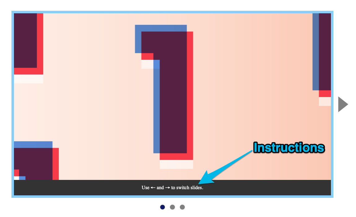
Instructions to use ← and → keys.

But we know NVDA users cannot use ← and → keys to switch slides. We need to remove this set of instructions for NVDA users.

Unfortunately, there’s no way to detect whether a user is using a screen reader, much less which screen reader they’re using. So we need to remove this set of instructions completely.

<!-- Remove this -->
<div class="carousel__overlay">Use &larr; and &rarr; to switch slides.</div>
/* Remove this */
.carousel__overlay {
/* ... */
}
Removed overlay instructions.

Normal users and Voiceover users won’t know about ← and → keys. They’ll have to discover the ← and → shortcuts by themselves.

This is okay because the ← and → shortcuts are enhancements. It’s not critical for users to know about them.

Try navigating through a carousel with a screen reader’s “Next Item” command. The dots and slides will go out of sync.

This is normal.

It happens because screen readers don’t send browsers any events when they use “Next Item”. As a result, browsers can’t send us events too.

We can solve this sync issue by preventing screen readers from “hidden” slides. We can do by:

  1. Setting aria-hidden="true" to other slides
  2. Setting visibility: hidden to other slides

Setting aria-hidden to other slides

The first method is to set aria-hidden="true" true to other slides. When slides change, we switch the aria-hidden="true" property (like roving tabindex).

This works on NVDA.

But there’s a bug on Safari. It shows the last slide.

Since aria-hidden doesn’t solve the problem completely, we’ll use the visibility: hidden method instead.

Setting visibility hidden to other slides

We can hide slides by adding visibility: hidden to them. We’ll only show the selected slide by changing visibility back to visible.

.carousel__slide {
/* ... */
visibility: hidden;
}
.carousel__slide.is-selected {
/* ... */
visibility: visible;
}

This works on NVDA and Voiceover.

However, it breaks the carousel’s transition animation slightly. It causes the outgoing slide to disappear before the animation is complete.

We can fix this by delaying the visibility transition.

.carousel__slide {
/* ... */
visibility: hidden;
transition: visibility 0s 0.3s linear;
}
.carousel__slide.is-selected {
/* ... */
visibility: visible;
transition: visibility 0s 0s linear;
}

Removing list semantics

If you pay attention to NVDA’s message, you’ll notice NVDA says: “List with one item”. But when we switch slides, it says “Slide X of 3”.

This is confusing. What does the carousel contain? List items or slides?

The best way to resolve this problem is to remove list semantics by setting role of the list to presentation or none. NVDA won’t say “List with one item” once we do this.

<ul role="presentation" class="carousel__contents">
...
</ul>

Hiding dots from screen readers

Screen reader users can move through the slides with the Left and Right buttons. They don’t need to access dots at all.

We can hide dots from screen readers by setting aria-hidden to true.

function createDots(slides) {
const dotsContainer = document.createElement('div')
dotsContainer.classList.add('carousel__dots')
dotsContainer.setAttribute('aria-hidden', true)
// ...
}

There are two things in each slide:

  1. Links
  2. Images

Each link should have an accessible name. This tells users where they will go to.

Normally, the accessible name is the link’s text content. We don’t have text content in this case so create the accessible name with the title attribute.

<li class="carousel__slide is-selected">
<a href="..." title="One"> ... </a>
</li>
<li class="carousel__slide">
<a href="..." tabindex="-1" title="Universe"> ... </a>
</li>
<li class="carousel__slide">
<a href="..." tabindex="-1" title="Learn JavaScript"> ... </a>
</li>

Images

There are two kinds of images:

  1. Images that are meant to convey a message
  2. Decorative images

If you have an image that conveys a message, you need to write an alt text for the image.

If you have decorative images (no meaning to convey), you need to have an empty alt text.

For this carousel, the images decorative images. That’s why I chose to leave the alt text empty.

That’s it!