You need to know three ARIA attributes to build expandable widgets:
aria-expandablearia-haspopuparia-controls
Aria-expandable
aria-expandable is often used on widgets like buttons. It can either be true or false.
true: Controlled element is expandedfalse: Controlled element is collapsed
<button>Normal button</button><button aria-expanded="false">Aria expanded false</button><button aria-expanded="true">Aria expanded true</button>Screen readers will say “expanded” if aria-expanded="true". They will say “collapsed” if aria-expanded="false"
Aria-haspopup
aria-haspopup is used to tell users what kind of element will appear when aria-expanded becomes true. It is only used when the expandable section is one of these roles:
menulistboxtreegriddialog
<!-- JavaScript required to show the listbox --><button aria-expanded="false" aria-haspopup="listbox">Show listbox</button>
<ul hidden role="listbox">  ...</ul>
Screen reader support for aria-haspopup is poor. JAWS and NVDA only support true (which is used for the menu role).
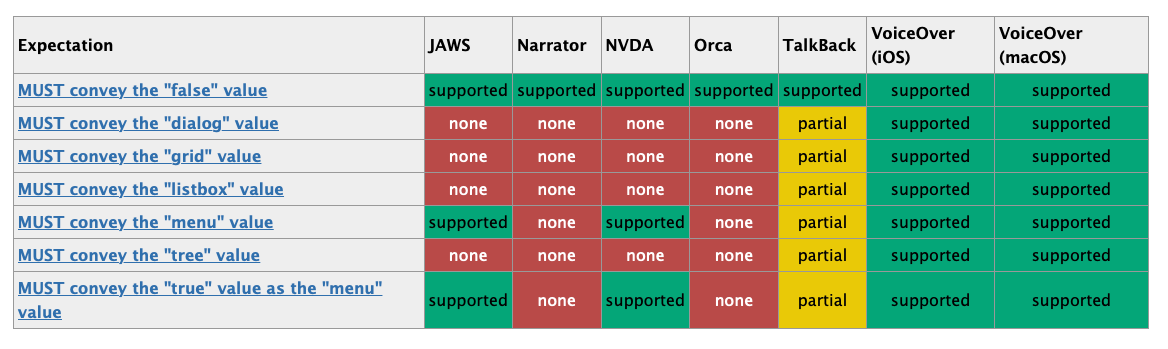
In practice, aria-haspopup gives the same amount of information as aria-expanded—something will pop up. There’s no need to use aria-haspopup if you already use aria-expanded. (Unless you want to provide the additional semantics for menu).
Aria-controls
aria-controls tells screen readers which element is being controlled. It takes in the id of the controlled element. The specs key stating we “must” use aria-controls.
<button aria-expanded="false" aria-controls="story">Show story</button>
<section hidden id="story">  <h2>Goldlilocks and the three bears</h2></section>
However, Heydon Pickering suggests that aria-controls is poop because it doesn’t have much screen reader support (and it doesn’t do much either).

So there’s no need to use aria-controls. (Yes, this goes against the spec, but let’s be practical 😉).
Welcome! Unfortunately, you don’t have access to this lesson. To get access, please purchase the course or enroll in Magical Dev School.
Unlock this lesson