How does the browser determine the layout of the boxes it generates? There are a number of factors involved:
- box dimensions and type (which we covered extensively in the previous section)
- positioning scheme
- relationships between elements in the document tree
- external information (e.g. viewport size, intrinsic dimensions of images etc.)
In this lesson, we will take an in-depth look at how positioning schemes work. If you had been following the lessons in order, you would have come across the term “normal flow” a few times by now. It is the laying out of boxes, one after another, either in a block formatting context or an inline formatting context.
Conceptually, a box can be in normal flow, floated or out of flow. The value of the position property determines which positioning scheme the browser will use to calculate the position of the box.
Any value other than static will make the box a positioned box, and allow the box’s position to be offset from various starting points depending on the positioning scheme used.
Static
The initial or default value for position is static. Boxes with this value are simply laid out according to their formatting context. They are considered in normal flow.
Boxes in normal flow will have an influence on the size and positioning of its sibling boxes and ancestor boxes. For example, under normal circumstances, the parent container will expand to accommodate the boxes of content within it.
Relative
A relative positioned box is laid out in normal flow as well, similar to that of a static positioned box. But it can be offset from its given position using the offset properties of top, right, bottom and left. The offset will not affect the positioning or sizing of the adjacent boxes around it though.
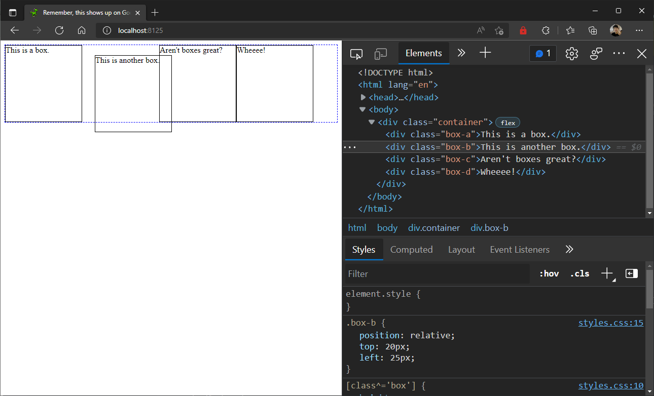
The flow of the boxes adjacent to the offset box only takes into account the original position of the box when it was first laid out, and not it’s offset position.
Sticky
A sticky positioned box similar to a relatively positioned box, and still remains in normal flow. However, it has some behaviours that distinguish it when scrolling is involved.
Unless you have very little content, most of the time, you will need to scroll down to access all the content on your page. And even if you have little content on your page, scrolling might occur if you resize your browser window to a small size as well.
When there is scrolling, it implies that there is content that is outside the viewport that you have to scroll to get to. With sticky positioning, it is possible to have content stay within the viewport instead of scrolling off-screen.
An offset value must be set on the box you want to be sticky. In the above example, the offset value for the sticky box was set to top: 0px, hence when the scroll starts, the sticky box remains “stuck” to the top of the viewport while the other boxes go out of the screen.
Absolute
An absolutely positioned box is taken out of normal flow altogether. This is in contrast with the previous positioning schemes, where all the boxes flow one after another.
Once out of flow, the box no longer has any impact on the size or position of its siblings and ancestors. Instead, it’s position and size is in relation to its absolute positioning containing block.
This containing block is the nearest positioned ancestor of the absolutely positioned box. If there are no positioned boxes on the page, then this defaults to the body element.
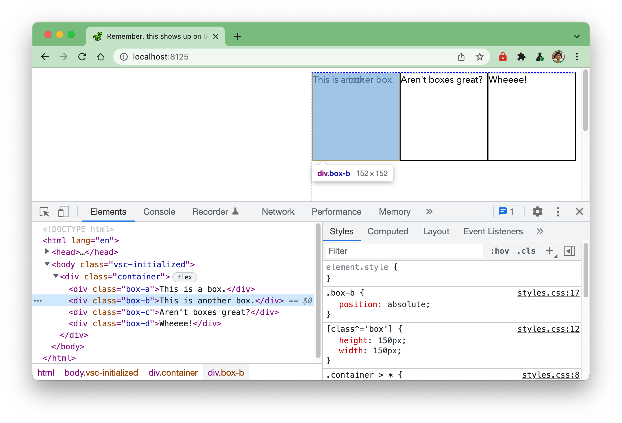
Because the box is now out of flow, it can overlap in-flow content or other absolutely positioned boxes. It’s size and positioning is solely determined relative to its containing block. If there are no offset values set, it will default to the upper left corner of its immediate parent.
Fixed
A fixed positioned box has the same behaviour as an absolutely positioned box, except that its reference point for positioning and sizing is always the viewport.
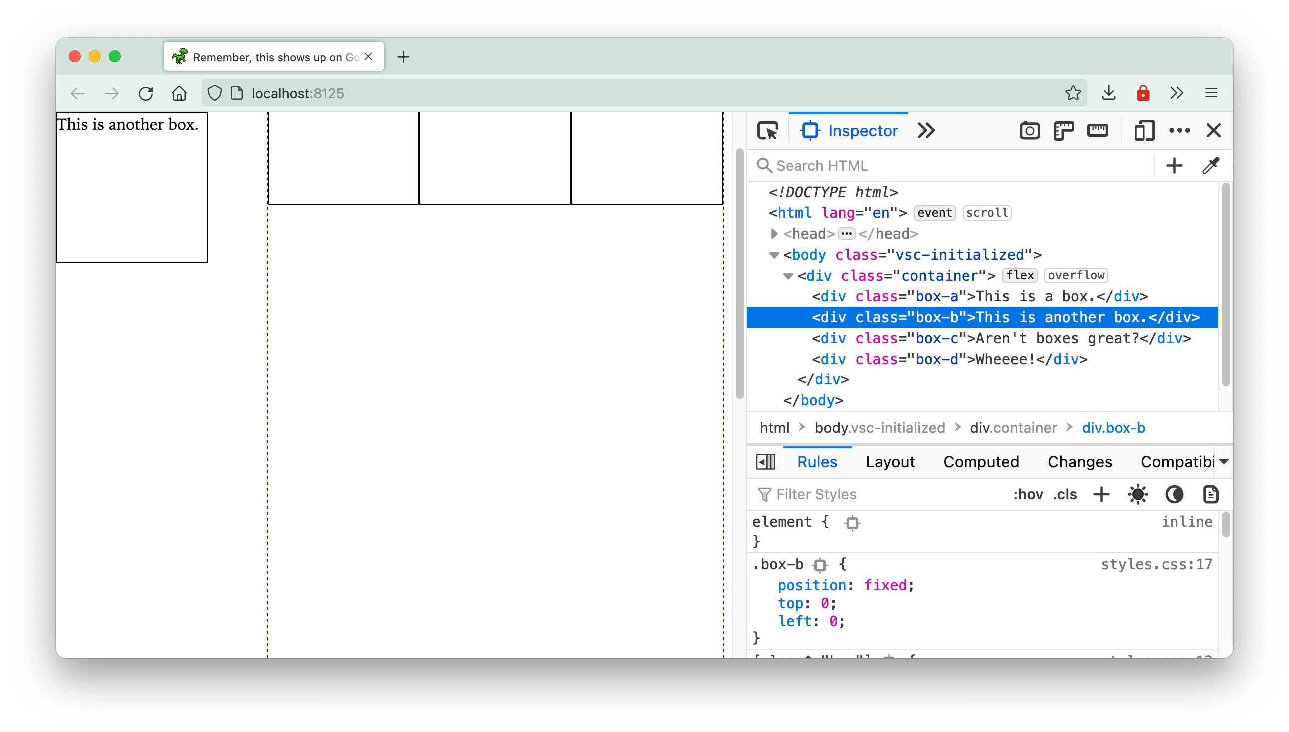
Regardless of how content is scrolled or how the viewport is resized, the fixed position box will always remain in the same position relative to the offset values in reference to the viewport.
Welcome! Unfortunately, you don’t have access to this lesson. To get access, please purchase the course or enroll in Magical Dev School.
Unlock this lesson