Before Flexbox and Grid became widely supported across all the different browsers, web developers relied on the float property extensively for their different layout needs.
Floats were never meant to be used in this manner, however, it was the best tool developers had at the time, so we made do. It wasn’t straightforward, and often required some precise calculations to get things working just right across different viewports.
These days, float-based layouts are almost obsolete, but that does not mean the float property itself should no longer be used. Rather, it can now return to its intended purpose, which is to “float” content all the way to the left or right while allowing other content to flow around it.
In the previous lesson, you learned about boxes being in normal flow, and boxes being out of flow.
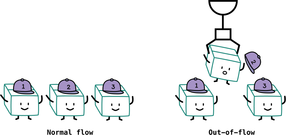
There is a third type of behaviour for floated boxes. It was most likely introduced to mimic a commonly-seen printed page layout where text flows around “floating̦” images.
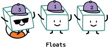
Basics of float
Unlike fixed or absolutely positioned boxes which are taken out of normal flow, floated boxes are still part of normal flow. A floated box is shifted all the way to the edge its containing block. Other content will then flow down either the left or right side of this floated box, depending on which edge it’s floated to, and the amount of space available next to it.
A great use case for float would be a long form article that contains images and text. The markup structure might look something like this:
<article> <p>Cupcake ipsum dolor sit amet soufflé…</p> <img src="http://www.cupcakeipsum.com/src/assets/essential-css/green_muffin.png" class="left-img" /> <p>Marzipan caramels sesame snaps wafer brownie…</p> <p>Lollipop jelly sugar plum sweet marzipan caramels…</p> <img src="http://www.cupcakeipsum.com/src/assets/essential-css/blue_muffin.png" class="right-img" /> <p>Croissant pie danish pastry dessert…</p> <p>Soufflé danish halvah danish tart jelly-o…</p></article>Where the images are interspersed with the text. Without any additional styling, both the images and text will stack on top of one another because the p elements are block elements.
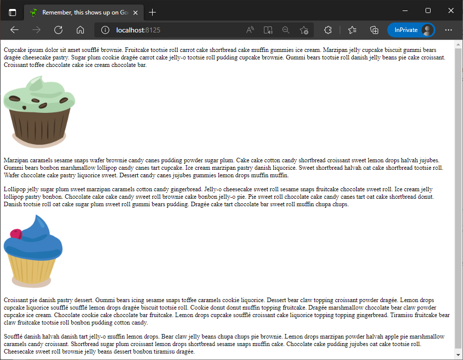
If we float the first image to the left and the second image to the right by applying the float: left and float: right properties on them respectively, you will end up with a layout that looks like this:
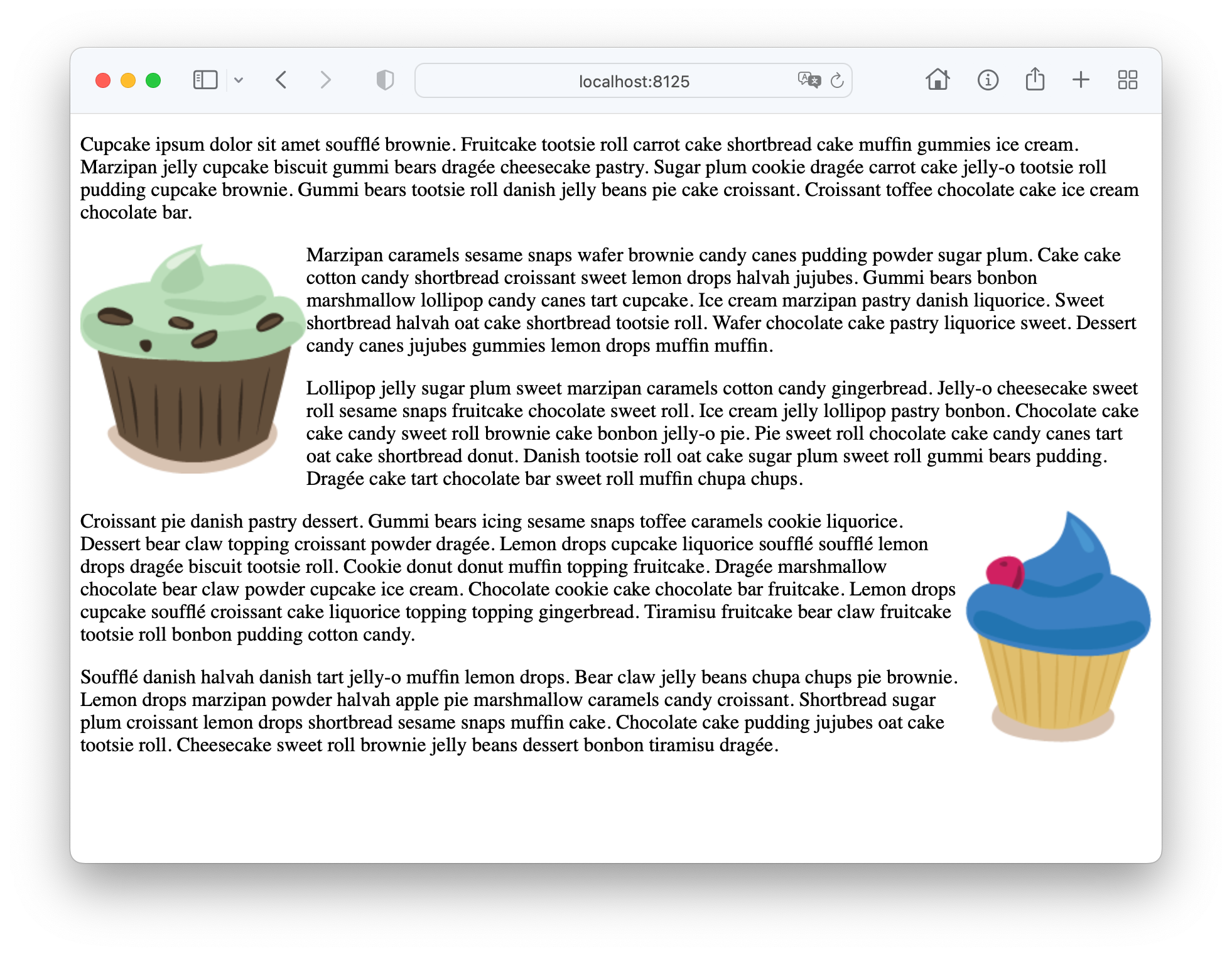
As you can see from the screenshot above, the text in the element directly below the floated images are aligned with the top of the images.
Welcome! Unfortunately, you don’t have access to this lesson. To get access, please purchase the course or enroll in Magical Dev School.
Unlock this lesson