No discussion of typography will be complete without the inclusion of vertical rhythm. So let’s talk about that — how to use it, and the principles behind it.
Vertical Rhythm in a nutshell
Vertical rhythm is basically the idea that you should align text based on the amount of line-height. When text is always aligned by this value, the text becomes orderly and uniform, and hence, is supposed to be nicer.
Typically, in print, the text sits on the baseline grid, while on the web, we do not have a baseline, but we have line-height, so text floats between lines.
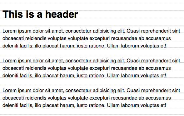
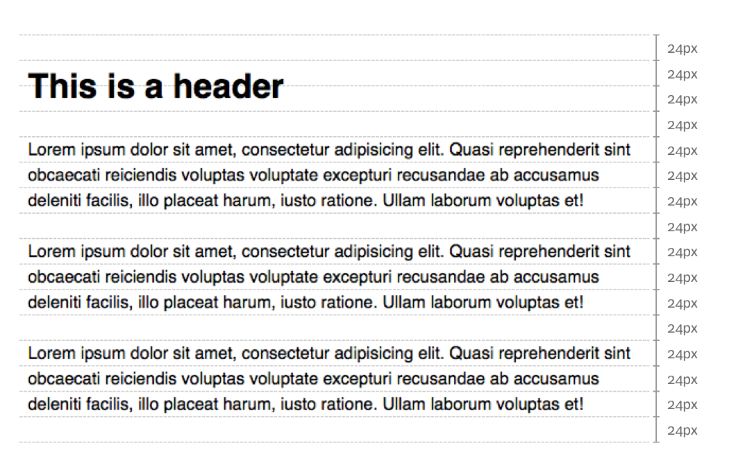
It is very difficult to create a perfect vertical rhythm on the web because line-height is split evenly above and below the font. To make headers sit on the baseline grid, a lot of calculations are required.
The question isn’t whether this is correct or not, but whether it is worth the effort to do so. (Most of the time, it is not.)
The real reasons behind vertical rhythm
Vertical rhythm is a rule derived from repetition and alignment.
- When something is repeated more often, it is more familiar so it looks more right. In this case, we are only repeating the white space.
- When something is aligned, it is more orderly, less chaotic. So people fall into a rhythm that they can flow with.
So it doesn’t matter what whitespace value you repeat. As long as you repeat it consistently, it will look nice enough. (Maybe not for getting awards, but good enough for most websites.)
Horizontal rhythm
Horizontal rhythm is just as important as vertical rhythm for the same reasons — repetition and alignment.
If you apply the same horizontal and vertical rhythm, the whole site looks uniform. If you don’t, the whole site looks a little bit chaotic.
No right, no wrong. Depends on the field you are trying to create.
The correct rhythm
There is no real consensus but I have seen points of view commonly converging into two values:
1em- onefont-sizevalue1lh- oneline-height
I used to think that 1lh was the correct answer (because that’s the rule!), but a print designer later told me that 1lh seems to be too much spacing between paragraph elements.
That got me confused for a long time.
Eventually, I understood that both values are correct (because you repeat them both on the page a lot). So you just have to be consistent and mindful about what context they are being used for.
My go-to simple rhythm
I use 1lh for longform text and 1em (or 1rem) for other contexts.
Because:
1emis good for most other contexts. It keeps things tight.1lhis generally too much space, but it excels in longform text because it lets users rest on new paragraphs (1emis too tight, so I disagreed with that print designer eventually).
To see why 1lh is good for longform, click this button here — it’ll switch the margins between paragraphs on this page so you can see the difference yourself.
Try it. You’ll see that:
1emfeels like a whole block of continuous text1lhallows for some breathing room as you’re reading.
Again, no right, no wrong, depending on how long your text is and what you are trying to create.
And that brings us to an interesting question.
The base rhythm unit
Since there is no definite answer to the right rhythm, you can explore and see what you prefer! One way to make this easy is to change the base rhythm unit that Tailwind provides you with. (It is called --spacing).
- By default, Tailwind sets one
--spacingvalue to be0.25rem. - That is why 4
--spacingis1rem. - But you can also change the unit to
0.25rlhif you want to experiment with line-height base values.
@theme { --spacing: 0.25rlh;}This is completely optional — but you might find that suddenly there is too much spacing everywhere! So much that you have to use 0.75rlh over 1rlh for most spaces.
Warning: do not switch between rem and rlh in the middle of a project, because all of the white space will go out of whack. Choose one and use it for the entirety of that site.
That’s all I want to share with you about typography in Tailwind!
Welcome! Unfortunately, you don’t have access to this lesson. To get access, please purchase the course or enroll in Magical Dev School.
Unlock this lesson